ABOUT THE PROJECT
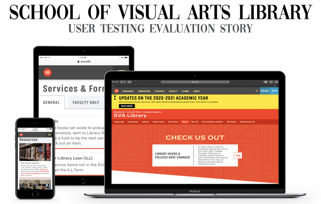
The School of Visual Arts has been a leading educator in the field of art and design for over seven decades. With the recent redesign of their library website, the purpose of this project is to conduct, collect and analyze users’ feedback of the new site. Through remote user testing via zoom, our tasks set out to test the library site’s various functions and services. Our team then identified 3 main problems- navigational, information architecture and functional- and provided recommendations that would improve overall user experience.
My role for this project was to:
– Create pre-test questionnaire
– Conduct and note take user interviews (2 each)
– Prepare contextual supporting material
– Design and compile final report
– Assist in creating presentation
– Answer post-presentation questions
Client
School of Visual Arts (SVA),
Phoebe Stein
Project Timeframe
October – December 2020
Our team
Celine Yap
Christine Tenny
Christy LaPerriere
LeMark McPherson
THE PROCESS
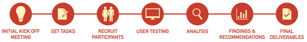
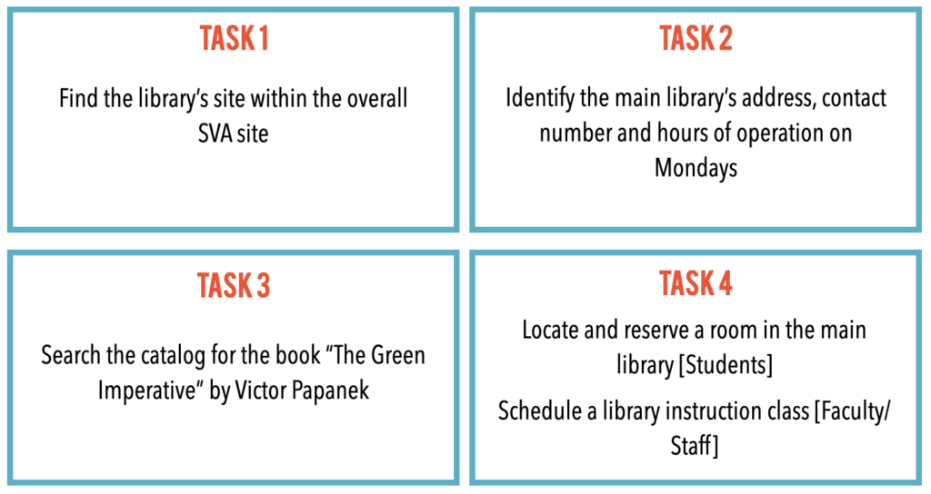
TASKS
Prior to completing the tasks, participants were asked to fill out a pre-test survey form [students] [faculty/staff]. Participants were then given 4 tasks to complete.
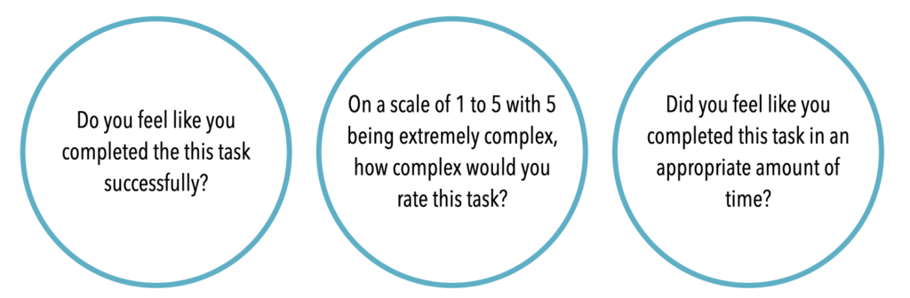
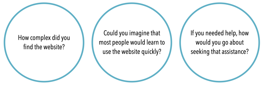
After each task, participants were asked the following questions:
The user testing concluded with a post-task interview:
PARTICIPANTS
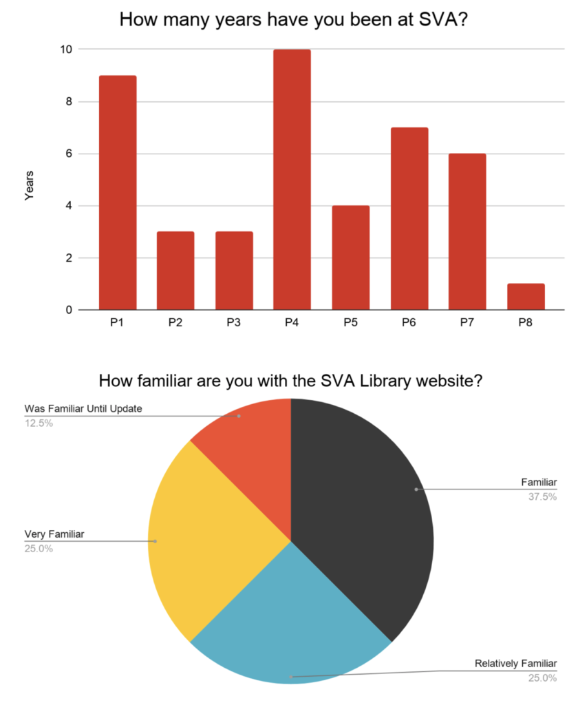
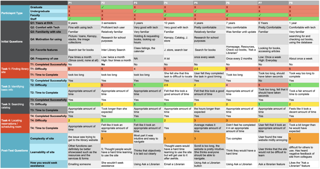
A total of 8 participants were recruited, with the help of our client. Participants consisted of 3 students, 3 faculty, and 2 staff members.
ANALYSIS
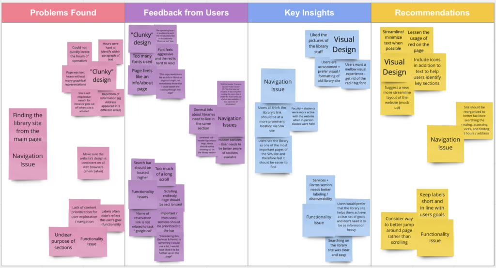
After user testing was complete, our group compiled participant responses and summarized all findings into a miro board as well as a google sheet. This provided an overview and a central location for all our data and insights.
RESULT SUMMARY
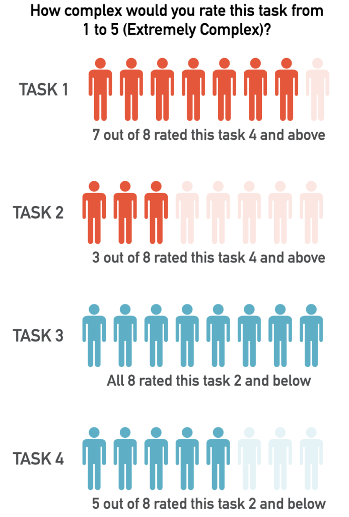
TASK COMPLEXITY RATING
OVERVIEW
The user testing conducted showed navigation and prioritization of information needed to be improved for the site to perform intuitively and function more efficiently and effectively
The text heavy visual design and arrangement of information confused some users, making it difficult to locate specific key information
FINDINGS & RECOMMENDATIONS
NAVIGATIONAL
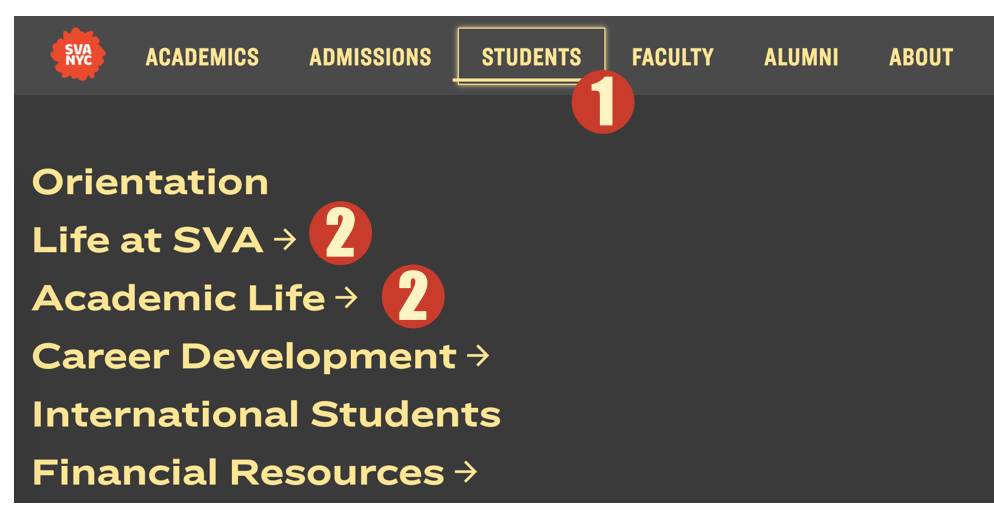
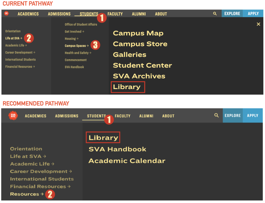
Problem: Users were not able to locate the library’s site from the main SVA website. A user noted the library’s site “should not be more than 2 clicks away“-P7. All 8 participants looked under “Students” and stopped at either “Life at SVA” or “Academic Life”.
The current pathway to find the library is Students > Life at SVA > Campus Spaces > Library.
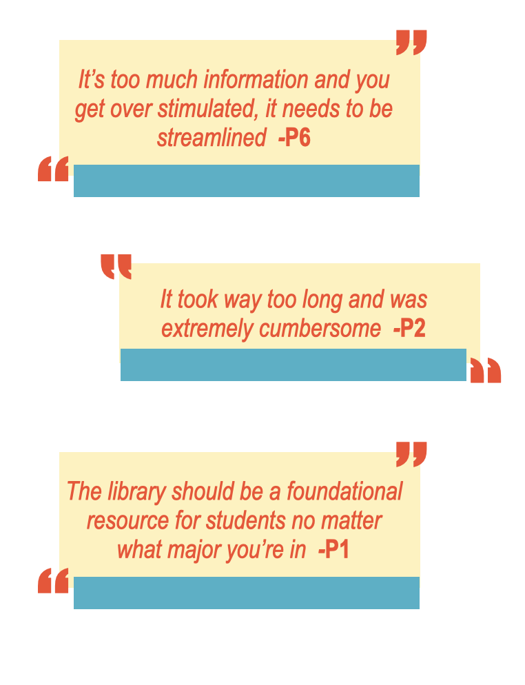
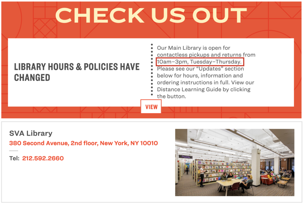
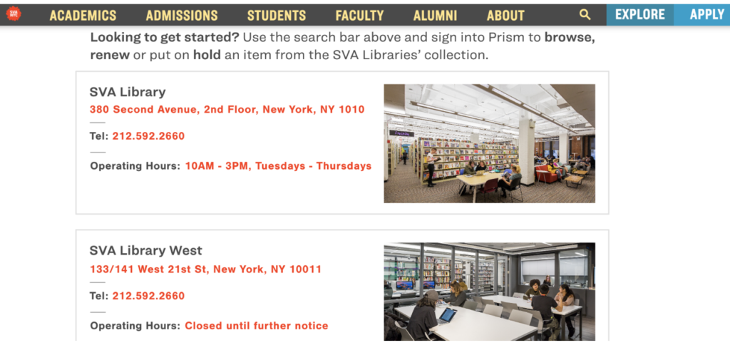
Problem: Users were not able to locate the hours of operation on the site- “The most logical place would be under the address and phone number“-P2.
Recommendation: Participants 1, 6 and 2 suggests adding a new link “Resources” under “Students” which allows the library’s site to be found quickly and efficiently.
Recommendation: Grouping the library’s contact information together
INFORMATION ARCHITECTURE
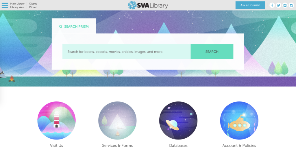
Problem: Users found that it was challenging to navigate the site as the new design features a single page layout (SPA). During the tasks, I noticed users would often scroll past what they needed and would have to scroll back to look for information. “The library’s subsections should be available to me without having to scroll“-P4. Users also noted their preference for visual icons in the old site (shown below)
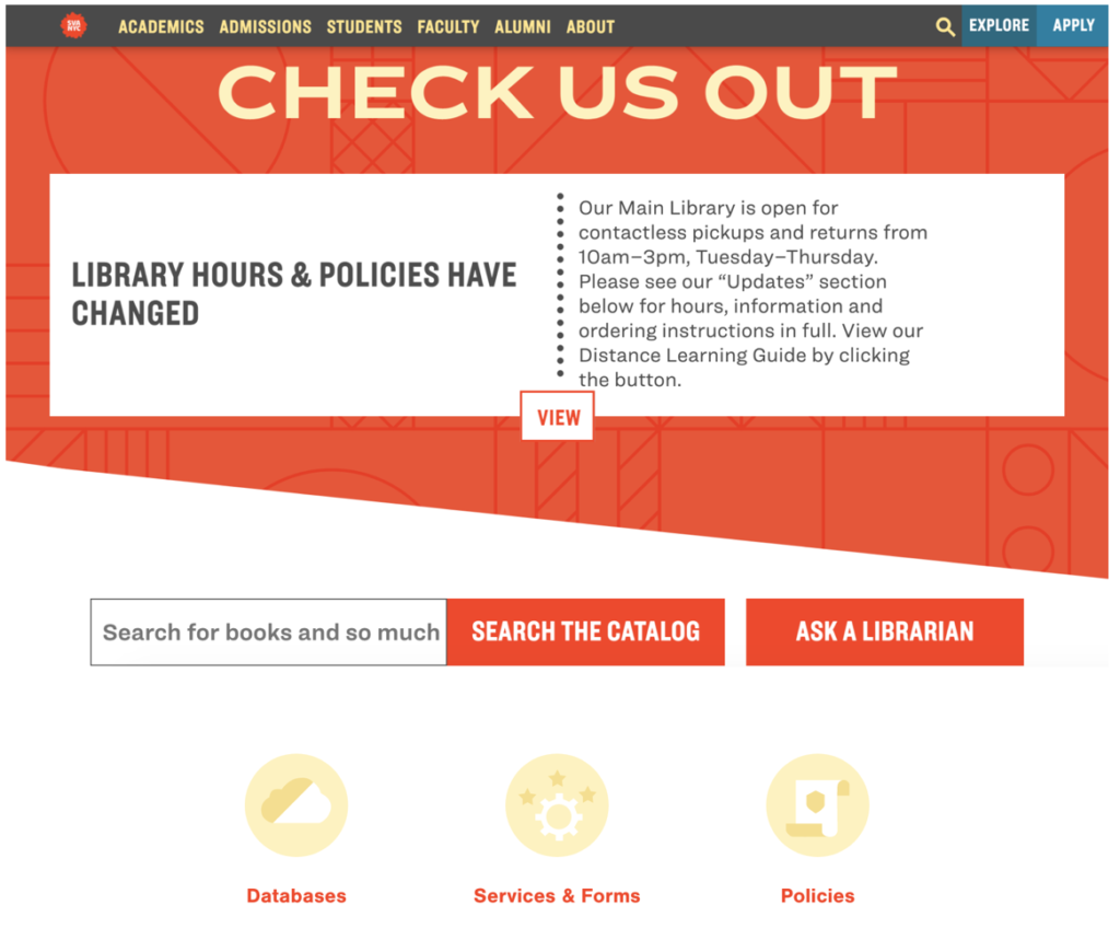
Recommendation: Use visual icons to highlight sections of the site. In order to maintain the SPA requirement from the client, these icons can be used to direct users to sections within the same page. The enables users to avoid endless scrolling and reduce chances of missing important information.
FUNCTIONAL
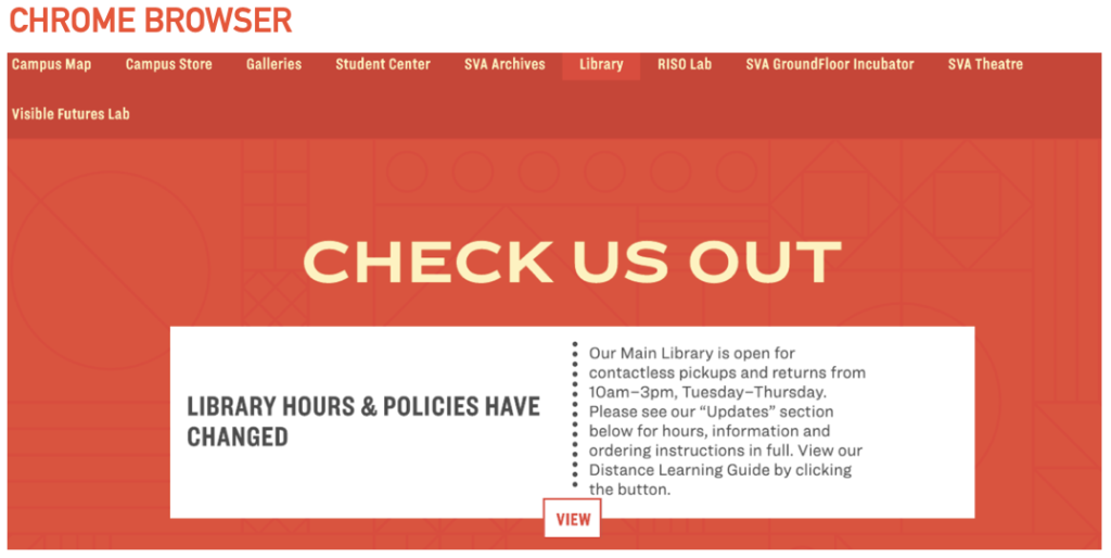
Problem: The site was not universally functional across all web browsers.
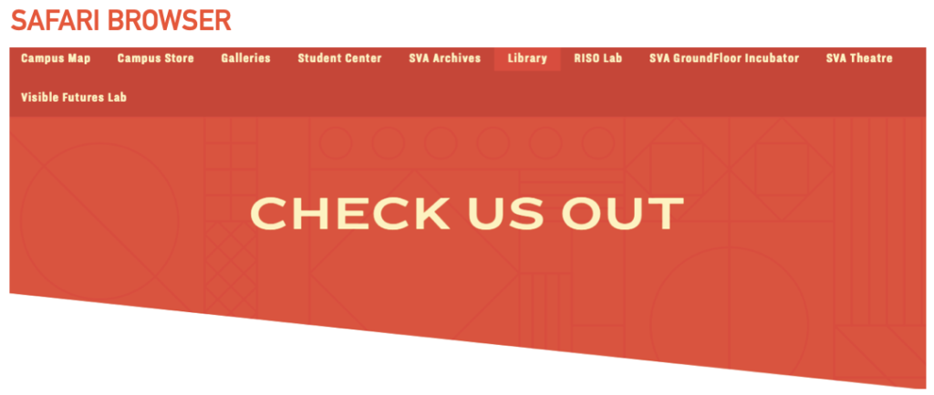
Recommendation: Ensure that the site’s design and usability is consistent across all web browsers.
CONCLUSION
To conclude, we presented our findings to the class and our client, SVA through a 10 minute presentation via Zoom. Our team also completed an in-depth report that was submitted to the professor and client. Feedback from our client Phoebe was generally very positive. She was pleased to see that our findings and recommendations supported her hypothesis about the library site.
NEXT STEPS
For the future, I would suggest conducting a second user test with our recommendations being implemented. That way, we will be able to know if the solutions presented were successful in improving usability of the site and resolving users’ pain points.
LESSONS LEARNT
This project was the first time I had to moderate a user test and work with a client. It was a daunting experience at the start but an extremely invaluable and rewarding opportunity. In the future I hope to improve on my skills as a moderator and take on more responsibilities. Furthermore, using Miro was a first and is definitely a platform I would like to use again. Lastly, I would also like to work on my skills to be able to create functional website prototypes- that I believe will elevate the project further.