
Overview:

JetBlue Airways is a major American low-cost airline,
and the seventh-largest airline in the United States by passengers carried. Three usability experts conducted an eye-tracking study to evaluate the effectiveness of the Jetblue Airlines homepage in helping travelers plan trips and adjust to COVID-19 travel regulations.
Through evaluative user research, we hoped to answer the following questions:
● How do users interact with the homepage and understand it’s content?
● How discoverable is COVID- 19 travel regulations from the homepage?
● What are the pain points associated with booking a flight?
● How have has travel considerations changed pre-and post-covid-19?
● Highlight possible usability concerns and provide recommendations.
Our Team & Tools:
T O O L S :
● Tobii Pro
● Figma
T E A M :
● Adalyn Lou
● Devin Singh
● Leslie Lopez
R O L E
● Plan and conduct usability testing on a target user.
● Analyze usability test results for issues and insights to
meet our research goals
● Craft a presentation deck and problem list
Research
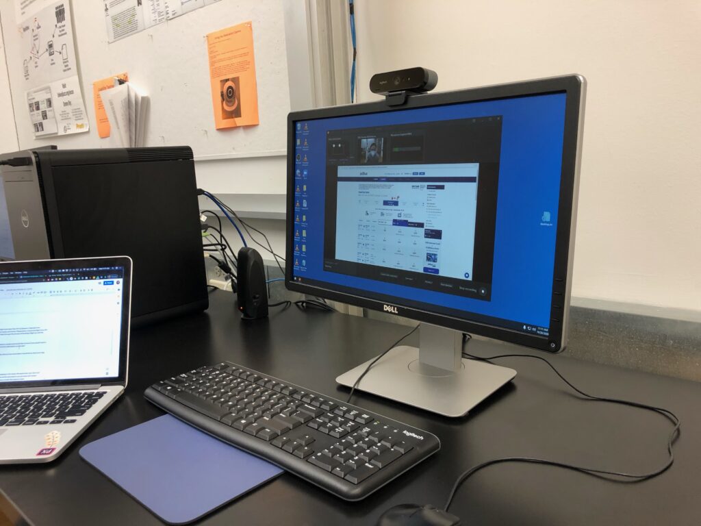
To complete this eye-tracking study we used Tobii Pro Lab, an eye-tracker tool that tracks users’ eye movement. Given the pandemic’s gathering restrictions, we were only able to meet as a team in-person once for the actual eye-tracking session. All pre-planning, scripts, as well as any initial pilot tests, were completed remotely using Zoom and Google Suite. Likewise, because of restrictions, we had a total of 3 participants who were recruited from within the Pratt Institute community.
Below are the criteria for our participants:
- Pratt Students
- NYC residents
- Avg. at least 1 flight/year
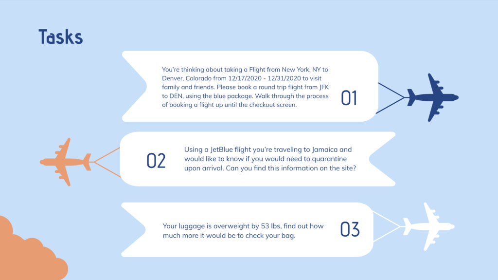
T A S K S :
Aside from our pre-and post-test questionnaire, we created 3 tasks for participants to complete, which can be read in the image below. During the usability tests, we asked participants to “think aloud” as they completed each task. This approach was meant to help us gain insights into what the participants were feeling and add context to their actions navigating the site. After completing the tasks, users were asked to complete a post-test questionnaire which allowed users to report their feelings toward the Jet Blue site and any changes in their travel or flight habits as a result of Covid-19. Alternatively, the pre-test questionnaire focused on participants’ flight habits prior to the pandemic.
Findings
01. Users did not notice the Covid Information Banner at first glance.
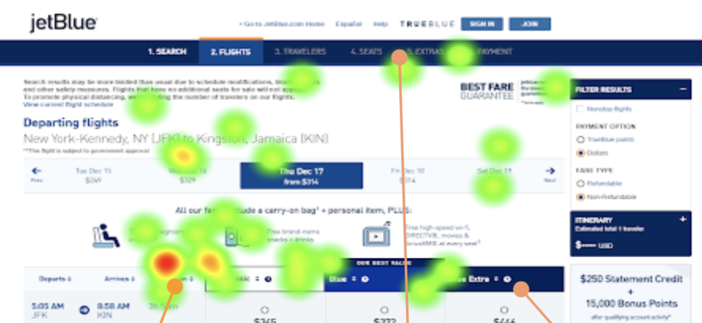
3 out of 3 participants users did not immediately notice the banner at the top which contained information related to COVID-19 and travel regulations unless prompted. Users’ eyes gravitated to the date selection module, which contributed to the banner being overlooked especially at the start of their sessions. There is a lack of visual hierarchy on the homepage due to overlapping analogous colors. This characteristic makes it hard for users to differentiate key actions aside from the module, which is a stark white box at the center of a completely blue page header.
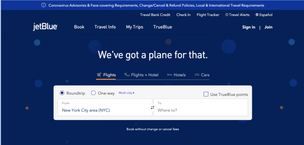
COVID-19 banner is not very distinguishable 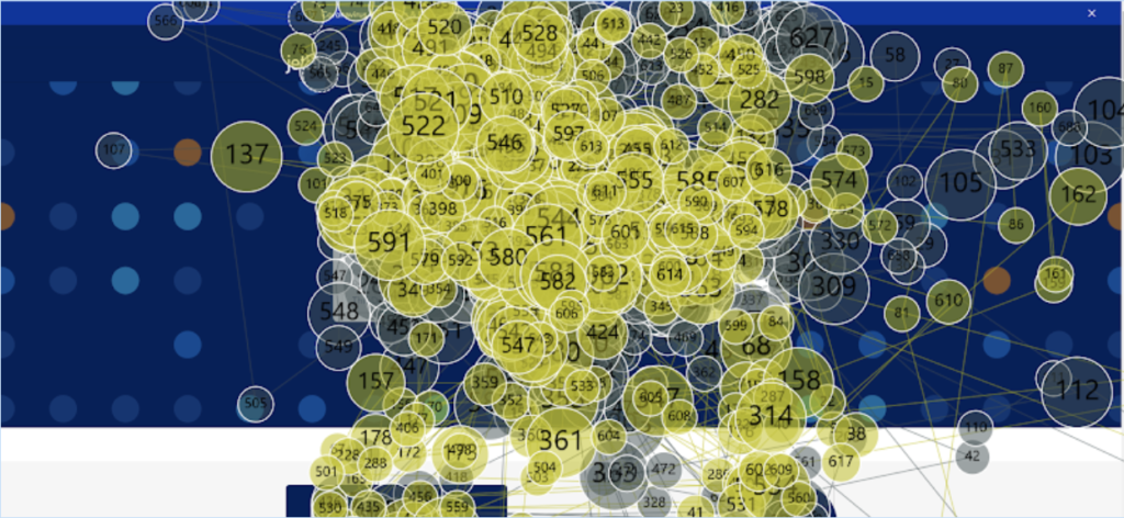
Eye activity is concentrated on the center module
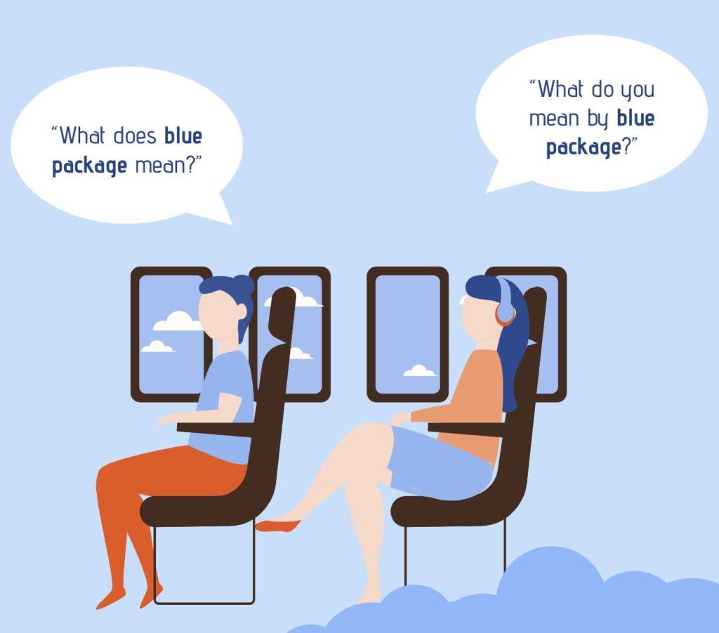
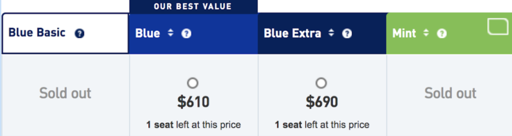
02. Users did not understand JetBlue package labeling.
3 out of 3 users did not understand JetBlue package labeling, which alludes to the idea that users are unfamiliar with JetBlue & its packages. Interestingly, besides the name of the packages, there is a help icon users can click for more information. However, the icons have no heat or interaction (green indicator) on these help buttons, users instead resorted to asking for guidance from their test facilitator. Thus, there need stronger signifiers and labels to increase new user understanding.
03. Overwhelming amount of text on the health advisory page
3 out of 3 participants commented on feeling overwhelmed by the text they had to read to locate quarantine information. Nearly two minutes were spent skimming text. As is shown in the video below, Users preferred content setups, which allow them to skim. The quick guide provided a sense of relief to all the participants who took the time to try and read the dense amount of text on travel advisories. Quick menus and guides were favored overall.
Participants were overwhelmed by the large amount of text 
Participant quote expressing favor for quick guides
04. Users found that the flight booking page lacked hierarchy
2 out of 3 participants felt the flight booking page lacked visual hierarchy and was inconsistent with their user mental model. Participants expressed concern with the lack of visual hierarchy as they navigate the booking process. Users missed the step indicator, help icons, and date module when first orienting themselves on the booking page. Participants felt the lack of distinct secondary colors eliminated visual cues that indicate higher priority. As is shown in the video below, users’ eyes are drawn to the icons at the center of the page. Since the icons are not clickable or directly necessary to the booking process, the participant feels “distracted.”

Participants were felt disoriented at times navigating the booking process 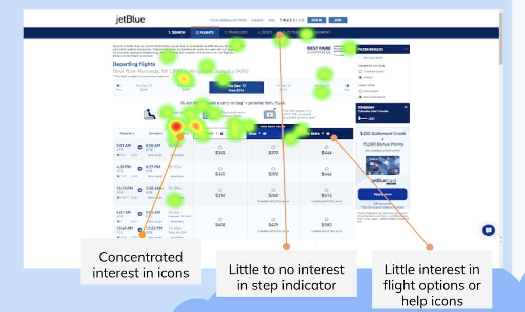
Recommendations
After analyzing our eye-tracking data and recordings, we developed 4 recommendations for the Jet Blue homepage. Based on the analysis of our user test results, We believe that if implemented, these recommendations could help improve the user experience for JetBlue Airline’s online audience. Below is a list of our findings as well as mock-ups to illustrate our suggestions.
01. Prioritize content hierarchy with color contrast.
The current site uses a dark blue banner 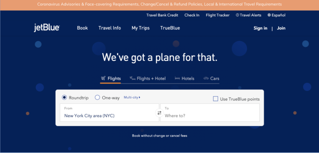
Using the brand’s secondary colors like orange make the banner noticable
A change as small as improving color contrast could greatly impact the discoverability of the banner. Using Jet Blue’s secondary colors, such as orange on the Covid-19 banner highlights the item and acts as a visual cue for users to put more importance on the link. It would make a huge difference in discoverability for important information regarding health and quarantine policies. Using the color orange would be more consistent with JetBlue branding. However, the use of the color red could also signal importance & is consistent with COVID-related banners among other sites.
02. More differentiable naming convention & labeling
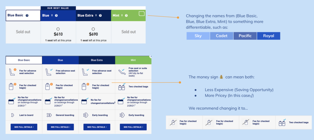
As stated prior, JetBlue needs stronger signifiers and labels to increase understanding, especially for new users. We believe adding some distinct names to the flight packages could improve the user’s ability to differentiate packages. Likewise improving signifiers such as the money icon representing fees for checked bags could be simplified.
03. Make the content more discoverable by organizing based on priority & using quick guides.
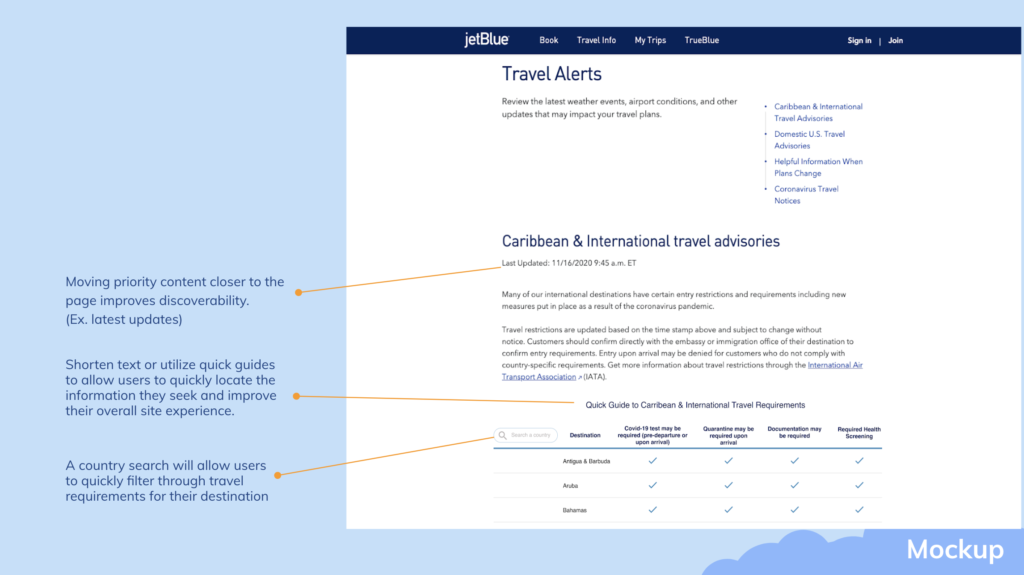
As shown in the mockup, JetBlue could improve the ease of use & discoverability of content for users by organizing based on priority. On their current site, users need to scroll far beyond the page or skim large paragraphs to find travel requirements. Moving priority information up such as the latest updates or streamlining information into quick guides could greatly improve users’ overall experience locating information.
04. Using clearer color patterns and signifiers
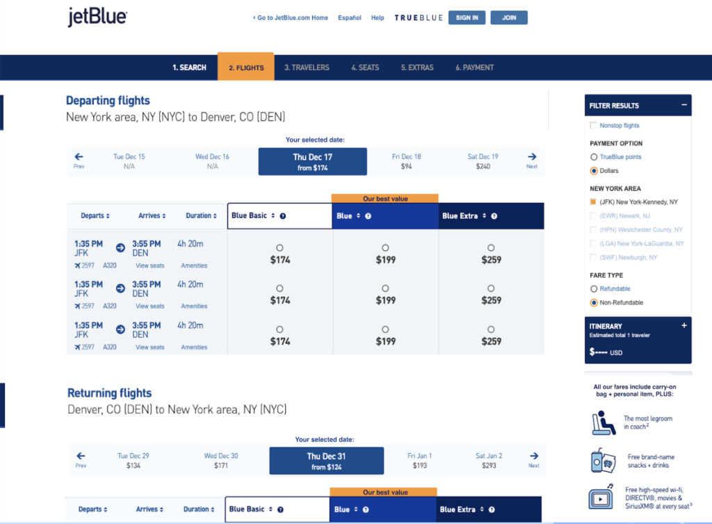
Jet Blue can improve their visual hierarchy & fit users’ mental models by using clearer color patterns and signifiers. For instance, the booking page could improve the visibility of the multi-step indicator & “best value” indicator using a secondary color. Doing so would help the user to not overlook it and orient themselves in the booking process. Likewise, adding the title “Your selected date” clearly defines the purpose of the toolbar. Lastly, moving secondary information such as the unclickable icons to the sidebar reduces the distraction users face in the current booking process. The booking process would become more linear without the advertisement splitting the page.
Conclusion
Despite the obstacle of pandemic’s gathering restrictions, the eye-tracking study was a great success. As a team, we were extremely happy to have completed the eye-tracking setup in-person. Likewise, though we had limited participants it was satisfying to practice user interviews in-person & be able to pick up on their live reactions to issues on the site. Had conditions permitted, it would have been wonderful to have spent more time exploring Tobbi’s other capabilities such as areas of interest or to have recruited more participants.