
About
Advanced usability analytics for NYU Langone using eye-tracking method.
NYU Langone Health is one of the nation’s premier academic medical centers. Located in the heart of Manhattan, with additional facilities throughout the New York City area, NYU Langone is a popular choice for students with insurance health plan.
Our study goal is to Evaluate the usability of specific pages:
- How do users find a doctor based on their insurance, symptoms, and location?
- How do users find ways to donate blood on the website?
- Identify what can be improved and provide actionable recommendations.
Conclusion Preview
The overall experience of using the website differs a lot regarding each individual. In order to improve the usability and friendliness, we recommend NYU Langone Health that:
1. For search result page, differentiate in-person vs. video visits and move the date horizontal scrolling option to each doctor’s section.
2. For blood donation page, add a side navigation bar and organize the information using bullet points in order to avoid a text-heavy page.
Methodology
Tool
- Tobii Pro Lab for eye-tracking
- Figma for recommendation mockup
Material
- Pre-test Questionnaire
- Post-test Questionnaire
- Tasks
- Observation
- Retrospective Think Aloud Interview
Tasks
1. Find a doctor based on insurance, symptoms, and location (check information on how to schedule a virtual video visit)
You have seasonal allergies and you want to schedule a video visit with a doctor in your neighborhood who accepts your insurance.
2. Find information about blood donation
You want to donate blood and you are not sure if you are eligible to do so. Find out if you are eligible and what to expect on the day of your donation.
Participants Overview
Target Audience: graduate students with health insurance plans.
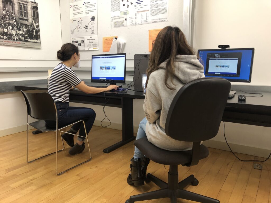
Participants : 3 students from Pratt Manhattan campus.
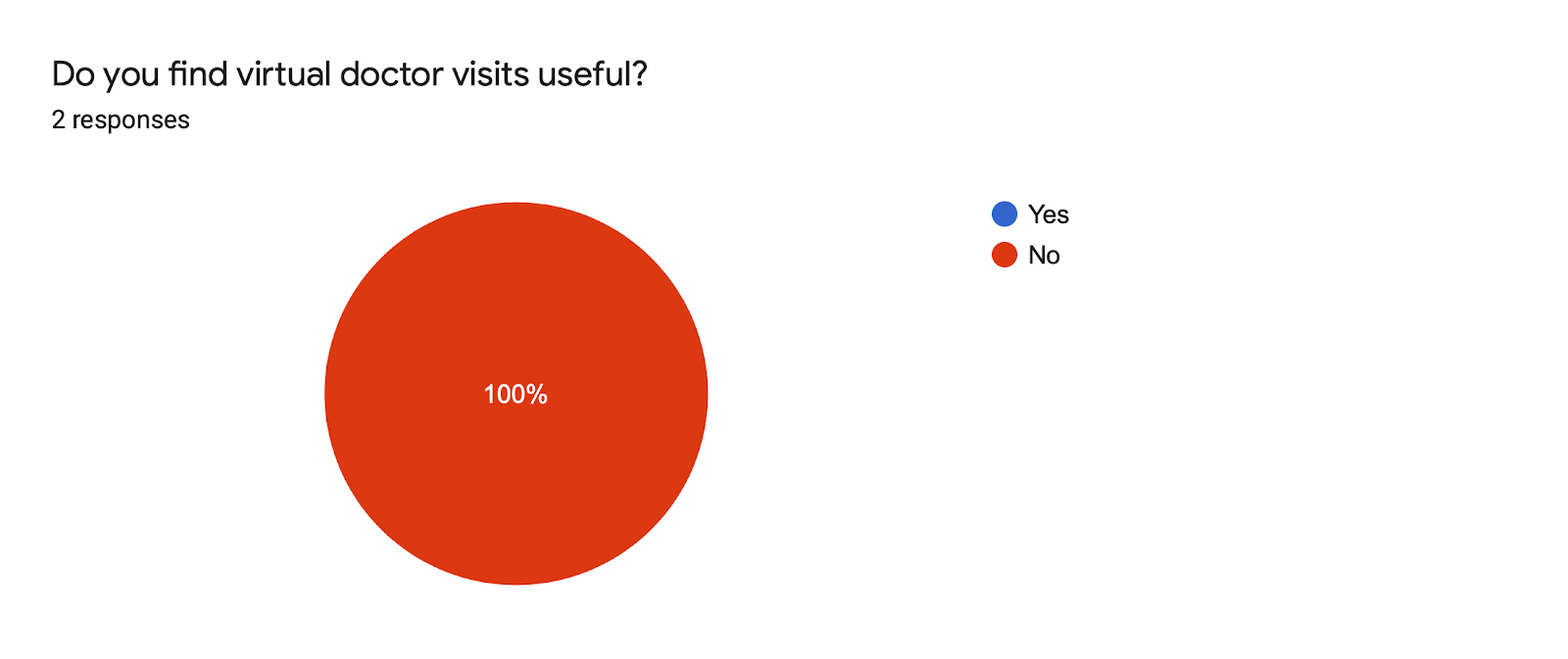
According to the pre-test questionnaire, we found that:
2 out of 3 participants think virtual doctor visits are helpful especially after COVID-19.

Analytics Metrics
Qualitative
- Recordings
- Observation
- User quotes
Quantitative
- Task accuracy
- Ease of use
- Average time for task completion
Data Visualization
- Gaze plot: analyze each participant individually of their eye movements
- Heat map: aggregated data of all participants, focusing on the home page and search results page
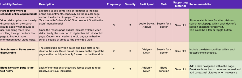
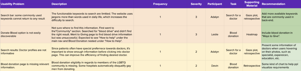
After we analyzed all gathered data, we created a problem list and rated the frequency and severity. Then we defined the main issues and trivial issues (and we put forward recommendations for main problems).
Findings & Recommendations
Overall
The majority of the participants found the website to be easy to use. However, they struggled to:
1. Book appointments
- Lack of indicators for online visits
- Lack of correlation between dates and time slots
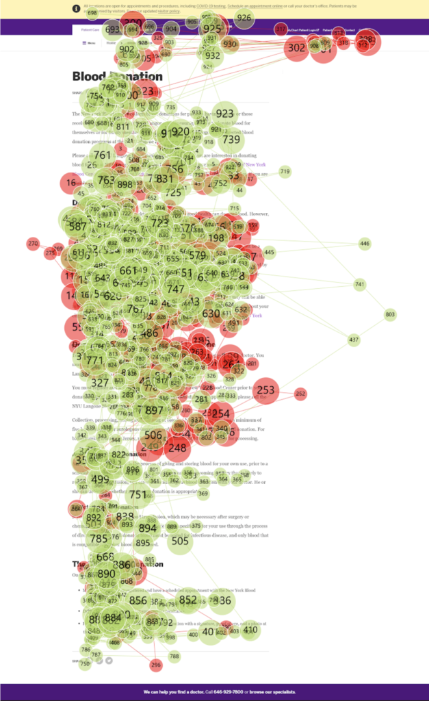
2. Find relevant information on the Donate Blood page due to:
- Text heavy
- Lack of visual cues
Task 1
Finding 1
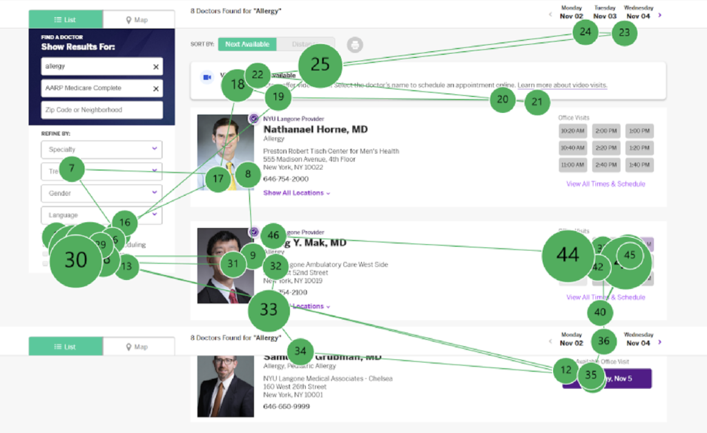
Video visit option is not easily discoverable on the search results page, which led to longer task complete duration (5 min 54 secs on average) and confusion:
I was expecting to see some kind of video signifer next to the time slots.
I need to click doctor’s bio pages to find out more information about video visits.
Finding 2
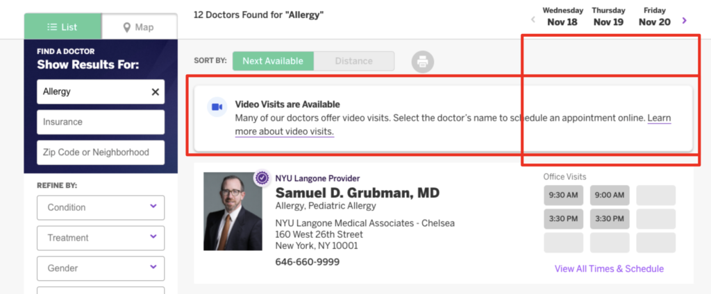
Participants had difficulty correlating the dates and time due to spatial gap, created by a banner between them.
I was wondering what day I’m booking appointments.
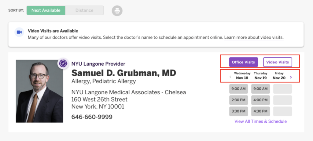
Recommendation 1 & 2
Differentiate in-person vs. video visits and move the date horizontal scrolling option to each doctor’s section.
Task 2
Finding 3
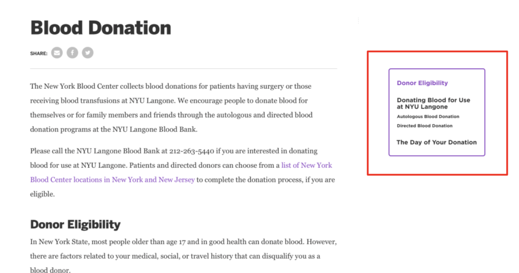
For task 2, participants found blood donation page to be too text heavy.
- They spent a long time reading the information to find the eligibility criteria for blood donation (3 min 26 secs on average to complete the task).
Recommendation 3
Add a side navigation bar and organize the information using bullet points in order to avoid a text-heavy page.
Conclusion
The overall experience of using the website differs a lot regarding each individual. In order to improve the usability and friendliness, we recommend NYU Langone Health that:
1. For search result page, differentiate in-person vs. video visits and move the date horizontal scrolling option to each doctor’s section.
2. For blood donation page, add a side navigation bar and organize the information using bullet points in order to avoid a text-heavy page.