FALL 2020
LIS 643: Information Architecture & Interaction Design
My Role: Product/Tech Manager
Team Green: Zhichun Zhao, Jiae Oh, Nathalie Traikos
Overview
The nycgovparks.org is a website providing all information for parks and facilities under the reign of NYC government. Team Green is responsible for redesigning the website homepage for both desktop and mobile structures. The goal for Team Green is to make the homepage concise, relevant, and easily navigable for the users.
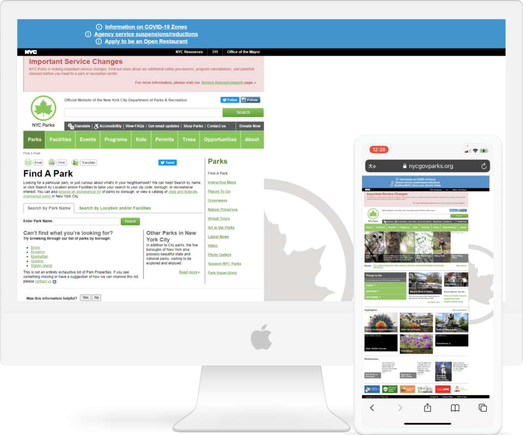
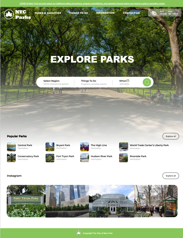
Current homepage
user research
To seek for redesigning the navigation and homepage, Team Green carried out qualitative research to better understand people’s motivations for going to the park, activities done at the park, changes in habit during COVID, and how users find park information.
Methodology:
- 3 Interviewers & 12 Interviewees
- Semi-structured 1:1 phone call
- Contextual inquiry with devices
- Synthesis through Affinity Mapping
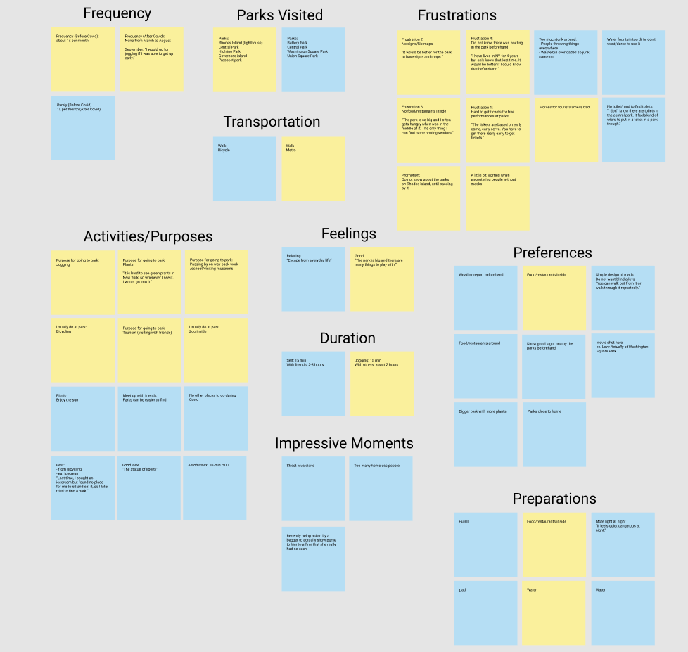
Affinity Mapping 1 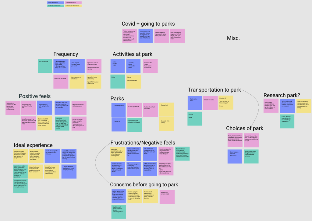
Affinity Mapping 2
User Insights:
- Users are either externally focused on other people’s behaviors or internally focused on their own behaviors regarding Covid-19 safety guidelines.
- Users tend to spontaneously go to parks as opposed to planning their trips, but they later regretted not knowing what events and activities that they would have liked to attend or prepare for.
- Users mainly seek quick recommendations from their trusted social network as opposed to taking time to do research on their own. They rely on this to help make decisions on what parks they should go to.
- Users choose to go a parks near their apartment for convenience to easily meet their social needs and exercise needs.
User Journey Map:

Comparable analysis
Each team member managed to assess three websites from the navigation, homepage, and appearance perspectives.
Design Insights:
- Covid-19 updates should be directly accessible from the homepage and refer to a trusted source (e.g.CDC).
- Make the information easy to digest and simplify delivery (i.e. images, icons, layout, amount of text).
- Information can be accessed from different points for easy search.
- Menu navigation bar at the top of the site should have a limited dropdown of 1-2 layers.
- Do not only rely on navigation bars; make sure to have search functions.
- Make available any potential next steps, as necessary.
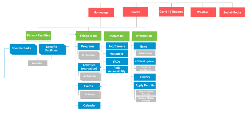
site map
Team Green conducted card sorting of 50 labels and tree testing of 6 tasks with users in order to better understand users’ mental model of the information structure of the website navigation. Team Green revised the site map based on the results.
Ideation
Team Green tried to brainstorm for opportunities throughout the whole user journey.

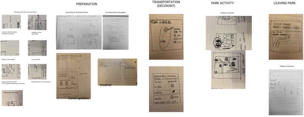
Features Prototype
Team Green decided to focus on opportunities in the first three steps out of the whole user journey.

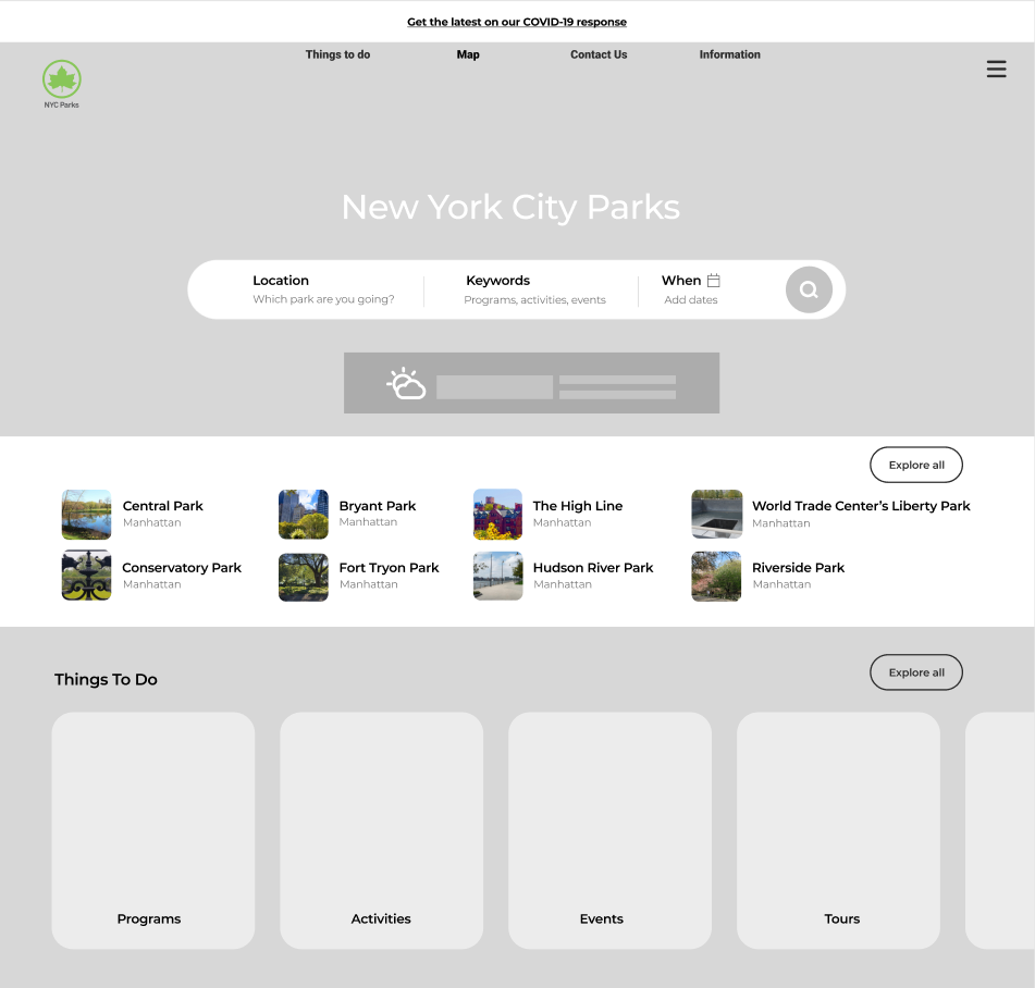
Feature 1: Browsing & Searching
Search bar gives users chance to do exploratory seeking or know-item seeking
Feature 2: Live Video
Providing a real-time feed to help users determine park activity and track behaviors
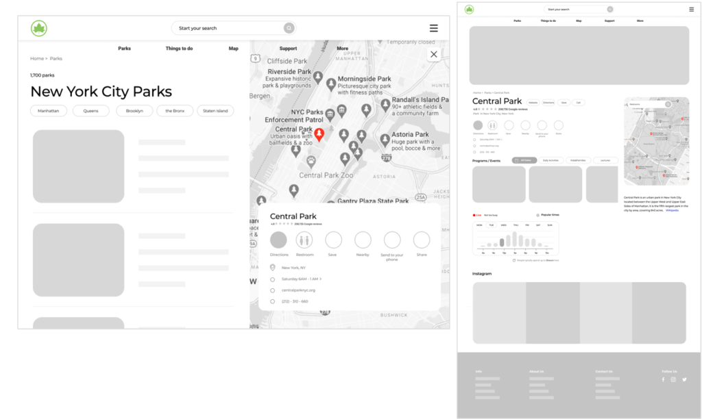
Feature 3: Find A Park
Displaying the parks altogether on the same map with clickable links to each park for more details and re-finding function
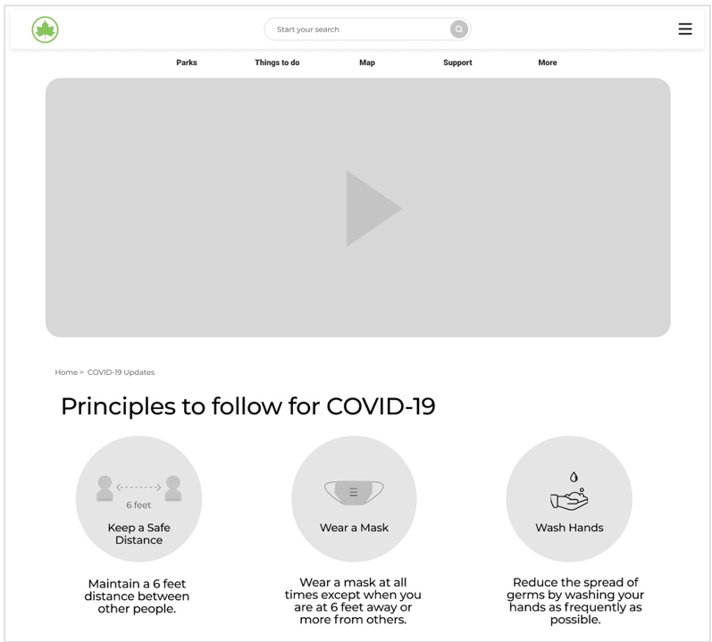
Feature 4: Covid Updates
Providing Covid-19 safety guidelines & Popular times addressing user’s both external and internal mental models
User testing
Tasks 1. You want to check if there are COVID-19 safety requirements to visit a park.
Tasks 2. You want to find a park near your place (144 W 14th St, New York, NY 10011) that takes less than 30min by train.
Tasks 3. You need to find an interesting outdoor activity in nice weather that you can do with your friend this weekend.
Feedback (Task 3):
- The three boxes “Programs” “Events” “Parks” seemed redundant to the search bar
- The “Things to do” on homepage is what is expected to be seen after clicking the “Events” square from homepage
- Expected to choose dates via icon on “Events” square
Revisions:
- Eliminate the three squares or reword the three squares to signify exploration capability
- Search bar at top of homepage needs to be more generic by adding keyword in placeholder text
- Add a date icon on the Events search bar
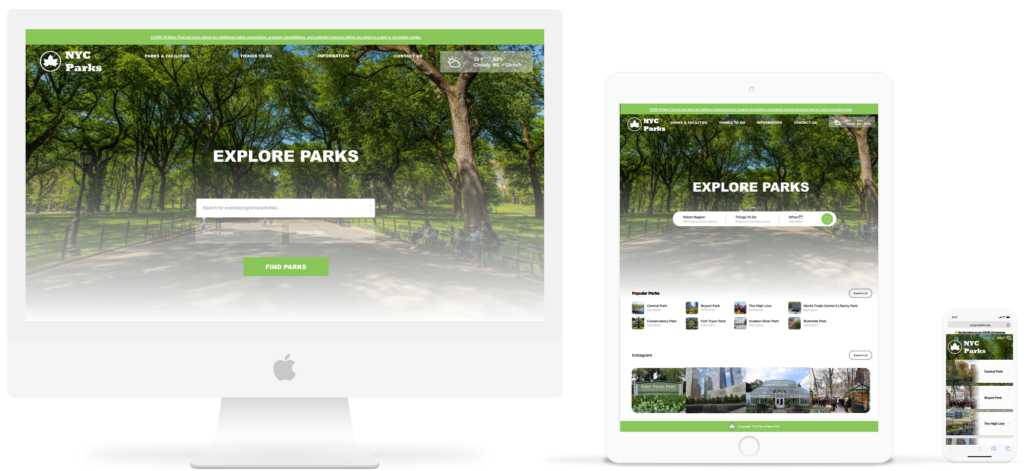
individual Prototype
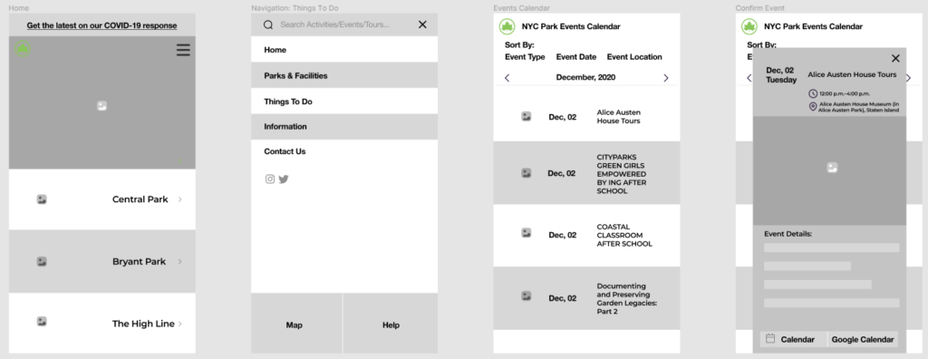
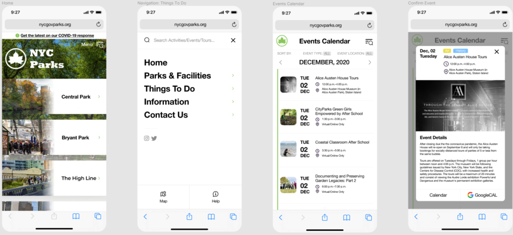
For the final prototype, I choose to work on the flow for users to find an event they would like to attend. Based on the user testing, I focused on developing the calendar and revised the homepage design by removing the things to do.
Besides the recommendations, I also decided to make the following design changes:
By choosing to work with webs on phones, I eliminate the homepage to parks only and hided the navigation with icon based on the feedback that users prefer clear design.
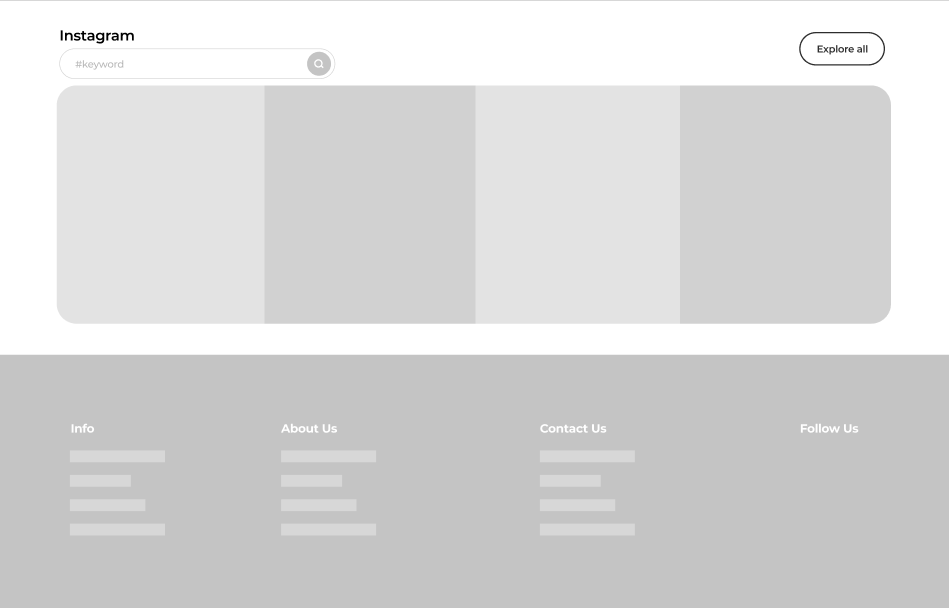
Adopt the revised sitemap, and hided the “find parks and facilities” function with the icon of a map. Keep the social media that users report they would like to have.
Apply calendar as all of the users in the user testing replied that they would like to see a calendar when looking for an event rather than having events plainly listed.
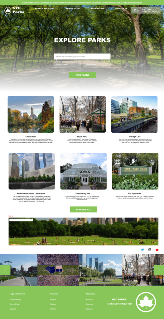
For both tablet and PC homepage, I removed the things to do section as users find the wording confusing and redundant, now that they are all beneath parks & facilities as the site map is showing.
Next step
Due to the scope of the project, there is not a chance for me to refine on all features our team designed. For next steps, we can work on each of them and produce high-fidelity prototypes across devices as well. Moreover, user testing shall be conducted on my individual prototype to improve and finalize the design.