Back story
This study was conducted for the Information Architecture & Interaction Design Course at Pratt Institute during Fall of 2020.
The client
- New York City Department of Parks and Recreation (NYC Parks)
- New York City Department of Information Technology & Telecommunications (DoITT)
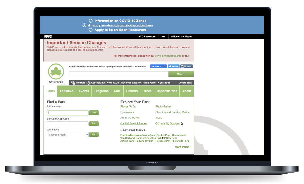
NYC Parks manages more than 30,000 acres of land. The DoITT provides IT services, infrastructure, and telecommunications to the city’s residents, businesses, employees, and visitors; collaborating with agencies like NYC Parks to maintain their current website. However, their official website to date is not optimized for mobile devices.
New Yorkers’ increasing demand for public space when most residents need to stay home has changed the way users interact with parks. In response to this change, our team set out to relaunch specific user experiences of the New York City Department of Parks & Recreation’s website with consideration to:
- How the user’s relationship with parks has changed during the COVID Pandemic
- The importance of mobile devices
- The financial challenges the organization is facing
The Goal
My team aimed to improve the overall interaction and information design of the “Find a park” page on the NYC Parks website for desktop and mobile devices.
The Objectives
A proposed solution with the following qualities:
- Mobile-Optimized & Responsive – web application as they do not have resources to maintain two separate websites.
- Consistent Branding & Design – using their existing design system, logo, colors, and other brand elements as much as possible, with consideration to new modules as long as its not hard to implement
- Content-Driven – reusing as much existing content as makes sense.
- NYC.gov navigation – aligning to the NYC.gov universal navigation that lives across all New York agencies.
- Location-driven through Google API – partnering with Google maps (Per DoITT) to provide a more contextual experience.
- Accessibility-First – ensuring that everyone has access to the full range of information, programs, and services.
Our CHALLENGES
- How does a user find a park nearby?
- What information is needed to help users find and decide on a park to visit?
- Once the user finds a park to visit, how do they access and interact with information?
- How do we optimize the website for mobile devices?
The Copywriter
I assisted with written pieces ranging from the script to the research protocol as the copy writer; working alongside with the product/tech manager and project manager. Some of my major contributions to the team involved developing the the quiz and compare features in the low-fidelity prototype and reviewing all written pieces to ensure uniformity. I also assisted with:
- Conducting ethnographic research, prototype usability tests, card sorting and tree tests
- Consolidating findings into insights with actionable recommendations
- Developing prototypes and wire frames
Tools: Google Drive, Figma, Optimal Workshop, Zoom as design and virtual collaboration tools.
Note: Zoom was used for all workshops
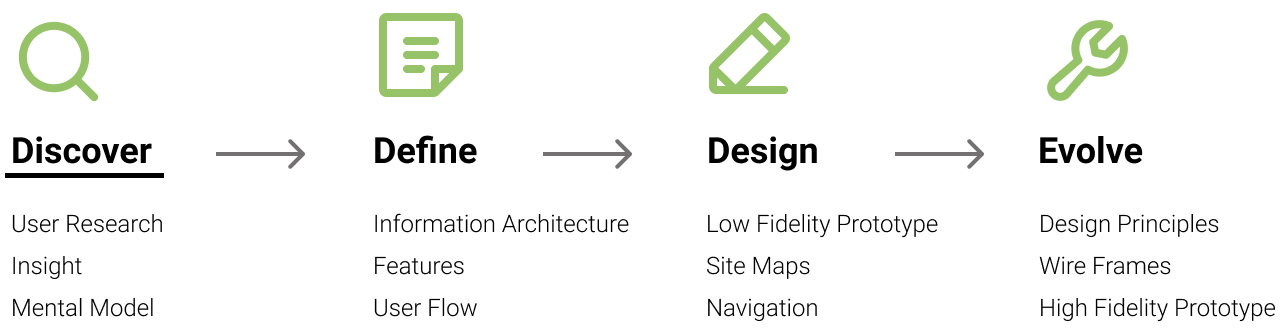
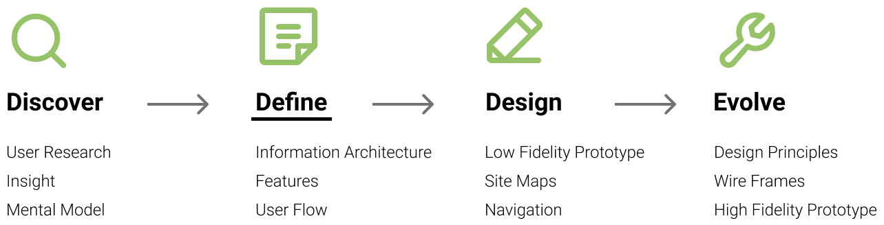
Design Process
Our Approach
To solve the questions, the team took the following steps:
Discover
We first conducted 6 semi-structured interviews to understand why users attend parks. Then conducted 6 observations to understand how find a desired park. Due to the current pandemic decisions, my sessions were done through Zoom or phone.
Findings & Insight
Motivations
Recharge: With COVID-19 requiring many to work from home, users go to the park to get fresh air and disconnect.
Physical activity: With COVID-19 causing gyms to close, users go to park to exercise. (e.g. tennis, fishing, cycling, running)
Social activity: Unable maintain safe distances in doors per CDC guidelines of COVID-19, users go to parks to safely spend time with friends.
Concerns
COVID-19 significantly influences the park selection process for participants; primarily worried about having to wait for amenities such as bathrooms, playgrounds..etc, and challenges with social distancing from other groups. Additionally, participants prefer going to parks closer to their residence due health & safety concerns around public transportation.
Factors
Several key factors influenced which park a user selects. First, they were concerned about the proximity of the park to their current location. They were concerned about the distance of the park between themselves and friends/family. However, they were also very interested in the specific amenities at a park, events going on, and how the parks were ranked.
Based on these findings, the team surfaced several key features to explore:
- A simplified the web navigation to find a park, by focusing location and amenities
- A more advanced or refined search functionality can be done on the results page.
- Search results organized and presented in a way that distinguishes location and amenities.
- Including a park’s visitor density / popular times (use Google API)
- Including ratings and reviews from other park goers
- including the ability to share on social media
Mental Models
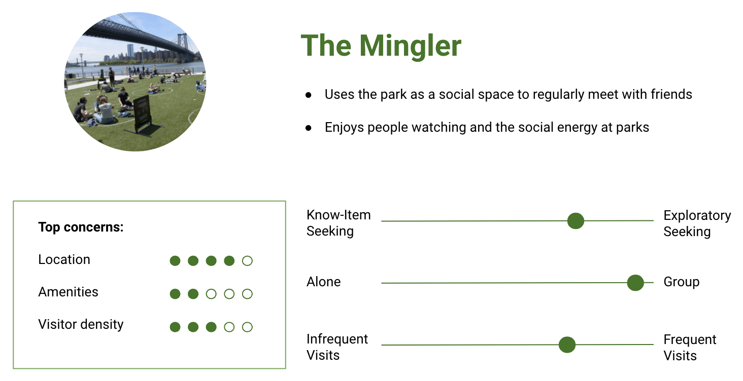
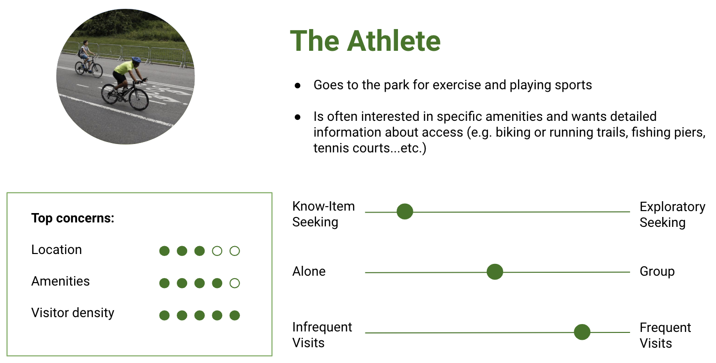
To visualize the types of common park goers, we built mental models from our interview insights. The attributes used to create these models include how users search for parks, who they go with, and how often they visit parks. These models also surfaced how users weigh their decisions based on location, amenities, and visitor density.
Model 1
Model 2
Model 3
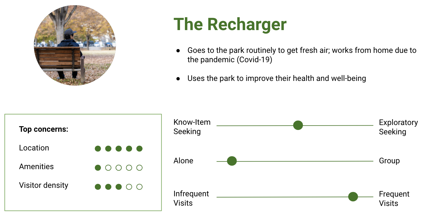
These models helped inform the thoughts and actions of NYC park users for our user flow. We used these insights to represent the typical actions and thoughts of park goers in order to surface opportunities to improve the ‘find a park’ web design.
Define
User Flow
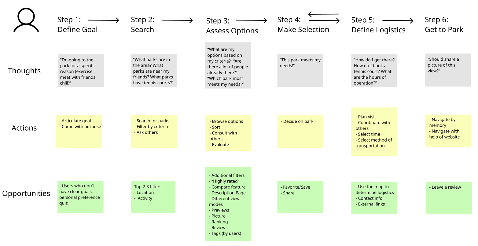
Based on the Mindsets, we identified 6 steps:
1. Define the Goal: Users would first either have an activity in mind that they wanted to do, or would be looking for an activity going on.
2. Search: Based on the goals or intentions of the visitor, they would conduct a search in the website by searching for nearby parks, parks near their friends or parks with a given amenity
3. Assess Options: Based on how they searched they would find results pertaining to their filters and see the parks that meet their initial criteria. From there they would need to narrow down their options based on additional criteria such as weather conditions, size, current occupancy level…etc.
4. Make Selection: The user would then decide the on the park through agreement with friends, or on their own if going by themselves.
5. Define Logistics: The user would need to determine when and how they will get to the park and if they’re the decision maker for their group of friends, share the information about the park with their friends.
6. Get to the Park: To get to the park, they will either need to use a map to navigate them there, or be able to navigate by memory. Once there, they may want to leave a review of the park or share a picture on social media.
Features and INFORMATION ARCHITECTURE
Based on our insights, the team determined four features to satisfy the needs of park goers exploring new parks (exploratory seekers) and ones who that know exactly what they want (know-item seekers):
- Filtered search for parks with a focus on location and amenities earlier in the search process for the know-item seekers
- Personalized recommendation for the exploratory seekers
- Compared parks to assess and narrow down options
- Restructured content on park description page for faster assessing
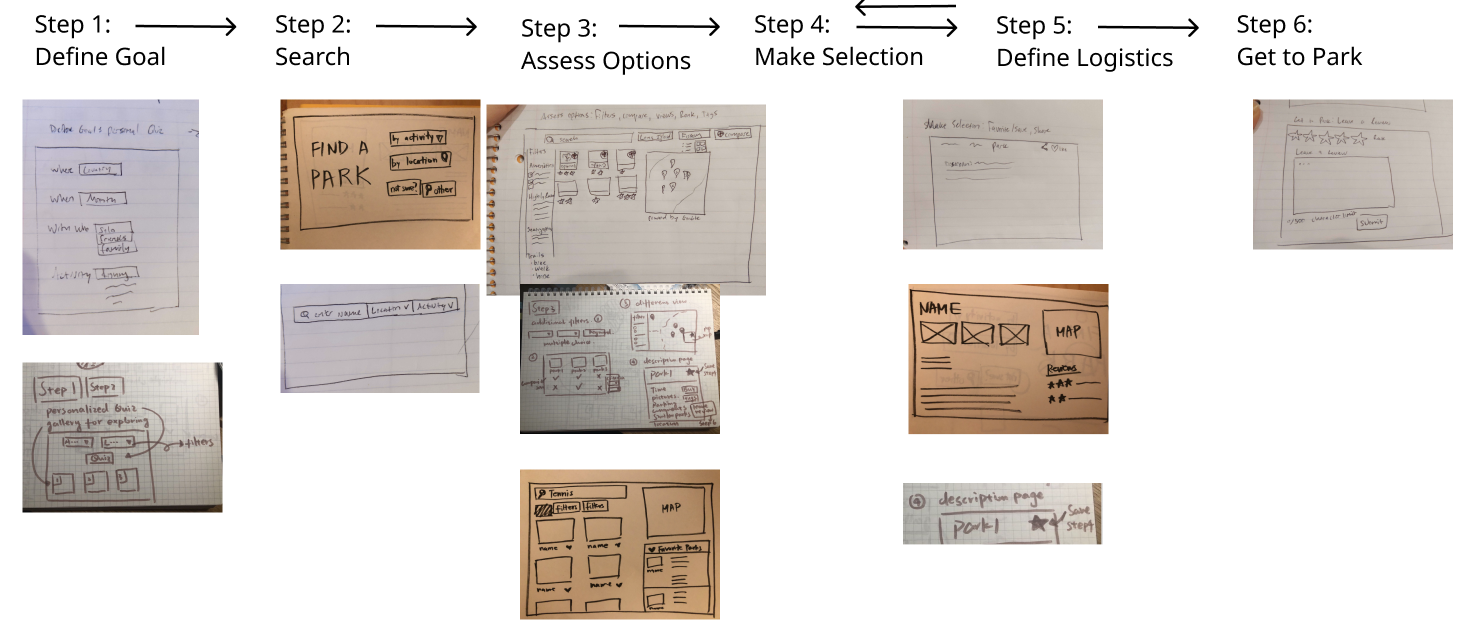
We designed some initial mock ups of these features and where they fit into the 6 step process:
Design
Low Fidelity Prototype
Based on the defined features, we created a low fidelity prototype to test the experience for the following scenarios:
Scenario 1: You want to go to a park near your house that has a lake so you can go on a walk with a friend — how would you find that park?
Scenario 2: You and your friends want to meet at a park in Brooklyn, but you can’t decide between Prospect Park, Fort Greene Park and Brooklyn Bridge Park. How do you decide which park to visit?
Scenario 3: You and your family are planning to have a picnic at a park, and you want the website to give you recommendations vs. applying filters to identify some parks that would be ideal?
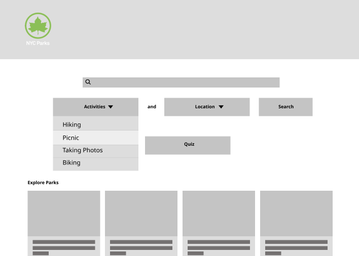
Search by Activity
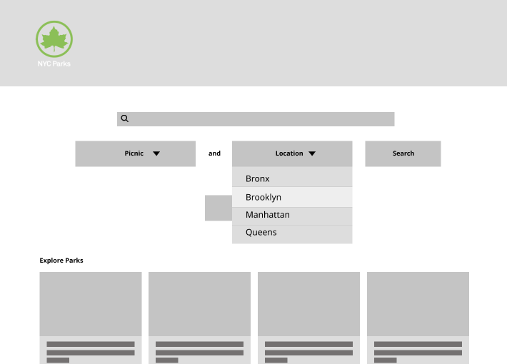
Search by Location
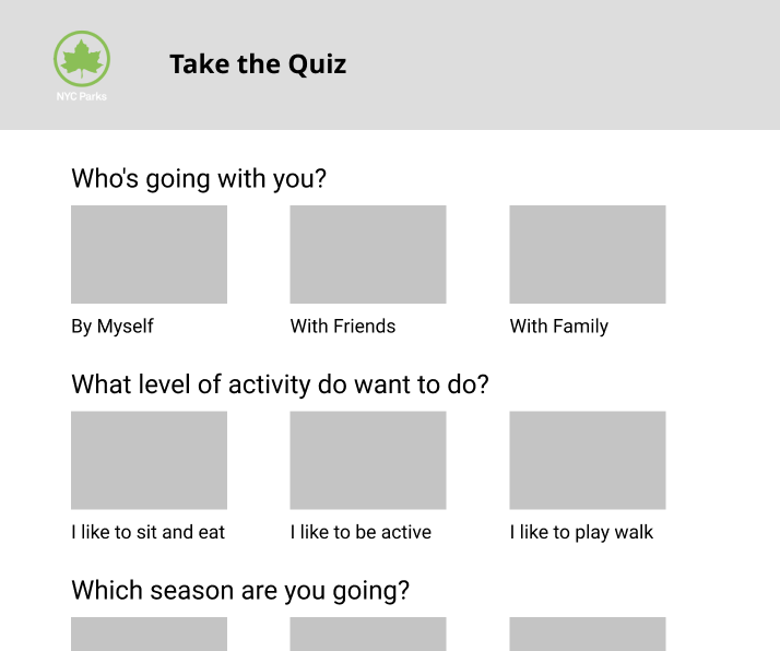
Recommendation via Quiz
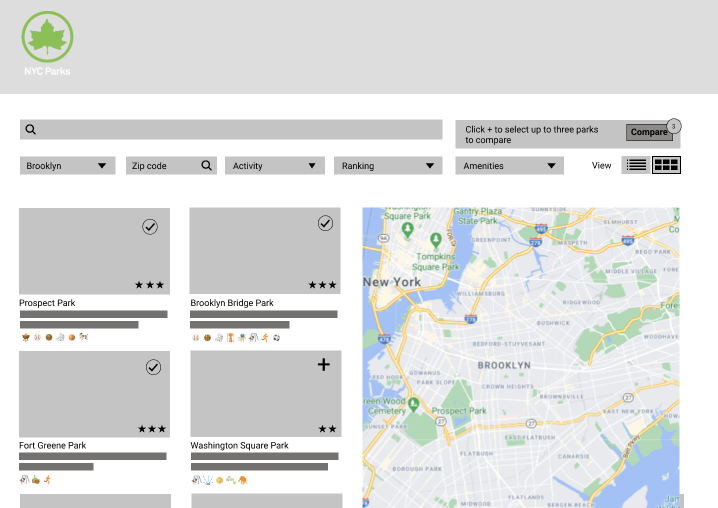
Search Results
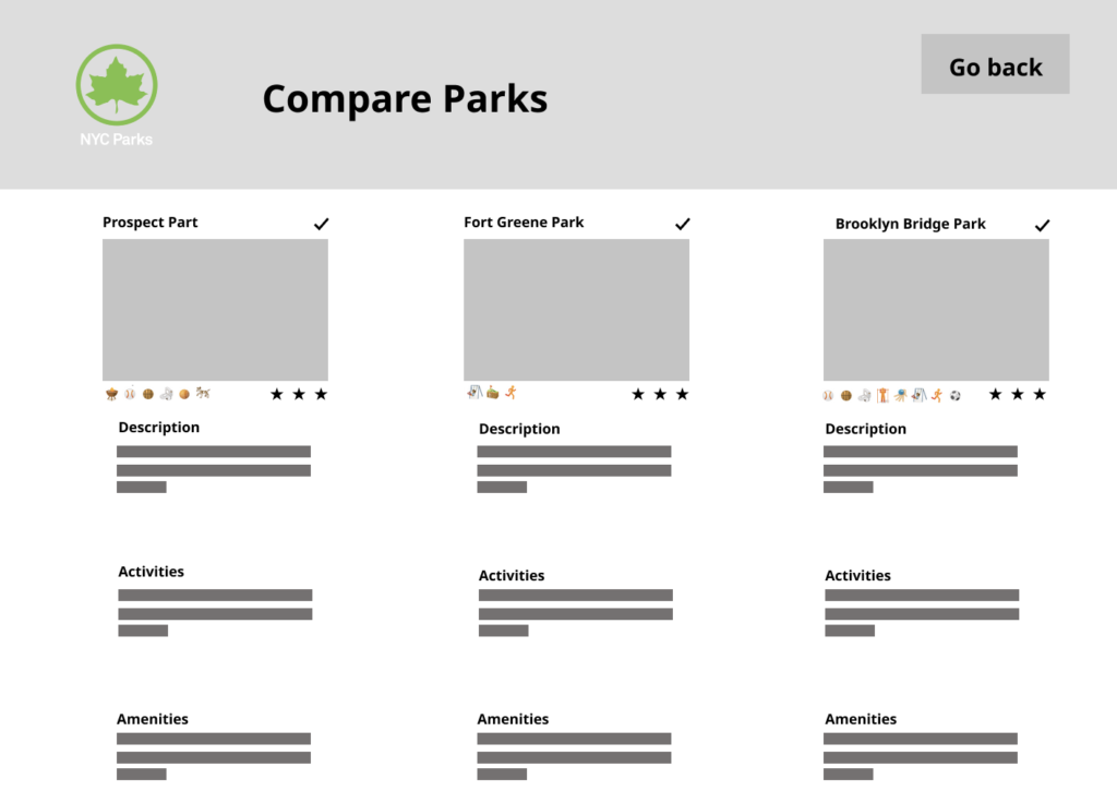
Compare
Page Description
Key Insights:
- Using type-ahead information and suggested drop down options would improve the usability of the search bar; by helping users understand what they can search for.
- Providing helpful text around the Quiz button would help users understand what it’s for and what it will do. (e.g. Find the Right Park [Start Quiz])
- Including questions that aren’t search filters into the quiz such as “what will you be wearing?” would add more value.
- Having more distinctive indicators for the compare feature near images will make it easier for users to easily add/remove parks for comparison.
- Adding hours, contact information, fees, and location information was spot on and helped users make a quick assessment before reading more about a park.
- Adding activities best suited at each park (e.g. known for good views or foliage in the Fall) to the product page description.
- Adding the ability to share a page/or location with friends and family (to make a selection)
- Adding popular times or how busy the park is currently helps users assess when to attend a park.
Card Sorting
Before designing features, the team conducted a card sorting test with 6 new participants to understand how we could improve the overall navigation of the website. Participants were asked to sort 30 cards, per the limitations of the Optimal Workshop tooling.
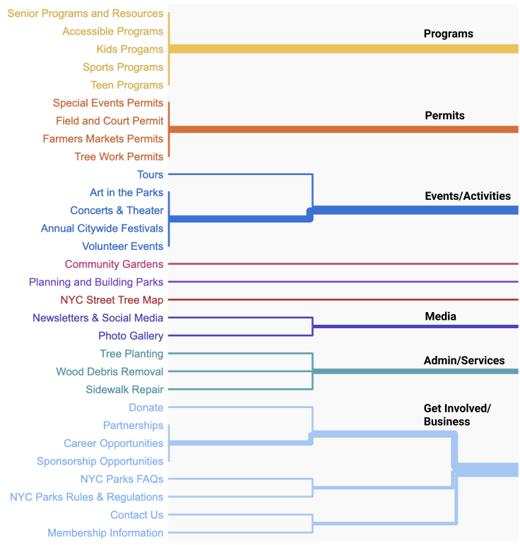
Based on the results analysis and visual representation aids (Dendrograms) from Optimal Workshop tooling, we were able to grouped topics aligned to how the users think.
This helped design an initial sitemap to improve the website navigation by consolidating topics under:
- About Us (to include general information)
- Events & Activities
- Programs
- Permits & Services
- Get Involved
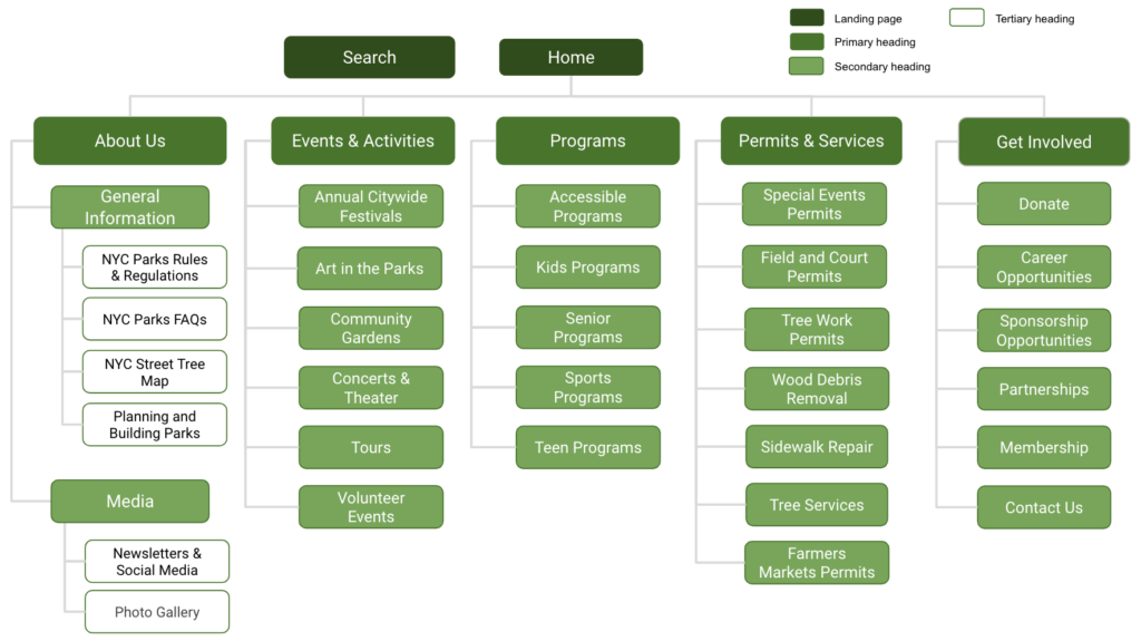
Since search was an overarching requirement from our earlier findings, we added it on the site map, separate from groupings, since the intention for it to be available on all pages.
Tree Testing
Before designing high fidelity prototypes, the team conducted a tree test with 6 participants to gauge the effectiveness of the new navigation menu. We used the following scenarios to test participants:
- You want to share feedback on how to improve New York City parks.
- You want to have a tree planted on the street in front of your apartment building.
- You want to identify the type of tree in front of your apartment building.
Key findings:
- Users expected to find “Contact us” under “About Us”
- Users expected to learn more out about a tree in front of their apartment from “Tree Services” rather than “NYC Street Tree Map”.
- Users expected to make the request to plant a tree from clicking on “NYC Street Tree Map” or “Tree Work Permits”.
Note: These insights could be slightly skewed since not all participants are New York natives. However, if someone just moved to New York, these findings support the need to move the topic to better align non-native New Yorker thinking.
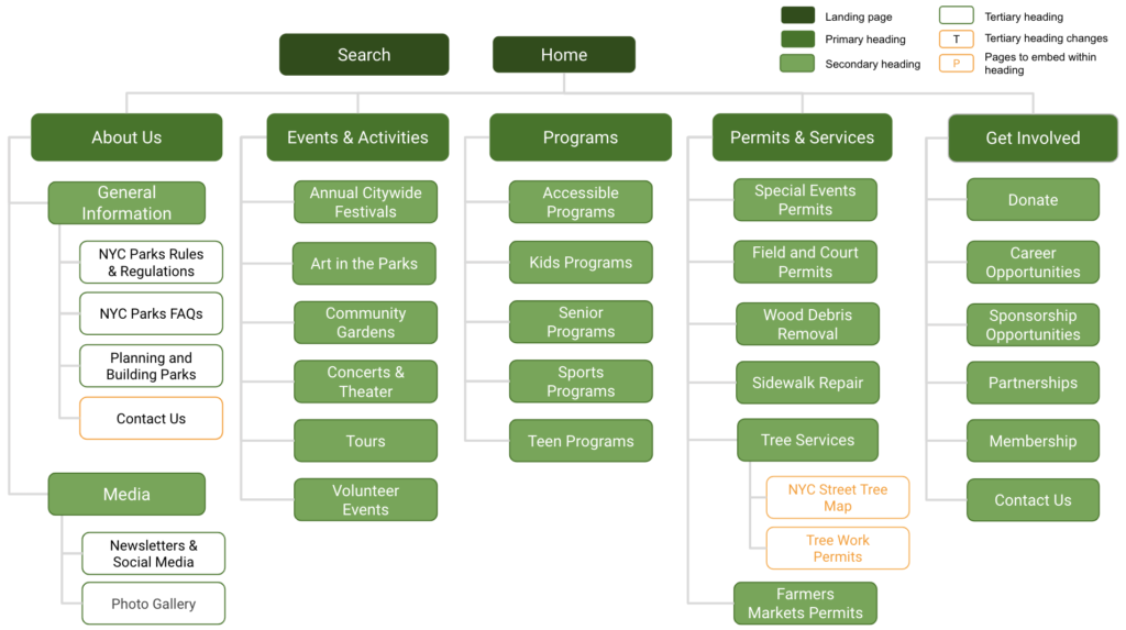
Based on these findings, we modified the sitemap by moving:
- Contact Us under the ‘About Us’
- NYC Street Tree Map and Tree Work Permits underneath Tree services
Evolve
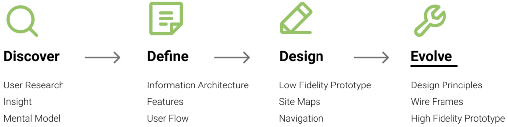
Recommended re-launch design
Our team used the following principles as guidelines for our wire frames and high fidelity prototype:
- Design for aesthetics and minimalism
- Present information in a logical order
- Eliminate unnecessary steps
- Make things easy to find
- Prioritize user feedback
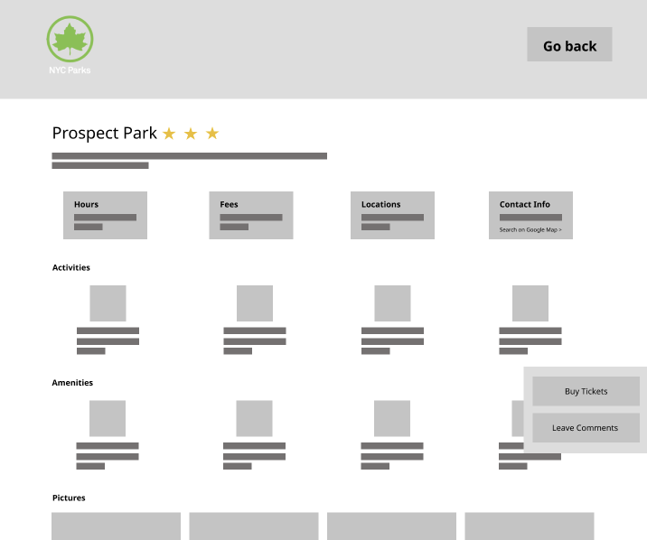
Based on the insights I propose the following information architecture changes to the product page description:
- Add location, hours of operation, costs/fees, and contact information at the top of the park description page, with the ability to click out to more information.
- Add a visitor density indicator for number of people usually at the park at the given time of the day.
- Allow for an option to provide the approximate distance if user wants to share their current location.
- Provide a park rank and a brief description of the park, followed by the park amenities.
- Offer the ability to share a park with a contact
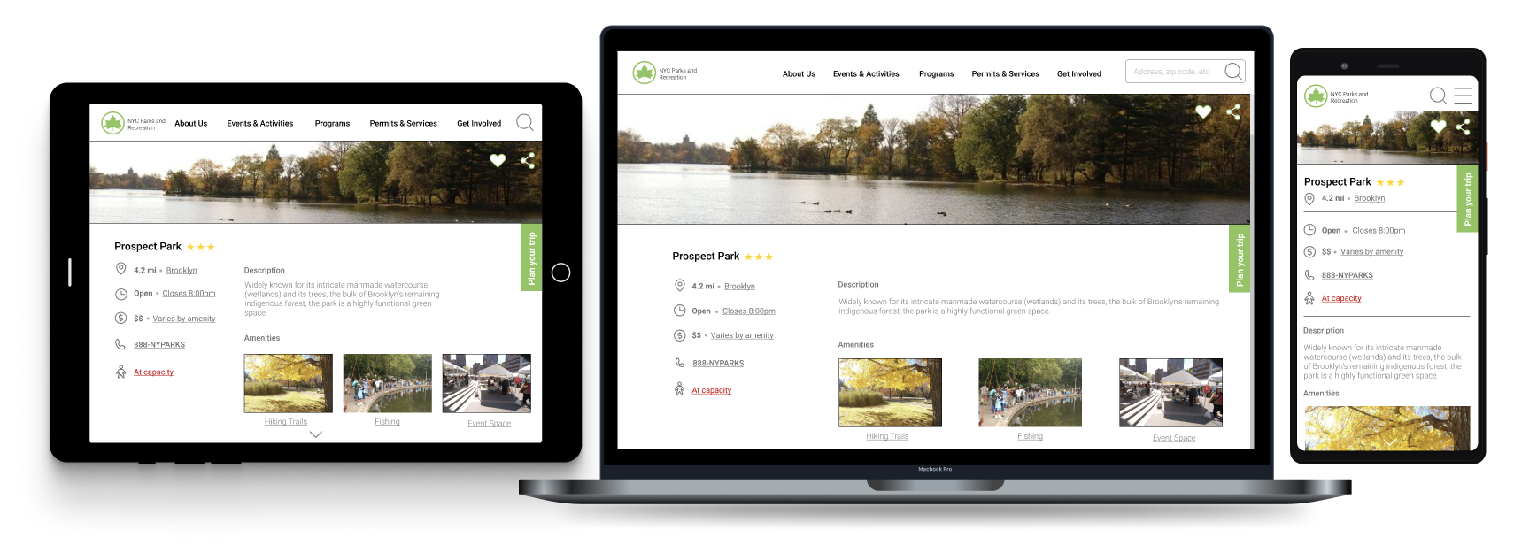
These changes will help a user assess and select a park to visit or plan to visit later in the week. Most importantly, using a grid system will make the site more responsive to the user’s device of choice.
Wire Frames
Problem to solve
Based on this insight, I chose to further develop the sharing feature, unfortunately we left it out of the prototype by mistake. It came up multiple times during my observation and prototype testing sessions. Users explicitly mentioned wanted the ability to share a specific entrance, (e.g. Such as a fishing pier or trail) with others. Especially if the park had multiple entrances.
From observing participants go through logistics planning process (e.g. what time, traffic route…etc) before sharing the location and time to meet with others. To help streamline the process, I wanted to create a feature to help plan out a user’s visit and provide the with the ability to share their plan with others, along with the specific location to meet, rather than just the general park location.
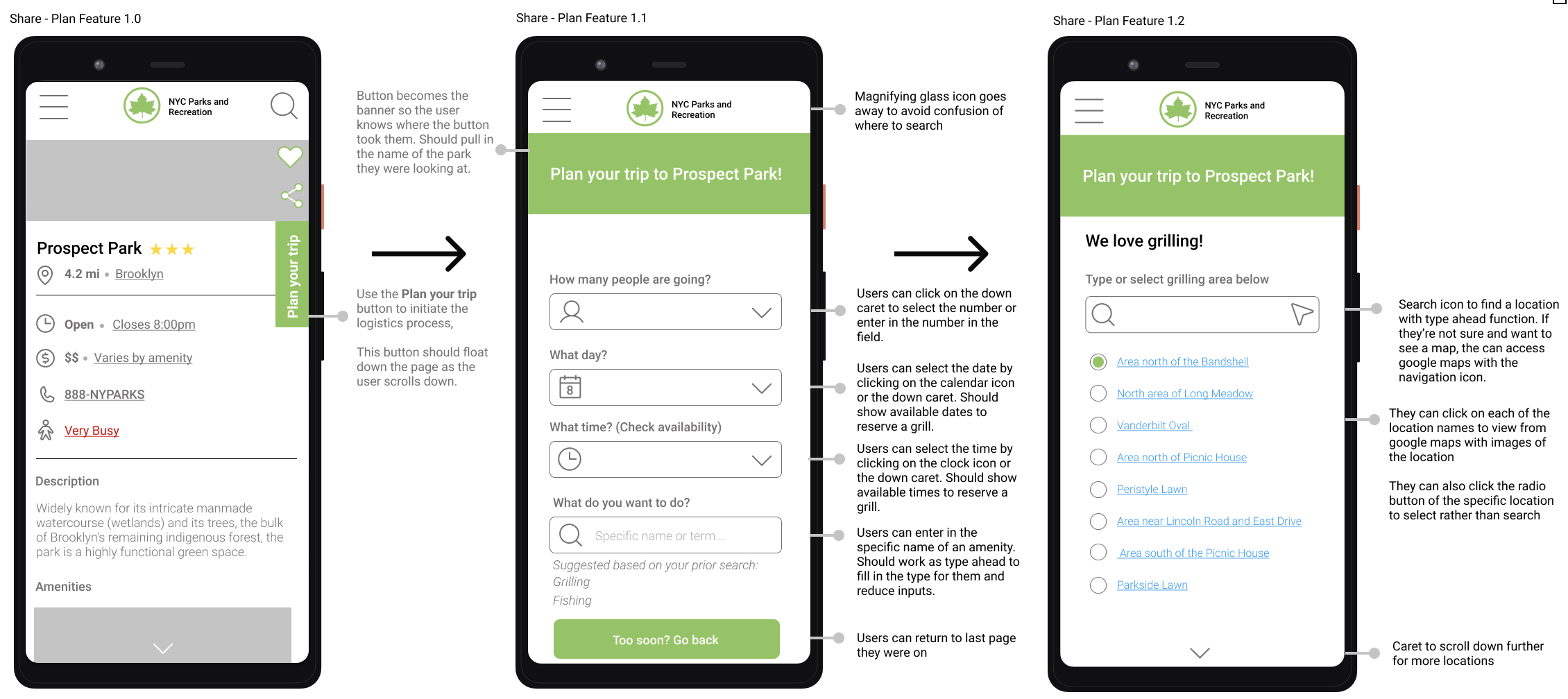
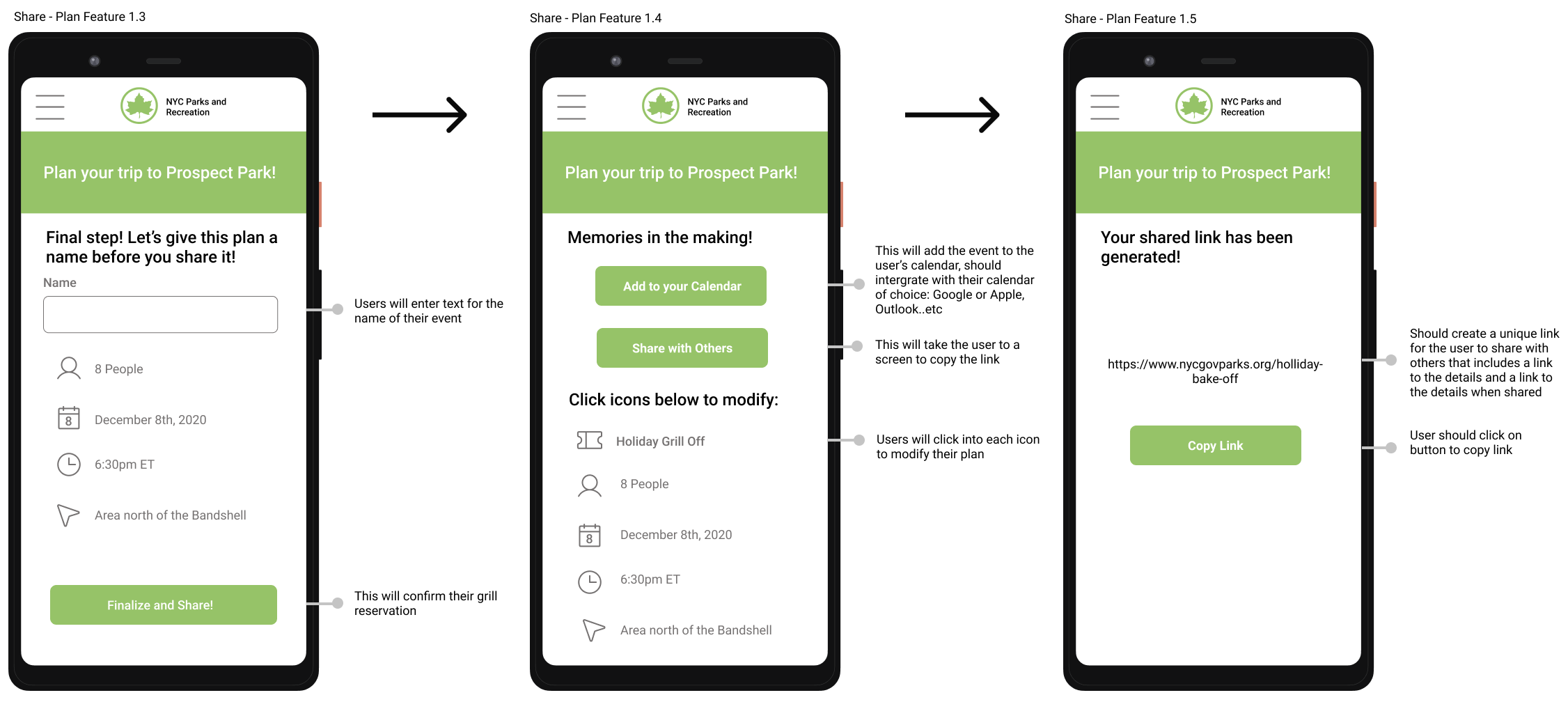
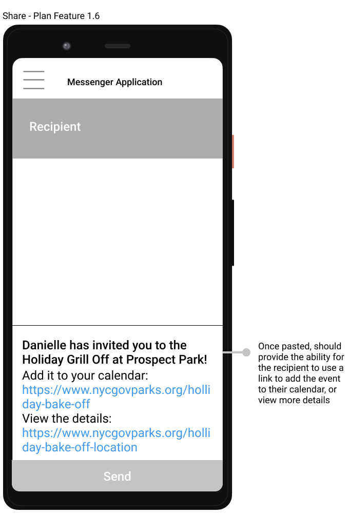
This experience will help users plan out their logistics in a simple flow that ensures their friends will have access to the specific destination along with a way to add the plan to their calendar so they don’t forget.
This also opens the opportunity for parks to setup reserved services for amenities like grills. It could also gives them the ability to anticipate visitor density and make accommodations or send communications to their followers on instagram about occupancy conditions in addition to proactively updating their park pages.
Next Steps
If there was more time, I’d want to conduct a moderated usability test on the wire frames to flesh out the experience further. I think that it would also be helpful to conduct additional tree testing to confirm that the new sitemap meets the needs of users.
Disclaimer
The New York City (NYC) Department of Parks & Recreation and its corresponding logo is being used for illustrative purposes for student work, and does not assume NYC Department of Parks & Recreation’s support or approval of this work.