
The Project
The Archivist Round Table website’s mission is to serve as an advocacy platform to:
- Raise awareness to the cultural preservation of materials by making things more accessible to the public.
- Influence court decisions on behalf of archives.
- Provide avenues for existing and aspiring archivists to share advice and best practices, and further their skills.
Purpose
Conduct a Moderated Remote Usability Test to evaluate the usability of the website’s current navigation and content for first time or inexperienced users.
Goal
Identify and offer actionable recommendations to improve the accessibility, discoverability, and find-ability of content on the Archivists Round Table’s website from a mobile and desktop perspective.
Questions to be answered
- Does the A.R.T. website clearly explain who the Archivist Round Table (A.R.T.) are and what they do?
- Do visitors understand how to get engaged in the A.R.T. community and participate related events/programs?
- Is the current user experience usable on both mobile and desktop devices?
My Role
- Conduct and facilitate client engagements
- Plan, conduct, moderate (2) and observe (2) usability tests on mobile or desktop devices
- Analyze results to surface significant usability issues
- Prioritize and consolidate actionable recommendations
- Build a presentation with videos of highlighted findings and mockups of recommendations
- Present findings/recommendations to the client
Duration: Approximately 5 weeks
Concentration: Usability Testing
Tools: Zoom, Google Sheets, UserZoom GO and Miro
Team Members Danielle Kingberg, Lu Pei-Yun Chung, Yi Zhong, Yuki Shimano
Deliverables: Assets for the client
- Presentation: A visual summary of the goals, approach, insights and recommendations with mockups.
- Report: An in depth written evaluation of the methodology, findings, and recommendations.

Zoom Meeting with Client
The Process
Tooling
- UserZoom Go (formerly Validately): To record screen-sharing, video, and audio in test sessions. This tool allowed the team to remotely moderate, observe and transcribe what participants were doing and saying as they completed the test. The tool also automated the screening and scheduling process.
- Miro: To consolidate and group our findings by task and category.

UserZoom Go Recording
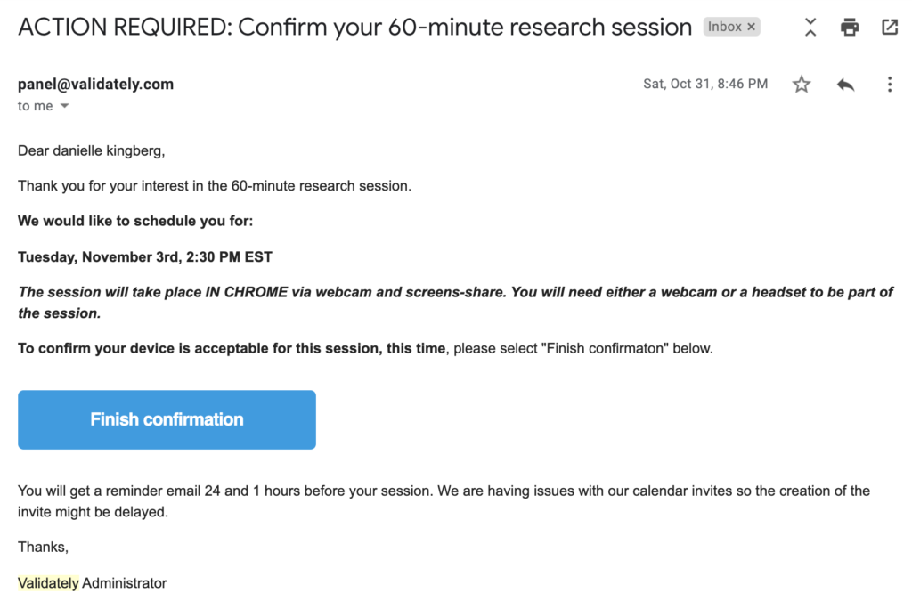
Session Reminder (Automated)
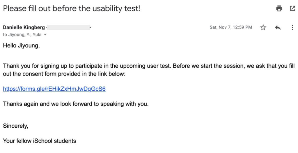
Consent Form (Manual)

Session Reminder (Automated)
Pilot Testing
I acted as the test user to help the team pilot test the screener and scheduling features of UserZoom Go. This helped to confirm the communication plan and eliminated the concern of duplicate emails (e.g. To complete consent forms) prior to their session. Additionally, it prepared the team to support participants if issues arose while accessing the virtual test session.
One thing that was particularly interesting from the initial tests, was that participants were more authentic in their feedback after the following statement was added to the script:
“We did not create this website ourselves, we are just conducting the usability test for it.”
Students were much more comfortable with providing constructive feedback when they realized our team was only performing evaluative research and did not design the website.
Setbacks
Due to testing remotely, we incurred system errors from the tooling which resulted in most participants only being able to perform the test on desktop devices. That aside, the UserZoom GO was a great way to capture what users were thinking and doing in real-time as they thought aloud while performing tasks. Overall, this approach provided us with qualitative insights backed by evidence from 2 mobile participants and 7 desktop participants.
Designing the Study
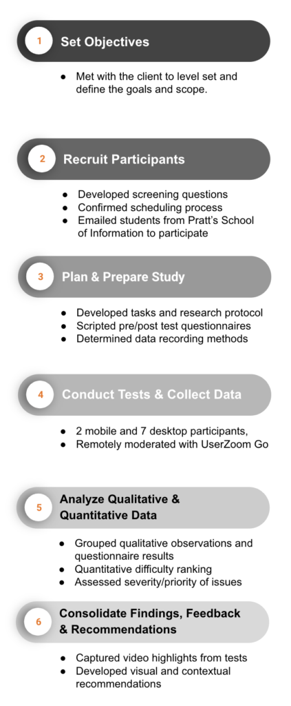
Participants: Per client feedback, we targeted aspiring archivists to recruit. Screened by:
- Their Master’s degree pursued from Pratt’s School of Information: Library and Information Science (MSLIS), Museums and Digital Culture (MS) or Dual Degree in History of Art and Design (MSLIS/MA)
- Number of times they frequented a museum: At least 5x Museum visits (including pre-covid) per month
Conducting Tests: Each team member moderated at least two sessions and were notetakers for another two sessions.
Task Scenarios: Designed to gain insight into the user experience of getting involved and learning about the organization.
- Task 1: First impressions of the website
- Task 2: Find an A.R.T. event you’re interested in attending
- Task 3: Find and contact a member
- Task 4: Find available mentorship programs
Post-Task Questions: Designed for tasks 2 through 4 to see if the experience met user’s expectations and ease of use:
- Is this experience what you expected?
- Do you feel you have completed this task successfully?
- On a scale of 1-5, 5 being very easy, how easy was this task?
Post-Test Questionnaire: Designed to gain further insight into the overall user experience and if the website aligned with the organization’s mission.
- How does this experience compare to other archive websites you’ve used? (1- worse 5 – better) Why?
- What frustrated you most about this site?
- What did you like most about this experience?
- Did this activity improve your understanding of what archivists do? If not, what would help you to better understand their role?
Analyzing the Data
After recording the findings, I adopted a template in Miro for the team to capture and structure the data then used Google sheets with the team to document, consolidate, and prioritize the notes. This helped surface repeating issues, which allowed us to consolidate them into categories, difficulty level, and priority by frequency.

Miro to group feedback by task and category for analysis
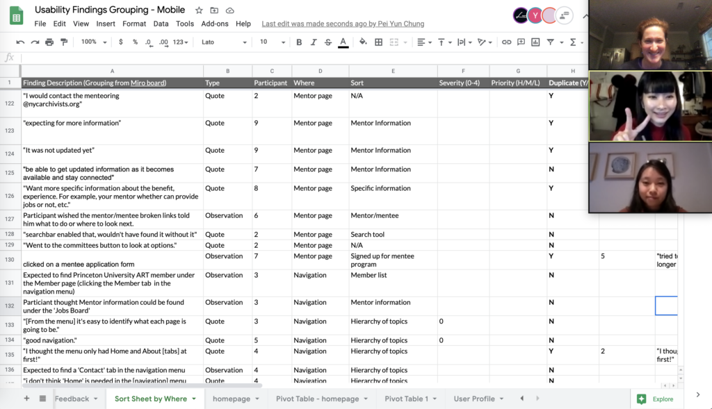
Google Sheets to analyze data
Findings, Feedback & Recommendations
Moderated remote usability testing is a very helpful method to surface insights about A.R.T.’s website when face-to-face options are not available. As a moderator, I could probe participants on their actions and thoughts to better understand why they experienced difficulty or ease when completing a task, which further substantiated our recommendations.
I performed the quantitative analysis for the team, which concluded:
- 34% of observations were positive or neutral. 62% related to the page layout alone.
- 35% of the observations were ranked a severity level of 3 or 4 in accordance with Neilson’s severity levels.
From there I summarized the findings to surface significant trends:
Going Well
1. There’s a lot of opportunities to engage that gives a better sense of what professional archivists do.
2. The website made good use of photos to illustrated what the website is about.
3. Comparatively, the A.R.T. website is not as busy as other library websites.
Not Going Well
100%
66%
56%
of participants testing on mobile devices had issues with navigation.
of participants stated the website has too much content to scroll and click through to navigate to information – with significant attention to issues resulting from misrepresented links and mis or non-categorization of content.
participants felt the website did not help them understand what archivists do or what the career entails.
Overall Findings
- Content appears too long and hard to navigate on the homepage
- Inconsistent purpose of search bar use and results
- Missing information on ways to get involved
- Minor content fixes
I focused on analyzing the overall findings 1 and 2, then shared my thoughts with the team for consensus to finalize the recommendations as seen below:
1. Content appears too long and is hard to navigate on the homepage
Findings
Due to the size of the graphics and the gray headers, participants weren’t sure where to focus their attention. They also expressed frustration about redundant information linked from the homepage.
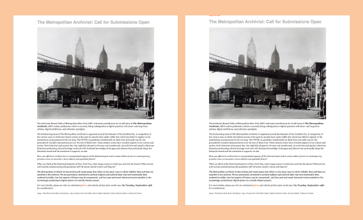
67% of participants suggested better organization in the page layout (segmented headings, more brief descriptions, and better use of space) would make it easier to identify relevant information.
Recommendations

(1) Grouped and prioritized content , (2) added column, and (3) updated logo to use as the home tab
Based on the findings and feedback, improved usability of content can be achieved by:
- Adopting a content card format, grouped and segmented by topic area, into easily understand information purpose and priority. Each card would have a small image and brief summary of at topic with a hyperlink to more information.
- Adding a column for more time pressed or highlighted topics to make better use of the margins.
- Making the logo the home button to further reduce page redundancy.
Findings
Both mobile participants found the information too lengthy and hard to read through. One participant stated “since the mobile version doesn’t have ‘control + f’ key, I can’t easily find things”.
Recommendations
Implementing a more responsive, modular format with quick access to the navigation menu, search functions, and homepage will improve the mobile navigation.

(4) ‘Home’ icon for quick access to the homepage, (5) ‘Search’ icon for quick navigation to key topics, and (6) Navigation Menu icon to access all tabs from a dropdown menu.
2. Inconsistent purpose of search bar and results
Findings
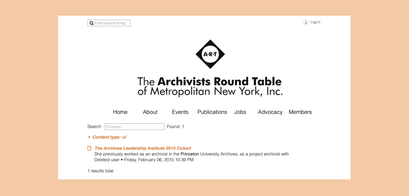
- 44% of participants used the search bar to find information about topics ranging from mentorship programs to contact information of A.R.T. members.
- 11% of participants successfully found information they expected.
As the A.R.T. Member directory was not easily accessible to non-members, participants suggested adding advanced filters to the search bar to help understand what information they could find.
Recommendation
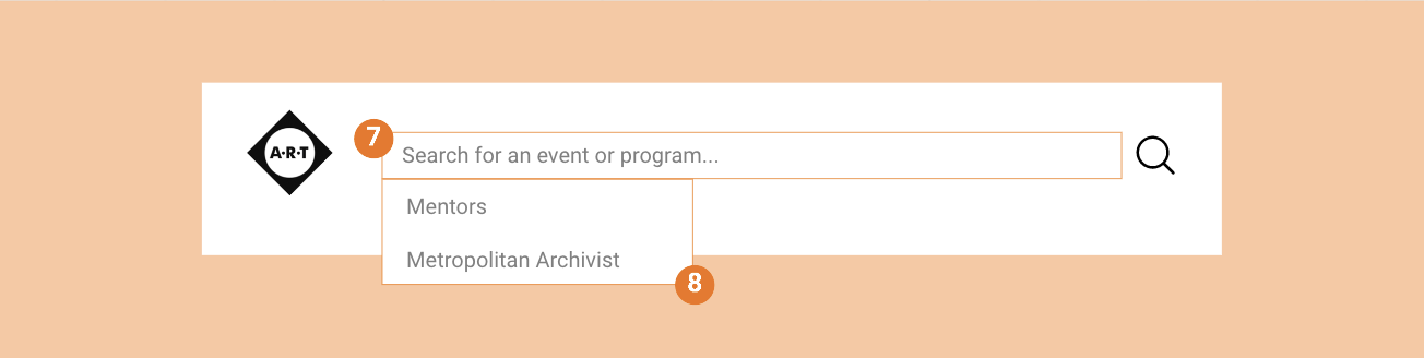
(7) type ahead and (8) dropdown suggestions
While adding a filter for more advanced filtering could improve the usability of the search feature, this could similarly be achieved by adding a type-ahead information and suggested drop-down lists to inform the user of information they can search.
Outcomes
Client reactions
A.R.T. was very appreciative of our recommendations. They mentioned how membership benefits are more important than ever as archivists in the area are looking to build out their network due to furloughs and untimely layouts from the recent pandemic. They are looking forward to discussing the report and presentation with their board of directions to implement our recommendations.
What went well
The team successfully adopted a new usability evaluation tool while virtually meeting to plan, prepare, and conducted nine usability tests within three weeks. We learned how the tool could automate the test scheduling, which saved us time by just coordinating the team’s availability in the back end.
More importantly, the team effectively met virtually to collect, consolidate, assess, and evaluate the findings. As a result, we were able to articulated and delivered thoughtful recommendations to help A.R.T. achieve their goals and improve their user experience for new users and individuals looking to network.
What could have been better
Pilot testing the mobile app and our tasks more before testing participants would have improved our tests. Half of the mobile testers experienced technical difficulties and were unable to share their screen using the Validately mobile app and had to test on desktop instead. This skewed the findings to be more desktop-focused. Pilot testing tasks would have helped us frame the tasks to be more concise and broad; putting more focus on exploring information versus navigation. The insight we compiled was good, but could have surfaced more insight on the information if the tasks were more focused on reading through the website’s content.
Opportunities for further research
Navigation
More research should be done to understand the user navigation through conducting card sorting and tree testing. These methods will help assess how users group and navigate the website to find information and reduce the number of clicks to access desired content.
Member experience
This usability research was focused on new users, but did not go into the signup or login experience. It’s worth exploring this user experience for members vs. non-members to understand what information A.R.T. would like to collect from users (e.g. photo, email address…etc) and similarly what information member-users vs. non-member users can access (e.g. what information they can access about other members, events, or programs).
Mentorship program information
More research could be done to better understand the benefits that mentees or mentors are looking for in the mentorship program and update the program page respectively. Similarly, it would be good to explore which networking activities that members are interested in.
References
- Clarissa Peterson. “Mobile and Beyond.” In Learning Responsive Web Design: A Beginner’s Guide.
- “Severity Ratings for Usability Problems: Article by Jakob Nielsen.” Accessed September 30, 2020. https://www.nngroup.com/articles/how-to-rate-the-severity-of-usability-problems/?lm=how-to-conduct-a-heuristic-evaluation&pt=article.
- “Font Size Guidelines for Responsive Websites (2020 Update).” Accessed December 7, 2020. https://learnui.design/blog/mobile-desktop-website-font-size-guidelines.html.