SCHOOL OF VISUAL ARTS LIBRARY REMOTE USER TESTING
PROJECT SUMMARY
The School of Visual Arts (SVA) is one of the world’s most influential artistic communities. SVA knows the importance of delivering informational materials, both in-person and online. Their online presents have become more relevant, especially in this 2020 Covid 19 pandemic. The library section on SVA’s newly designed website provides Artistic resources to students, staff, and faculties. Because SVA believes in quality and satisfaction, they decided to execute user testings to see how their users interact and react to the library section on their newly designed website’s—testing the accessibility, usability, and functionality; the overall efficiency.
My Role
Our group consisted of four (4) usability researchers from the Pratt Institute:
- Celine Yap
- Christine Tenny
- Christy LaPerriere
- (LeMark McPherson)
I was primarily responsible for writing the introduction, methodology, conclusion, and references. Being asked to write these main sections of the report, I participated in the brainstorming process, finding tasks and questions for the participants to ensure we had the right questions to meet our client Phoebe Stein’s needs. I also conducted user testing interview and did the note-taking for my fellow researchers. Together as a team, we analyzed the collected data and came up with recommendations for the findings during our research weekly team meetings.
Process
- Meeting with Phoebe Stein our main contact at SVA
- Our first strategy meeting.
- Recruiting Participants
- Using Testing
- Analysis
- Report writing
RESEARCH Method PROCESS
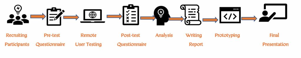
Methodology
Remote user testing was used to evaluate the library section on SVA’s newly designed website. Before the remote user testing session, each participant was emailed a consent participation form to be signed before the meeting. Note; this also allows us to record the session for research purposes only. We had eight (8) participants who participated synchronously using zoom’s platform. We used a structured note-taking and interview script, so all participants are asked the same questions as this format promotes unbiased results. All participants were awarded a $10 amazon gift card.
Participants were given tasks to complete independently and were asked to think out loud during this process. We also recorded the interview session as an audio reference and or later playback. The assigned note-taker documented the entire process to pool the gathered information to be evaluated to conclude the final finding.
We used three (3) groups of participants for the user testing: Students, Staff, and Faculty. These participants were recommended to us by Phoebe. The variety of participants gave us the best angle for results. All of the participants were allowed to participate in their natural environment while completing the instructed tasks.
The Tasks were:
- Finding the Library’s site within the overall SVA site
- Identifying the Main Library address, hours of operation on Mondays, and their phone number
- Searching the catalog for a recent research article
- Finding out how easily one could reserve a room in the Main Library (For student participants) or Finding out how easily one could locate and schedule a library instruction class (For Staff and Faculty participants)
Questions After each task
- Do you feel like you completed this task successfully?
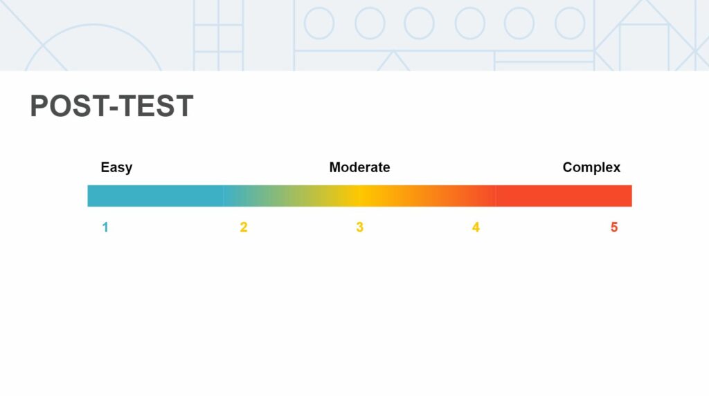
- On a scale of 1 to 5, 5 being extremely complex, how complex would you rate this task? See (Fig 1) below for scaling visual.
- Do you feel like you completed this task in an appropriate amount of time?
Fig 1
Findings from the remote user testing
We found three areas of improvement for the website:
- Navigation
- Visual Design
- Functionality
Recommendations form findings
As a group, we analyzed the results from the data collected and collectively came up with recommendations. I will only highlight the major findings and the recommendations given, as the full user testing report is linked. But before I highlight and visualized these findings, it is imperative to show the current path to the library section on SVA’s new website; See (Fig 2). The first finding is the lack of organization and content prioritization on the navigation bar. For this, we came up with a few recommendations, of which I will list two. One (1) is to Rearrange the navigation bar on the Homepage. Making the path to the library section more relatable and accessible. These paths were based on how the participants navigated to find the library section when we asked the question, “Can you please locate the library on SVA’s new website?” (Fig 3) shows the top two (2) common paths taken by the participants, and The new Path 1 is based on the re-arrangement. Students > Academic Life > Library See (Fig 4).
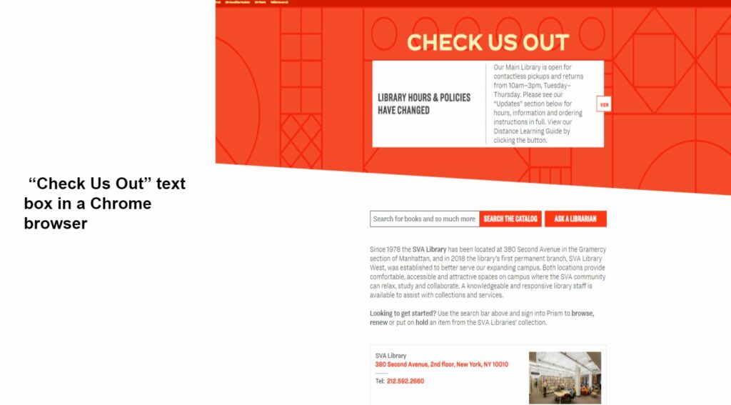
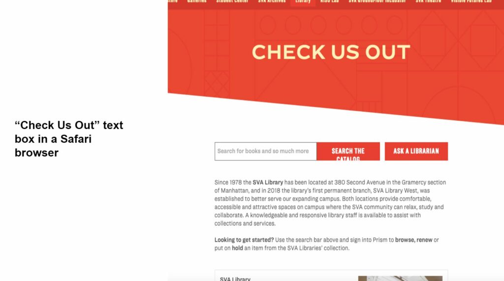
The second recommendation is to group related information for consistency. Path 2 is based on the re-arrangement. Students > Resources > Library Also in (Fig 4). For the second major finding. The participants discovered some Inconsistency in the visual design and textual elements. For this finding, we recommended incorporating more visual iconography to emphasize the call-to-action opportunities on the site, see Fig 5. We also recommended to reduce the amount of promotional content and create a new section labeled About for the library’s general information. The statistical dataset shows that 75% of the participants thought it was very difficult to locate the library section on SVA’s new website. We also found that only 50%( half) of the participants could find the library’s general information like the address, phone number, and operation hours. However, the positive takeaway is that 75% of the participants could reserve a room using the new website. Please see the visual dataset below ( Fig 6). For a little more insight into the amount of data collected and how it was analyzed, I have attached (Fig 7) for a quick visual. Another major finding is that the website works differently based on the browser the user uses to navigate the site. The findings show chrome works best. See (Fig 8 )for visual.
Fig 2 ( Navigation)
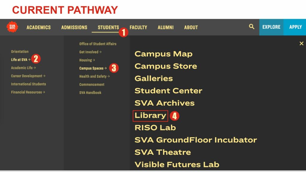
Fig 3 ( Navigation)
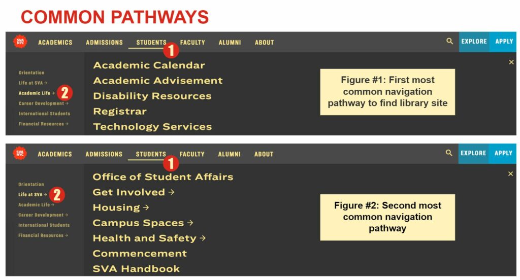
Fig 4 ( Navigation)
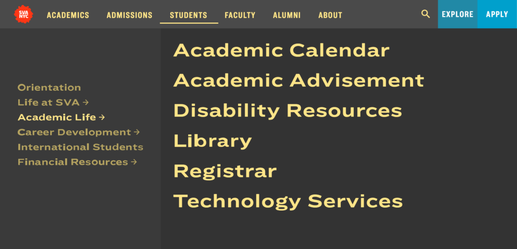
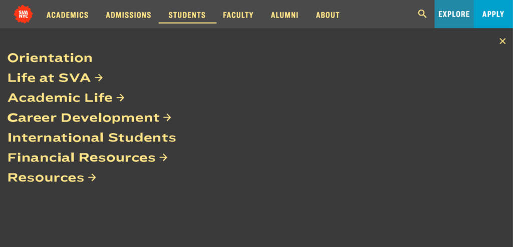
Fig 5 (Visual Design)
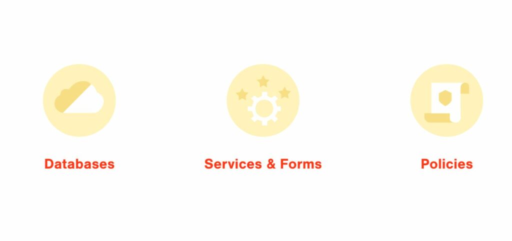
Fig 6 (Functionality )
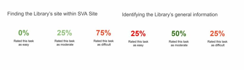
Fig 7 ( Data Collected and analytical process )
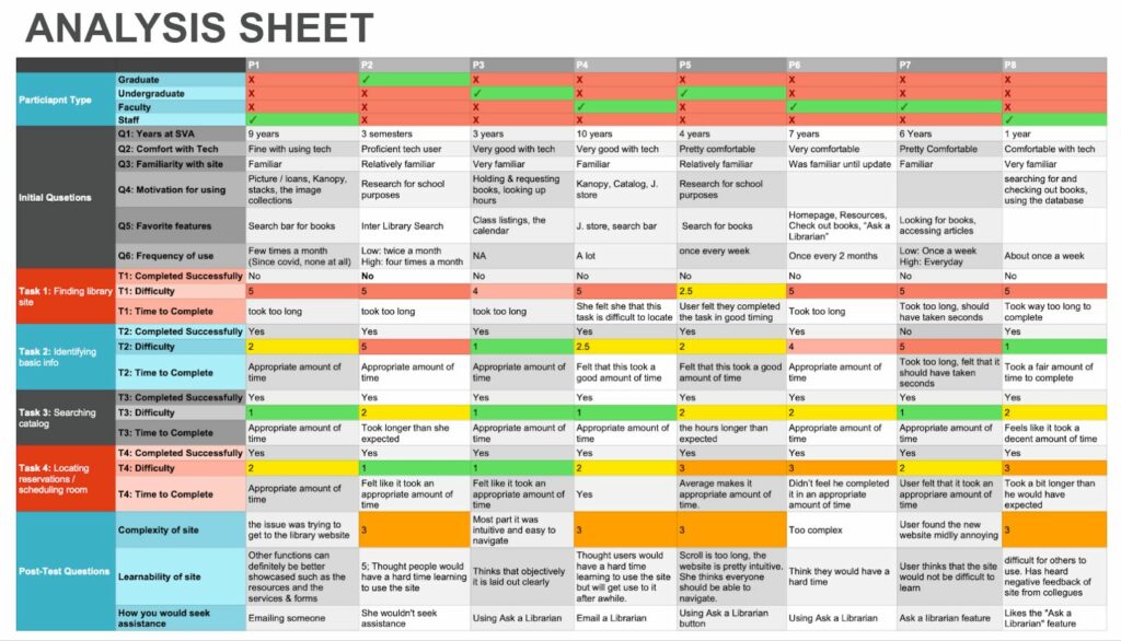
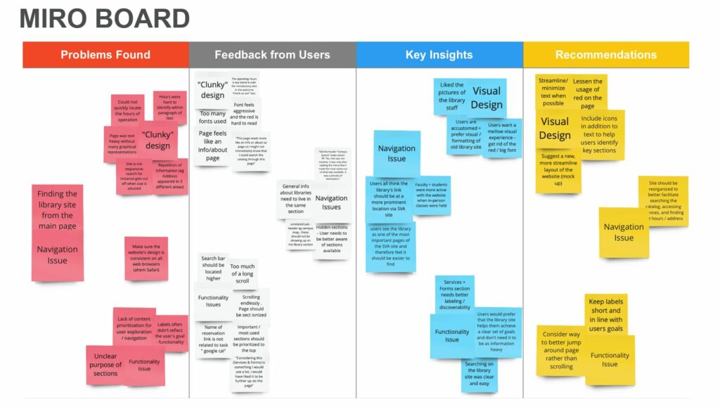
Fig 8 (Functionality )
Reflection & Next Steps
This was a great testing experience where I learned a lot, and with that, I uncovered a lot of findings. I wish I had the opportunity to interview more participants and have the ability not only to give suggestions but also to assist with changes. In the future, if I should continue working on this project. I would source a wide array of participants, including upper management. This may afford a speedier attempt to implement the recommendations because they would have a first-class seat to see the users’ problems when they try to access the library section from SVA’s new website.
Conclusion
From the user testing data collected, we found that there are issues with the Navigation, Information Architecture, and the website’s Functionality. Hence, recommendations were given to improve or fix the problems. The findings and recommendations were presented synchronously to our client Phoebe Stein via zoom’s platform. Phoebe thinks that the user testing penciled out exactly how she expected it and is grateful for the actual data collected to bring back to the design team at SVA to prove her claims, especially the path for the library on the website. The path needs to be more accessible, seeing that the library is vital to SVA school’s population. However, she was surprised that the website is not compatible with all browsers, which calls for immediate attention from the design team.