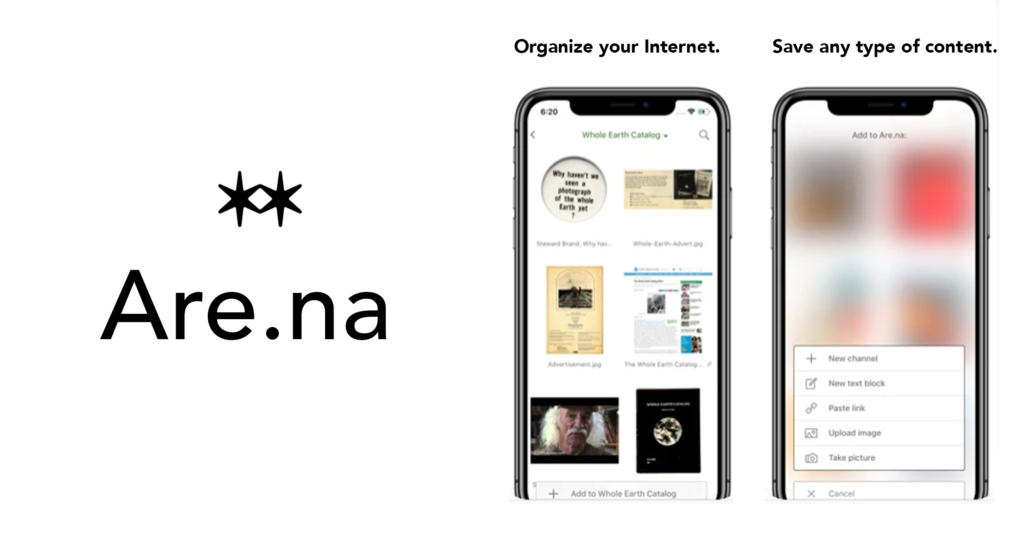
Are.na is a popular visual organization tool to publicly or privately curate and search for creative content online. With an Are.na account, users can collaboratively build collections and connect blocks of digital material such as text, images, and URLs. This design critique focuses on the Are.na iOS app on an iPhone.
1.Adding content
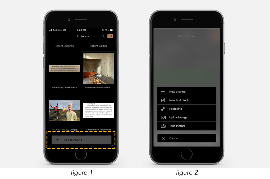
The action to add content to Are.na is easily discoverable. The correct operation is clearly signified through a “+ Add to Are.na” button that’s consistently present on the bottom of the app no matter which of the three main views the user is in: “Profile”, “Feed”, “Explore” (fig. 1). The + sign also naturally maps ‘adding to’ and therefore knowledge in the world in its design. Selecting the button changes the view (instant feedback) to a menu option using digital constraints to select an allowable format for content to add (fig. 2).
Once you select a format, the action of filling out the content fields are poorly designed i.e. “Text”, “Title”, “Description”. The field labels are repeated as placeholder text in the field themselves (fig. 3). Not visually distinguishing the label from the field in the system image may conflict with behavioral processing as many users are accustomed to filling out blank/distinguishable fields causing a slip during the Gulf of Execution.
Solution
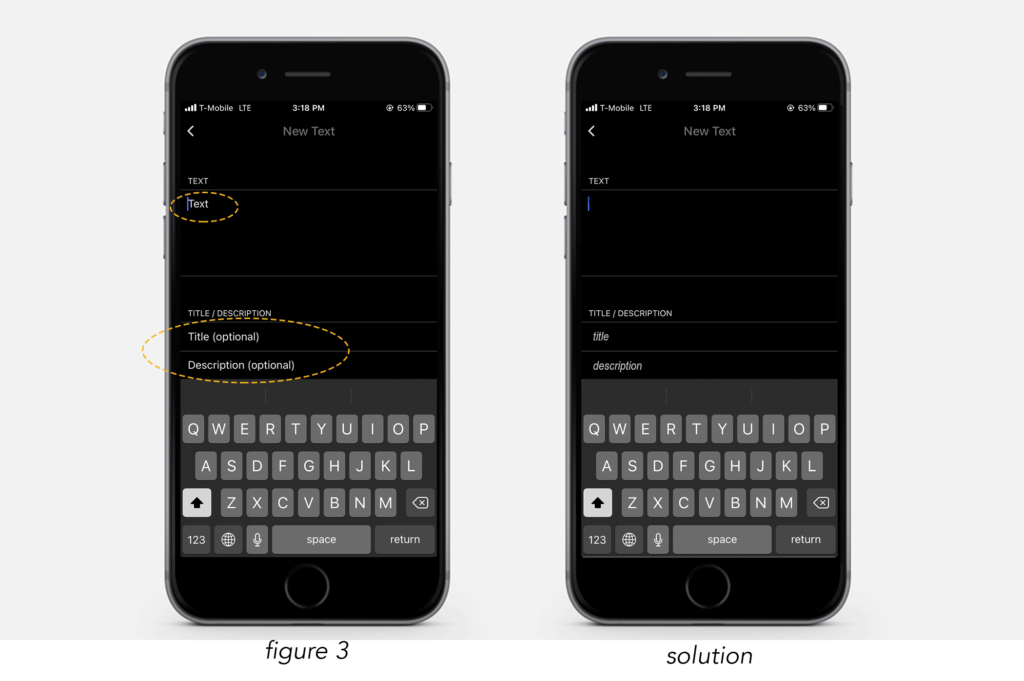
Visually change the placeholder text to signify it’s a sample (Italicize or grey the text) or create clearer feedback when the user selects the field the placeholder text disappears, leaving the cursor to signify typing. This would align the system image with a user’s behavioral reaction to filling out forms and fields.
2.Exploring New Content
There are two main modes to Explore for new content–through “Recent Channels” or through “Recent Blocks”. The system image of Channels vs Blocks are consistent throughout the whole application so once the user’s mental model has developed this association it’s visually clear which explore view they are in.
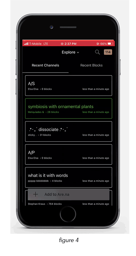
An element of poor design in this view is when the user begins to ‘explore’ and scrolls down the screen the “Recent Channels” and “Recent Blocks” menu options disappear (fig 4). If the user wants to switch between the “channels” or “blocks” explore view the signifiers are absent and the user has to scroll all the way back up.
Solution
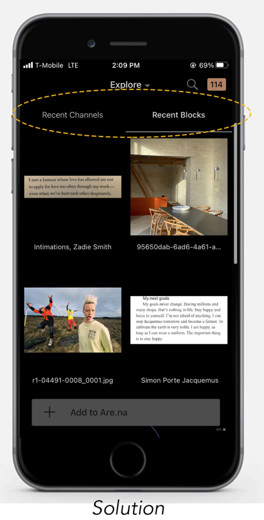
To modify the Explore view by keeping the “Recent Channels” and the “Recent Blocks” menu options visible at the top as the user scrolls and explores, enhancing the usability of navigation during the Gulf of Evaluation.
3.Search for Content
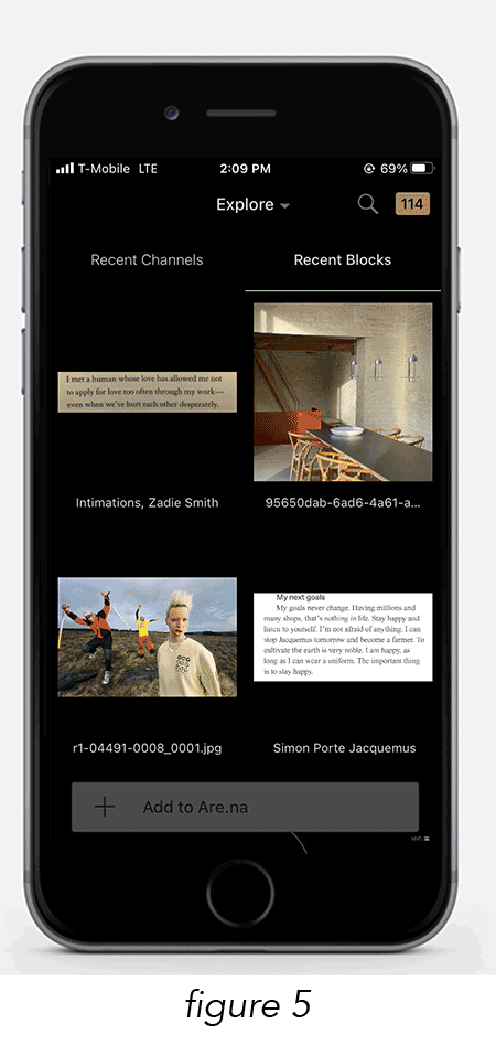
The action of searching for specific content is well designed. It is clearly discoverable and signified by the consistent placement (top right) of a magnifying glass icon that naturally maps to the search function.
The three categories (“Channels”, “Users”, “Blocks”) to search within are labeled right under the search field. A white category underline signifies the ability to select a category and instant feedback is given when the underline moves to the selection and the search feed format changes (fig 5). Unlike the Explore view, the three category labels stay visible as the user scrolls, allowing users to easily navigate searching between category types during the Gulf of Execution.