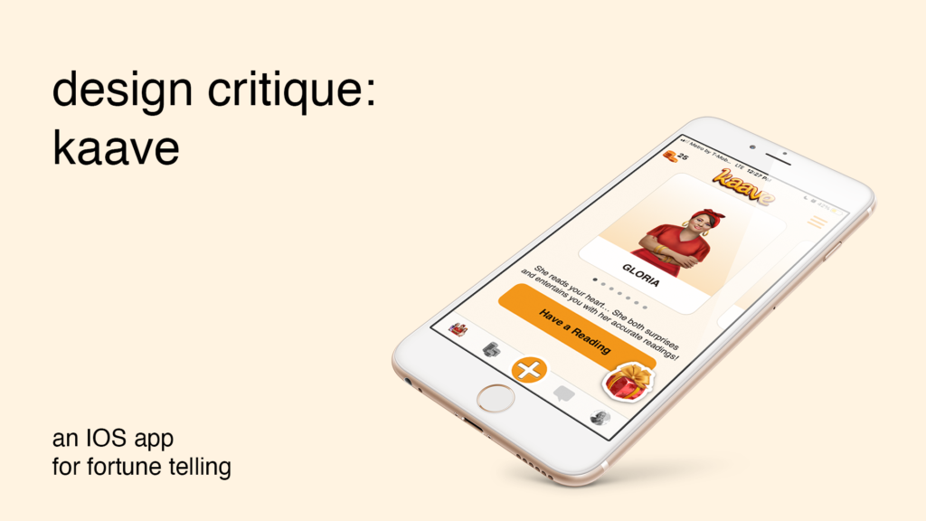
Kaave is a fortune telling app based in Turkey that works by reading Turkish coffee cups – which is usually done to spark conversation and gossip. This article will evaluate the IOS version of the Kaave app, based on the usability principles discussed by Donald Norman, in his book: The Design of Everyday Things.
1 – Requesting a Reading
People usually turn on the Kaave app in order to get a reading of their coffee cups. The main goal is to usually have conversation material to speculate on and have fun around it.
Kaave’s main function is quite discoverable in the interface. Being the most prominent button on the page, “Plus” (Figure 1.A) icon signifies the next step to be taken. Only problem is, app does not take full advantage of the knowledge in the world. The plus sign itself does not say what does it do exactly. This creates a gulf of execution. User knows what to do, but not exactly what they are doing.
Solution:
In order to remove ambiguity, “plus” icon could be changed with something that gives more contextual information. (Figure 1.B) A “coffee cup” from the app’s own visual vocabulary, could help solving this problem.
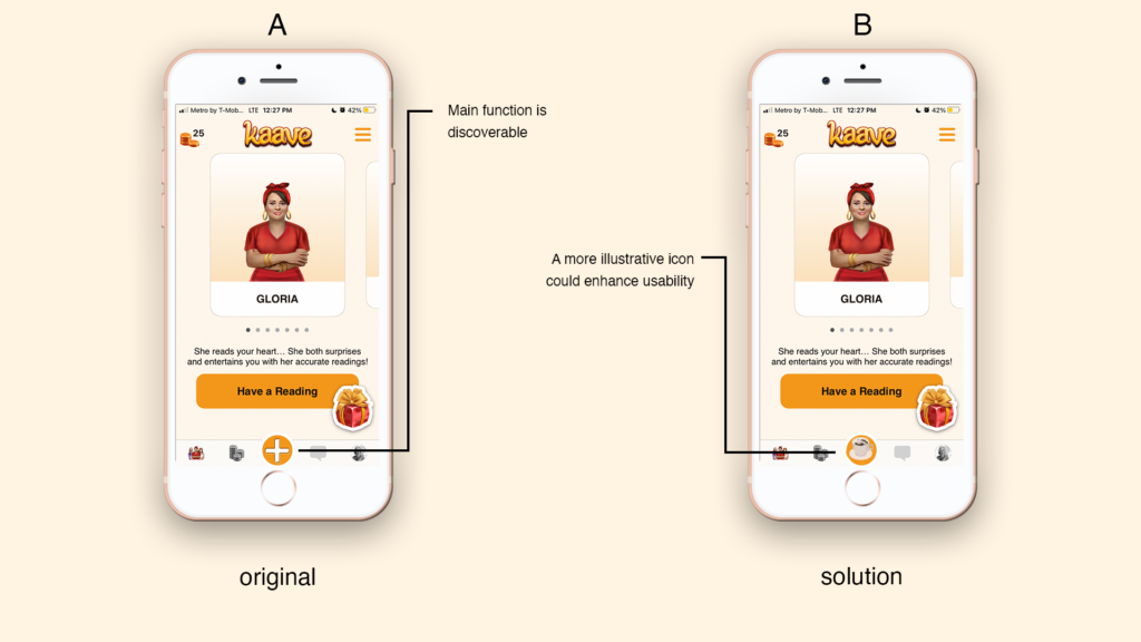
Figure 1.B: Suggested changes to the app
2 – Process of Uploading
Upon clicking the button, Kaave presents the reading options with short descriptions. Once coffee reading option is selected, user is presented with the fortune tellers. Then choose the way the reading will be done and click continue.
Although there are several steps need to be taken, the task has a narrow structure and does not add up to cognitive load.
After selecting the fortune teller, Kaave demands the user to take pictures of the coffee cup. Three picture icons signify that three images should be taken. The “null” colored button signals if the task is done or not. It is activated only after all images are uploaded, thus creating an interlocking forcing function for the user.
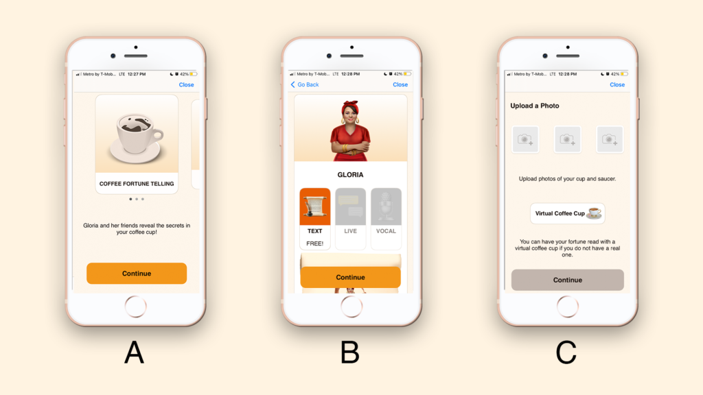
Figure 2.B: Choosing the fortune teller
Figure 2.C: Image uploading page, with the null button
Although the user is slightly assisted while taking pictures, (Figure 3.A) no feedback is provided about the quality of it, creating a gulf of evaluation.
Solution
An overlay in picture taking screen would create a constraint (Figure 3.B) for the user and act as a preventive effort against errors. It would also reduce the cognitive load by providing a good conceptual model on how to take a picture of the cup.
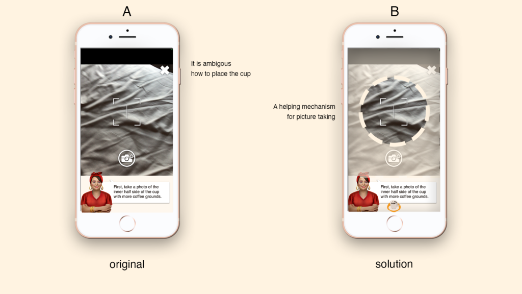
Figure 3.B: Area that cup should take is specifically determined.
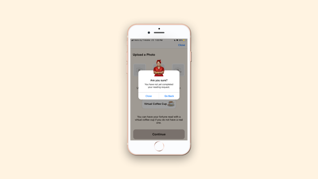
3- Error Prevention
Getting a reading from the Kaave app requires several steps and it takes some time to complete those. When user attempts to quit in the middle of the process, app asks for confirmation (Figure 4). Acting as a preventive measure this lock-in function protects the user’s progress.
4 – Lack of Main Page
Kaave does not have a main page, violates the conventions, thus it does not offer a good conceptual model . The page the user currently on is signified by the colored icons in the bottom (Figure 5.A) however it is lacking visibility. The logo on the top has no functions, but its prominence sends a wrong signal for the user. Lack of function of such an element creates a gulf of evaluation: It is clicked, but nothing happened!
Solution:
The selected page’s icon could grow in size and contrast to make it more visible (Figure 5.B). The logo on top could be decreased in size to stop signaling a function to the user.
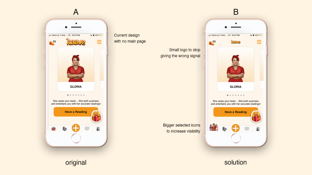
Figure 5.B: Navigation is made more visible, the size of the logo is changed