Pinterest is an image sharing platform designed to enable saving and discovery of information on the internet using images, animated GIFs, and videos, in the form of pinboards. Within the app, users can freely search for any visuals related to their keywords. It is a common tool for designers to create mood boards and a place to look for visual references and inspirations.
Browsing Images
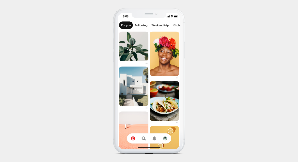
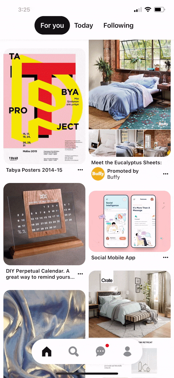
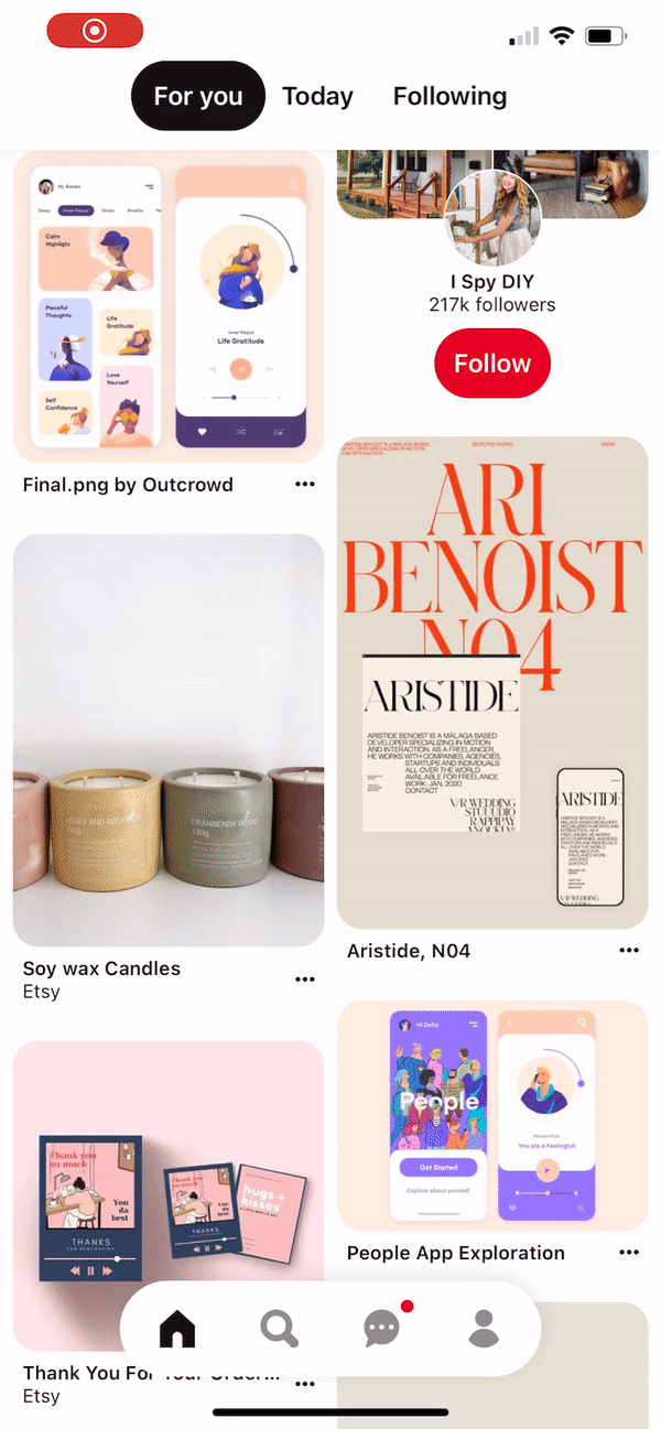
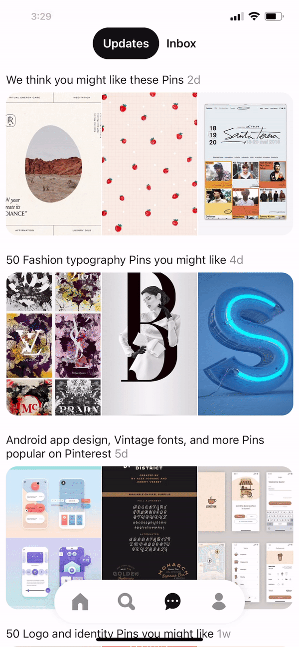
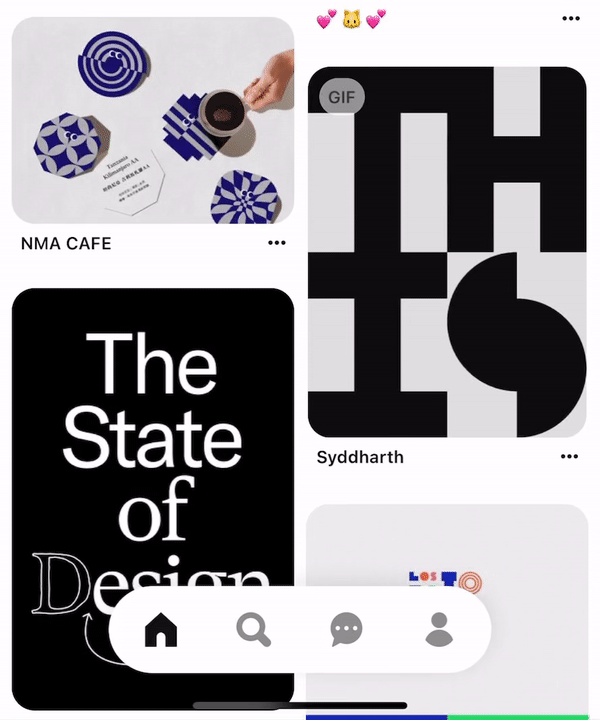
Browsing images is the primary function of Pinterest. As the user enters the app, the entire interface is filled up with blocks of images. The model of the continuous feed affords the user to keep scrolling to see more content. The scrolling action also follows the consistency and standards of the modern mobile app of a vertical content display model.
Gallery View
Once clicked into a block of the image, the user can simply swipe left or right to view the next images in a gallery view. This feature mimics a conceptual model of a common photo album on our mobile phone when we would swipe left or right to view more pictures.
There is no signifier indicating such action is possible. A new user wouldn’t know if it is possible to swipe left or right. My suggestion would be to add arrows on the left and right sides similar to the one on the top left to indicate that more content is available on swipes.
Another alternative is to not show the sliding card as a whole screen and to show an edge of the left and right block on both sides as an indicator just like how they showed the top part of the bottom block in the gallery view.
Loading Animation
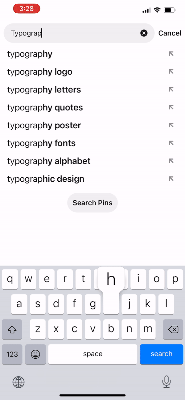
Throughout the app, there is a consistent animation that shows up whenever there is a searching or loading action. The simple animation of four circles rolling gives out feedback to the user that the system is working on the request.
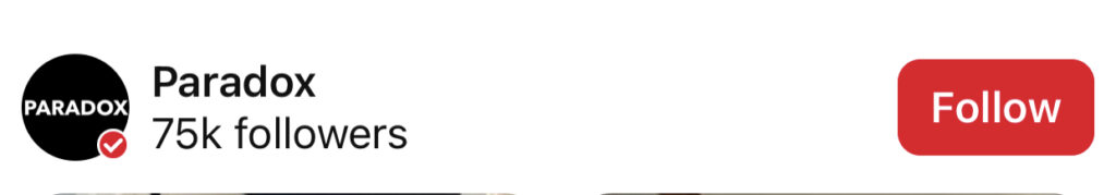
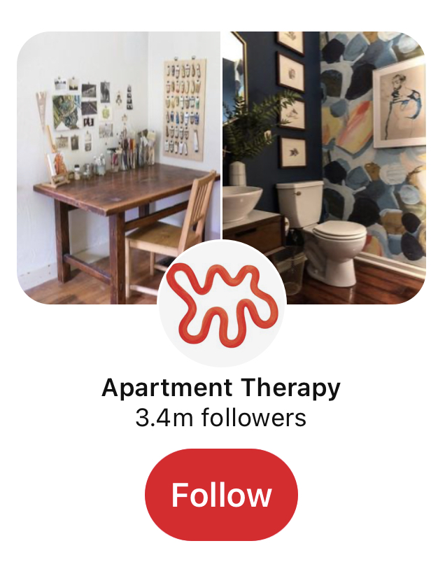
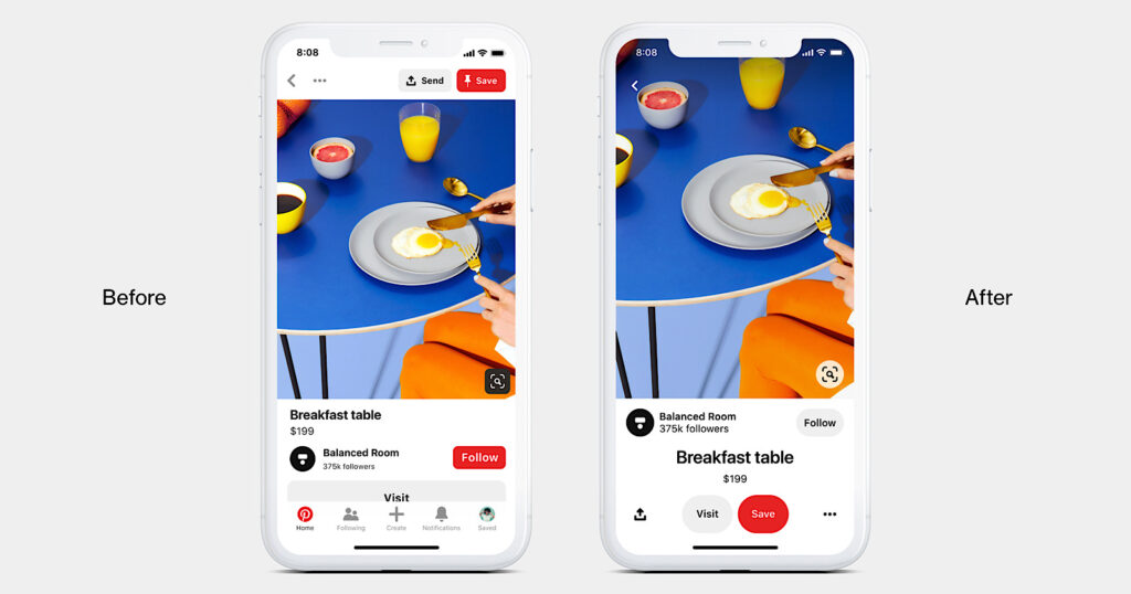
The Red Buttons
Pinterest encourages users to save images and to follow others’ threads to generate more interactions. There are only a view main buttons that are visible throughout the app. (The other ones are hidden and require one to hold to reveal) The buttons are affordances for the users to save or follow. The red buttons are the most prominent ones, comparing to the grey ones, as they have the signature red color as a signifier to motivate possible actions which make the red buttons a perceived affordance.


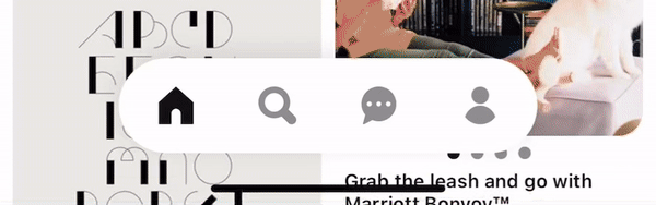
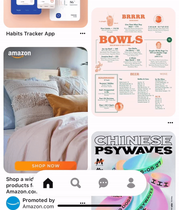
Hidden Navbar
A hidden navbar is very uncommon in a mobile app as the user may be lost in the navigation. However, in this case, I think it is a clever idea because it is quite discoverable and understandable, according to Don Norman’s two characteristics of good design. It is discoverable with the animation of the navbar popping up with a white background and shadow around it. It is easy to understand how to use with the action of scrolling up and down, which is the primary hand gesture of using the app.
The hide and show navbar not only saves the space to provide more area for the images (as we know how important images are for Pinterest), but it also shows up for the user whenever they need it.
https://www.searchenginejournal.com/pinterest-launches-a-refresh-of-its-mobile-app/334001/
Apart from the highlighted icon when clicked on to show which section the user is on in the navbar, the top section also signifies where the user is. For example, in the search section, there is a search bar at the top; in the profile section, there is a profile picture or simply noting at the top the section name.


Since all four pages are image-heavy, it may be hard to distinguish which section is which at a first glance. There needs to be more signifier to indicate. One solution is to use natural mapping as a hint by including a sliding bar at the top that reflects the navbar status.
Action Buttons Shortcut
Other than the save and follow buttons, Pinterest also provides users with send, hide, and report functions. For more efficient use, one can hold down on the picture and move the finger toward the icon of choice. With proper feedback, the user will then release the finger to proceed to the desired action. And just in case one doesn’t know this shortcut, there is also a menu button provided for the same function.