
Slack unifies all the services needed for a team to communicate efficiently and effectively. It supports tools such as one-on-one direct messaging, calling, and topic-based group conversations, while making it easy to incorporate other administrative apps and share files in all communications.
Getting Started
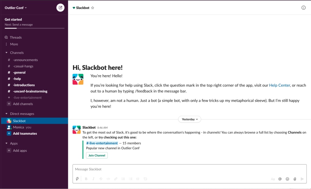
When a user logs into a new workspace, they are greeted by a slackbot that helps orient them to the app usage. This bot helps new users generate a conceptual model that matches the design’s conceptual model, decreasing the likelihood of rule-based mistakes as they begin to use the app. The ‘Message Slackbot’ in greyed out text signifies that the box at the bottom of the screen affords asking the bot questions. The slackbot also remains available for questions even after a user is first introduced to the workspace, providing a valuable way for the user to re-orient themselves if they are interrupted during the intro. This helps prevent memory-lapse mistakes.
Joining Channels
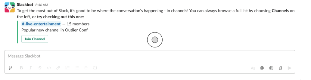
Before clicking ‘Join Channel’
After clicking ‘Join Channel’
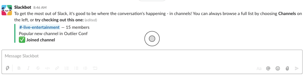
If the user chooses to join the sample channel that the bot selects, the app immediately provides the user feedback that the action worked via a green check mark. Because in many cultures this symbol is used to signify success, it is an effective way to help the user bridge the Gulf of Evaluation and conclude that their action worked as intended.
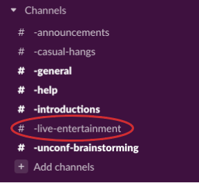
One limitation of this step is that the bot does not provide a signifier of where to click to explore the channel that was just joined. The user would need to notice that the channel is now available under the ‘Channels’ menu, which can be difficult when the list is long and other channels are bolded due to unread messages (see below). I would recommend that the bot circles the channel that the user joins.
Posting a Message
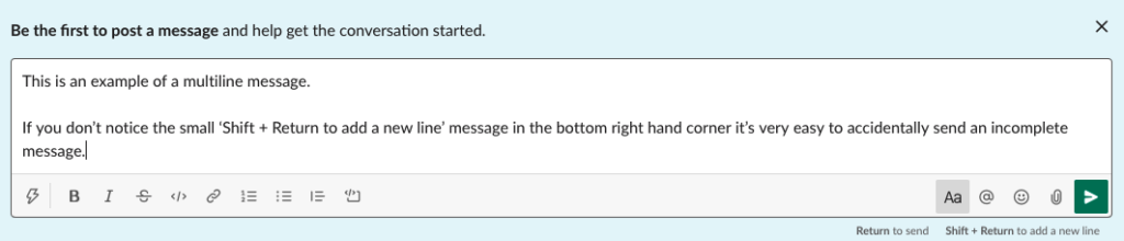
When you start typing in a channel or direct message chat, a guide appears in the bottom right hand corner of the text box signifying what actions ‘Return’ and ‘Return + shift’ will afford. Unfortunately the small size of these messages makes it likely that users will miss them. In this scenario, the user is likely to draw upon an incorrect conceptual model grounded in other word processing tools, where hitting ‘Return’ would bring the cursor to a new line. This makes it very easy to accidentally send incomplete messages. To prevent this rule-based mistake the ‘Shift + Return to add new line’ should be displayed in a larger font. In addition, I would recommend that slack conduct a sensibility check on the written text and raise an “Are you sure you want to send this message?” confirmation message if the text that the user has entered is clearly incomplete (ex. a phrase with a semicolon demarcating the start of a list). It is important to design assuming that the user will make errors.
Making Work Feel Good
As can be seen in the above screenshots, Slack not only designs for usability, but also for user experience. The clear lists and bold purple of the menu give the app a confident and organized aesthetic. These qualities, considered advantageous in many workplaces, are likely to evoke a positive visceral response from the user. This subconscious reaction could encourage the user to choose the app over competitors. It’s important to recognize though that interpretation of aesthetics is unique to each culture. Confidence is not a positive characteristic in all regions, and this could negatively impact the user’s visceral response to the app’s aesthetic in some markets.