The New York Times Crossword app is available on iOS and Android and provides daily crossword puzzles that vary in size. The options are the mini and daily crosswords, the mini can be completed quickly while the daily is much larger and (in my opinion) more difficult. The critique will be focused on the mini, since that is the one I use most often.
The Mini Crossword
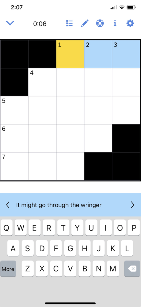
The mini crossword provides a lot of great context as to how the user should interact with the game. Highlighting in yellow what box the user is on, and in blue the rest of the word, it signifies where the user should type and in what direction they will type in. This also is a good example of natural mapping because the clue easily corresponds to the highlighted area, signifying the relationship between the control (clue) and the object to be controlled (typing area). Although this works well, for additional clarity and discoverability the clue could say “1 Across: It might go through the wringer”, instead of “It might go through the wringer”. By adding the “1 Across” it is another signifier as to where the clue is referring to in the crossword. The number of squares creates a logical constraint, that the answer can only have as many letters as there are boxes. All of these attributes help the user establish where they are in the crossword and that the clue correlates with the highlighted area.

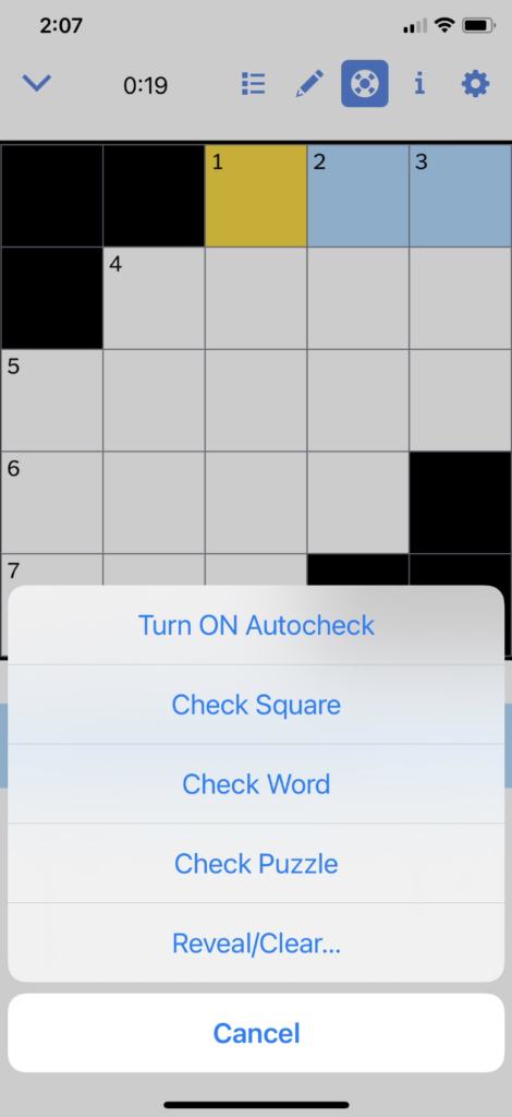
Turning On Autocheck
The app purposefully does not have feedback to tell the user if their answer is correct or incorrect, deliberately making things difficult, unless the user turns on autocheck. I like the multiple options that are provided, the whole crossword could be checked or just that one square/word. This provides flexibility and efficiency of use so users who want to know if their answers are correct can have that option, or if they prefer to never use autocheck they can do that as well.
The only con here is that the symbol for autocheck is not immediately clear as to what its function is until the user clicks on it. Analyzing it more closely I think it is supposed to be a life raft, but it fails the consistency and standard design principle. This is hard to solve because I’m not sure what a clear icon would be, possibly a checkmark because that would signify “checking” or “correct” associations.
Using Autocheck
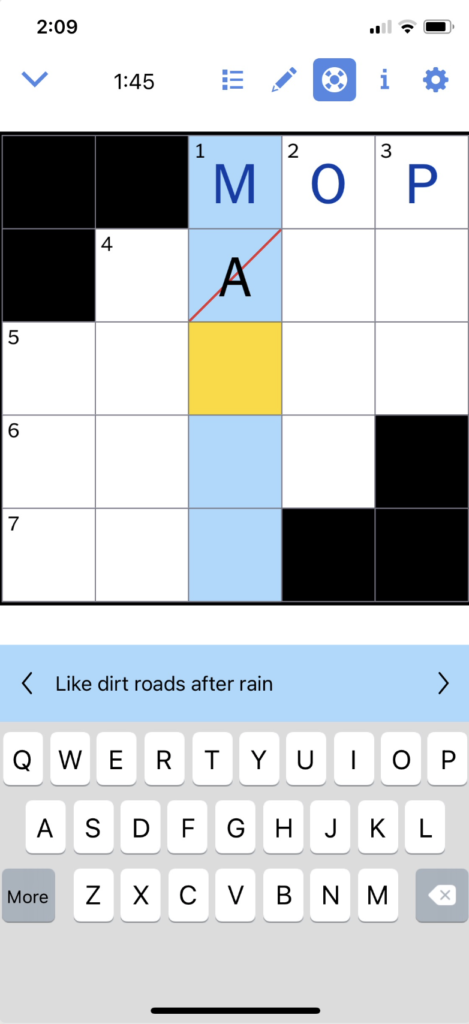
When using autocheck the highlighted icon surrounded in blue provides feedback that autocheck is on, and anything that is correct the text also changes to blue. Another nice feature that provides error prevention is that when deleting letters the app will skip over anything that is correct and only delete letters that are incorrect. The red line also provides feedback in what is incorrect, allowing the user to easily discover it and attempt to fix it.
Pencil Mode
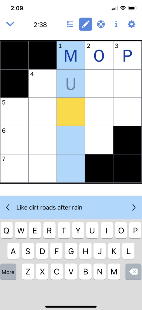
This is the one area of the app where I’m not sure what the purpose is. It could be used if the user is unsure if their answer is correct and wants to visually differentiate between answers they feel are correct and answers they want to come back to because they are not positive it is correct. This could help with preventing memory-lapse mistakes, if the user is interrupted or distracted, by using the pencil it indicates that is an area they want to return to and not forget about. This provides a match between the system and the real world in using pen vs. pencil when filling out a crossword.
The pencil icon reminds me of an edit feature, when its true purpose is to change the color of the text. For additional clarity they could provide a similar userflow as turning on autocheck where it says “Use pencil mode” but this could be cumbersome if the user had to click yes every time. Another option would be to change it to a color swatch or the letter “A” that is the color of text (similar to Microsoft Word).