I haven’t used my apple products for music in a long time. Since my first iphone, I didn’t have enough storage for all of the music I listened to, but because the pandemic is draining us all, I had to cancel my subscription to Spotify and return to the Apple music app.
The problem I had anticipated, the fact that I haven’t purchased music since very early high school, was not my biggest problem. Although it is a pretty well functioning app, in terms of signifiers, mapping and feedback; it is also a giant ad for more Apple products.
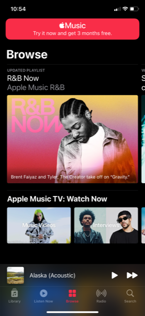
In 2015 Apple launched a new product called Apple Music. This is a subscription based service, similar to Spotify. While I can appreciate a little competition between extremely similar products, what I do not understand is that Apple Music does not have its own app. Here I was thinking I was returning to all the 2005 and 2008 music I downloaded in middle school, when instead the songs I had purchased with my hard earned babysitting money were pushed into a tiny corner of the app, which had been completely taken over by the subscription based service.
While I could go on about how annoying it was to be encouraged to buy an overpriced product on a product I already pay too much for, there are three main design critiques I will be going over categorized as follows: Opening the app, navigating the app, and using the app.
Opening the App
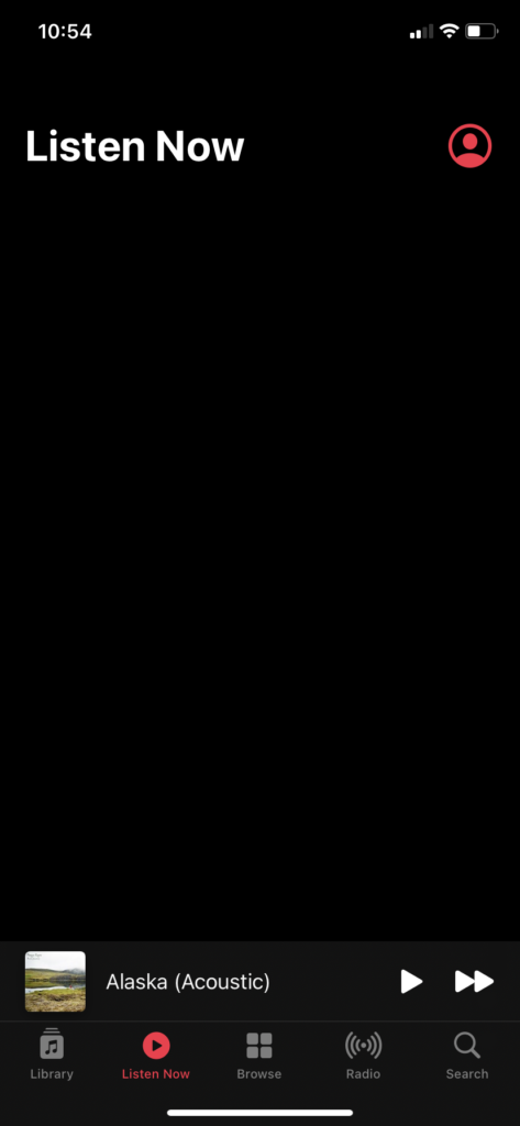
The app opens to your library, which is great. This is the function I expected, opening my music app to see all of the music I have already spent money on. The sticky navigation menu on the bottom of the screen, or the one that stays on every page, is a constraint. It is a navigation menu that limits the user and only functions to those who pay for every single subscription service that is offered by Apple Music. The menu options are Library, which brings you to your own purchased music, Listen Now, which is a blank page when I click on it, Browse, which is for Apple Music, and Radio, also a part of Apple Music, and Search, for the entire app. Not only is this the largest constraint I have seen in an app that I have already paid for, it makes more than half of the app completely useless to most users. As Don Norman said, the app may be usable, but it forces the user to “behave the way the product wishes rather than as we wish.”
Not only does this sticky menu not function for every user, it is also completely useless to act as the sticky menu. If you are opening the app to use your own music, you do not need a quick button to switch your service to Apple Music. Instead, it might function better to be a navigation bar within each product. For example in my own library I might want navigation to switch from sorting by album, to sorting by artist. Instead of having to hit the back button until I am back to the home screen for my library and then finding the option to sort by artist. Most people who have music on their Apple products, typically have quite a few songs in that library. Having the user only be able to sort their music one way each time they look is a constraint, and relies too much on their short term memory to recall the artist, album title, or song title for every single song they have in their library. In the end, it’s just profit centered design, and not human centered design.
Navigating the App
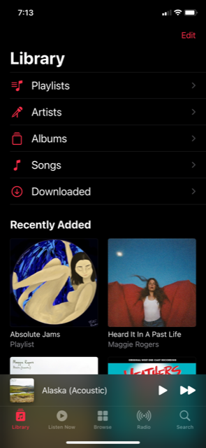
The part of the app that holds the music library has high discoverability. There are six options to choose from to sort your library. You can make your own playlist, sort by artist name, by album title, by song name, by the songs you downloaded on your device, or by recently added. There is a constraint with the fact that the music can not be sorted by genre. This limits the users possible actions.
Every page functions the same, there is a title that provides feedback that you have arrived at the page you wanted, a sort button or a more options button, you are able to scroll, click on images and play or shuffle the music. There are signifers such as an ellipsis that will display more options, an arrow functions as the back button, a down arrow to download the music to your device, and the typical play, pause, and volume signifiers.
Using the App
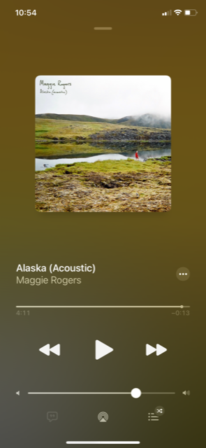
The library function of the app is understandable and functional. Knowledge of the signifiers like the play and pause button makes the design human centered. In addition to the title feedback, once a button is clicked, it will turn a different color. The feedback provides reassurance to the user on a behavior level, as well as meeting their expectations of playing and sorting their music. The reflective level may of course be, should this have been easier to find?
Overall, the library function of the app is great. It navigates well, there are countless signifiers to show the user what is afforded by the app, and plenty of feedback. Where the app lacks is in its overall design to encourage the user to purchase more products from Apple. They will allow the user to easily play the music they already purchased, but they are going to show you an ad first.