
Adobe Acrobat is an application software available in both Windows and macOS for people to view, create, manipulate, print and manage files in pdf. This article would critique the usability issues when saving and retrieving a starred file in Adobe Acrobat based on the framework mentioned in Don Norman’s The Design of Everyday Things.
1) Good discoverability and feedback for starring a file

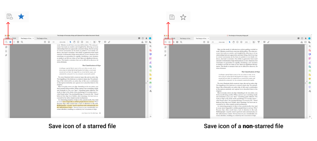
Adobe Acrobat affords to star a file so that users can retrieve the file easier on the landing page later. Figure 1 shows that the star outlined icon is the visual signifier showing the “star”/ “bookmark” function. The star icon is located at the top left-hand corner of the document interface, which is easy to spot, so the star icon (i.e. the bookmark function) has considerable discoverability. After users click the star outlined icon, the icon is filled with blue. There is also a dialogue box popping from the file icon saying “Copying to Document Cloud” and a loading icon animation showing that the file is being saved. This clear visual signifier offers obvious feedback and system status’ update, helping users bridge the gulf of evaluation. Users then know that the file is starred.
2) An ambiguous saving file’s signifier and imperceptible feedback
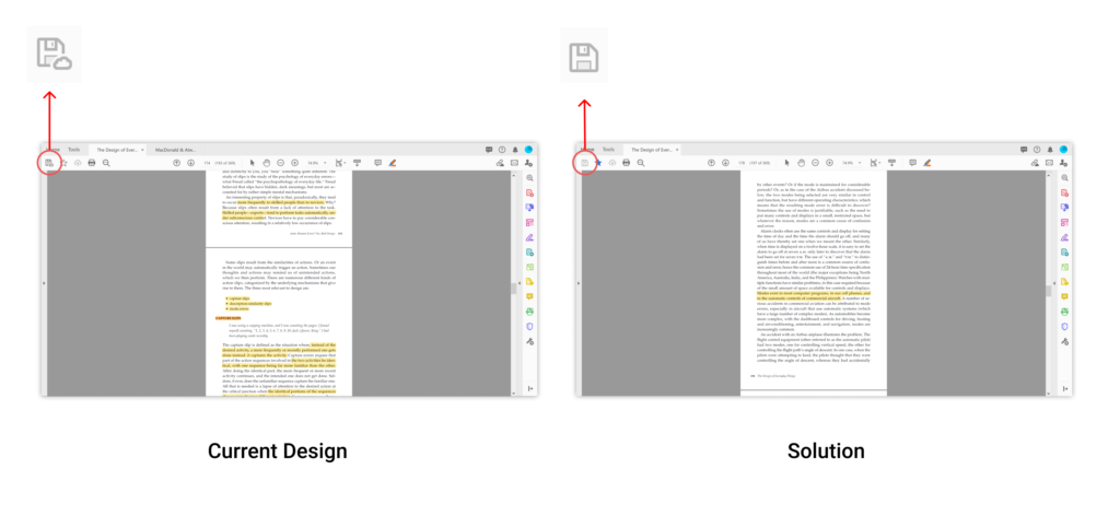
After users have starred a file, the save icon is different from the normal save icon (Figure 2). The save icon of the starred file has a “small cloud” near it as a visual signifier, showing that any file change will be saved to the cloud. The discoverability of the differences between the normal save icon and the save cloud icon is small. Users might not recognise the differences as description-similarity slip occurs.
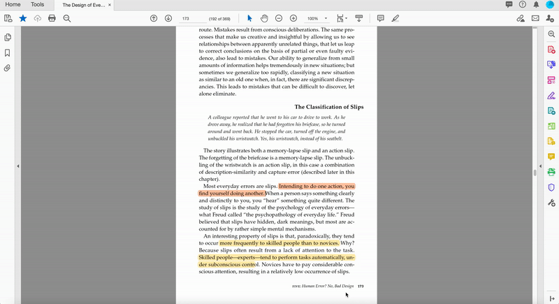
Users would edit and save the file as usual after starring a file. When users click on the “save cloud” icon, it becomes grey, and there is a modal box popping up at the right-hand side, giving system status’ feedback on saving. (Figure 3) However, the message “document is saving to the cloud” only showed for 0.1 seconds. Users definitely cannot see this message and build up a conceptual model that the file is being saved to the cloud instead of the computer’s file. Thus, the outcome of the saving function is incorrectly evaluated, leading to rule-based mistake and problems explained below.
3) The discrepancy between the system’s mechanism and users’ conceptual model of retrieving a starred file
Afterwards, users would open the edited file by going to the file saved in their computer system originally. However, when users open the file in their computer, they would find that the file is the one without any editing (i.e. the original state). This is because the starred file is saved to the document cloud in default instead of the original file location users have saved in the computer system. (Figure 4) That means users saved the starred file in the document cloud after their previous editing and the file in the computer system remain unchanged without any editing.
It is a rule-based mistake as users’ conceptual model of the save function is different from the system’s actual mechanism. In the starring file step, the file is copied to the document cloud, which is shown by the message on the dialogue box.(Figure 1) Nonetheless, users would not know that their edited file is saved to the document cloud. Given by the knowledge in the head of users, guided by convention, it is known that edited file is always saved to the original location that is first saved. Users would expect to open the edited file in the computer system they have saved at, so there is a gulf of execution between the system’s mechanism and users’ goal. Even if users know their edited files are uploaded to the cloud, users have a high possibility to find the file through a more frequent way of retrieving a file (i.e. going to the computer’s file) after an interruption or a period of time, which creates a capture slip. Moreover, users might not remember the file is put to the cloud, creating a memory lapse.
Solutions
Solution 1: Changing the mechanics of the system to match users’ conceptual model
The simplest solution is to star the file without saving it to the document cloud (Figure 5), matching the user’s conventional conceptual model, thus bridging the gulf of execution. Hence, users can edit, save and retrieve the file by going to the corresponding computer file.
Solution 2: Helping users to build up a correct conceptual model of the system throughout the interactions
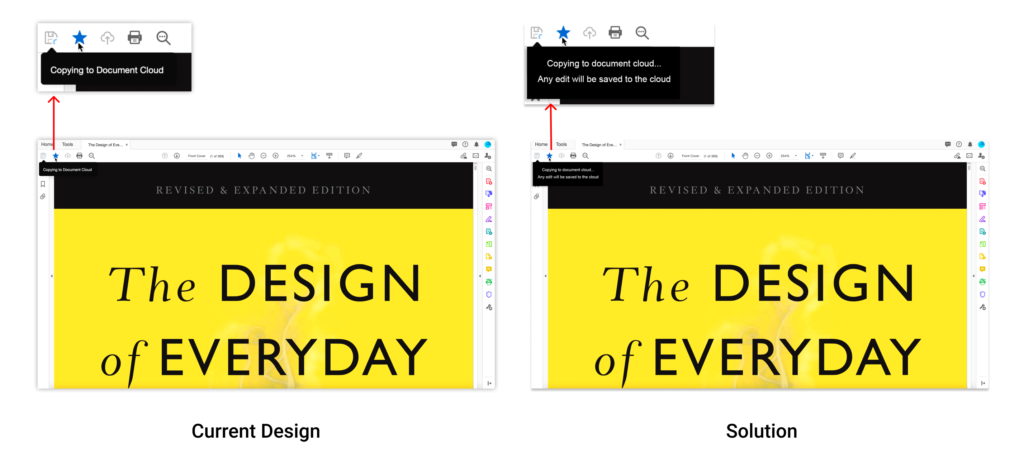
In the first point abovementioned, the signifier tells users that the file is “copying to the cloud”. (Figure 1) However, it would be better to rephrase the message as “copying to the cloud and any edited file will be saved in the cloud”. (Figure 6) This improved visual signifier can help users building a correct system image that the file is put to the cloud. Thus, users might know that their edited file is saved to the cloud but not the computer’s file.
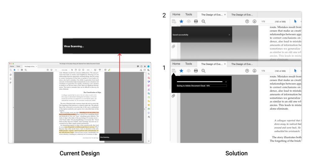
The third point mentioned that after users click the “save cloud” function, the saving status’ modal box appears too quickly. (Figure 3) Therefore, it is better to place the modal box near the “save cloud” icon to increase the discoverability of the system status’ feedback. Furthermore, the feedback of the progress bar of saving (No.1 in Figure 7) and the “saved successful” message (No.2 in Figure 7) should stay on the interface for a longer time for users to read and percept (even if the saving time does only take 0.1 seconds). The feedback in this action cycle is a feedforward that informs users to know where to retrieve the file in the future.
Solution 3: Asking users before saving
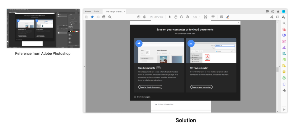
After users click the save icon, the system can show a modal box, asking users where the file should be saved. (Figure 8) This approach has already been used in Photoshop. The Adobe Acrobat team could reference how Adobe Photoshop is doing.