A “Seamless” of sorts for healthcare, Carbon Health defines itself as a “modern, tech-enabled healthcare provider designed from the ground up to put patient-care first” (Carbon Health website). The company’s B2B2C (Business-to-Business-to-Consumer) business model works by offering technology solution to clinics around the U.S. and ultimately to consumers (patients) to help “deliver a uniquely seamless experience from virtual care to in-person care” (ibid.) Put simply, the app allows patients to search for, schedule, and manage appointments as well as get access to lab results, prescriptions, and other documents. As a non-clinic-affiliate, this design critique is in the perspective of a consumer of Carbon Health’s patient-facing platform and based on principles introduced in Don Norman’s book, The Design of Everyday Things.
example of good design 1: home page navigation and functions
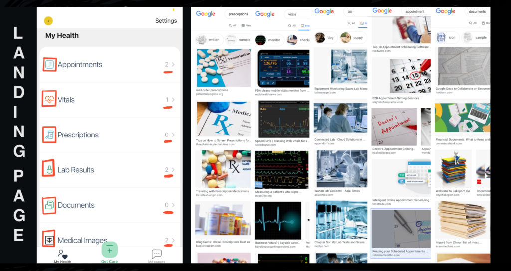
The home page navigation contains multiple examples of good design principles. Icons and text-descriptions are closely associated in the U.S. cultural context-Googling the terms result in images that mirror the icons used, an indication that most users will have a good conceptual understanding of what each function is. As the icons are juxtaposed to text, there is no room for mapping-related questions. The user can immediately perceive that each row maps to the function described within that row.
The distinct yet correctly representative icons further act as agents that prevent description similarity slips for users who may not understand English. Using different colors and shapes the design ensures that each function displayed serve different purposes. This is extremely helpful as slips in healthcare could have high stakes as it is largely dealing with a person’s life.
Moreover, ‘>’s act as signifiers affording that each row is ‘expandable.’ That is, the interface shows the perceived affordance of click-ability. The added numerical indications further hints to users that despite the presence of the affordance of clicking on the rows, they do not need to if there are no content to show (i.e. ‘0’). It acts as a constraint in keeping users from wasting time when the expanded page will be empty.
Example of good design 2: booking an appointment
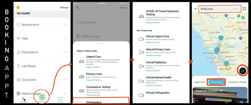
Clear labeling, iconography (in-clinic vs. virtual), and navigation provided by signifiers such as ‘+,’ and ‘>’ make each step in booking an appointment highly discoverable and perceivable. The cut-off text in the ‘Get Care’ roll-up affords that it could be scrolled down. The user flow of identifying the type of care and searching for locations by geography, proximity, and availability resemble how users search for an appointment via a search engine. Users have a clear conceptual model for scheduling an appointment.
Users are also presented with immediate feedback upon each event/action: clicking on navigation button (‘+’) immediately shows the roll-up modal, choosing the care-type shows the page and mapping of available clinics, clicking on clinics presents the appointment scheduling flow, and bubbles are colored turquoise when selected (shown in the right-most image above).
A potential improvement in this use case would be to have a more perceivable signifier that the roll-up modal is scrollable. Although a digital-friendly user would know to swipe to scroll, adding a visible scroll or a vertical ‘progress bar’ may provide a better perceived affordance that the roll-up modal shows more types of appointments. A lock-in forcing function such as ‘Would you like to finish making this appointment? Yes-No’ may prove handy as a future feature to prevent users who have critical appointment to make from having slips and forgetting (or unknowingly failing) to book an appointment.
Potential area for improvement: user profile
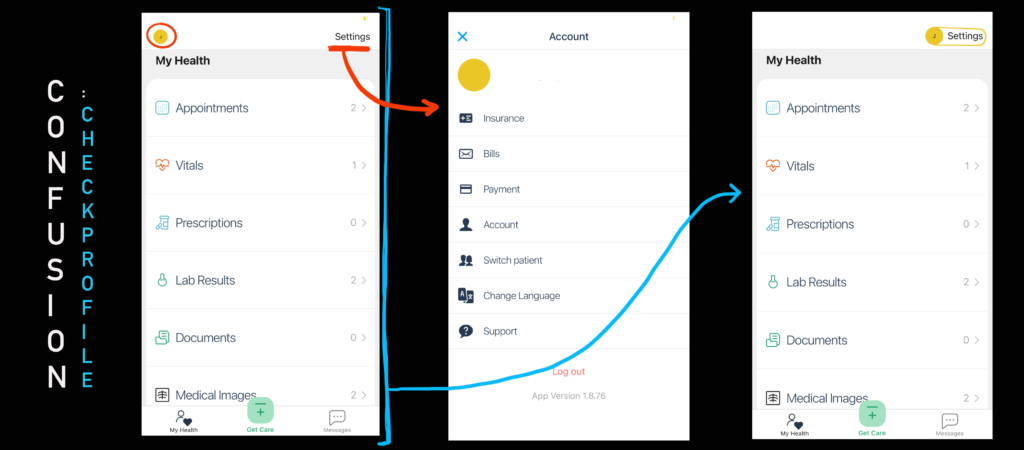
An area of improvement was that the profile ‘icon’ was found to have no affordances-it is a static image of the user’s initials in a circular shape. Clicking” on the ‘J’ icon resulted in zero feedback-contrary to my expectation that it is a navigation to profile settings. Profile setting buttons are common in other widely used applications such as G-mail with very similar designs: a circle with initials. The bold yellow color and non-plain text (placed inside a circular icon) moreover signified that it would afford click-ability. This confusion may be common to mobile applications, in which users are unable to “hover over” an object to see embedded interaction elements. I found that clicking the text ‘Settings’ shows the profile settings page, further finding the profile icon futile. A suggested design will provide clear perceived affordance of click-ability by 1. only presenting objects that have interaction elements, 2. switching the ‘J’ icon to text and making the settings button into an icon, or 3. combining/juxtaposing the ‘J’ and ‘Settings’ and group as one interactive element that will navigate to the profile settings page.
Concluding notes
Overall, the Carbon Health app is easily usable-critical features around appointment-making and managing healthcare reports are discoverable immediately, perceivable, and mapped correctly. Particularly as the app deals with human health, it is critical that the application take Don Norman’s quote to heart that “designers must always keep foremost in mind that the products are to be used by the people” (Norman, 2013, p.257).
As the healthcare industry continues to be disrupted by technology, the company should be wary of “featuritis”-too many features in a healthcare app may end up overwhelming users and hinder the “seamless” healthcare experience Carbon Health strives for. And as Carbon Health potentially expands globally, designers and product managers should rethink whether the features (even the good-designs) fit the cultural context of users outside of the U.S. Perhaps the icons will need modification or perhaps not at all.
References
About us. (n.d.). Retrieved February 07, 2021, from https://carbonhealth.com/about-us
Norman, D. A. (2013). The design of everyday things. New York: Basic Books.