Google maps — launched 2005 — stands out for digital map interaction. I am really fond of this app and it’s one of my most consistently used apps. Two years ago I outlined major details for a two-week long road trip abroad by just using Google Maps. This app is available both on iOS and Android, in the web browser and the users can download offline maps. I wrote the following analysis based on the awareness gained by reading Donald Norman’s book ‘The Design of Everyday Things’.
Where are you now
This app provides a helpful way of navigating to a destination, finding local businesses, and exploring new areas. As soon as the users open the app it shows them signifiers and the app offers easy to understand affordance which takes no time to get used to. Some users immediately begin and get started, and others gradually understand and go through the discoverable components on the app. It is not mandatory to sign in but the app needs to collect information in order to and give personalized recommendations.
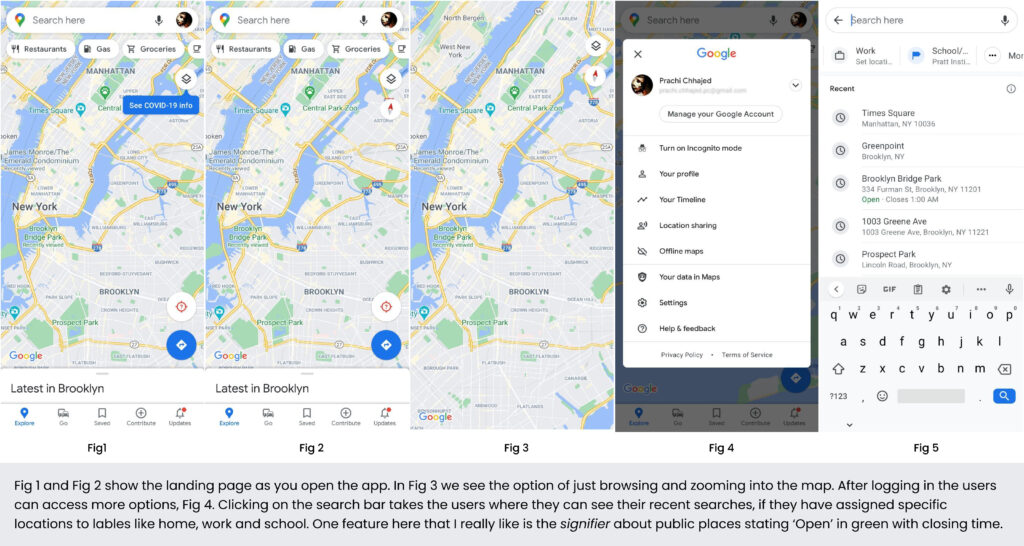
You are here
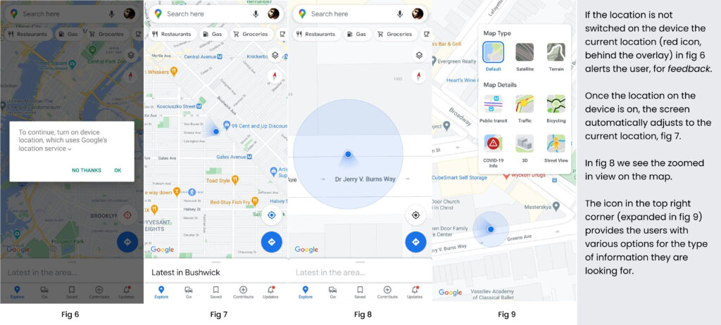
Your location on the ground can be determined with incredible precision and it appears as a blue icon on your screen. The conceptual model of that icon makes it an appropriate signifier by recognizing the user’s action to discover the direction the device pointed at. The current location is precisely discoverable, the constantly moving light in real time provides affordance. Google Maps is one of the dominating navigation tools for people anywhere in the world. This systematic feedback includes satellite photography, street view, real time traffic data, public transit, etc. You could also be a member of Google Local Guides and contribute reviews, photos and edits of the places you’ve been.
Let’s go
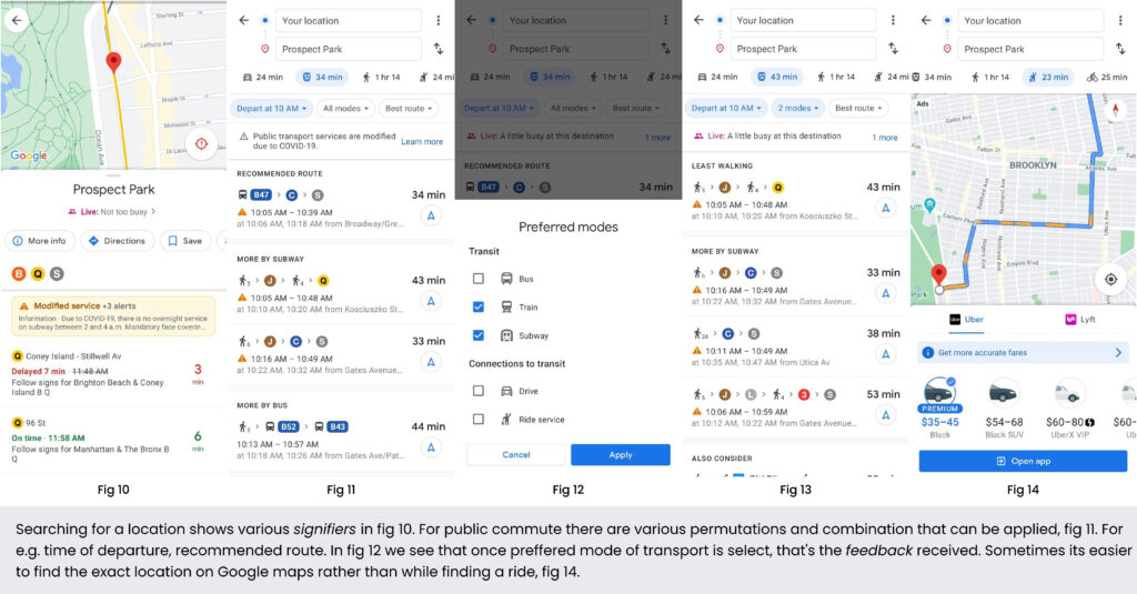
We know from knowledge in the head (existing learning in the human memory) that the app affords a diverse range of actions. Conceptual model of the the icons with the copy clearly states the action that can be taken by the user, additionally with natural mapping, the user knows that the app affords various ways to reach a destination . Showing half of the icon after groceries under the searchbar makes the activities carousel discoverable.
This or That
As the users advance through their journey the app steers towards numerous signifiers. The video below compares the conceptual model of the the icons for two scenarios, signifying walking towards a destination. The video on the left shows the users route to walk towards a subway station and the video on the right shows the directions to walk to a restaurant.
In the left side video, there are two options, either the user can navigate according to the light in the direction of the blue icon or they can click on the location icon (bottom right). With that selection the app gives an immediate visual feedback, to the users and they also understand that the app clearly affords showing them exactly which direction they are walking towards. The video on the right uses a different icon for the same scenario. The conceptual model of the the icon here is much bigger, which makes it difficult to understand while walking through narrow streets and sharp turns.
Recommendations
Billions of users are using maps in billions of different places. Google’s mission revolves around building the most effective way possible to make information more accessible to their users and customize their experience. Sooner rather than later this app would be the backbone for Google’s self-driving expedition.
-The experience and the feedback of the icons in the video on the left is more intuitive. It would be more helpful if the signifier for these two actions could be the same, to avoid confusion and consistency is maintained for the same action . The users should also be given the option to switch between options to navigate (given in the left video).
-When a mode of public transport is not available the option simply does not show up. Users come with different understanding of how the app works, it might lead to a misunderstanding. A signifier indicating the unavailability of an option would be intuitive as it guides the user instead of blocking their action without explanation.
– Within two weeks of moving to New York, I found myself heavily leaning on both Google Calendar and Google Maps to plan. Everything was entered into my Calendar, firstly I would go to was Maps to plan the departure and then start the journey. An event created in Google Calendar appearing inside Google Maps itself would lead to a better flow of information.