Duozhuayu is an online transaction platform of second-hand book, clothes, kindle, game console, and wireless earphone. Clients sell directly to the platform at a price of 80% to 90% off, then the platform help renovate and sanitize the product and resell to other clients at 30% to 60% off. The evaluation of Duozhuayu app is based on iphone X and version 2.3.6.
Homepage
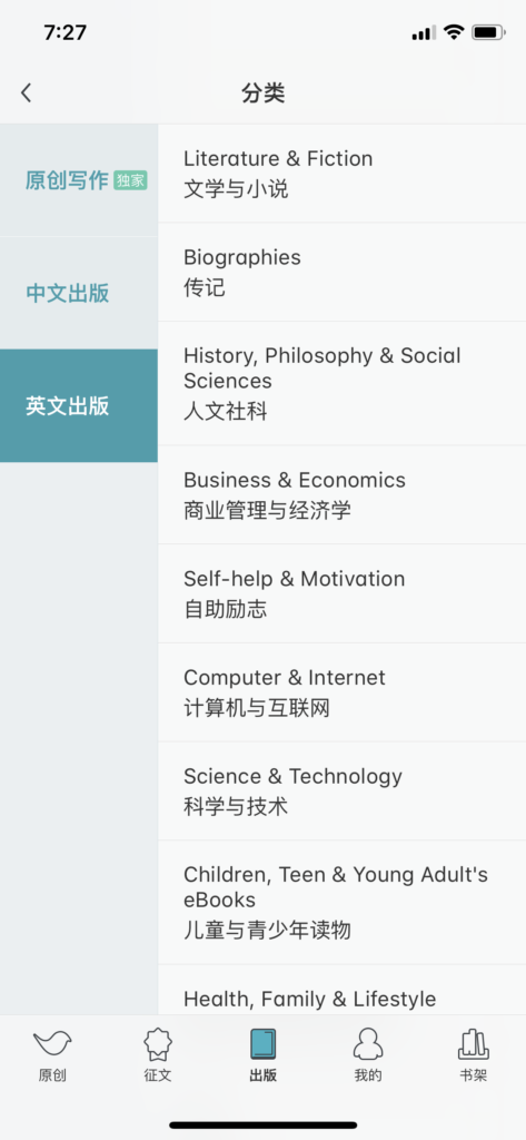
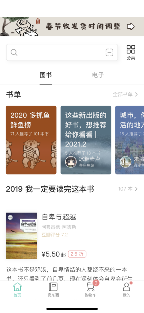
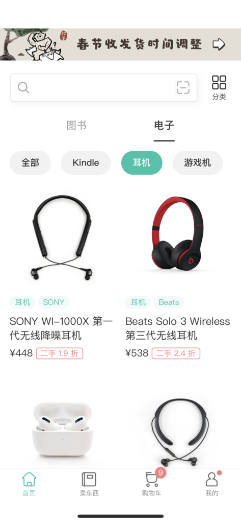
The homepage of Duozhuayu is consisted of books and electronics. The books section is consisted first of book list, and then recommended author books, book list again. However, the author recommendations are not searchable or located in the right corner of “categories”. When users are browsing downwards, the homepage continues to generate new authors, which confuse the users. Also, the categories mess with users knowledge of categories since it is not usually a glossary of types but again with titles such as “open new maps”, “37.5 degrees of lifestyle guide”. For the electronics page, there is not even a glossary, the game consoles are even sell at the same page with the games, which confuses the users again when they are browsing. Therefore, the information architecture of the homepage is considered a bad design.
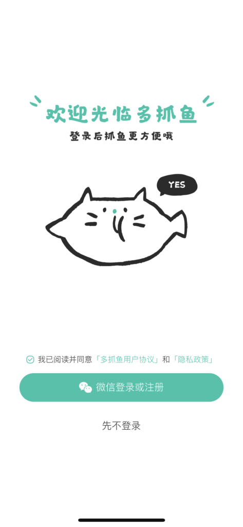
Login Page
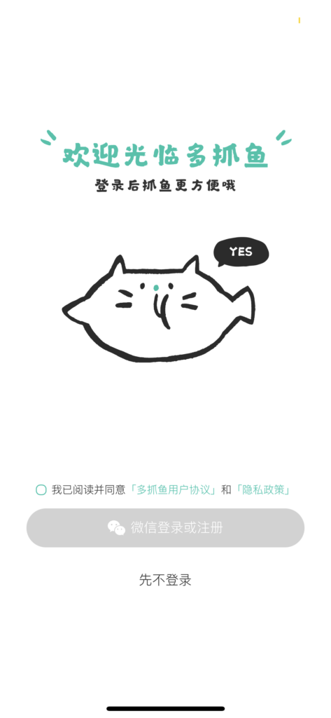
The login page matches with the user’s mental model. The terms and conditions is left blank for selection, and after the user select it. The login or signup button changes from grey to green which serves as a clear signifier for user to act. Generally, the login page is considered a good design with its direct and simple function.
Selling Page
The selling page is consisted of three pages: books, electronics and clothes. Each page draws out the cognitive walkthrough of the transaction and list out the common FAQs, which aids the learnability for users. Just like the login page, the green highlight again severs as signifiers, meanwhile the consistency also increases discoverability of actions. Once users input information into the app, for example, for books, the user can either scan or type in the ISBN barcode, the app will remember the books users input and tell users either the platform wants the book or not. The feedback is clear: books wanted is highlighted with green check mark while the book that the platform does not want remain grey and leaves a mark of “once the platform wants the book will inform you”. Thus, the selling page is also considered a good design.
Shopping Cart
As the users add books into the shopping cart. The process again familiarizes the users. Users first click on the products they want, next input addresses and then check out. The shopping cart is special for the new page of the remind me when in-stock, users can select books they want and then click on remind me. However, users cannot select remind all at one time, which decreases the conveniency of the action.
Recommendation
- Include a glossary author names in the category function, or search by authors in the search bar area.
- Add remind for all books in the remind page at the shopping cart.
- Restructure the electronics page: add glossary and rearrange with in stock items on top, and no stock items at bottom.
Existed Examples