GoodNotes is a digital notetaking app. It completely transforms the way we are accustomed to taking notes. GoodNotes allows you to take precise, handwritten notes on anything you can imagine whether it be PDF files, PowerPoint slides, or Word documents. All notes are searchable so nothing can be misplaced.
Organization of Documents
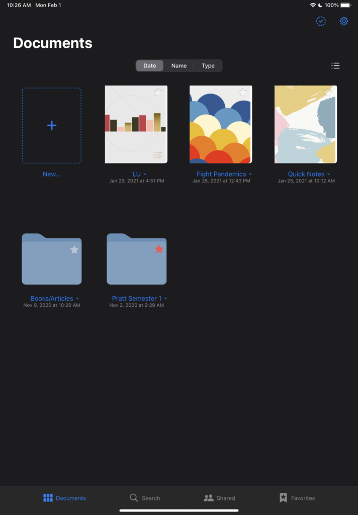
The Documents page of the GoodNotes app is the perfect example of using mapping in order to allow users to navigate through notebooks and folders (Figure 1). As human beings we already have conceptual models established for how notebooks and folders are used in the real world. Notebooks afford being written in and folders afford holding things.
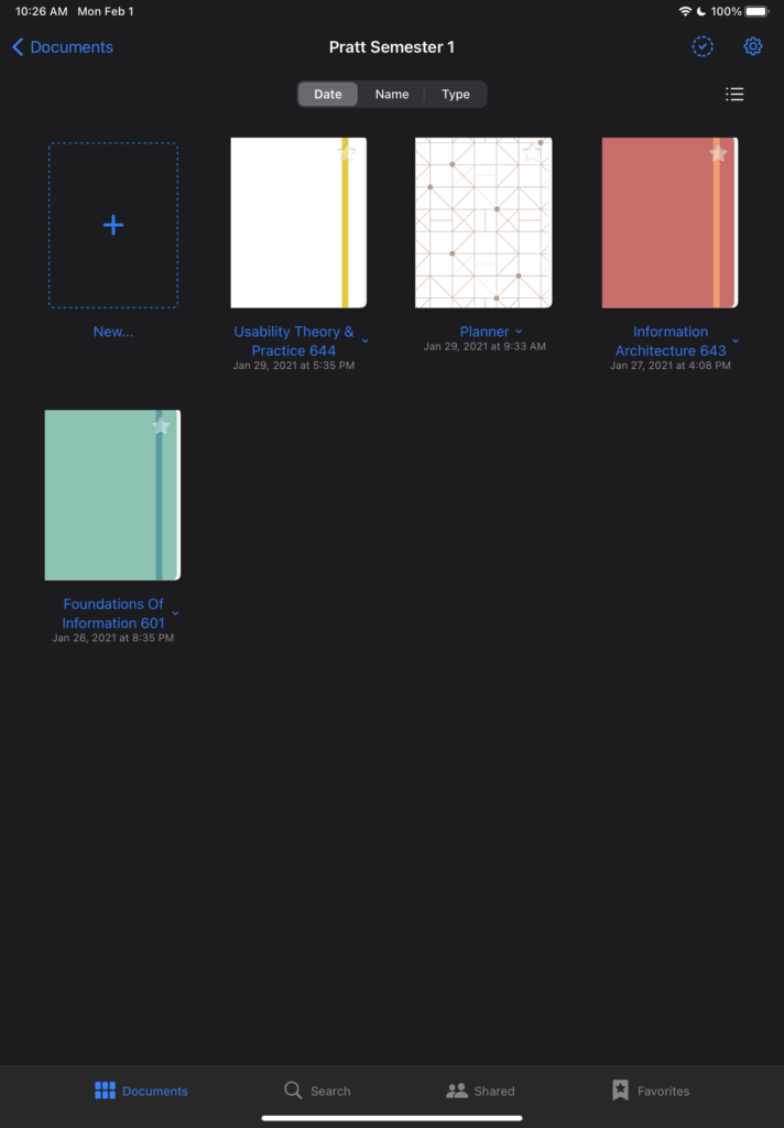
As we further click through the folder that is displayed, we are met with a set of notebooks that were created for my semester at Pratt (Figure 2). Using the natural mapping that students typically recognize, the notebooks are separated by having a dedicated notebook assigned to each subject. This allows for the clear-cut organization of the knowledge of the notes I take while doing my readings or copying class notes.
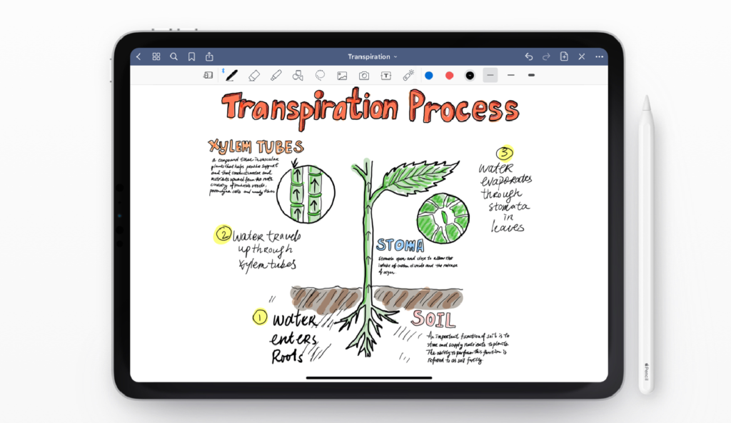
Like physical notebooks, GoodNotes allows users to swipe to the left as if they are flipping a page in order to see the next page (Figure 3). Our conceptual model supports this notion because the action of swiping is the closest thing to what we would do if we had a physical, 3-Dimensional book.
“Poor feedback can be worse than no feedback at all, because it is distracting, uninformative, and in many cases irritating and anxiety-provoking.”
― Donald A. Norman, The Design of Everyday Things
Page Interface
Going further on our mission to complete the goal of notetaking, we are greeted with a pleasant interface where a lot of the capabilities are discoverable through signifiers.
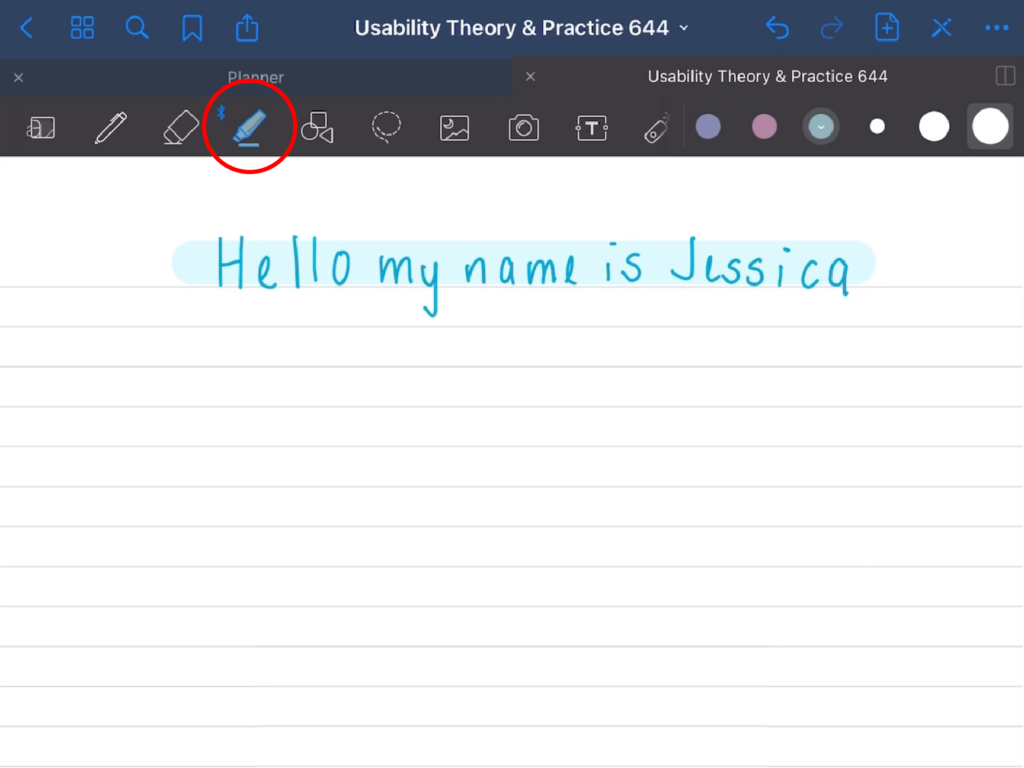
If we decide that we want to write, there is a correct signifier of a pencil/pen/marker that affords writing. When choosing a color for the writing instrument, (after the color has been selected) the app changes the color of the writing instrument (Figure 4). This is a great example of good feedback.
When a user decides that they want to highlight something, they need only click on the highlighter which is found through good visibility (Figure 4.1). The user can then highlight the desired text that is on the digital paper.
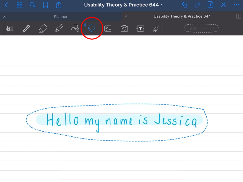
Another really amazing feature, that is not possible when using a traditional pen and paper, is the ability to “lasso” written text or images. The contents within the “lasso” can then be moved to another page or another location on the same page (Figure 4.2).
“Design is really an act of communication, which means having a deep understanding of the person with whom the designer is communicating.”
― Donald A. Norman, The Design of Everyday Things
Resizing Images
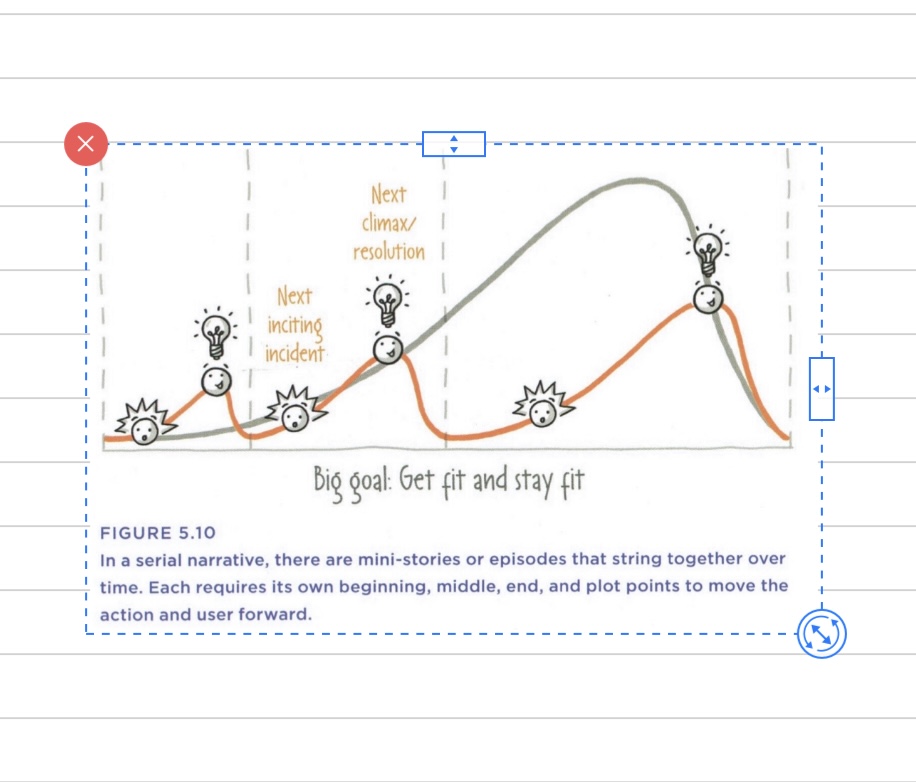
While there are plenty of amazing ways to use this app, there is one thing I noticed that did not match my conceptual model. One feature allows users to add pictures/text/objects in their notes. A user who does not already know the system will have trouble figuring out how to resize the picture/text/object. They would need to realize that they need use a small resizing circle on the lower right-hand corner of the object (Figure 5). This was not easily discoverable and led me to feel confused and almost swindled while using my two fingers to manage the object, only to see that nothing happened.
My suggestion to fix this would be to allow users to rotate or resize the object with two fingers– which is a much more common gesture. This use of constraints, will prevent the user from engaging in any errors.
Final Thoughts
Good design is featured when it comes to errors because the app is specifically designed to avoid anything that can’t be undone. Since most features seem to match our conceptual model, the app decreases the frequency of mistakes. If a mistake or slip does occur, a user can just simply click the redo button to return to the previous state as many times as is necessary to backtrack the mistake or slip.
GoodNotes is a revolutionary app that has addressed many of the issues associated with traditional notetaking methods by increasing our capabilities, in turn allowing the user to seamlessly navigate the app. What is particularly interesting is that GoodNotes does not seem to engage in creeping featurism. As Norman stated in his book, “a good strategy is to concentrate on areas where the product is strong and to strengthen it more” (Norman, 263). GoodNotes focuses on its product’s strengths, and that is clearly evident in its offerings.