
Google Play is an app store widely used by Android users. Through Google Play, users can download various applications, games, subscript services, or buy movies and e-books.
Homepage & menus
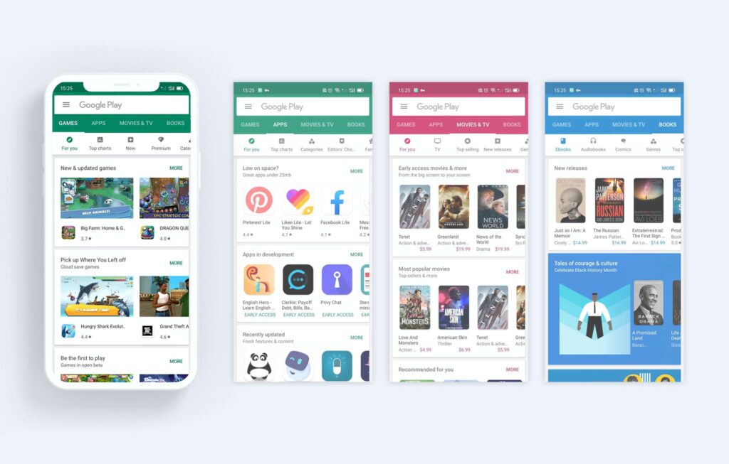
I think the homepage design of Google Play is clear and concise, easy to use, also provides the right feedforward information for users. First is a conspicuous search bar, which ensures users can quickly find what they need. It gives users a certain sense of control and freedom. The secondary menu is under the main menu, and the selected icon color of the secondary menu corresponds to the main menu. These are good mappings that make the logical relationship between the two menus evident for users. Another effective signifier is to display half of the pictures and text information on the screen’s right side, prompting users to swipe left to browse more. The designer also used utterly different primary colors for ‘MOVIES & TV’ and ‘BOOKS.’ This is also great mapping showing the content displayed by different color is not in the same category as the previous content. All the above designs make me feel comfortable and convenient when browsing at will or looking for specific applications.
Help & feedback
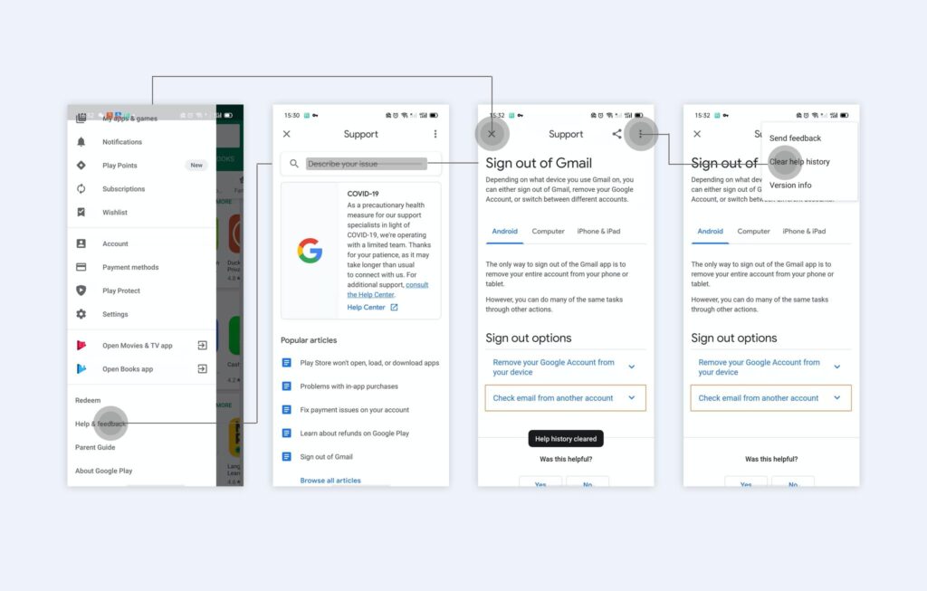
When I tried to sign off Google account, I didn’t know how to do that, so I tap the ‘Help&feedback’ button at the bottom of the side menu bar. Then I found the guidance I need through the search box on the ‘Support’ page. In the above steps, the conceptual model of ‘Help&feedback’ is consistent with my mental model, so my operation went smoothly. However, when I wanted to further search for another issue, I found myself unable to return to the search interface. The ‘Close’ button directly sent me back to the homepage. Even worse, when I opened ‘Help&feedback’ again, it turned out that the content I had searched before was still there. I was confused. It took me few second to find ‘clear help history’ by tap the icon that may meaning ‘more’ for me in the upper right corner, then I exited again and back to ‘Help&feedback,’ and finally I could search for other issues. In this task flow, the conceptual model of ‘return to search again’ was too complicated, even hidden, and did not conform to the mental model, which led to my blind operation.
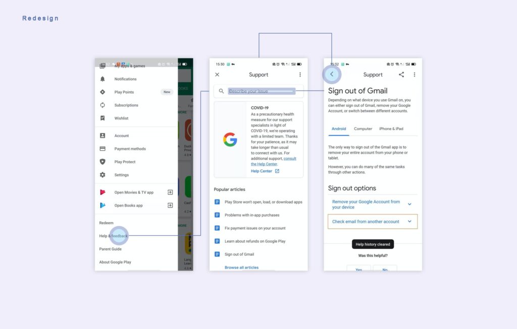
In the redesign, I changed the ‘close’ icon to an arrow as a signifier of the ‘return’ operation, allowing users to go back directly to the previous level. This process does not require any memory burden, and it is in line with most people’s mental models.
My apps & games UPDATES
In updating applications and games, Google Play can bring instant feedback to users: if the user selects ‘UPDATE ALL,’ all programs are changed to ‘pending’ status. The downloading application will display a progress bar and download speed. These feedbacks help users determine the download status, make the waiting time more acceptable. About discoverability, all update buttons are very prominent and readable. The ‘UPDATE ALL’ ‘STOP’ is longer and more prominent in color than other ‘UPDATE’ buttons. Because it involves more downloading operations. Each ‘UPDATE’ button aligns with the program they relate to. All these clues guide users to choose to the action they want.