Insight Timer is an “app for sleep, anxiety, and stress”, offering a meditation timer and a wide variety of audio recordings such as guided meditations and relaxing music. This critique used version 15.12.0 of the Android app on a Google Pixel 4a phone.
App Starting Screen
When a user opens the app, they are greeted with a starting screen offering quite a few different entry points.
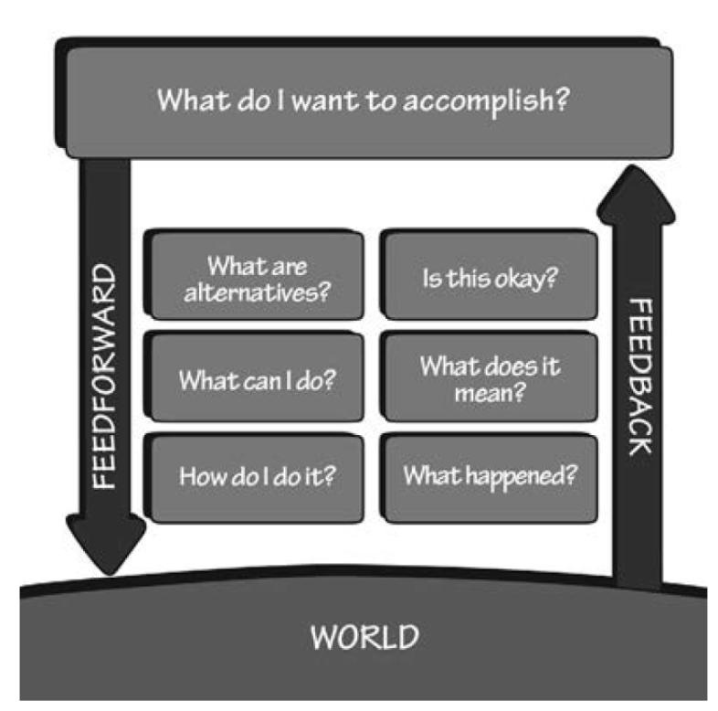
This moment is key for guiding a novice user through Don Norman’s “Gulf of Execution”. Imagining a user asking, “how can I relieve my stress?” or “how will I meditate today?”, the gridded menu does a pretty good job answering “What can I do?” or “What are alternatives?” at a glance. However, I would argue that the swath of options may create some decision paralysis in deciding, “How do I do it?”
Even as a nearly-daily user of the Insight Timer app, I sometimes find myself a bit lost on this screen trying to decide what to do. I would guess the menu is designed for discoverability or exploratory seeking rather than know-item seeking, but for advanced users who know what they are trying to do this may be distracting, and for novice users, it lacks hierarchy or constraints to guide their use of the app.
Menu Personalization
If the user drags to the left on the menu grid, they’ll see that they have the option to Organize the grid to personalize their opening screen. The app teases this functionality by showing small previews of the additional menu items on the right of the first screen. Because the user knows that they can scroll to the side on their phone, letting additional items peek through should afford the possibility of continued scrolling.
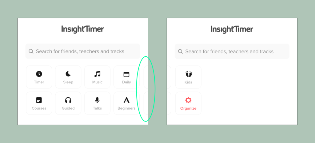
While creative, this teasing is quite subtle, and it took me hundreds of uses of the app to realize I could customize my grid. I might suggest a slightly more visible signifier here to make the scrolling option more clear, without making the signifier stand out too much to avoid distracting a novice user.
Rethinking the Starting Screen: Hierarchy & Constraints
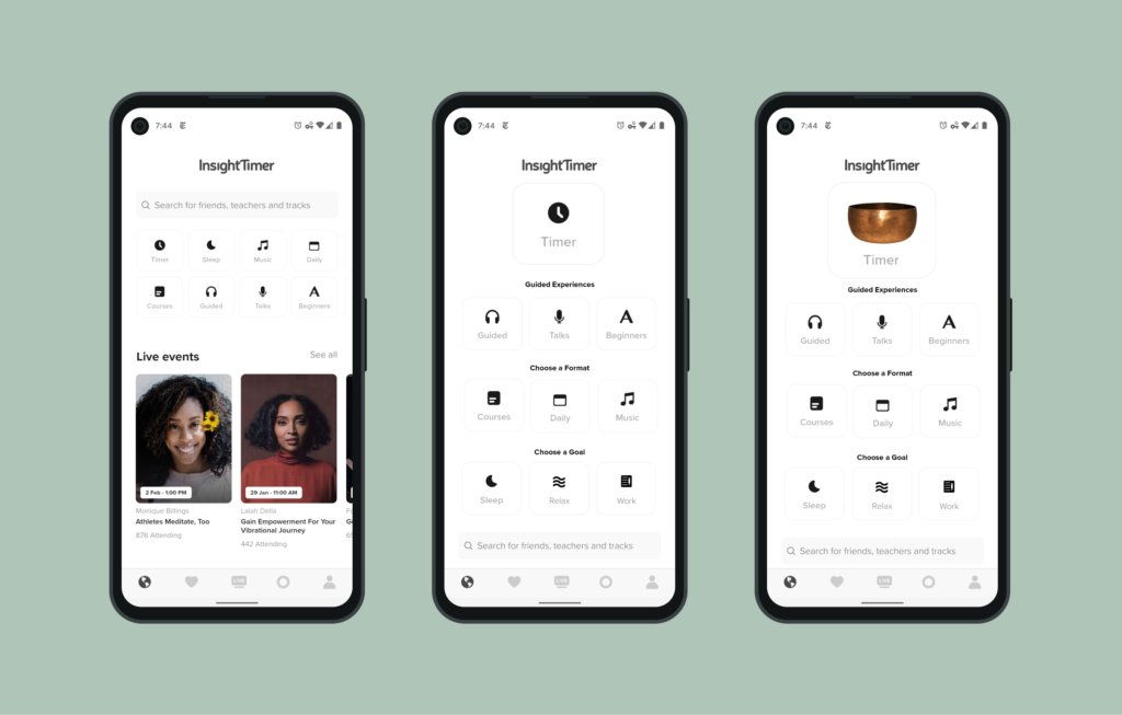
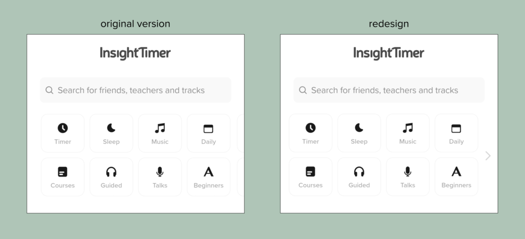
The menu grid above uses simple language and icons to communicate the range of options available within the app. However, it feels a bit disjointed – the menu mixes goals (like Sleep), formats (like Music and Courses), and levels (Beginners). The opening screen offers many options to click on and little direction for where a user should go if they’re unsure where to start. The opening screen could do a better job offering a conceptual model of the offerings of the system at a glance through a stronger visual hierarchy.
In the redesigned mockup below, I’ve emphasized the Timer, the core function of the app, to offer a soft constraint to guide action for a user who isn’t sure what they want to do and guide them to the app’s core function. I’ve also organized the other functions into categories. The search remains at the bottom of the screen as a “backdoor” for experienced users.
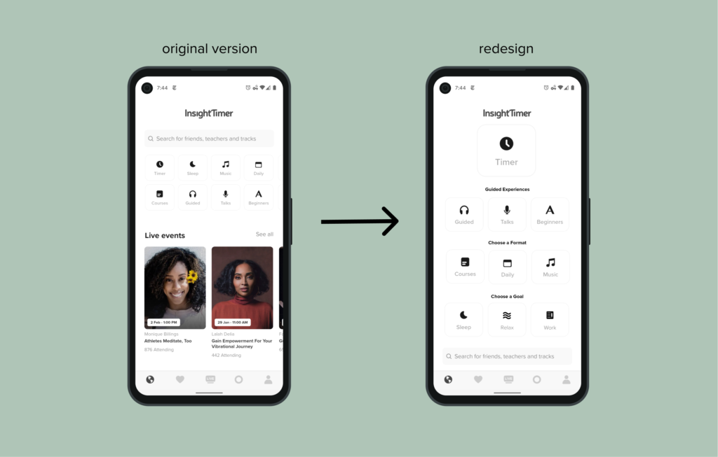
This new version of the screen feels a bit monotonous and bland. The previous version used human faces to add some color in the “Live events” section, which has now moved off the first screen (though it could still be up for discussion whether to make these links available if someone scrolls down).
In the Timer section of the app, Insight Timer uses a number of skeumorphic “bells” representing digital sounds to draw a connection between the app and the real experience of meditating. In this second mockup, I’ve used one of the bells to add a bit more color and to connect more with the memories people may already have of meditating in-person, and create a visual connection with the Timer section of the app for experienced users.
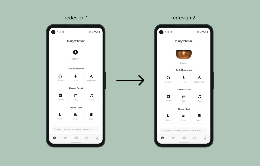
This new version of the starting screen is only a mockup and could benefit from more visual design attention, but I think this added hierarchy could help users get to the meat of the app more quickly, rather than scrolling through options in perpetuity.