Instagram is a social-networking platform where you connect communities with digital contents. With years of iteration, it has advanced many features to cater different user groups and evolved into a marketing and merchandising channel. This design critique will discuss v 172. iOS app version in Asia Pacific as some features may not be available in different regions.
CREATE
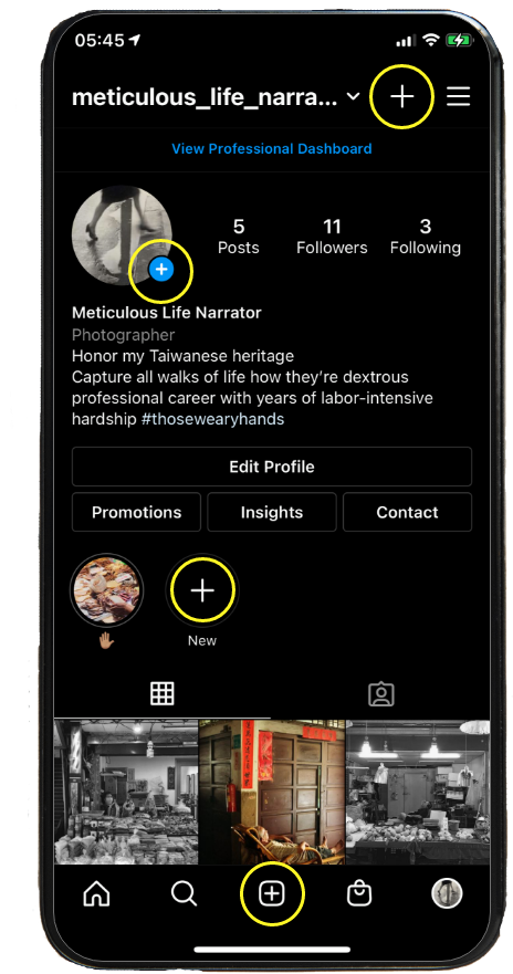
When a user logs into an account page, signifiers for a possible action is discoverable. The four “+” icons communicate that it affords creating function. Each translates similar yet slightly different purposes but with its relative layout you can intuitively navigate which to click in terms of creating a story, posting photos and more, this demonstrates a good natural mapping.
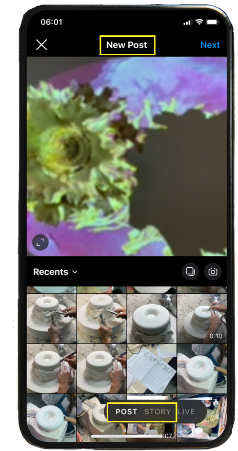
Once you click the button, it gives signifiers to reflect your corresponding action and feedback by bolding the word.
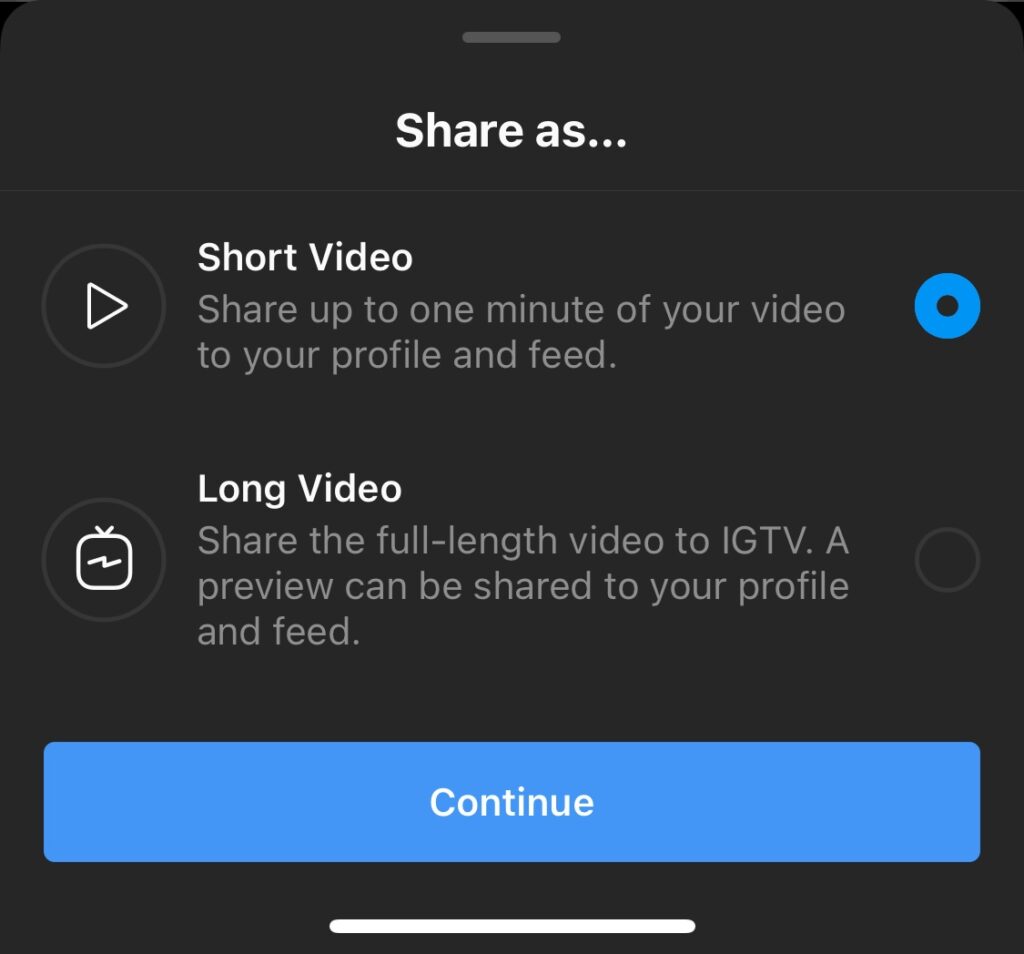
Instagram uses video lengths as a physical constraints to categorize story, video and IGTV.
VIEWING A STORY
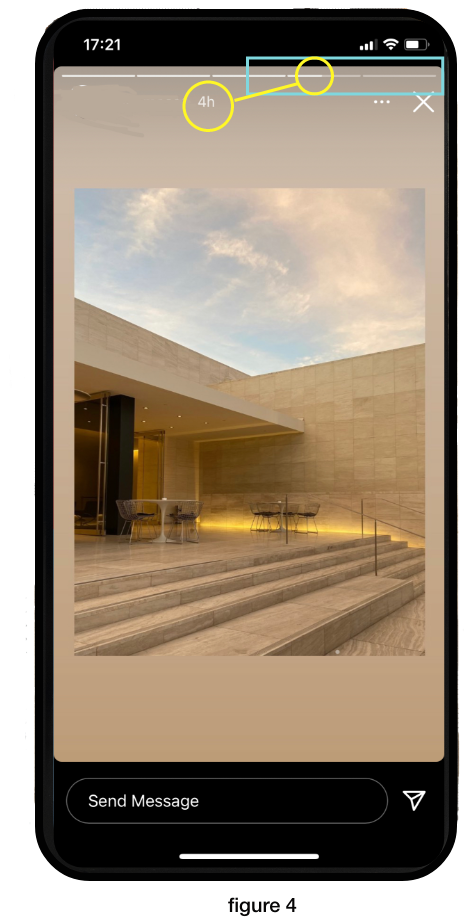
The choice of text direction corresponds to people’s preference for time. The story timeline is following this cultural mapping system; a horizontal chronological order so right is to the future. The time thread signifies users which system status they are, how many more clips left and time of the story (figure 4).
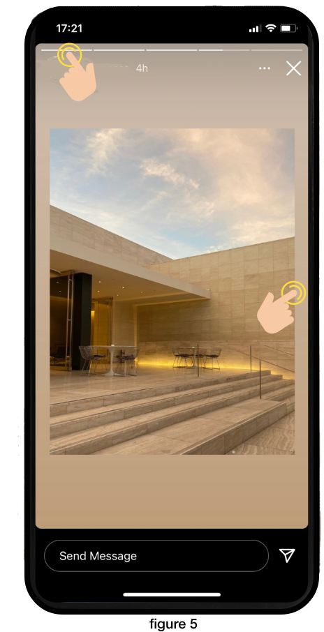
The swipe feature fits in the user’s conceptual model while using a tangible interface. However, a novel user may not know tapping the right and the left screen will succeed a fast forward and backward action since no clear visual clue is provided. An interactive icon as guidance will be a solution (figure 5).
CONTROL
Instagram has many features to assure users have a feeling of control and freedom, you can recall slip actions such as unsend message, delete media and remove followers. Before and after each destructive action, the system will pop out a confirmation message and notify the result. It establishes a responsive connection with users.
SHOP
This feature is relatively new, the recommendation algorithm is based on brands you follow, your activity across Facebook products to personalize relevant ads and content. The image grid design is very similar to Pinterest. However, when you search for a specific item it will result in a list of accounts instead of the item images that you assume. This violates the user’s expectation of an image-heavy conceptual model. An image results like below video as an alternative for a wall of text will be my solution.
CONCLUSION
Instagram successfully captivates user’s attention by deploying Norman’s principle of design: conceptual model, signifiers, feedback and constraints. The intuitive interface design bridges a sound communication with users. An algorithm affords preference feedback and follower count to trigger a user’s visceral response. Overall, instagram has great emotional design.