
Joe & The Juice is a juice bar/coffee shop chain that has over 300 locations in the world. The iOS App was first released in 2019 and is now available in 13 operating countries. With its App, customers are able to make orders, earn points and receive benefits.
ORDER NOW
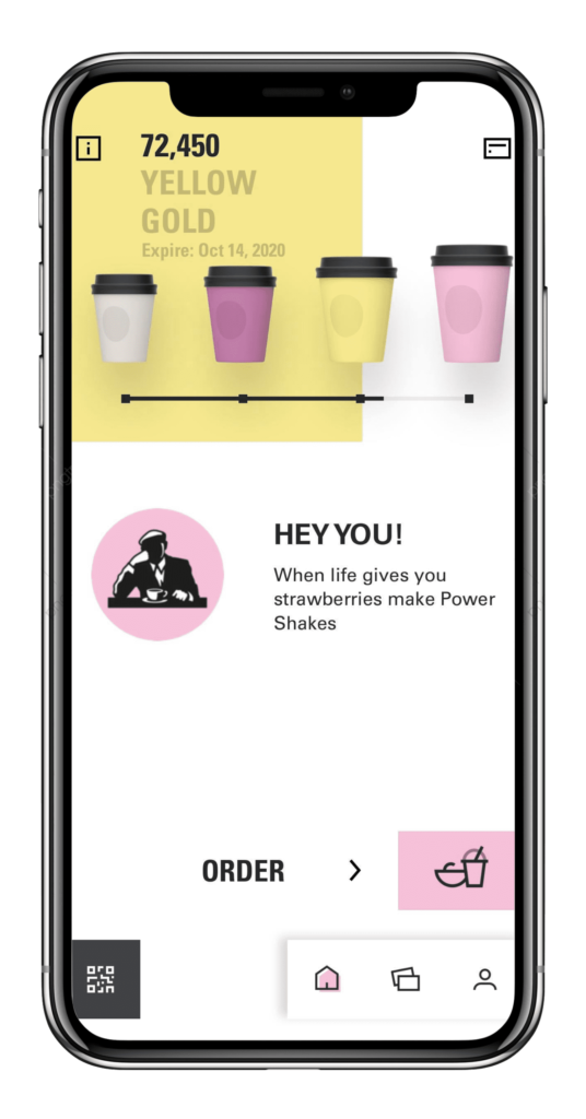
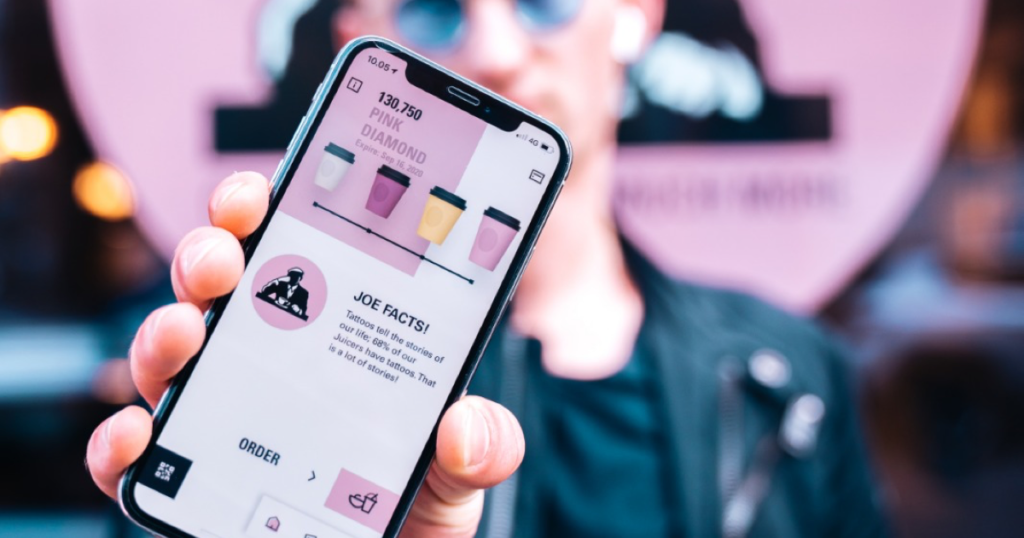
As soon as users open the App, a conspicuous, all-capital written signifier located near the bottom of the homepage will lead them to its primary function: pre-order. Excellent discoverability and affordance are simply achieved by the concise interface of the homepage. After clicking on the icon, users will be introduced to the next steps: select store and order. Stores are ranked according to their distances from the users’ locations. Users also have the option to save their favorite stores for future re-ordering purposes by naturally clicking the “heart” next to the store’s name. This method is frequently seen in other Apps, which follows Norman’s principle of consistency and enhances memorability. The last steps are: review, finalize and checkout. Feedback is provided by allowing users to track the progress of their order and to receive notifications on the ordering status. Such excellent learnability allows first-time users to accomplish a basic task seamlessly.
TIER LEVEL
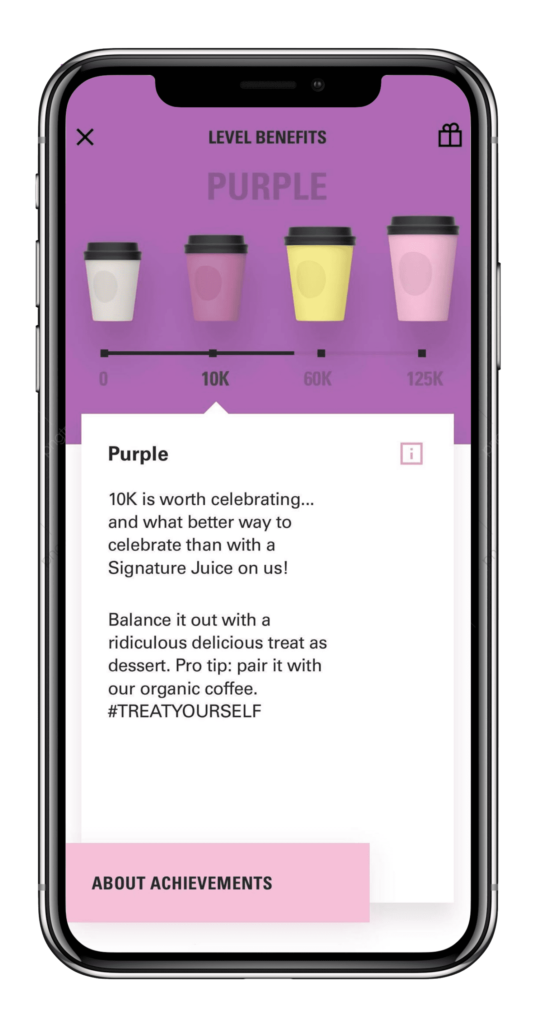
Access to four different tiers will be given once users reach a certain number of points. By mapping four signifiers by their sizes and with numbers below them, it is quite straightforward for users to understand: more purchases = more rewards. Users can also see detailed information regarding the benefits of each tier by simply clicking on the icons. However, information such as points history and qualification period have extremely low discoverabilities. The lack of efficient signifiers limits users’ access to such information. Adding written context and more related icons will increase the discoverabilities of these functions.
LOYALTY CARDS AND MORE
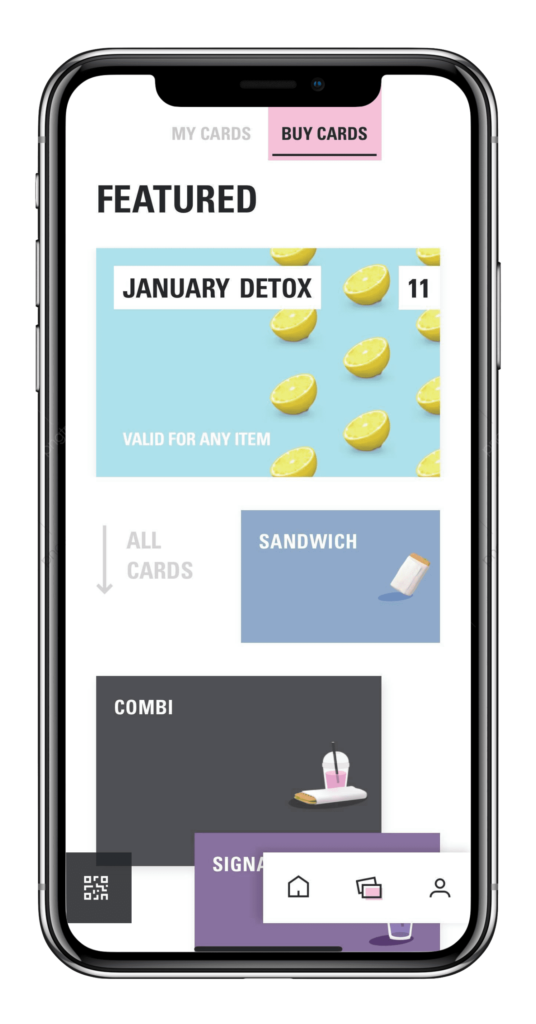
Users also have the option to purchase loyalty cards, which are pre-paid vouchers that can be redeemed for ten items. Although it’s an outstanding way to engage customers and maintain the company’s brand loyalty, the affordance of this design needs to be improved, for users cannot effortlessly understand what a loyalty card is and what it provides. No clear guidance was found to demonstrate the purpose of the loyalty card. Concise written languages are encouraged to explain how it is supposed to be used.