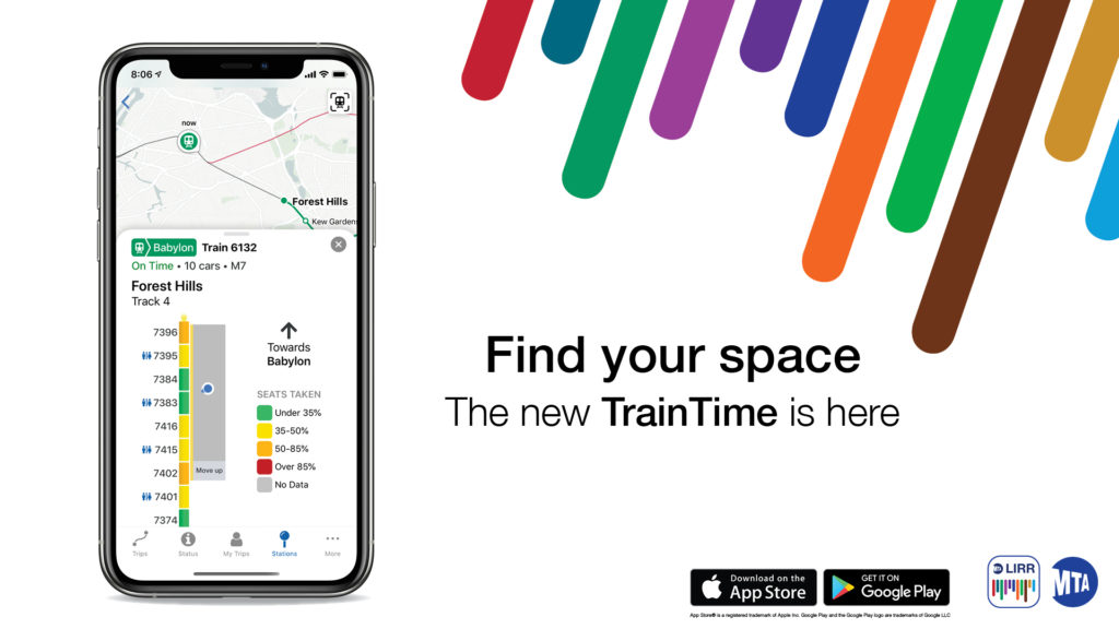
The Metropolitan Transportation Authority is North America’s largest transportation network, serving a population of 15.3 million people in the 5,000-square-mile area fanning out from New York City through Long Island, southeastern New York State, and Connecticut. In 2020, MTA updated their Train Time App of both LIRR(Long Island Railroad) and MNR(Metro-North Railroad) to improve their riding experiences. Users could check the train time, the service status, station information, their own trips, etc in this App. MTA built the ticket buying App called “eTix” separately, which is still in the old version.
Selecting Station and Time
Good Performance
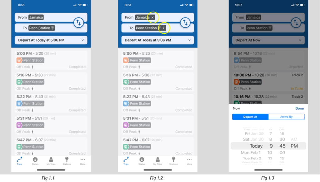
On the top blue background area in the App (Fig1.1), there are good signifiers “From”, “to”, “Depart At”, these signifiers provide a clear clue to users what the information of train time below.
On the button of Depart At (Fig1.1), there is an arrow on the right side, that is an effective affordance that helps users know they could tap it and information will show up below. After tap the “Depart At” button, the time changing area shows up on the bottom. The feedback is immediate. The design of the area of date and time is like a roller(Fig1.3), that affords users to scroll. During scrolling, when changing succeed, users will hear a mechanical sound effect. The feedback is effective to make users ensure that time and date are changed successfully.
Problem
There is no effective affordance on the button “From” and “To”, which allow users to know they could tap the button directly(Fig1.1). However, users might tap it, because the style of these two buttons is the same as the “Depart At” button. The conceptual model works a little here that allows users to assume. However, conjecture is not user-friendly to the information navigation application.
Solution
Adding a signifier on the “station” black graphics is similar to the “receiver” bar in the email. The “X” graphic will provide a clue that users could change the station. When the users tap the “x” area (Fig1.2), they actually tap the whole button. The “x” works as a signifier will mitigate users’ cognitive process.
The Mode of Button
Good performance
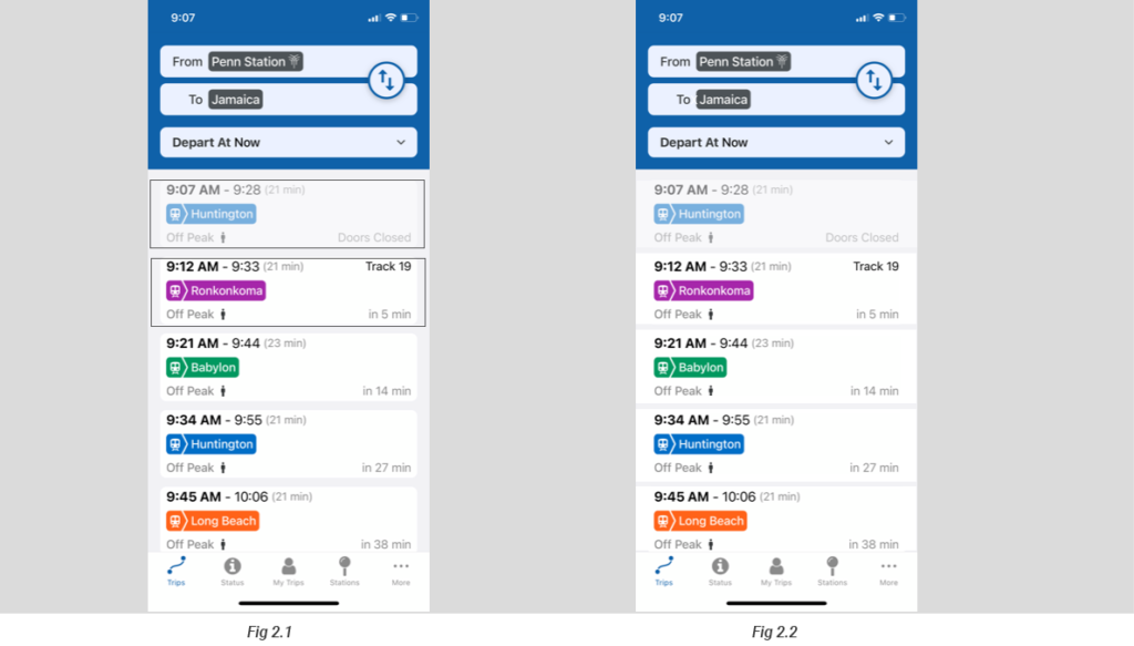
There are two modes of the button in the App(Fig 2.1), the button shows bright white color means the incomplete status, which means the train does not arrive or depart. The grey color means complete status including train door closed, departed, finish the trip. The two different colors of the button provide a correct conceptual model to users, that is fadeout (color change from white to grey) means inactive. On the side of information delivery, it is effective that users will directly know which train is the latest one that should be the top one of the white button.
Problem
It might be a minor problem. I use the word “button” instead of the information section or box. Because each white box actually works as a button’s function that allows users to tap and go to another relative information page. Also, the design implies a conceptual model, they are buttons. However, there is a conflict that exists. Button fade out to grey color, which the information present on the button expired (inactive), but the function of the button is still active. That makes a constraint, users might not consider the information box could be tapped. At this moment, the button loses its tapping function. Or, users might consider when the button turns to grey, the tapping function of the button changes to inactive as well. Actually, it is not. That is the issue of the conceptual model.
Solution
In order to fix the conflict about the conceptual model. The easiest way is to eliminate the button appearance (Fig 2.2), it is not necessary to look like a button at the same time present the information. Once eliminated the button appearance, there is only one attribute of the information box that is showing the train information. Users tap it to see more information without considering the button’s attribute(on or off). Adding an arrow as a signifier that helps users to tap to see more information.
The Usage of Color
Good Performace
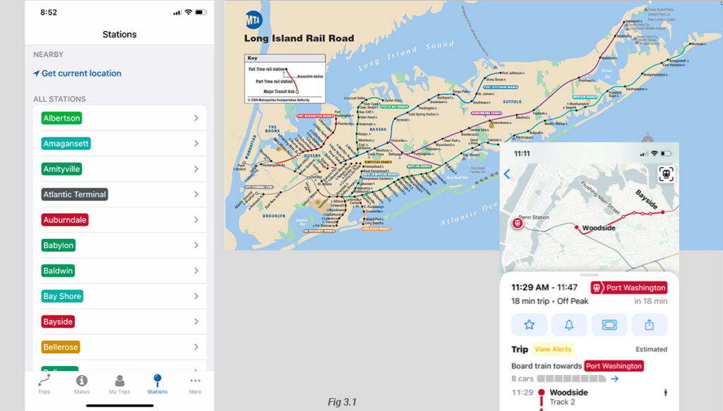
Each line has a unique color, There are a total of twelve lines in LIRR, so there are twelve different colors. The color is a good signifier, which supports users to do a quick review. Also, distinguish each line without the need of reading the word, which reduces the chance users will do the mistake, for example selecting the wrong line. Moreover, it enhances users’ memory that means users could check the route on the map according to the color. They do not need to remember every specific location of stations to construct the route in the mind. The color here is an effective constraint, which helps users to see the route information clearly and remember the route in general. It mitigates users’ memory loading.
The Usage of Icon
Good Performace
The bottom static navigation bar of the app has good discoverability(Fig4.1). The words and icons on each button are straightforward, users could know the content of each page very quickly. When users go to the Trips page, both icon and word on the button turn to blue(Fig4.2), which makes users clearly notice which page they go to.
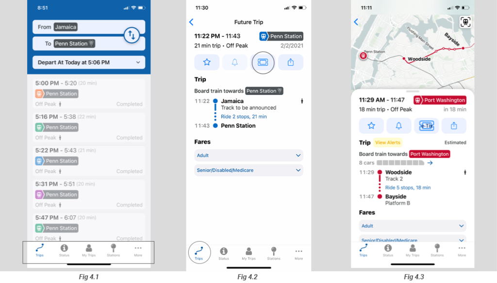
Problem
On the train riding information page, there are four icons that apply to four buttons. There is no word attaches to the icon(Fig4.2). The signifier failed in this situation. Users do not understand what exactly function they are. The third icon means e-ticket, no one will know that until they tap it.
Solution
It is easy to fix these failure signifiers. Adding the appropriate word under the icon provides a clear signifier.(Fig4.3)
Switch to the E-ticket App
Problem
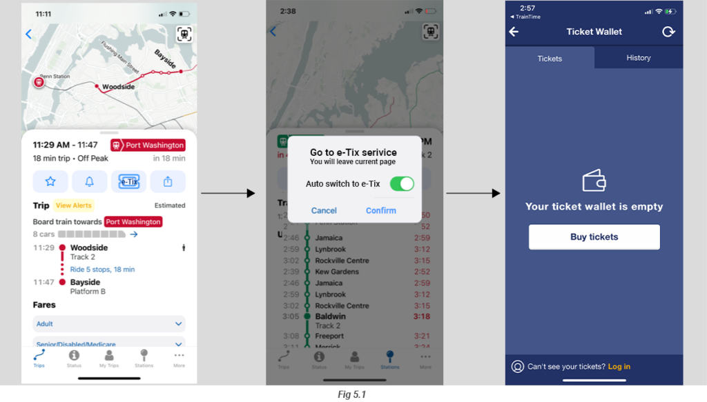
What I mentioned above, the failure of the e-ticket signifier makes users assure what it is. Users need to tap it to explore, however, this button will directly switch to the buying e-ticket App that is a separate app. When users just want to explore what the icon means, it will leave the TrainTime App by tapping the e-ticket button accidentally. At this time, users need to take extra actions to back to the TrainTime App. That is an error.
Solution
After fixing the e-ticket signifier, users will know it is a button to go to the buying e-ticket function. Some users might not know the e-ticket service section is a separate app. When users tap the e-ticket button, there should be a window(Fig5.1) pop up to tell the users that they will go to another app means they will leave the TrainTime app. When users cancel it, they could still stay on the current page. Adding the ignore option allow users, who are familiar with MTA TrainTime and Ticket Buying App, to switch between them automatically.