Introduction
NPR One is an audio app that connects users to a stream of public radio news, stories, and podcasts from NPR and local stations.
For this critique, I will apply concepts from Don Normans’ The Design of Everyday Things to examine the digital interface of the v1.12.0 version of the NPR One app on an iPhone 8.
Streaming
The NPR One interface to support the user task of starting a NPR stream is well designed due to discoverability and understanding.
The application’s home screen prominently featuring a “Play” button, a clear signifier that is supported by text that invites users to “Start Listening to NPR One” (Figure 1).
Pressing play offers immediate feedback as an audio announcement alerts the user that “You are Listening to NPR” as a corresponding screen invites a user to set their local station. If no action is immediately taken, the news stream automatically begins and the interface updates to the “Listen” page, which offers program details and streaming controls.
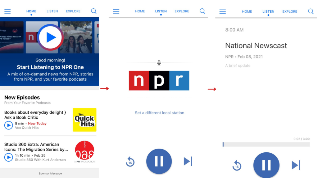
For the most part, the streaming controls are well designed as they fit a user’s existing conceptual model for standard audiovisual controls:
- A bar maps a stories progress from left to right.
- The center play button doubles as a pause button.
- The center Play/Pause button is flanked by two opposing buttons that move the story backward or forward.
The mapping of the controls adheres to the cultural constraint: left is the past and the right is the future. By fitting a user’s conceptual model, the interface supports user’s understanding of the streaming controls with no learning time required for new users.
Skipping
Therefore, skipping a story that does not interest the user is a perceivable affordance: the user simply presses the “Next” button until they land upon a story they want to hear.
However, what happens when a user slips, and accidentally presses next on a story they wanted to stream? Currently, nothing.
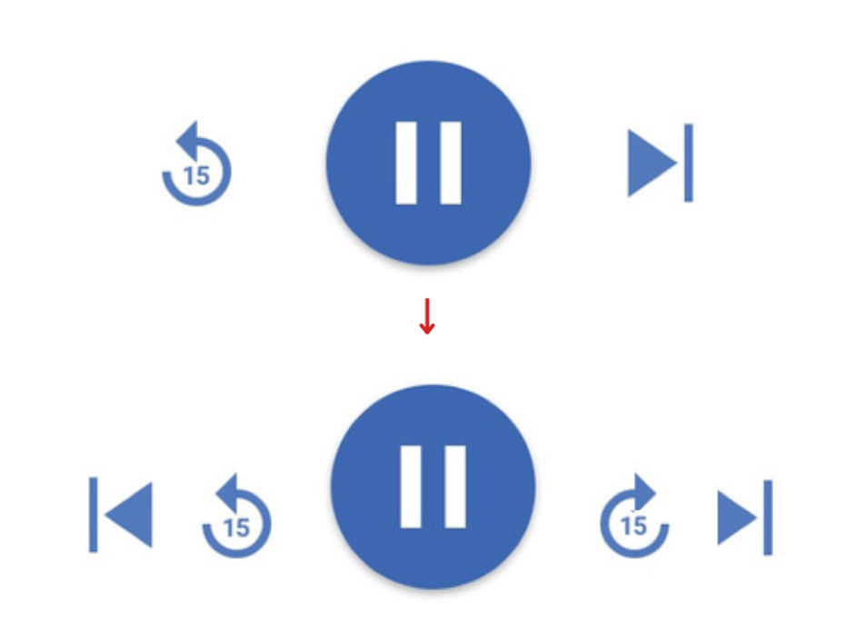
The streaming controls require humans to be precise and accurate offering no affordances to “go back,” only rewinding within the current story.
To remedy, I propose adding a back button to the left of the rewind button. This would effectively add an “undo” for user slips (Figure 2).
Bookmarking
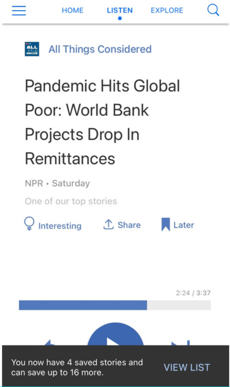
The “Listen” page controls utilize another universal design element, the bookmark icon, to communicate an affordance of saving a story for future reference.
Although immediate feedback in the form of a pop-up bar offers confirmation that a story has been successfully bookmarked (Figure 3), a user re-opening the application to re-find a previously bookmarked story faces the gulf of execution.
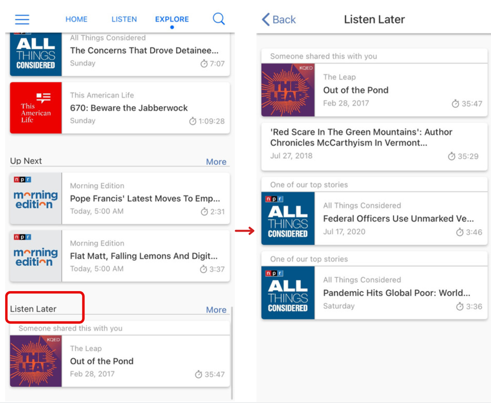
Currently, the application does not offer any bridges to users seeking to re-find bookmarked stories or stories previously listened to. The only option is to exhaust all the physical constraints of the application. For the NPR One application, this requires scanning all navigable elements: the sidebar menu, Home Page, Listen Page, and Explore Page (Figure 4).
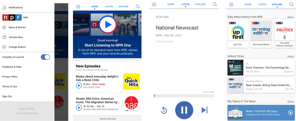
Bookmarked stories are only found after all other alternatives are exhausted, at the bottom of the Explore page under the title “Listen Later” (Figure 5).
Designing for Re-finding
In order to bridge the gulf of execution for a user seeking to re-find stories bookmarked, previously started, listened to, or accidentally skipped, NPR One must provide feedforward information that better adheres to a user’s conceptual model and expectations of consistency in experience.
“Finish Listening” is featured second on the Home page for users to pick up stories started but left unfinished. However, while a user’s listening history and bookmarked stories are buried below several other headings inviting users to discover new, previously unheard content (Figure 6).
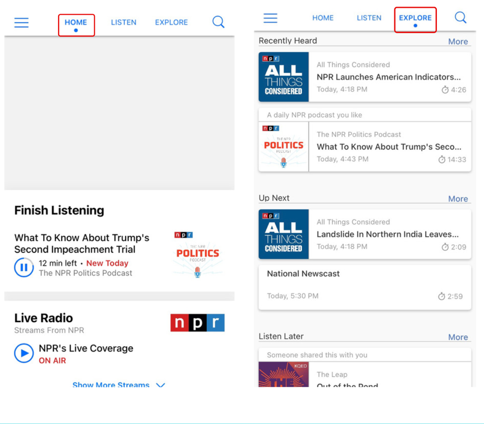
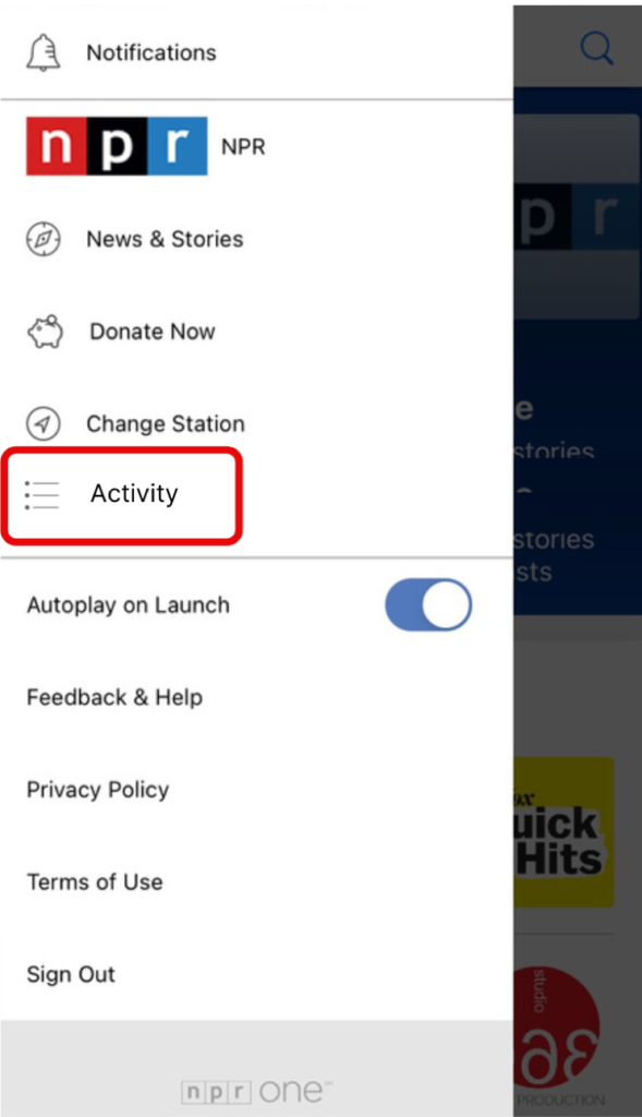
Therefore, the simplest design solution would be to group all listening activity – unfinished, previously listened to, and saved – on the Home page to aid consistency and discoverability. Another, option would be adding a new navigation accessible from the side-bar navigation named “Activity” to make re-finding tasks more easily discoverable (Figure 7).
As Don Norman warns in The Design of Everyday Things, an affordance is not functional unless it is discoverable.
