PhonePe is one of India’s most used digital wallets apps that allow the use of UPI, credit card and debit card or wallet to recharge mobile phone, pay all utility bills and also make instant payments at offline and online stores. It also provides a platform to invest in mutual funds and buy insurance products.
Getting started
Initial login is based on a standard format that provides the users with explicit design cues to derive how to perform the task based on the concept of knowledge in the world. It gathers the basic details from the users such as their name, contact details, bank account details for future payments and preferred language.
Content on home page
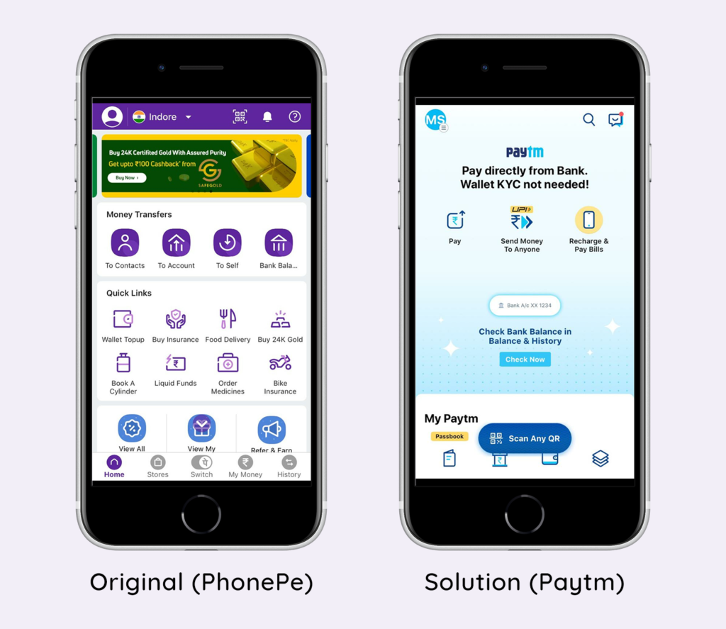
After launching the app, as the first screen you are greeted with is too cluttered and presents a truckload of options, many of which are avoidable, it creates a poor user experience, making the user overwhelmed with options and not a clear path. This reduces the discoverability as it makes it difficult to figure out all the possible actions of contents at first.
Solution
PhonePe has laid out all the possible second-level options on the top-level itself. It would make the experience much better if the home page had just one button for “Recharge & Pay Bills”, after which the user can choose the type of payment instead of having to go through so many secondary options on the first screen. Example: Paytm app which is a competitor of PhonePe has only provided the key features on the home page as the top priority as shown in figure 1.
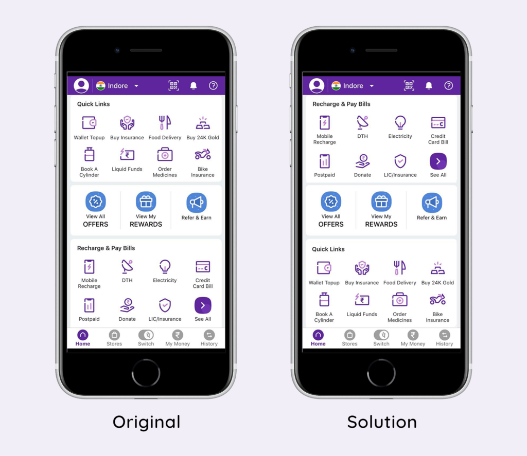
As the position of a feature plays a great role in its discoverability, a good conceptual model allows predicting the effect of our actions. When you scroll down on the screen, you see some of the key features of the app under ‘Recharge & Pay Bills’, which could easily replace the features above under ‘Quick Links’ in terms of order & preference as shown in figure 2.
Solution
Exploring options
The 5 labels and icons created for different categories (home, stores, Phonepe switch, my money and history) on the bottom remain visible, as the user browse through each of them which gives a fairly balanced visibility to enhance the navigation during the Gulf of Execution.
Feedback
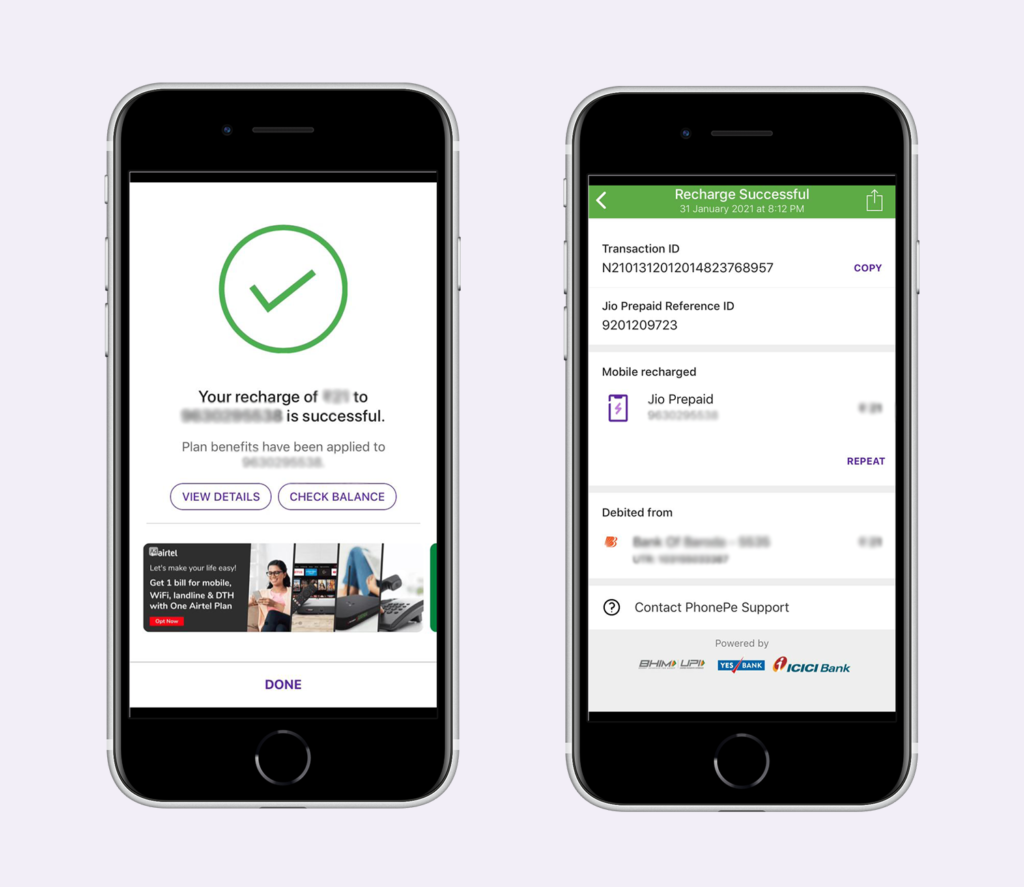
When the user selects a particular option, the app immediately provides the feedback as it moves to the next step. On completion of the task, it indicates clearly that the action was performed bridging the Gulf of Evaluation. For example, the user gets a confirmation along with a receipt available in the history page on recharging the mobile data as shown in figure 3.
Final thoughts
In conclusion, instead of exposing the user to a volume of options, the app should focus on providing more filtered choices for the users at any given point with 2-3 levels of navigation. All the features in the app can be categorized into Primary and Secondary features.
Once the user’s mental model has developed through interaction with the system image, the app definitely gives a good experience in terms of the signifiers that clearly indicate the clues for the operation along with communicating the results of the actions back to the user with feedback.