
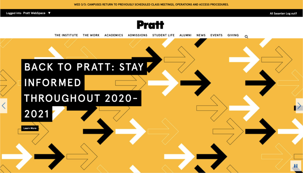
Pratt.edu is the official website for Pratt institute through which all of the information necessary for students can be accessible. Processes such as registration, accessing bills, accessing MyPratt, OnePratt, and etc. is available through this portal which makes it a vital element through every student’s collegiate career at Pratt.
Now in order to assess this website, I decided to define an objective that is to be achieved using the website and critique the factors that are in work using Norman’s fundamental design principles.
My defined objective throughout the process is to find and use the MyPratt feature on the app and analyze ways in which this process could be made easier.
Stage 1
My first instinct in trying to find a possible option often starts by testing out the main buttons provided at the top of the website. For finding MyPratt, I assumed that this option could be placed under Academics, or Student life, considering that it is either related to my student life considering that I can pay the bills through the app, or academics considering that I am already an enrolled student at Pratt institute and any academic features should be listed under Academics page.
Clicking on Student life, takes me to a page that has no mention of MyPratt and focuses mainly on marketing the student life at Pratt for students that are thinking about applying to Pratt rather than current students which I consider to be a mapping flaw.
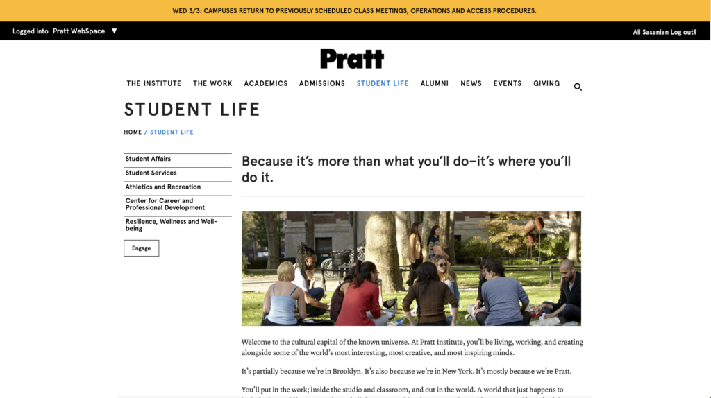
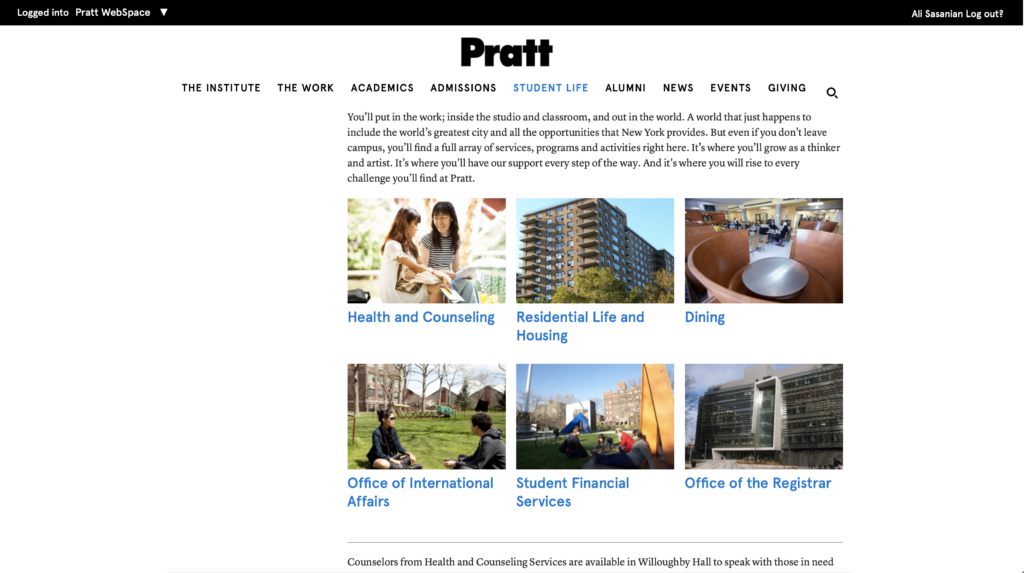
Related content and topics should be listed in relation to one another to prevent unnecessary repetition and confusion for the user. Providing a “Current students” tab could highlight the difference between marketing material for future students and vital material for current students which is a big problem here.
Stage 2
Clicking on Academics, takes me to another page that has the list of possible programs and schools at Pratt and considering that I am in the school of information, I proceeded to click on “School of information” but that also took me to a page that had no mention or relation to MyPratt and was again design to cater to the individual thinking of applying for Pratt rather than current students.
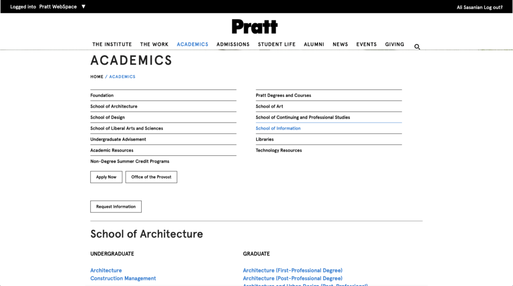
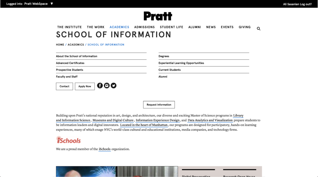
This indicates a major flaw in the discoverability of a most important feature (MyPratt) on the website that is almost the only function a current student at Pratt could be looking for on this website. As well as issues of affordance considering that after clicking on school of information, I expected an interaction with all the necessary tools for a current student within the school of information however I did not find that to be true due to all the information targeting future students and those thinking to apply for the program.
This could be handled better by allowing drop down lists to show up while scrolling over the main navigation buttons to allow for further exploration of options without having to click on them and not finding what you look for and having to move backwards again to only test out another possible option that will disappoint you as well.
Also, providing a choice that would tailor the visible options to a current student or a future student could help simplify a lot of these problems in the future. School of information could provide a set of available actions for current students that are looking to find a specific function which would greatly improve the state of signifiers used within the school of information page.
Considering that MyPratt is a vital tool for current students, it could also be great if it was placed in the main navigation bar replacing vague buttons such as “The Work” or “student life” which could both be placed under the “admissions” drop down list.
Stage 3
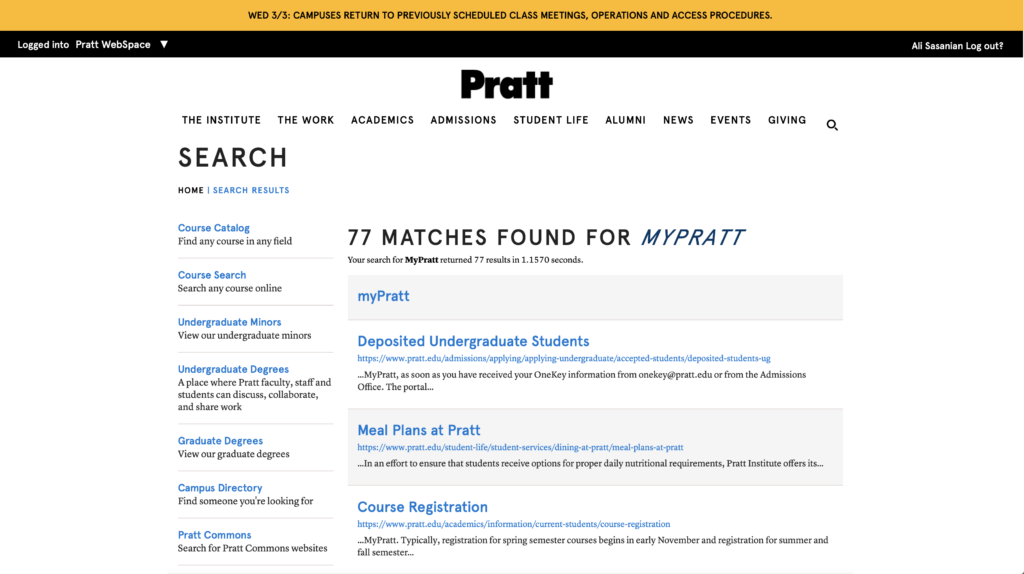
At this point, I have yet not managed to find the MyPratt key, so my third option was to look up “MyPratt” through the search function which oddly enough found no proper mention of MyPratt for me to click on which is an outstanding issue of discoverability and mapping considering that the search algorithm cannot reach or find a page placed deep within the website.
Stage 4
At this point, I have yet not managed to find the MyPratt key, so my third option was to look up “MyPratt” through the search function which oddly enough found no proper mention of MyPratt for me to click on which is an outstanding issue of discoverability and mapping considering that the search algorithm cannot reach or find a page placed deep within the website.
Pages should be linked properly throughout the process of designing the website to ensure that any search activity or web tracing could be performed flawlessly.
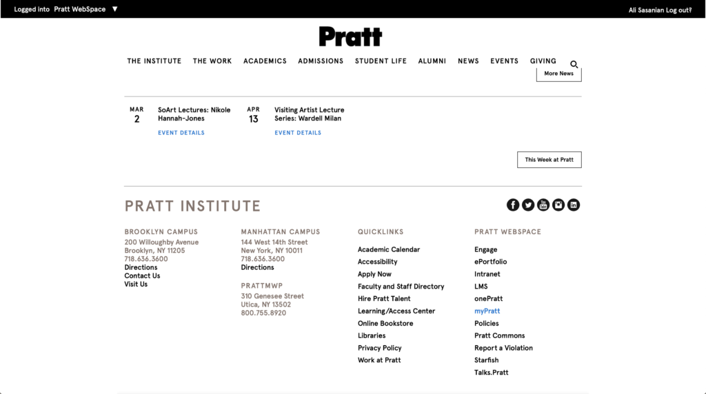
In the final step, considering my previous experience with badly designed websites, I scrolled all the way to the bottom to maybe find the MyPratt button down there, and finally did come across the MyPratt button.
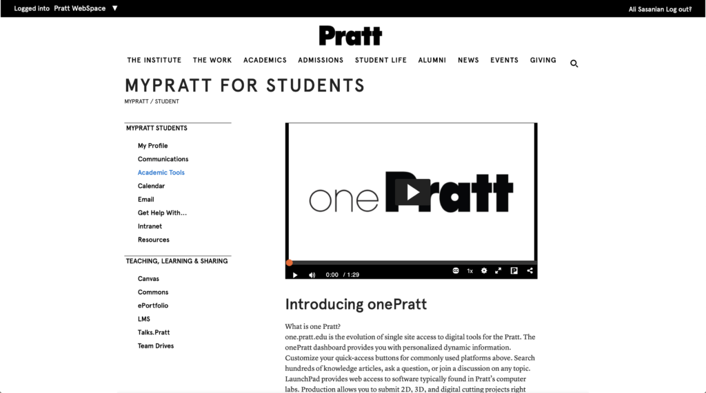
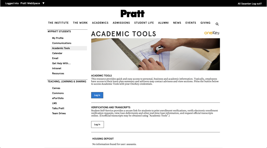
By clicking on the MyPratt button, I was redirected to a webpage that had a list of available actions on the left-hand side and continued by pressing on to the “Academic tools” button that was available.
After clicking on academic tools, I can see a “Login” button although I can also see that I am already logged into something considering that on the top right corner I have the “logout?” button available but I still continued by pressing the “Login” button. This was also an outstanding flaw of feedback considering that I had a login button available while being shown that I’m already logged into something.
This could be easily prevented if every firewall and login system could be harmonized to recognize an authorized user throughout their use of the website without asking to login again while the user has already logged in.
Clicking on “login” took me to another page that had no login features but again, had another “login” button.
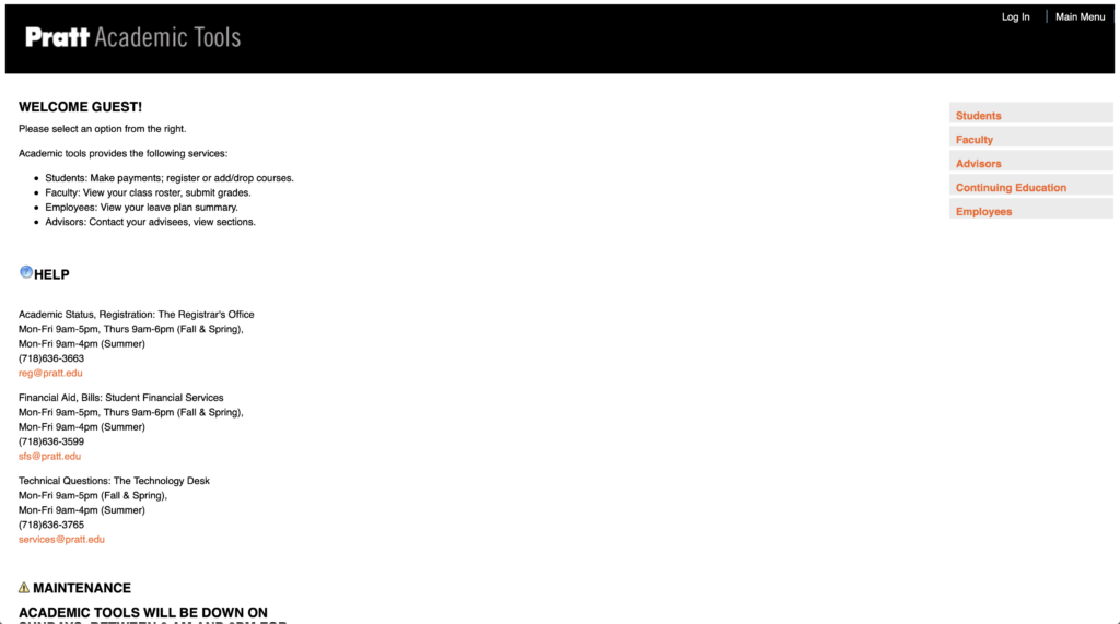
It is okay to have multiple login pages only if the user was also made aware that there are different login credentials, however, this login uses the same login credentials as the previous login which makes this button and action redundant and confusing.
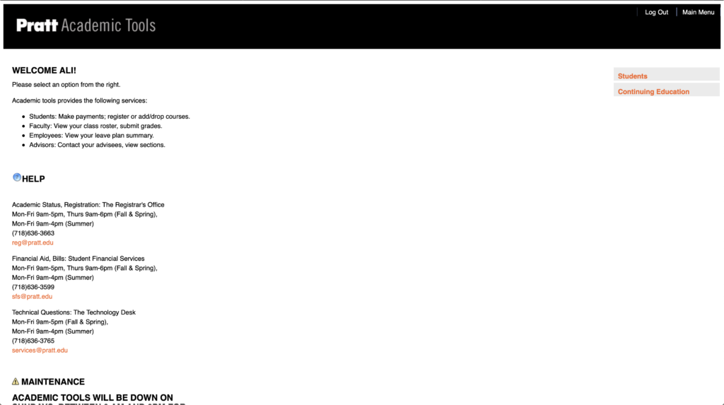
I continued to press on the “login” button and after reloading the same page only with less option, which was odd at first considering that often logging in to a portal would give you more options rather than less option.
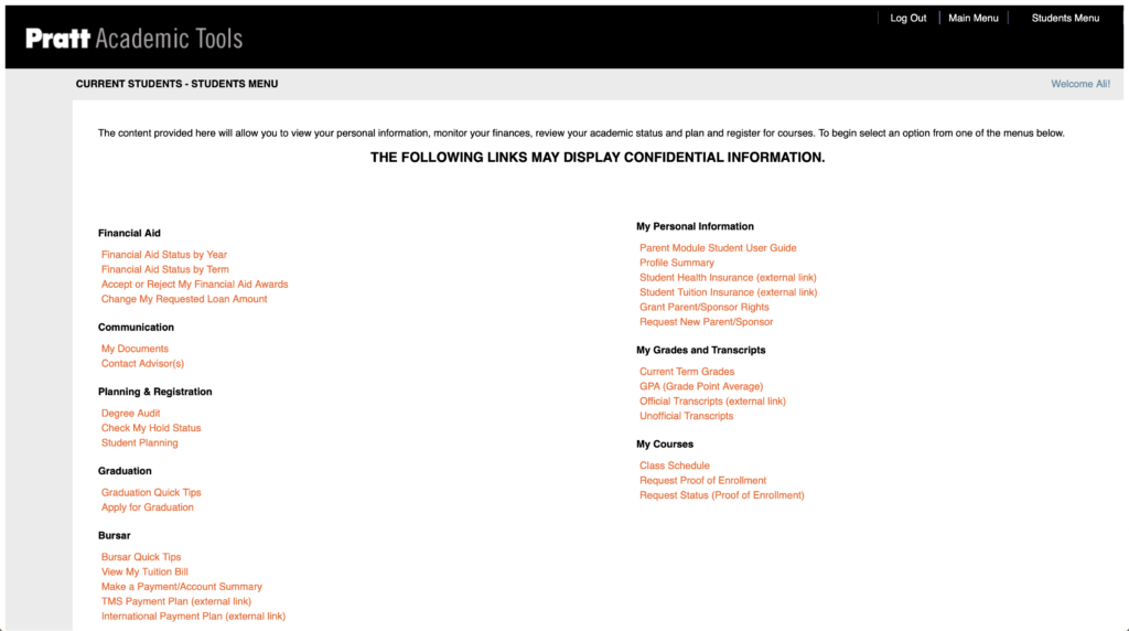
By proceeding to click on “Student”, I finally got to the page I was trying to find which is a portal through which you can pay your bills, check your class schedules, register for classes, and do almost anything that matters regarding your educational programming.
This was indeed a critical analysis of the Pratt.edu website through the eyes of an student, however, to mention a positive aspect, I should highlight that once I was also an individual that was looking to explore different programs and options at Pratt Institute and their website that is tailored for marketing purposes made it unbelievably easy for me to assess my options and learn about the services they provide which was a great factor considering that a institute such as MIT has a website that is tailored specifically to serve their current students and lacks the ability to cohesively help you with admissions and available programs assessment.
I believe Pratt.edu could greatly benefit from creating a balance in their design approach to allow for current students, and future students to benefit from their services and easily navigate finding the answers they are looking for on this website. As Don Norman believes, a website should be functional, intuitive, and easy-to-use.