
The Robinhood App allows users to invest in stocks, options and ETFs without having to pay commission to a broker. It is geared to millennial users and those who are new to investing in stocks, options, and ETFs. The purpose of the app is to simplify the process of trading.
Interface of App
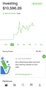
On the interface of the app once you login, there are 5 tabs that you can choose from to see information about your Robinhood account. The discoverability of the tabs are very easy and not hard to find. The 5 tabs are Dashboard, Cash Management, Search, Messages, and Profile. Each of these tabs have icons that are signifiers of what each tab does. The Dashboard tab has a chart icon which users will know they will receive a report on their stocks. The Cash Management tab has a wallet icon which a user can know that’s where they can manage their money. The Search tab has a magnifying glass icon which is a most common signifier for anything search related. The Messages tab has a chat icon which is also a most common signifier to know there’s a chat/message feature. And, lastly there is a Profile tab which has a most common signifier too such as an icon of a person. These signifiers can also be related to knowledge in users’ heads if it reminds them of commonly used features and icons on other devices or applications.
The only problem I see is for those who may not be familiar with devices or apps that use the same signifiers may not know what each tab is for.
Solution: The tabs can have the names associated with the icons. For example, the Dashboard icon can have the word “Dashboard” underneath it. The same method can be applied to the other tabs.
Colors of Stock Prices
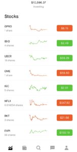
When users look at the stock prices, it has two colors either red or green. Red let’s the user know the stock is down and green let’s the user know the stock is up. These two colors are also most commonly used signifiers to note when something is good or bad. I would consider this as natural mapping as well because it doesn’t take too much thought for a user to identify and translate via the colors that when the stock is green, it equals good and that the stock is up and when it is red, it equals bad and the stock is down.
I believe there can be other signifiers of when a stock is up or down.
Solution: Adding up and down arrows next to the price when a stock is up or down. This will afford two different ways of a person identifying when a stock is up or down.
Messages
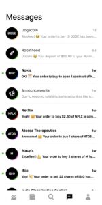
On the message page, it provides feedback when someone purchases a stock, transfer or withdrawal funds, and updates of what’s happening in the app. You will see an alert notification on your phone and in your email that there is a new message once the transaction is completed.
I do believe with messages feature it should allow you to chat with a representative if you have any questions about the transaction made. It only seems as if the communication is one way.
Solution: Creating an option to send messages because for some users the knowledge in users’ mind will believe that they can send messages too.