Shake Shack is an American fast food restaurant founded in 2004. It’s main focus is on selling burgers, hot dogs, fries, shakes, beer & wine. It started as a NYC based restaurant, and it has managed to expand to over 14 countries through a total of 275 locations.
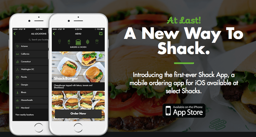
The mobile app was developed on 2016 for only in-store pick up. By ordering through the app, customers can qualify for benefits, points and special promotions for registered customers.
To start out
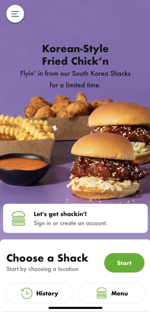
On the home page of the app, users are presented with two signifiers that will take them to ordering via 2 different methods; they can sign in to their account or they can select a location and proceed as a guest.
The benefit of signing in to you account is that users can collect points, obtain rewards and if desired, all of personal information is saved. As a guest, it can seem to be a much faster procedure but no loyalty rewards can be obtain and all personal information has to be input when checking out.
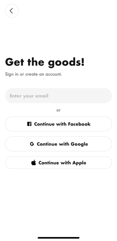
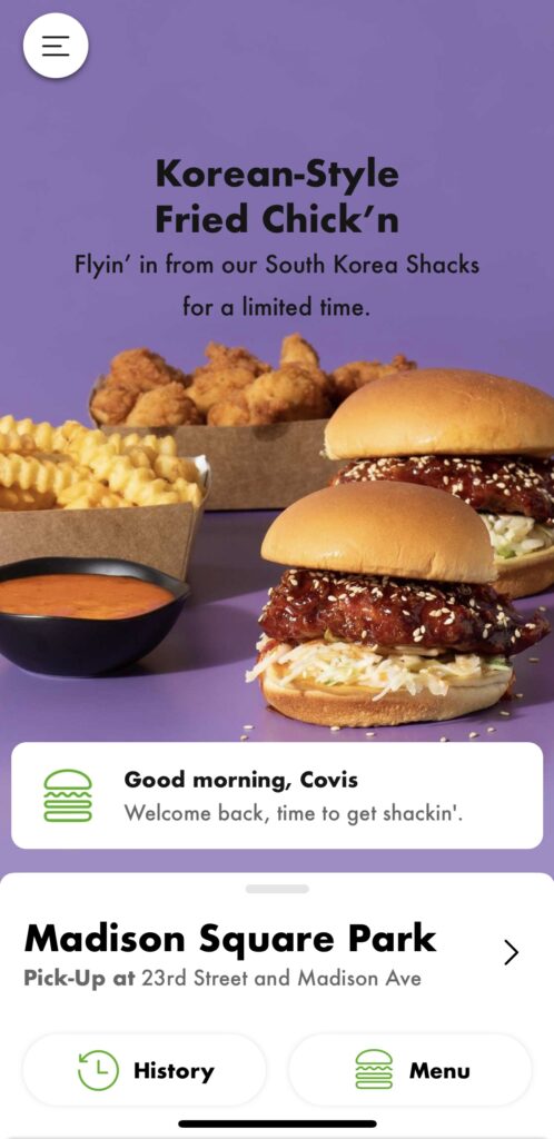
I will proceed to log into my account. Different ways of logging in are presented in a clear format. Once user logs in, favorite store or store you visit more often is automatically selected to proceed and place order.
After sining in, the home page interface has changed somehow. User’s name and location can be noted at the bottom of the page. Which clearly states that you are signed in to your account.
It is clear at the bottom of the page that in order to proceed with ordering, users have to click on menu or history in case they want to order something they previously have. This speeds up the process of customers to check out, and is a quick and efficient way of remembering customers favorites.
Ordering
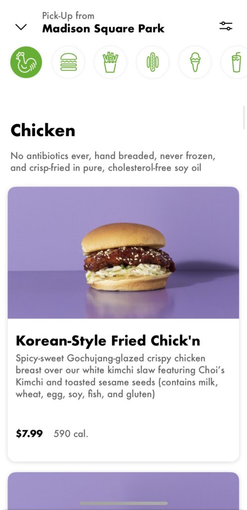
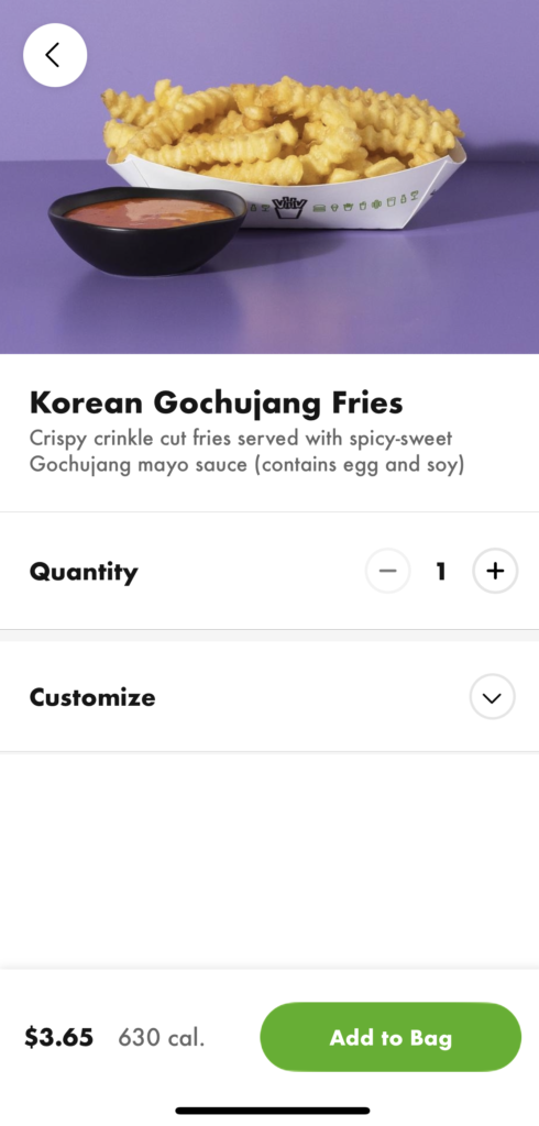
After clicking on “menu”, through clear signifiers users can find the type of food they are looking for. It has a minimalistic look; no more information than needed is presented. Menu has brief description but places more focus on the images which facilitates users for decision making as it gives a visual that is easily interpreted.
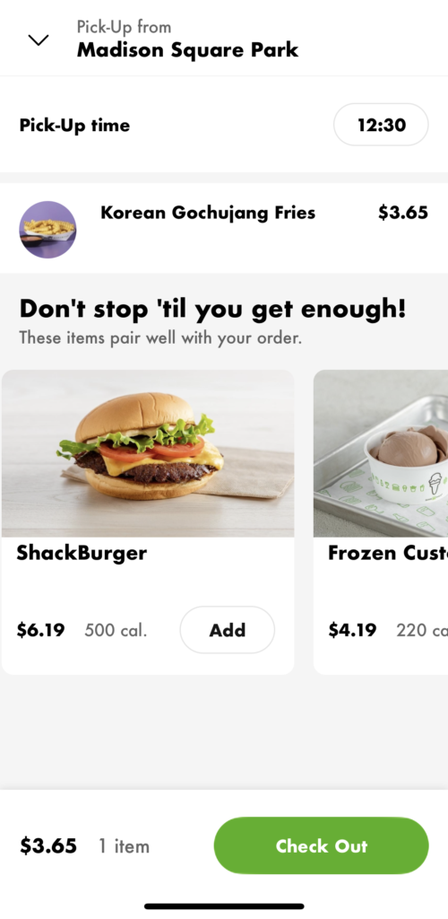
To order, customers click on desired product’s image, select quantity and add any customization noted. At the bottom of the page, a big green button is clearly legible and reads “Add to Bag”. After clicking and finish adding all desired products, a big, green “Check Out” button is presented making it clear for users how to move on to the next step.
All orders placed trought Shake Shack’s app are meant to be picked up; ASAP or any desired time (within store working hours) can be selected. A last look at location is shown just to confirm correct store has been selected, and based on users order history or most popular items that go with your order, Shake Shack presents users with some suggestions.
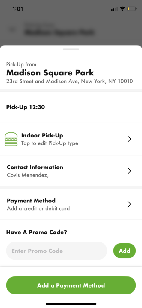
Checking Out
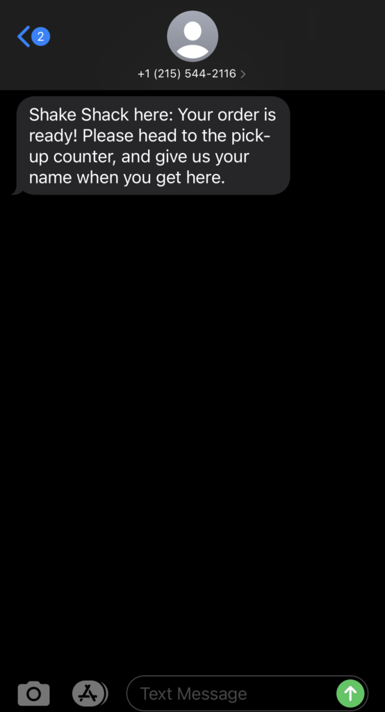
Lastly, a quick glance at users order is shown. Contact confirmation is shown and payment method is added. At the bottom of the page a “pay $1.00” can be seen, which make sit clear for customers to know the next step is placing order. After clicking, a confirmation number is given with an ETA. Once order is ready, Shake Shack will text users to let them know their order is ready for pick up.
Conclusion
Shack Shak App does a great job at targeting any type of customers. It is self explanatory, all buttons are clearly mark which make sit easy for customers to move forward. The simple design with a lot of visual content facilitates and speeds up the whole ordering process. New users will not feel overwhelmed as only needed information is provided. Design is minimalistic and has a pleasant aesthetic look that smoothly flows.
The app designers understand that the user want is fast and simple. They make sure to provide the same experience as the in-store ordering; no complicated menus. Design in general is effective, has the users best interest and fulfills its goal.