Starbucks is the world’s largest multinational chain of coffee shops. Starbuck’s iOS mobile application features mainly include allowing users to find stores, redeem offers and order.
Homepage
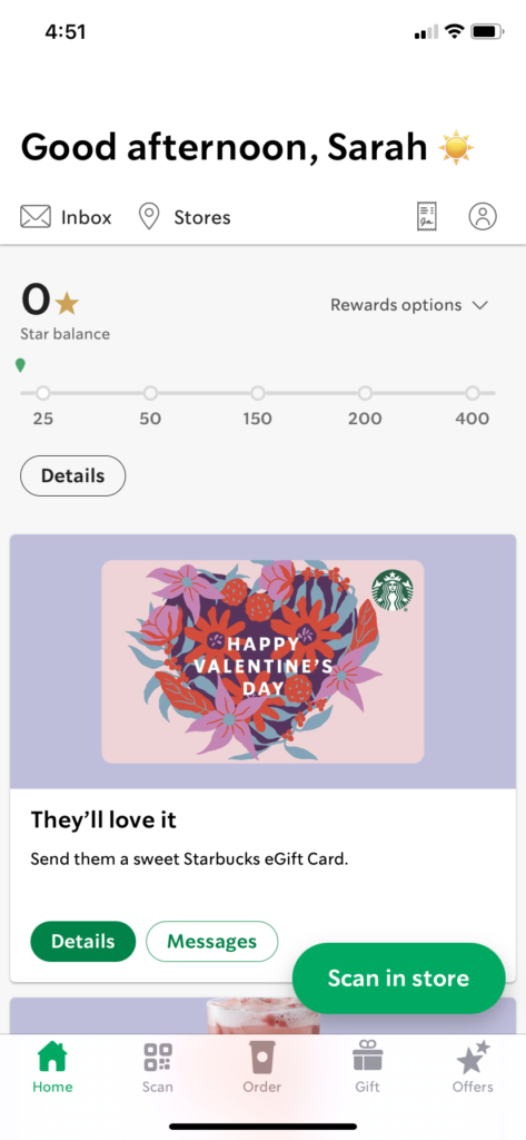
First glance upon the Homepage, there aren’t any striking problems. The discoverability of the app is great. It is easy to locate a user’s desired action as most of the options are shown on the homepage: pay in store, check, star balance, order ahead, select offers and etc. Icons used are naturally understandable and most of them do have associated titles below the icon. However, there is the issue of inconsistency as some icons have description for them while others do not.
Another issue of the homepage is the proportion of screen real estate. We can see that a large proportion of the page is the advertisement of the gift card (Happy Valentine’s Day image and two buttons), and it is also available on the footer navigation bar. However, most users mainly focus on using the “scan in store” and “star balance” thus, the utilization of space was not done well as it draws away and decreases its value in visibility.
The inconsistency of text styles, colors, button styles and sizes should all be fixed in order to build a more aesthetic application.
Order Page
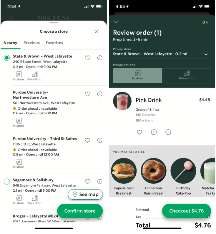
The order page displays a better version. Fonts are more consistent and there is not an outlier in font or style that may throw the user off. User friendly as there are maps installed within the app the allows users to have a better understanding of where the stores are located.
Pages Together (home, order,gift)
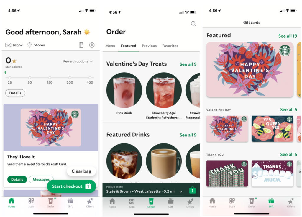
Again, we bring up the issue of inconsistency. The header in the 3 pages are all different sizes. The images, some are rectangular styles, while others have a form of frame in circular shape.
Starbucks should choose less variety of fonts and colors, along with the size of on each main page (pages are shown in the footer navigation bar) and stick with it.
Conclusion
Overall, the Starbucks app is fairly user friendly and easy to navigate. However, there can be improvement in the overall design of the application in order to advance visibility and the overall aesthetic of becoming more clean and minimal.
In order to properly distribute screen real estate, I would suggest conducting a survey on app usage or tracking how users are using the application (if it does not invade any privacy issues). With the data collected, the sizes and location of buttons, texts, images and sections can better distributed thus thus creating a better visual experience for users.