
Introduction
Tasty, a popular recipe app, provides its users with thousands of food videos and recipes that render cooking and baking as fun, simple, and easy activities. This design critique will focus on Tasty’s user experience for iOS devices.
Discover
When users open their Tasty app, they are directed to the discover page. Through clear discoverability, the user sees that they have three options to discover content.
BROWSING
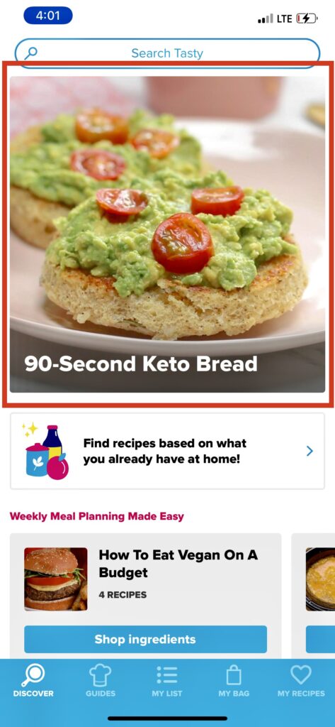
The first option is browsing the home page and scrolling through videos categorized by relevance (Figure 1A). One noticeable design concern when looking at this page is that there are no clear signifiers to suggest scrolling up or down, right or left. However, because the iPhone’s screen affords touching, users combine knowledge of the world and knowledge of the head to easily navigate through the page despite the lack of explicit signifiers, this is an example of Natural Mapping.
Room for Improvement
On the discover page, the app highlights one video/recipe that it believes is content the user would be interested in (Figure 1B). This is great! However, the app will promptly display the same video/recipe for days on end – even if the user has already interacted with that video/recipe. This could negatively impact the visceral response users get each time they open the app, especially if the recipe is not one the user is all too thrilled about.
SEARCH TOOL
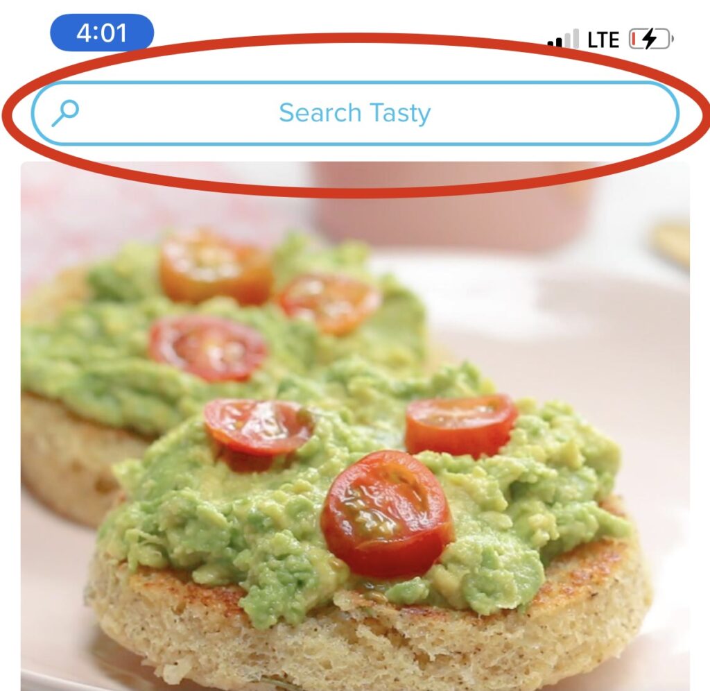
The second option users have to discover new recipes is filtering the app’s content through a personalized search tool; the search bar is used as a clear signifier for this action (Figure 2A). Once the user selects or types in their personalized filter(s), the app provides clear feedback by immediately showcasing content that meets the user’s search query.
Room for Improvement
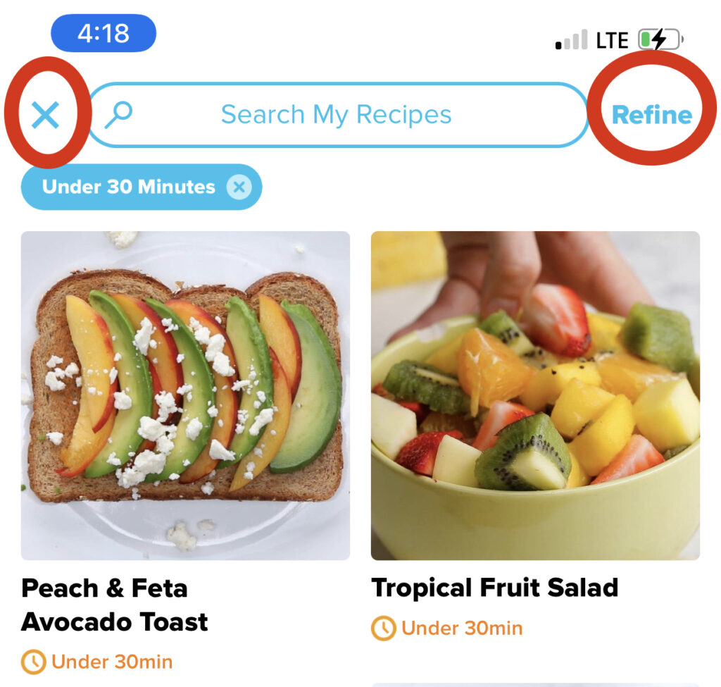
The layout of the page that meets users’ search queries is not designed for avoiding human error (Figure 2B). If users want to add an additional filter to further limit their search, they may click on the “X” icon on the top left corner (which causes users to return to the discover page) instead of the “Refine” action on the top right corner (which allows users to refine their filter selections) resulting in a description-similarity slip. This occurs because users’ function subconsciously as they interact with low-level tasks. In this case, the “X” icon, which is a common symbol that allows users to return to previous pages, is confused as an action that would allow users to return to the personalized filter options. Since the “X” symbol is located on the left corner and the “Refine” action on the right corner, users see the “X” icon first and perform the slip without ever seeing the “Refine” option to their right. An easy solution would be to simply swap the positions of the “X” icon with the “Refine” action, so that the “Refine” action is on the left and therefore seen/read first..
WHAT’S IN YOUR KITCHEN
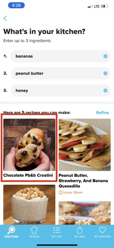
The third option users have to discover new recipes is the app’s “What’s in Your Kitchen” feature (Figure 3A). This feature allows users to manually input ingredients, up to three, to filter recipes with ingredients they already have. This option of searching allows for users to immediately go through the Seven Stages of Actions since users’ mental model (or conceptual model) of the app — to view, follow, save, and replicate recipes — is possible to achieve.
Room for Improvement
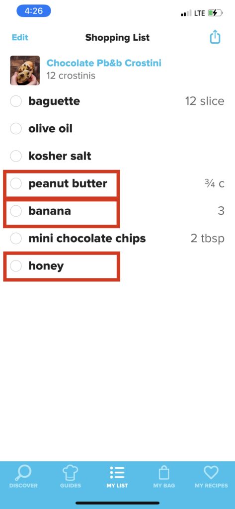
Though users are searching for ingredients they have in their kitchen, some recipes that may show up in their query will have extra ingredients the users will need to get. Fortunately, The app allows for users to add ingredients from recipes into a “Shopping List” to reference back on when they go grocery shopping. However, when users perform this function whilst using the “What’s in Your Kitchen” filter, all of the ingredients, including the ones users have already stated they have in their kitchen, are added to the shopping list (Figure 3B). When the time comes for users to go grocery shopping, they will reference the shopping list that includes a mix of ingredients they need and don’t. What was designed to create a seamless transfer of Knowledge in the head to Knowledge in the world is now a potential for users to exhaust their memory to recall exactly what ingredients on the list they do not need to buy. The solution would be to have the app register the moment users use the “What’s in Your Kitchen” feature and automatically remove the selected ingredients for the recipes the users add to their shopping list.