
TikTok is a video sharing social media platform owned by the company ByteDance. It was initially released on the Chinese market in 2016 and became accessible internationally in 2018 when it merged with Musical.ly. With the Covid Pandemic, the app has experienced even more attention and popularity. Indeed, as of October 2020, TikTok had over 2 billion mobile downloads internationally. This critique will focus on the viewing (rather than the creating) experience on TikTok.
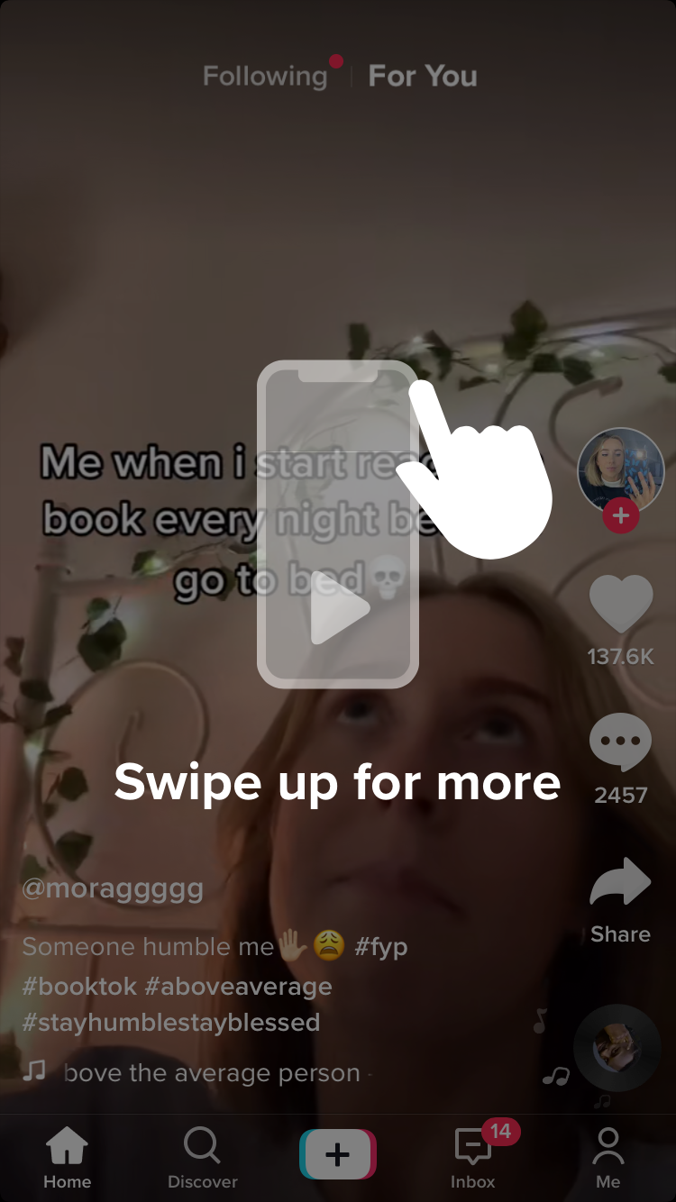
Upon downloading the app and creating an account, the user gets a strong and clear signifier as to how to navigate the central channel of content: the “for you page.” The “Swipe Up for More,” with a hand and phone icon, gets the user started on their TikTok experience. The app’s design is indicative of the app’s goals, priorities, and the kind of experience it seeks to cultivate. With full screen as the default and only setting to view a video, the user is invited to start scrolling immediately and be immersed in the captivating experience. This also signals immediately that the app affords watching videos and being entertained. The infinite scroll and the full screen can create a distortion of time and flow that absorb the user. Furthermore, the automatic looping of the video ensures that the user is rarely interacting with the app in silence and is given an incentive to swipe to move on to the next video.
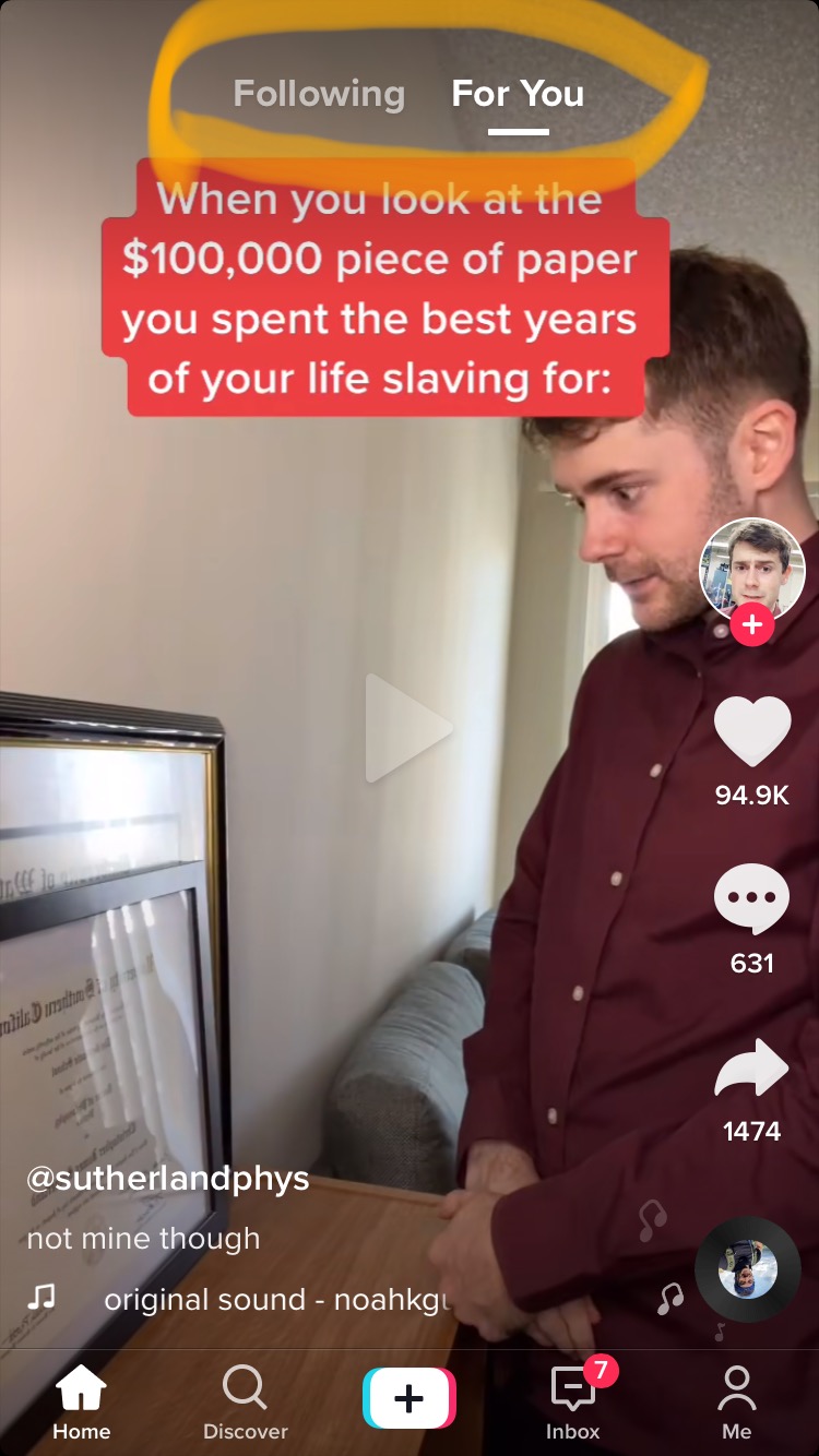
Within the home page, users can navigate through the “for you page” and the accounts they follow (although the app always automatically opens on “for you page”). These signifiers are conveyed through text.

On the other hand, the signifiers at the bottom of the page, which reveal an discover option, creation option, inbox and profile, are conveyed through icons and text. These indicate that if a user is tired or unsatisfied with the home page, they can explore videos through other channels including trends, which are organized by hashtags. The centrality of the “for you page” illustrates how immersion, rather than browsing, functions as the main structure of the app. Browsing is possible, but always secondary to the “for you” page.

Lastly, there are also signifiers on the right side of the screen to follow the creator (with an icon of their profile picture), like the video, comment, share and find the sound used by the video.
The structure of TikTok thus offers different ways to browse through content: by theme (on the discover page), sound, creator (by checking someone’s profile), personalization (i.e., the algorithm of the “for you page”) and by people one follows.
When using the app to browse and view content, users can move through the app with two actions: swiping or clicking. Once the user enters a channel of content (either the “for you page”, or videos organized by hashtags), they must swipe to keep watching more videos. To access the other channels, the user must click on the signifiers (either “following,” “discover,” or the sound icon). However there is also another option. Once the user is watching a video, if they swipe left, they will be taken to the creator’s account. The discoverability of this task is contingent on the user’s exploration and potential accidental action. There is is nothing to indicate on the screen that this action is possible. There are therefore two ways of finding creators (either by clicking on their handle or profile picture, or by swiping left on the video). This is the only other function, other than moving on to the next video, that can be accomplished by swiping.
TikTok is the only social media app that defaults in full screen. The settings and design of the app are very effective in creating an immersive experience, which is further reinforced by the personalization of the recommendation algorithm that provides the user with videos that are catered specifically to their taste and previous behavior. Nevertheless, the design can also feel a bit overwhelming for new users. Indeed, users can come to the app with previous knowledge of other social media apps, which have a more zoomed out layout and in which users can see several posts at once (the posts are separated by space). Perhaps TikTok’s design can create a contrast with the user’s head-knowledge of how most social media app work and look. The lack of space between videos on TikTok can be disorienting for the new viewer as there is no way to situate oneself. But that is also the goal of the app: to lose track of time within the “for you page”. This design is very effective for its goal, but does not necessarily have the user’s best interest in mind.