
UberEats is an online food ordering and delivery platform launched by Uber in 2014. Through this app, users can make an order and pay for food from the restaurant and get general restaurant information such as menus, reviews, and ratings. UberEats application is on both iOS and Android, also in the web browser, but this critique will be focusing on iOS app inspired by reading Donald Norman’s book ‘The Design of Everyday Things’
Ordering pickup vs delivery
On the homepage of the app is defaulted to food delivery. On this page, I can choose one of the restaurants that the app recommends or my favorite restaurants list. Otherwise, I can click on the search icon on the bottom navigation to search for what I want. The bottom navigation gives you a clear indication of what page I am current at by changing colors(Grey to Black).
So How do I order pickups? How do users know if they are ordering pickups, not deliveries? On the homepage, under the address bar on the very top, there are filter tabs. When you click on the Pickup tab, the grey tab changes colors to black to indicates you have selected the tab. Also, homepage interface changes. In the center of the homepage, the map appears with the location icons and the list of the restaurants.
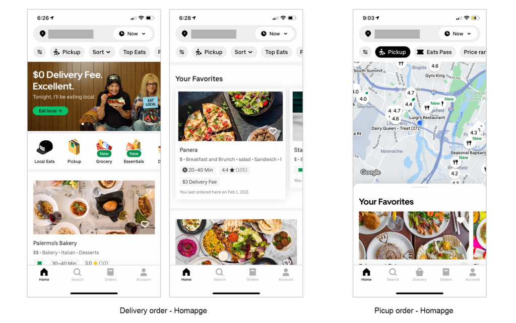
Making the homepage interface different depending on each option to indicate whether users are on the delivery page or the pickup page is very helpful.
Adding an item to your cart
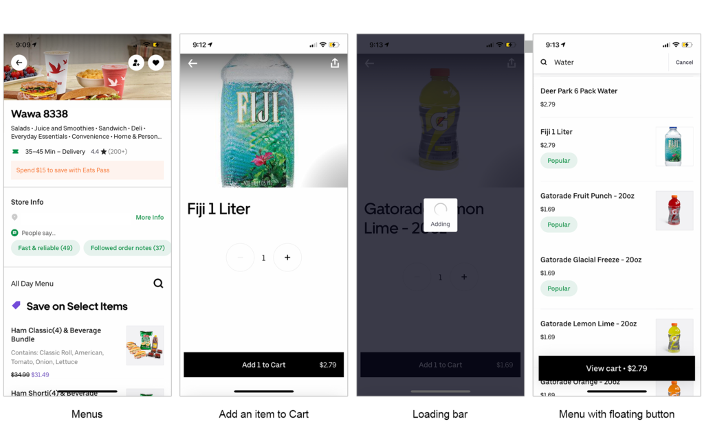
Choosing a menu from the restaurant you want and adding it to your cart is very simple. Just click on the menu you want, select the quantity, and add it to the cart. While I was going through this step to write this, I’ve realized this app really understand that the users are very impatient. It takes less than 1 second to transition the screen after clicking on Add to cart button. To visualize this process, the animated loading circle appears while it’s transitioning. So that the users know it’s processing.
After it’s processed, users are directed to the menu page. On this page, a floating button appears on the bottom, with the title View Cart and your order’s total price. So users know there is something in the cart. As you add more items to your cart, the price on the button sums up. If users are not sure what items in the cart, they can click on the button, and the list of the items slides up to the page.
Making a payment
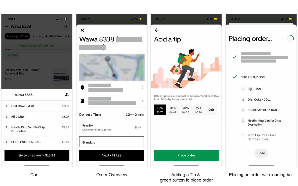
When users have saved credit card information in this app, it takes seconds to make a payment. After users click on the check out button, the order overview page appears. Users really don’t need to scroll down to see the price; the price is indicated on the floating button on the bottom with the text Next. After selecting the amount of tip, click the Place Order button to complete. This button’s color is green, whereas the other button’s color is black, to inform users that this is the final step of the order.
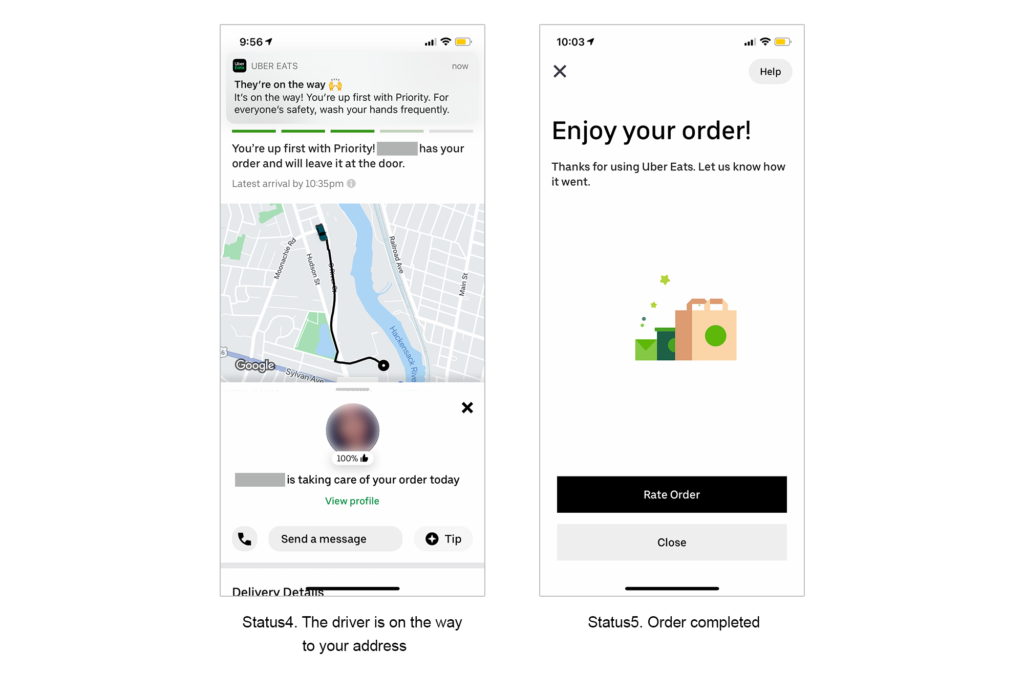
This app informs users the order is completed in two ways. One, the app sends a notification to users that the restaurant received the order. Two, users can track the order in five steps live with the status tracking bar.
Getting food delivered
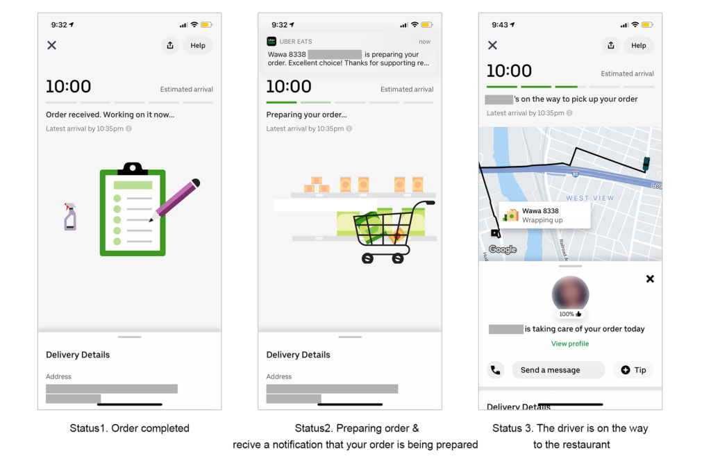
As I mentioned earlier, after users complete the order, five steps live status tracking bar appears on the page. The first step is order received, two is preparing food, three is the driver is on the way to pick up the user’s order, four is the driver is on the way to deliver, and five is the order is completed. On step3 and 4, users can track where the driver is at on the map live. So users know your delivery is coming.
Conclusion
The designer of the app UberEats, understand the users very well. Especially they understand that the users are not very patient. They included loading bars throughout the process, where there have to be a few seconds delay. And they also provided the status tracking bar with the map, so that users know where their deliveries are to address the users’ pain points of the delivery system.