Abstract
Venmo is a mobile payment service owned by Paypal that allows users to transfer funds to others via their mobile phone app. Its primary function allows users to send or accept payments from others or even some businesses that use their platform. It has a user friendly history system that allows its users to put down text, emojis, bitmojis or even gifs as notes when making transactions.
This design critique will mainly be based on the design principals and concepts from Don Norman’s book The Design of Everyday Things. Furthermore, this design critique will follow the three main user journeys that are synthesized from the three main functions, which are:
- Sending or requesting a payment
- Paying a payment request
- Checking payment history
Sending or requesting a payment
Steps
- The user taps the Venmo app
- The user reaches the landing page, and finds the pay or request button.
- The journey is completed.
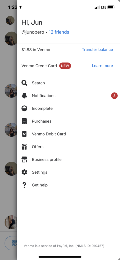
The landing page of the Venmo page is simple and easy to navigate, it has clear affordances on how to get its primary function done, which is to send or request a payment.

This is aligned with Norman’s idea of good design, namely, having a good conceptual model, which Norman describes as the “idea of how something works”. In this case, the landing page immediately greets its users with the “Pay or Request” button at the bottom of the screen. The discoverability of the button, given its distinctive size and color, and reachability allows the user to quickly execute the action of initiating a payment or requesting one.
Paying a payment request
Steps
- The user taps the Venmo app
- The user reaches the landing page
- The user taps on the menu button on the top right
- The user taps on “Notifications”
- The user pays.
- The journey is completed.
Besides directly clicking on the notification you receive on your phone when someone requests a payment from you (which directly brings you to execute the action), the user us forced to tap on the menu and then on notifications.
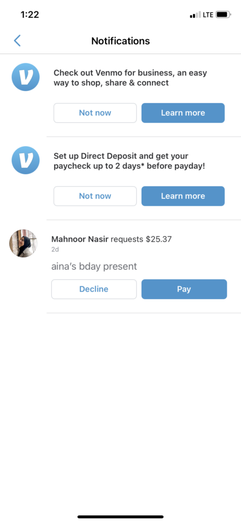
While having a red signifier on the right side of the “Notifications” button is helpful, the “Incomplete” button below is slightly misleading as it could also signify that a payment request is perhaps incomplete. This would mean that there is a possibility that users might not tap on the right button to get their intended action done. The presence of both buttons resulted in affordances that did not work properly. It might be wise if payment requests were put in the “Incomplete” button, in addition to “Notification” button allowing users to execute the action as well.
Checking payment history
Steps
- The user taps the Venmo app
- The user reaches the landing page
- The user clicks on the button on the top (in the shape of a person); conversely, swipe left
or
- The user clicks on the menu button on the top right
- The user clicks on friends, and searches for friends
- The user clicks on “Between You”
- The journey is completed.
When accessing payment history, the user has two choices, either to view the overall payment history, or search up a specific payment history with between them and another Venmo user.


This particular user journey exposes the user to the social component of the Venmo app, which is slightly interesting (given that users can see random people and their transactions with other people). On both the landing page and a friend’s wall, the user has to do an extra step of either tapping or swiping. A constraint, which makes something easier to use by making it impossible to do otherwise, can be implemented in this situation. Instead of having users make an extra tap or swipe, the user’s personal overall payment history should be the default on the landing page. Presumably the “Between You” feed should be the default as well when user’s access the history between them and another Venmo user.
Verdict
Don Norman described good design as “not needing instructions”.In a whole, albeit having some constraints that did not direct users properly, the Venmo app is an extremely user friendly app that still can be navigated easily and helps its users get what they need done.