CLIENT
Kazani Beauty a family run business based in New York, creating hair and skincare products made of natural ingredients and contributes to causes surrounding environmental conservation and animal cruelty.
According to internal data from Kazani, its mobile website 0% mobile user return rate over four months – a primary indicator that the website did not optimally meet user needs or expectations.
↓
OUR TEAM
Derek Frisicchio – UX Project Manager
Ellen Connell | Evan Tao – UX Researcher
Jun H. Kok | Nahee Kim – UX Designer
↓
THE PROJECT
The objective of this project is to discover how well the current design meets a user’s needs in making an informed first-time purchase and share insights on what information a new user needs to effectively utilize the website to make an informed purchase decision.
To support the forthcoming redesign of the Kazani website, we conducted a remote moderated usability test, hoping to find out:
- Do users have the information they need to make an informed purchase decision?
- What information do users expect to see in making a purchase decision?
- What information is most important to a user?
- Can they find the information they need and the right product to purchase?
Survey → Recruit → Test
We formulated the test questions that aimed to evaluate how the current site communicates key information to a new online shopper: including who Kazani is, what they sell, and what their value proposition is. The tasks were developed to prompt exploration of the most important web pages: the homepage, shop page, and product detail page:
Task #1 – From the homepage, describe in your own words what type of products Kazani sells and what are its benefits?
Task #2 – Using the whole website, find out about Kazani brand story and describe it in your own words.
Task #3 – Using the whole website, find a product that you are interested in purchasing (proceed through up to adding the item to your cart).
↓
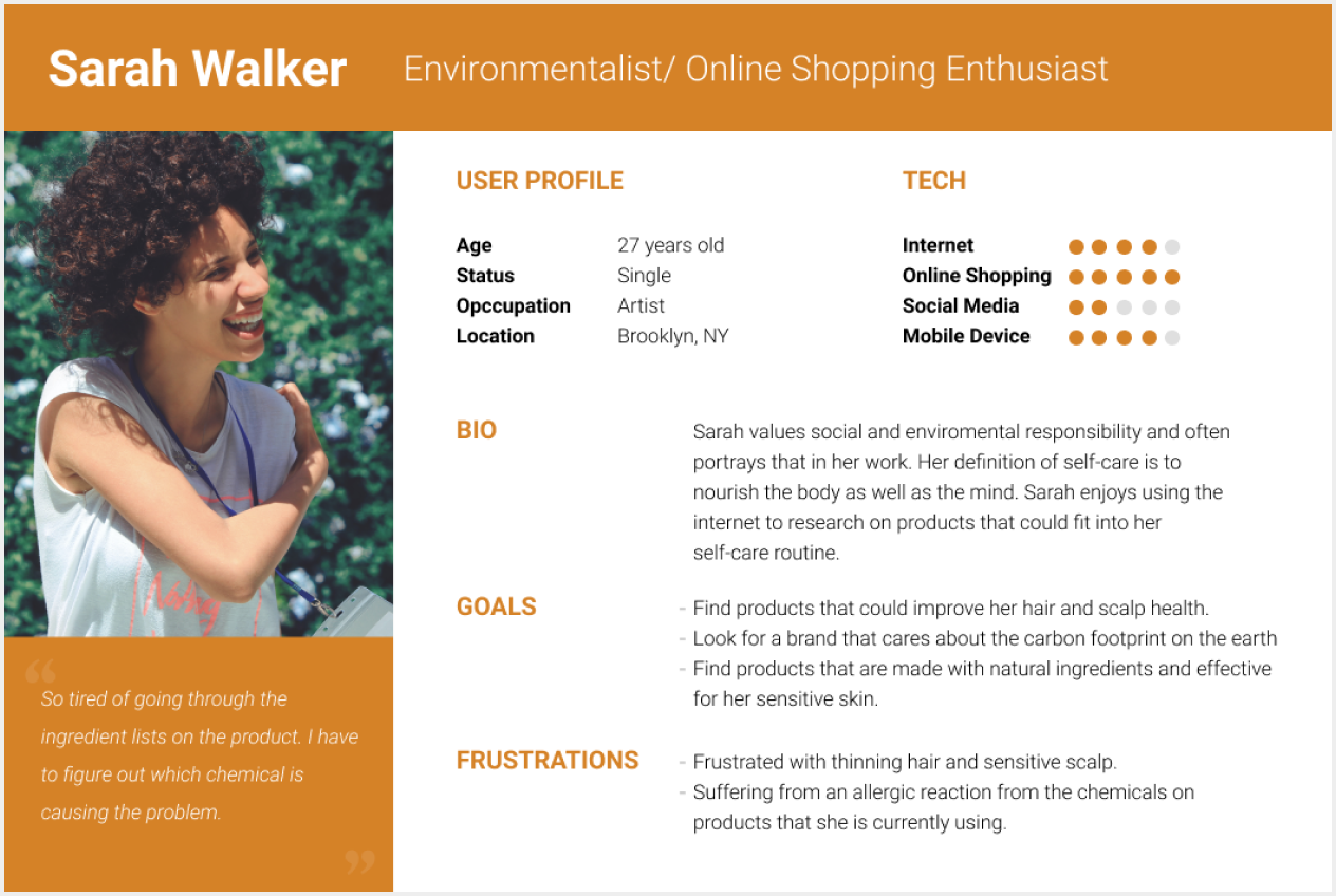
PERSONA
↓
FINDINGS AND RECOMMENDATIONS
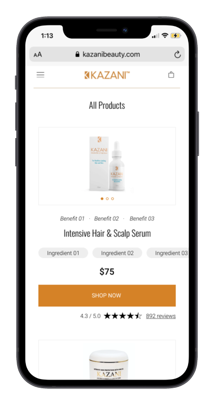
Finding #1: Users expect to see information organized by what matters the most. Recommendation #1: Restructure content to feature product information first, followed by ingredients, and brand mission.
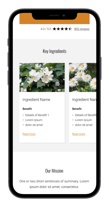
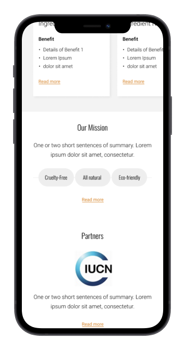
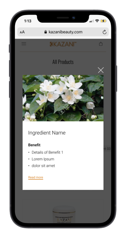
Finding #2: Users gravitate towards headers and images to seek information. Recommendation #2: Utilize key terms, short descriptions, and contextual images.
Finding #3: Users seek detailed information as a secondary action in evaluating a product. Recommendation #3: Add clear entry points to support users seeking detailed information.
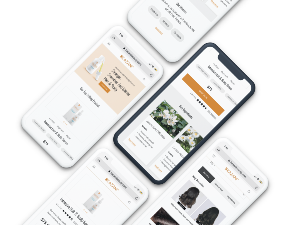
REDESIGN
Homepage – Restructure content to feature product information first, followed by ingredients, and brand mission. Remove long text and utilize key terms, short descriptions, and contextual images. Add clear entry points to support users seeking detailed information. detailed information.
Shop All – Utilize key terms, short descriptions, and contextual images. Add clear entry points to support users seeking detailed information.
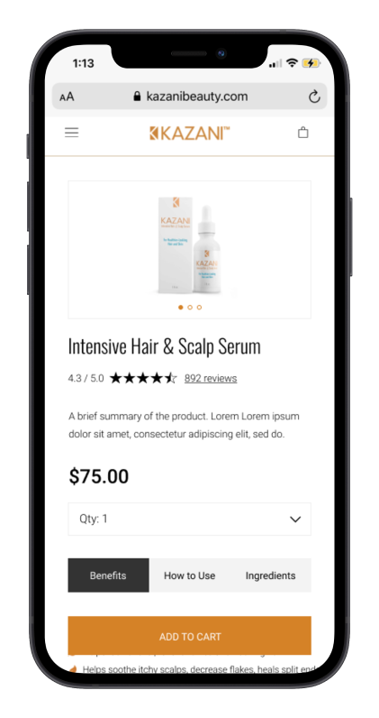
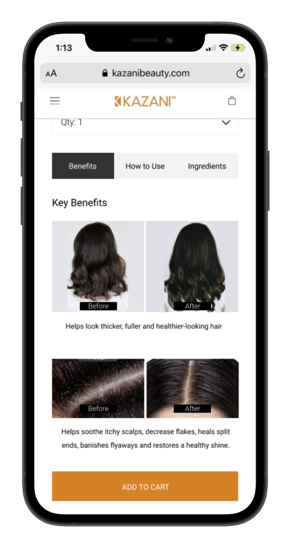
Product Details – Restructure content to feature product information first, followed by ingredients, and brand mission. Remove long text and utilize key terms, short descriptions, and contextual images. Add clear entry points to support users seeking detailed information.
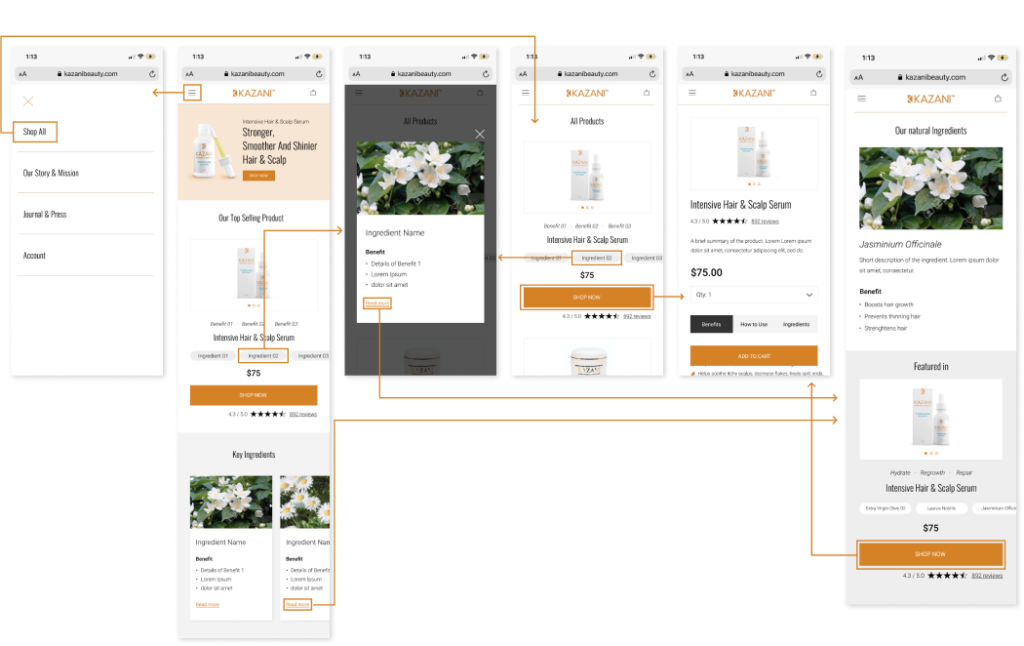
REDESIGNED USER FLOW
Cohesiveness + Interconnectivity
Channeling information funnels appropriately: Direct users to the desired information + Help users achieve their goals
↓
CONCLUSION
New mobile visitors to the Kazani website never stayed on past 30 seconds. 90% of them would bounce before committing to a session. New mobile visitors to the Kazani website need to see the most important information first in a skimmable format. They also need access points to more detailed content. Once Kazani initiates this new design format on the mobile website, new users will be more comfortable with the site as it meets their expectations and provides the information they need to make an informed purchase decision.