Introduction
The Urban Outreach Center (UOC) is a non-profit community organization focused on connecting homeless and low-income New Yorkers in East Harlem and the Upper West Side with food and other critical supplies. The UOC helps “nearly 50,000 vulnerable New Yorkers each year to move with dignity out of homelessness and food insecurity toward self-sufficiency.”
Goal
The UOC approached the Center for Digital Experiences to identify possible usability challenges on the UOC’s website discouraging community involvement. The UOC representative expressed interest in expanding their donation base and community demographic of donors. For the scope of this study we focused on evaluating the website’s ability to inspire and facilitate monetary contributions.
The Team
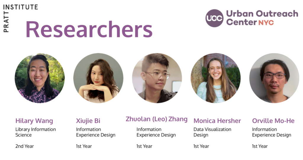
I worked with four other researchers: Monica Hersher, Orville Mo-He, Zhoulan Zhang, Xiujie Bi, to design, execute a moderated remote usability test, and collate a report to make actionable recommendations to our client. I acted as the point person for communicating with our client, organizing our documentation, scheduled usability studies with our recruited users, moderated two studies, and observed as a note taker for an additional two.
The Process
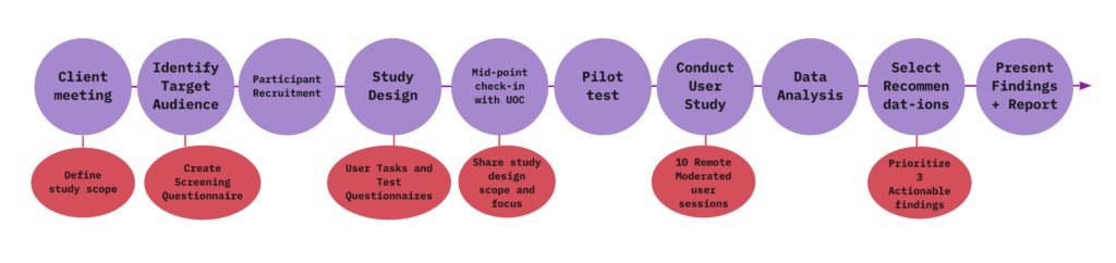
Project Timeline: March 17th-May 5th, 2021
Recruitment Plan & Participants
Based on the initial client meeting with UOC, the team identified two target age groups and two target moderated study platforms: Desktop and Mobile, this division was then divided based on age. A total of 10 participants were recruited for this study.
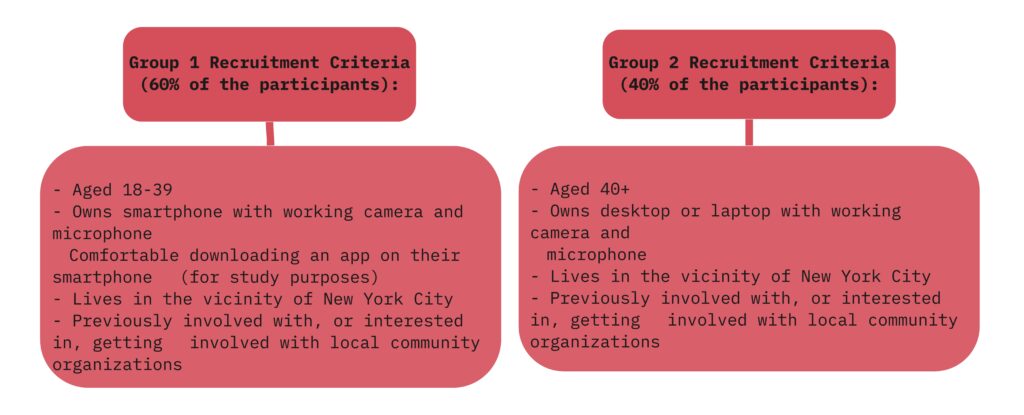
We designed a screening questionnaire gauging potential users interest in local community involvement and locality to NYC. The questionnaire was then sent out on the following platforms:
- NYC Junior League listserv
- Urban Outreach Center Volunteer listserv
- Pratt Community listservs
Study Design
Tools:
UserZoomGo for both Desktop and Mobile studies
Miro for note taking
- Pre-test questionnaire: Understand the participants current or prior involvement and familiarity with volunteering and donating to organizations.
- Scenario outlined to users: Please imagine that you’re interested in learning more about Urban Outreach’s initiatives and getting involved with the organization’s work.
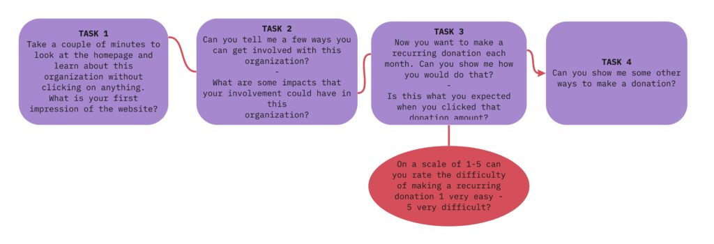
- Tasks: 4 tasks were assigned
- Post-test questionnaire: To illicit additional feedback about UOC’s website
Analysis
Upon completing ten moderated usability studies, the research team collated our usability findings into a collaborative document. We referred to Nielsen Severity Scale 0-4 to rate the severity of each usability finding and considered actionability and impact when selecting three main recommendations to make.
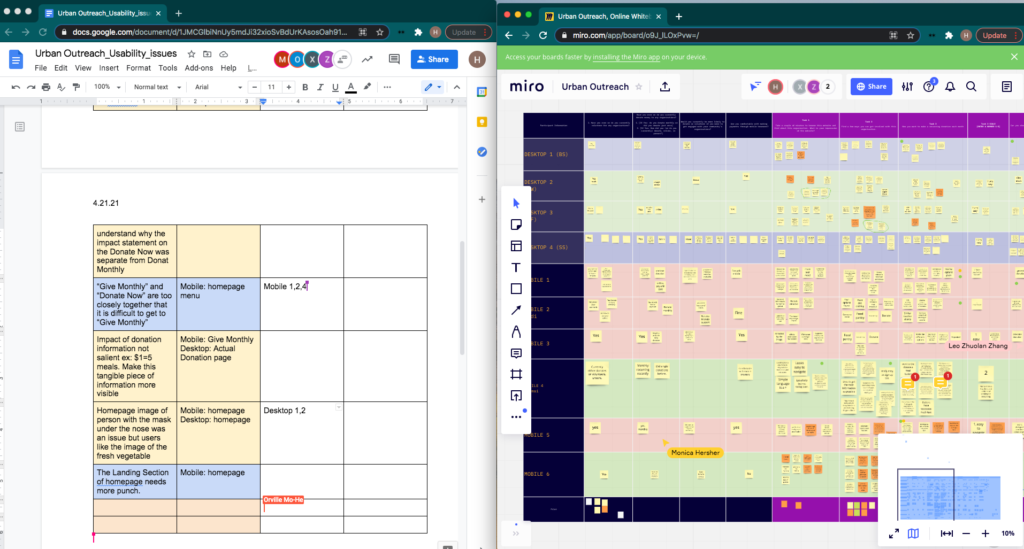
Screen capture of group analyses. Collated list of issues (left) notes taken during studies (right) (Figure 1)
Results
The ten participants in this Moderated Remote User Test reacted very positively to the overall look of the Urban Outreach Center’s website. A user stated: “I like the colors, aesthetically pleasing and clearly see where [Urban Outreach] is putting their services!”
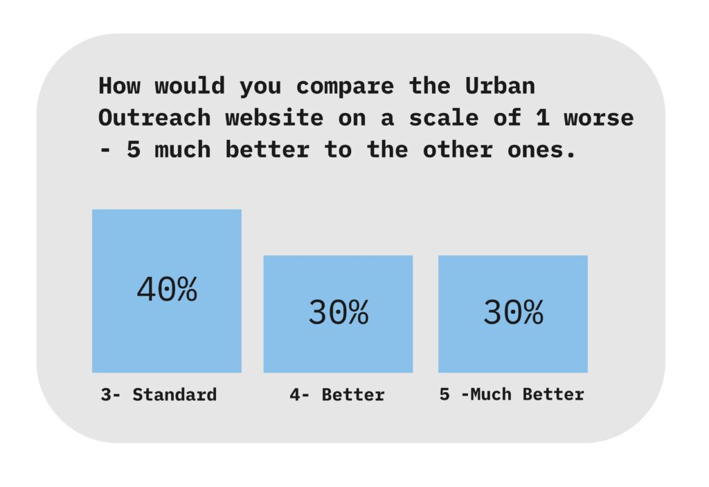
Participants noted how the website provides robust information and statistics supporting the organization’s mission and highlighting their work locally to support the homeless and low-income community in East Harlem and the Upper West Side. When asked to compare UOC’s website to on a scale of 1 worse – 5 much to others websites: users rated 3 or above (figure 2).
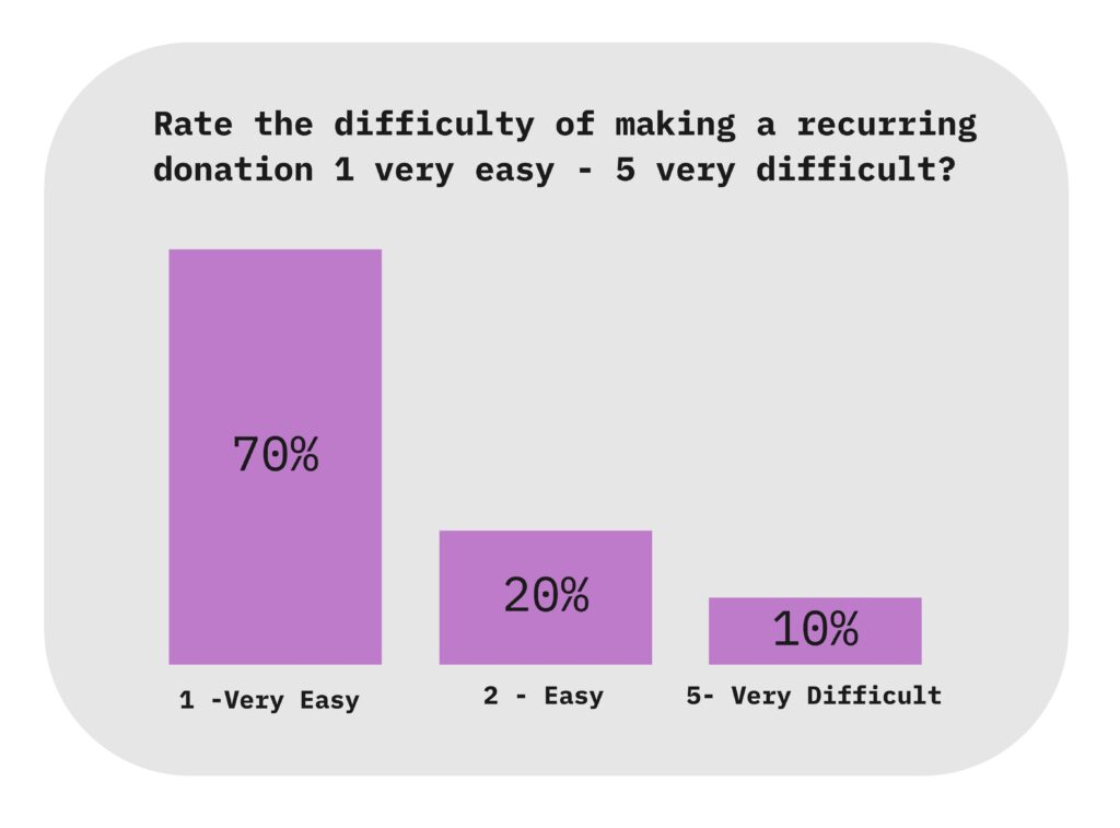
Though the 70% of users rated making a monthly donation as 1 -Very Easy (figure 3) , multiple users expressed redundant buttons and inconsistent presentation of information throughout the website. The five researchers identified twelve usability challenges and selected three for actionable recommendations to resolve these user barriers:
- Reformat the “Give Monthly” page to consolidate buttons and add clearer language highlighting tangible impacts of monetary donations.
- Mobile Browser: Implement an additional navigational menu that links to the different sections of the page it’s in.
- Reformat labels and information architecture of the homepage navigational buttons.
The full recommendation details can be found in the final report. Outlined below is one key finding and recommendation.
Recommendation 1:
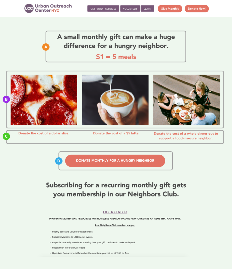
In this study participants found the image of the pizza and latte eye-catching and expressed being able to easily visualize the correlation between the item depicted and the dollar amount associated with the items. Half of the participants (five) however, incorrectly interpreted the pictures of pizza, latte, and the subway ride as descriptions of what would be donated to the Urban Outreach community in need rather than what they as donors could monetarily donate.
Figure 4 points to current usability design issues:
- The current page title “A small monthly gift can make a huge difference for a hungry neighbor.” does not highlight the impact of monthly monetary donations.
- Of the four images, the subway ride and button label “Or a $2.75 train ride” do not align with the food focus theme of the page and created some user confusion.
- participants expected the current amount in each button (four) label below each image to automatically populate in the donation form. Three participants found the five different buttons “redundant” since they took them to the same donation form.
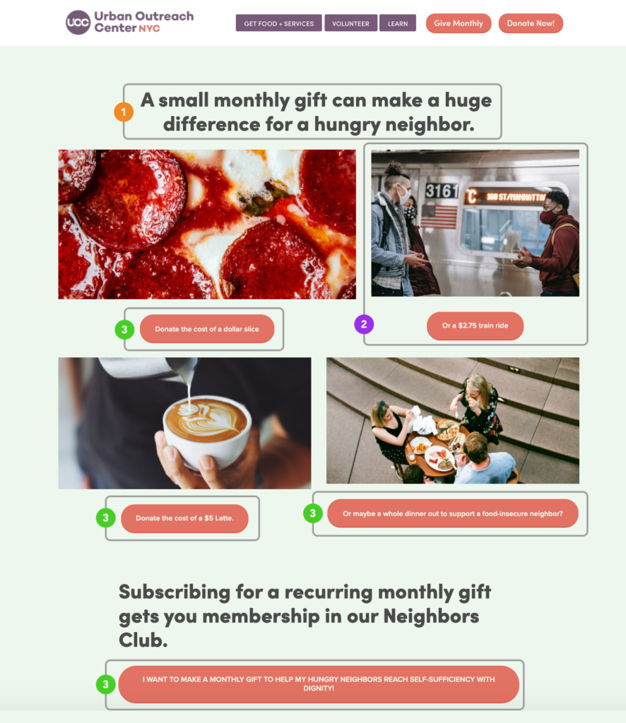
Figure 5 highlights our recommendations:
- To highlight the impact of monthly donations, the researchers suggest adding language from the donation form page “$1=5 meals” to the “Give Monthly” page above the images. This will help imply that monetary donations will go towards providing meals to the Urban Outreach community in need.
- Remove the image of the subway ride and align the images of the pizza, the latte, and the meal.
- Turn the buttons into captions.
- One large button below the captions: “DONATE MONTHLY FOR A HUNGRY NEIGHBOR”
Conclusion
Delivery
Final Report: As a group we created a final report which gave an overview of three actionable recommendations, as well as additional areas for usability improvements that were outside the scope of our study but could provide important insight for UOC. The full report can be found here.
Presentation: The findings were also presented in a 10 minute presentation over Zoom. Our team gave an overview of our collected data and analysis which informed the resulting recommendations. The presentation can be found here.
The Urban Outreach Center’s representative expressed:
“This was amazing in providing concrete recommendations for us and confirmed suspicions we had.”
Lastly we met as a team with UOC, where I led a debrief to go into more depth about our findings and highlighted additional recommendations that would support UOC website overall. Such as updating the landing page image to make sure the depicted individual’s facemask was covering their nose.
Reflection
Though our study was focused on a very specific aspect of the UOC website, the ten participants provided insightful feedback beyond the scope of our study. We made an additional suggestion to conduct an A/B study in the future to enable UOC to better evaluate community engagement for volunteering vs donating. Given more time, it would have also been exciting to explore these additional findings regarding the information architecture and layout of pages pertaining to other services provided by the Center.