Evaluation Story
Alan Webber
CASE OVERVIEW
MoMA Education enriches the day-to-day visitor experience with robust multimedia learning resources located on the MoMA website and a broad range of events, workshops, programs, and courses aimed at general and specific age groups across a wide spectrum. They program traditional learning opportunities as well as public events that are centered more around entertainment and appreciation of art.
Department Manager of Administration and Strategy, Lyn Hsieh, came to our team with an expressed interest in developing a more accurate way of monitoring digital analytics specific to Education within the greater MoMA organization. Ms. Hsieh outlined specific goals of clarifying specific KPIs, identifying who digital audiences are, and where traffic is coming from. She provided an internal spreadsheet that highlighted specific Education events for deep-dive analysis. Her primary focus was on Education pages within the MoMA website.
Upon examination of MoMA’s website, I quickly found that MoMA Education did not have a distinct identity. MoMA has different pages for Research and Learning and Events, but it is hard to distinguish which ones are specific to Education. Ms. Hsieh clarified this is the case during our Zoom meeting, that Education used to have its own web presence, but that MoMA’s tech department deemed that it was better to spread Education content throughout the website without categorizing it off. This presented a significant hurdle in accuracy to our group in providing digital analysis.
My team consisted of myself and group members, Rachel Jackson, Anna Size, Jing Zhao and Kira Zimmerman. Along with overall group discussion and direction, I contributed to development of the Google Data Studio dashboard. I also helped to define KPIs with corresponding metrics, did qualitative analysis of peer museums’ education web presence, strategized client communications and partook in the writing and editing of our report.
PROCESS
Following our kick-off meeting with Ms. Hsieh, we met to discuss our overall take on the situation, notating the specific concerns dealing with identifying audience, traffic sources, defining KPIs and developing a method of analyzing MoMA Education analytics. Our group quickly established a primary communication method by creating a dedicated Slack channel, where links to core data and documents could be found. We also created a Google Doc for ongoing notes, and a new, shared Gmail account where we could receive access to MoMA’s Google Analytics account and other private documents.
Once we received access to MoMA’s data, we decided to split the data into two timeframes: pre-COVID (2019) and post-COVID (2020). We conferred with Ms. Hsieh, and she agreed that it was a good idea. Since we were also at a loss as to figure out how to decipher which Google Analytics data was unique to Education, we asked Ms. Hsieh to provide some samples of Education pages, along with any specific links she would like to have examined. She replied with a Google Sheet, which contained fairly granular data on specific Education events, including some which were highlighted as ‘special interest.’ We found that the majority of the URLs were “Events” pages, and thus developed our digital analysis around this unique element. As for KPIs, we felt the basic focuses on Content, User, Source and Date would best serve the client’s needs, and drew different metrics from there.
We began creating a new dashboard in Google Data Studio. Following on coarse with our plan to present data pre and post-COVID, we created separate sub-pages on the dashboard for each date range. An array of metrics were chosen to identify audience, including: gender, age, city, country, language and device category. Metrics chosen to identify traffic source included: medium, source, campaign, social network, and other MoMA pages Education visitors also landed on. Metrics chosen to identify content included: event names and page views from specific campaigns. Dashboard sections for Family Education Events and YouTube were also established.
While we were happy with the look of individual dashboard pages (the mixture of line and bar graphs, pie charts, etc.), we initially wound up with 22 pages (including pre and post-COVID sub-pages). Professor Villaespesa advised us that this was far too many to give to a client. We incorporated a method of increasing individual dashboard size, and included pre and post-COVID information on a single page. Our total dashboard page number was decreased to seven, a number I still feel is too large.
Professor Villaespesa also showed us methods of renaming dashboard categories and creating a filter to provide more accurate results within the MoMA “events” URL zone. We incorporated these into our design and began analyzing the data for our report.
RESULTS
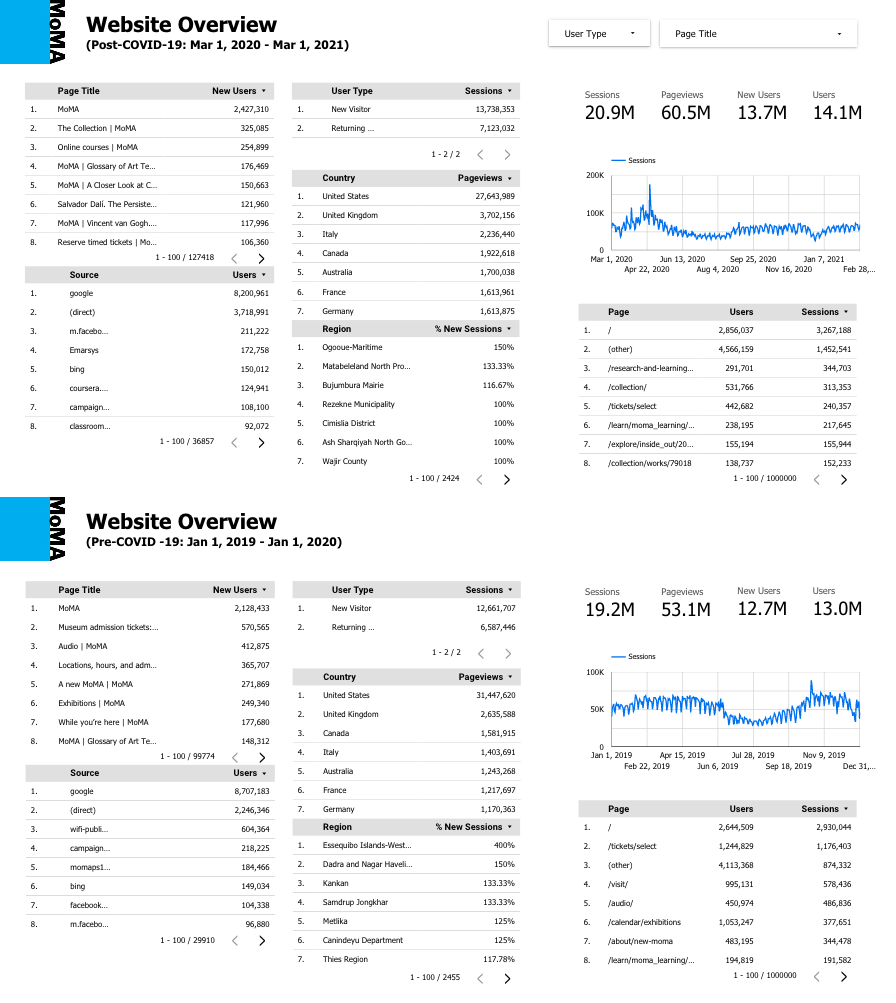
In analyzing traffic, we found that the majority of MoMA Education web page visitors came from organic searches through Google, and that Facebook was the most popular source of traffic through social media. Education events pages experienced a 65.4% decline in visitors post-COVID. We also found that Education web page visitors frequently visited MoMA’s Collection and Exhibition pages, and that post-COVID, the Audio page visitors contributed to 16.63% of mutual traffic to Education pages.
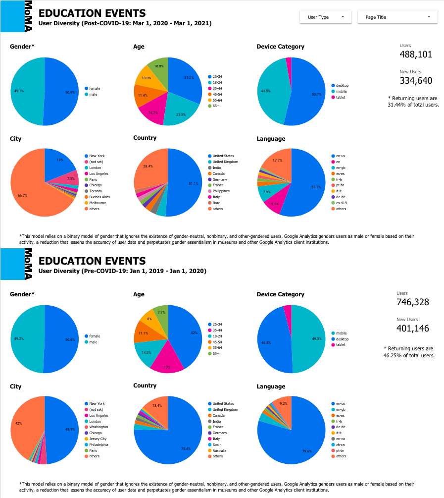
In analyzing content, we found that traffic was highest on days surrounding major events, such as Party in the Garden 2019 and Come Together (Apart) 2020. In analyzing audience, we found that pre-COVID, 46.25% of Education visitors were return users; that number dropped to 31.44% post-COVID. The number of New York City visitors also dropped from 48.9% to 18.9%. At the same time, the number of desktop users and non-English speakers increased.
We also analyzed data for specific “Family Education Events,” which Ms. Hsieh provided specific information on, including actual attendance numbers. We found that only 7.98% of total Family Education Event users attended events. Source-wise, 35.2% of users came from E-mail, 25.1% from referral sources and 11.9% through organic search.
Although not a stated priority from MoMA, we also analyzed data for Education content on their YouTube channel. Our findings showed Sunday was by far the most popular day for video views and that overall views increased when more videos were posted. Videos shorter than nine minutes had more views and likes than longer videos.
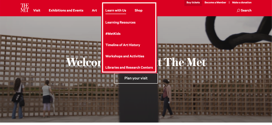
Upon our client’s request, we also performed qualitative analysis of education content on peer websites. (Ms. Hsieh identified the Tate Modern, the Metropolitan Museum of Art, the Chicago Art Institute and SFMOMA as peer institutions.) While we lacked access to the digital analytics for these museums, we wanted to provide some insight and thus combed through each museum’s site to identify how they categorize education pages on their websites. Surprisingly, we found that the peer institutions had education sections, which were grouped more succinctly and placed more prominently within their sites (often at the top of the homepage).
CONCLUSION
Overall, we are pleased with the results we gathered from our digital analysis of MoMA Education. We created a series of recommendations based off of our findings. These include:
- Continue to provide virtual education events to maintain audience outside of New York that was gained during the pandemic
- Link to Education events from popular Visit and Collection pages
- Link to other upcoming Education events on Education web pages
- Create concise meta-descriptions about events that will clearly show up in organic searches so that text is not jumbled with unfocused information
- Focus on in-person events with Family Education content, as more return users fall into this category
- Make sure only Education videos are posted into the Education section on YouTube
- In the vein of peer institutions, create a hub page to link Education URLs on the MoMA website (ideally linked prominently on the homepage)
* Perhaps the most pertinent recommendation is to embed tags and/or metadata within Education-specific pages and posts to improve the accuracy of digital analysis. While I feel we did good work with our analysis, we cannot be certain as to the accuracy of our results since we do not know if all Education content was accounted for in our analytical breakdown, or if other departments’ content might be contained within the ‘events’ parameter we set in our dashboard. This could come in the form of adding a unique element within Education URLs (e.g., “e.g., https://www.moma.org/calendar/events/education/6746” or something shorter, like “me” for MoMA Education, if the tech department does not like listing the word, education.
A more formal version of this project is documented in our report, which a good portion of our final two weeks was spent working on. A fair amount of time went into the graphic design of both the report and the slide deck for our presentation to our class and MoMA representatives. Final content decisions and debates over dashboard design concurred simultaneously. Some last minute tweaks were added upon the advice of Professor Villaespesa, including the refinement of KPIs into three groups (users, promotions and source; eliminating dates) with detailed metrics associated, along with dashboard layout/ordering.
After giving our presentation and meeting with Ms. Hsieh, I realized it would have been good to work more with her along the way. She was surprised to see that our results encompassed other MoMA departments, even after filtering down to URLs that contained “events” in them (and though we highlighted the limitations based off of MoMA’s data structuring). She did appreciate that we deep-dove on some of the key URLs that she had supplemented, and was definitely intrigued by our findings and dashboard overall. Hopefully she can try to incorporate our suggestions on embedding “Education” metadata to better track inter-departmental results within our dashboard template in the future.
I feel it was a successful project overall, but managing limitations and client expectations are definitely important parts of digital analytics. Data analysis can be tricky and even misleading, you need to make sure you’re taking the right measurements and measuring the right things from a theoretical point of view before relying too heavily on the results you are culling. Overall, my group was great to work with, and I feel the different individual members contributed to the flow of ideas and the project itself to form an impressive, organic composite.