Project Summary:
The goal of the Kazani usability study was to assess how well the kazanibeauty.com meets a user’s needs in making a an informed-purchase decision and discover areas for actionable improvements to better meet user needs.
Based on 10 remote user tests, our research team of 5 members identified three overarching problems, addressed by three recommendations and applied across the website’s three most important pages of the site: homepage, shop page, and product detail page.
Background:
Kazani is a New York City based hair and skin care company, who prior to COVID-19, primarily sold its products in boutiques, pop-ups, and other in-person events. In the last year, new traffic to Kazanibeauty.com has been through social media channels like Instagram. To support Kazani’s goal to increase new sales online and convert visitors from social media, our research focused on the mobile website experience.
Approach:
Our team conducted 10 moderated, remote usability tests using Lookback, a user testing application that allows researchers to observe user behavior and receive verbal feedback while conducting the user test.
Process:

Recruitment:
Before launching the test, we developed a screener survey to recruit participants who fit Kazani’s target audience and a pre-test to understand gauge their awareness of Kazani and their behavior for discovering and purchasing hair and skincare online. All 10 participants fit Kazani’s user profile, ensuring quality of data collected in the user test.

USER TESTING
Our team developed a test aimed to discover if the current website meets a new user’s needs in making a purchase and in process understand:
- Does the current site contain all information needed?
- Can the user find it?
- What information is most important to a user?
By employing semi-structured interview method, our research team asked three tasks followed by ‘probing’ questions aimed at understanding user’s mental models. Participants were asked to think aloud while completing tasks:
Short post-task questionnaires with multiple choice and Likert scales recorded the success values of each task.

Analysis:
Overall, the 10 user tests revealed that the kazanibeauty.com website contained the information needed to make a purchase, but qualitative data revelated that the experience of finding the information was neither as efficient or easy as user’s expected.
To analyze the qualitative data and identify key themes and areas for actionable improvement, our team employed affinity boards and empathy maps.
Findings & Recommendations:
With the understanding that the average stay of a new user of Kazani’s website is 30 seconds, findings & recommendations address usability issues preventing quick and clear transmission of key information while intentionally supporting secondary engagement with more detailed information.
Finding 01: Users expect to see information organized by what matters most
Within the short time frame a new user normally takes to evaluate the home page on Kazani’s website with a mobile device, users expect to be able to clearly and quickly answer: What is in the product? How does this help meet my hair and skin needs?
In order to support a user’s visceral evaluation, prioritization and presentation of content must match user expectations of what matters most. Currently, the Kazani homepage features a text-based our story section below its banner image, not meeting user’s expectations to see:

Recommendation 01: Restructure content to feature product information first, followed by ingredients, and brand mission.
Users expect that the most important information about the product and brand is included on the homepage, ordered by relevance to answering the question: is this product something I am interested in?
Based on user feedback, we recommend restructuring content to meet users’ expectations.
Finding 02: Users gravitate towards headers and images in seeking information
90% of users mentioned the current website was too wordy, making the information they sought too hard to find. Currently long paragraphs inhibit a user’s comprehension and discoverability. Searching for desired information from a paragraph of text increases a user’s cognitive load causing frustration.
Instead of reading paragraphs, users were drawn to headers, bold text, and images to comprehend key product and brand information.

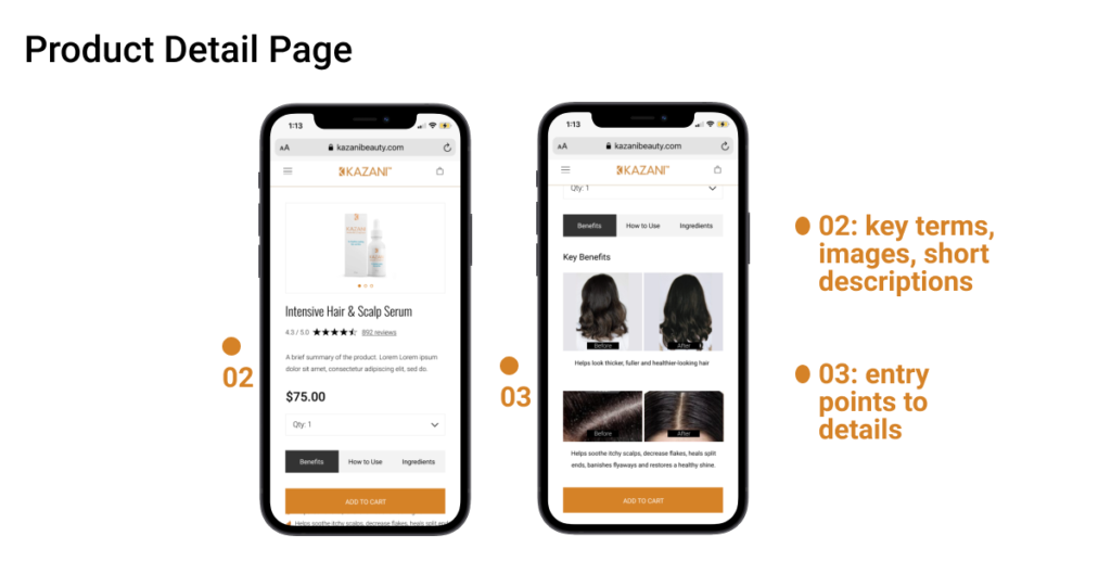
Recommendation 02: Utilize key terms, short descriptions, and contextual images.
To aid quick comprehension, our team recommended removing block of text use short descriptions, key terms, and images to impart import key details of who, what and where
Finding 03: Users seek detailed information as a secondary action in evaluating a product.
Although users expressed frustration at the use of long text in establishing first impressions of the brand and product, other users responded positively and enjoyed the opportunity to delve deeper as part of their evaluation process:
“It mentions Mediterranean numbers of times throughout the site, however I’m not able to figure where exactly in Mediterranean the family and the ingredients are from.”
Recommendation 03: Add clear entry points to support users seeking detailed information.
Through clear labeling and positioning of signifiers, users will be able to “Learn more” in understanding important, but secondary, information.
Recommendations Applied:
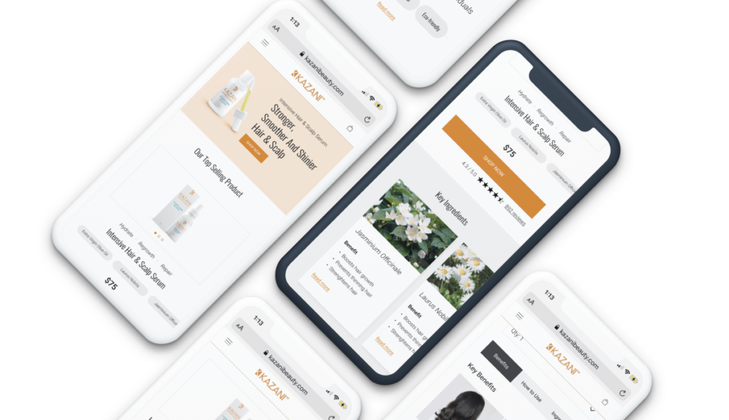
In the end, we applied recommendations across the most important pages of the Kazani website: homepage, shop page, product detail page.


Conclusion:
By restructuring content, removing and replacing blocks of text with key terms, short descriptions, and images while still supporting pathways to more detailed information, new visitors to the Kazani website will be able to quickly identify key information about the product before deciding to invest more time. Next steps for this project would include user test the revised pages asses user needs to make an informed purchase decision.
Read the complete report and presentation here.
