
Adobe Fresco is a digital drawing application developed by Adobe and released in November 2019. The app was created to provide a more ‘painterly’ experience for art-making on iPads, and to compete with similar apps such as Procreate.
Eager to try out Adobe’s latest creation, I downloaded the app on its initial release date. Fresco has an over-saturation of tools and icons, and I felt that the interface was so difficult to navigate that I quickly closed the app. Now, I’ve decided that it’s time to revisit Fresco and challenge my learned helplessness.
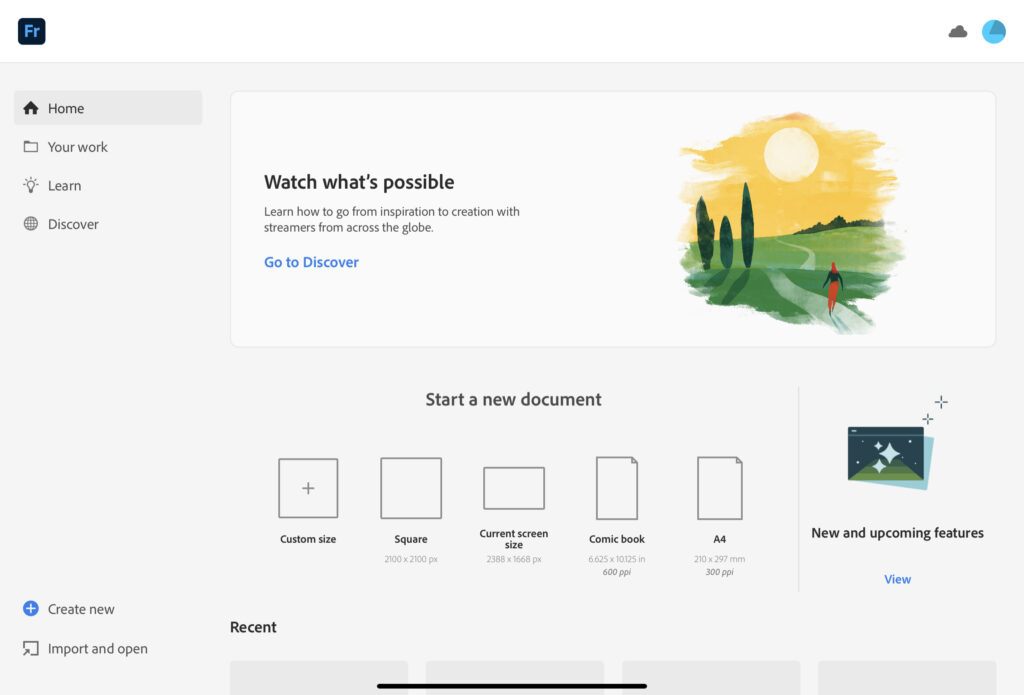
Homepage
Fresco’s homepage provides many options for the user to interact with the app. The sidebar navigation contains sections titled ‘Home,’ ‘Your Work,’ ‘Learn,’ and ‘Discover.’ To the right of the sidebar sits a large banner prompting the user to visit the ‘Discover’ page; if the user clicks on this, it takes them to the page which showcases live-streamed artist videos. Below the advertising banner is the easily discoverable option to start a new document and Fresco’s new and upcoming features. Scrolling down presents the user’s most recent works.
Workspace
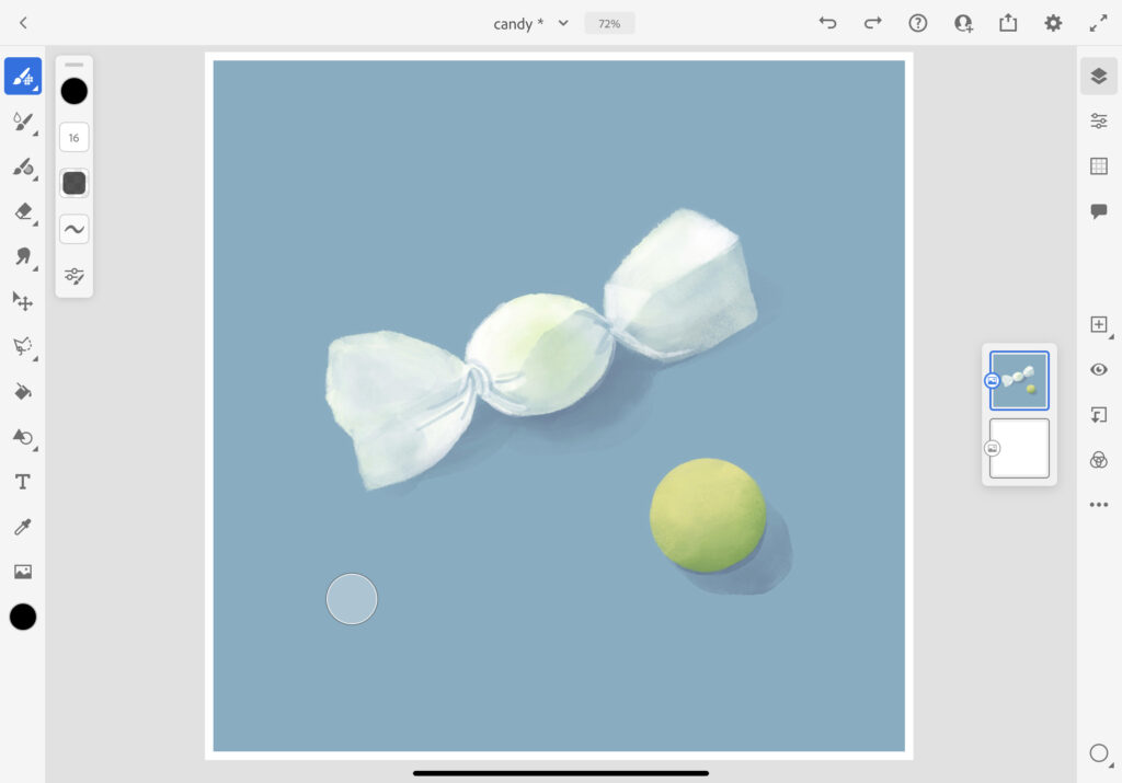
All digital drawing applications have a learning curve. As someone who uses multiple digital art programs, I possess knowledge in the head when it comes to recognizing art tool icons and their purposes. Many of the representative icons used on Fresco’s user interface require an immediate advanced understanding and therefore lack natural signals, which I assume would make navigating the application much more difficult for beginners. Once within the actual art-making section of the app, the interface contains many different tool options that lack signifiers.
I recommend giving the user the ability to customize the individual location of the tools within the toolbar, and using words to represent some of the tools rather than icons could improve their discoverability.
Using the Tools
There is an icon on the left-hand tool bar which I had thought was a basic shape-making tool because of its design. However, I assumed the signifier incorrectly based on the mappings. This button does not produce simple shapes such as circles or triangles, but unique designs like comic book effects.
After opening the tool, a pop-up window appeared which told me that the tool I was looking for was actually located within the Ruler tool. I eventually found the button, and was able to create a circle by tracing against a ‘circle guide.’
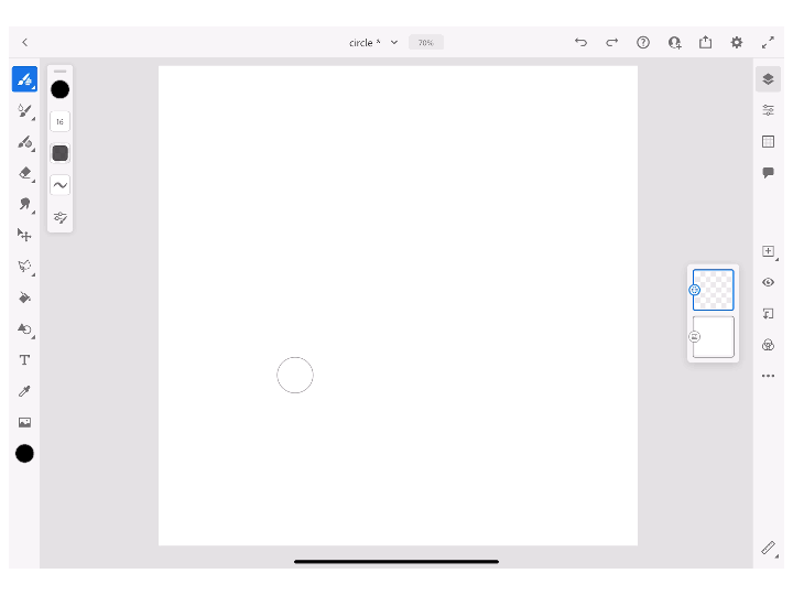
After making my circle in Fresco, I was unable to see any immediate feedback and I had to move the ‘circle guide’ out of the way. This left me wondering if I had even performed the task correctly. There was also a confusing signifier below the guide that I initially clicked believing that I could use it to move the guide, but the correct way to move it was to drag the circle itself. You can see my confusion in the GIF above.
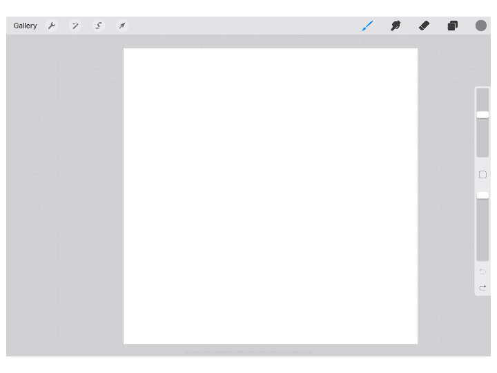
In comparison, notice how Procreate allows me to form a perfect circle simply by drawing a circle, holding my stylus in place, and touching a finger to the screen; each step giving instant feedback.
To fix this issue, Fresco could create a tool specifically for shape-building or develop a gesture similar to Procreate’s shortcut.
Buttons Versus Gestures
Users are most likely using a stylus or their fingers to navigate this app – not a mouse. Fresco does have a few finger gesture controls, but seven out of ten are related to workflow rather than art-making. The interface has multiple windows that open when the user wants to select tools and adjust brush sizes, a design that is not streamlined for a touchscreen. Having to click so many different signifiers with unclear mappings to obtain the results they’d want can be frustrating for users.
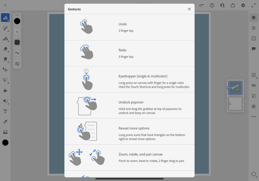
I recommend shifting the purpose of the app’s gestures to focus more on the art process, such as shortcuts that allow the user use their fingers to adjust the brush size, or quickly switch to the eraser tool.
Conclusion
A digital drawing app should have a streamlined interface and tool set with little distraction. Adobe Fresco has been out for almost two years, and its workspace still feels clunky in comparison to its competitors. Fresco’s lack of clear signifiers and confusing mappings will keep beginners and hobbyists from enjoying the app’s full offerings. With adjustments to these issues, it can become an enjoyable digital art-making experience for users.