Founded in 2008, Airbnb is an online marketplace that enables both travelers to discover places to stay and hosts to list their space for extra money. Aiming to create a world where people belong anywhere, Airbnb now covers more than 100,000 cities and 220 countries worldwide.
Log in or Sign Up
Unlike most apps where users have to click the button of “Log in” or “Sign up”, Airbnb’s “Log in or sign up” page pops up automatically when entering the app, making it highly discoverable for users. The “continue” button serves as a signifier that informs users to click in order to move on. However, there is a constraint applied, combining the “Log in” and “Sign up” in one function. By distinguishing existing users and novice users based on the emails they enter, the system will re-direct them to different pages (Figure 1). The “continue” button fails to clearly indicate the affordability, either “Log in” or “Sign up”. This could cause confusion to users, to some extent.
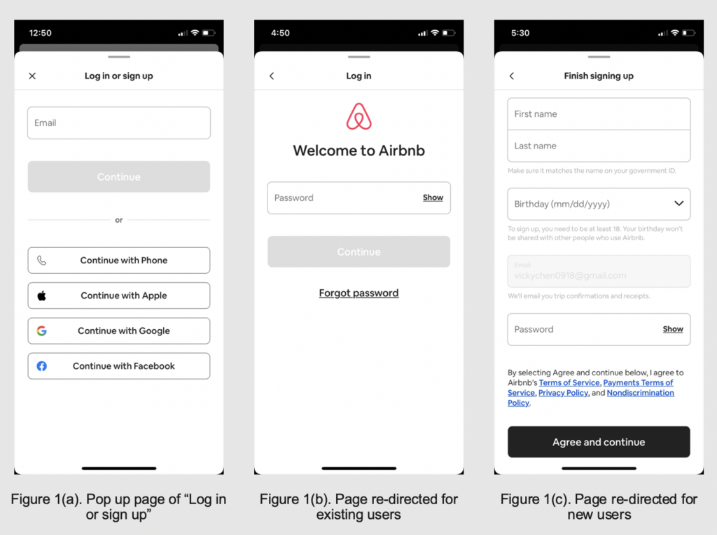
Solution: Make “Log in” and “Sign up” two separate buttons, leading users to different pages with entering email and password for “Log in” and personal information for “Sign Up” (same as Figure 1(c)). These two buttons, or signifiers will make users informed about the process and the next step, improving the system image.
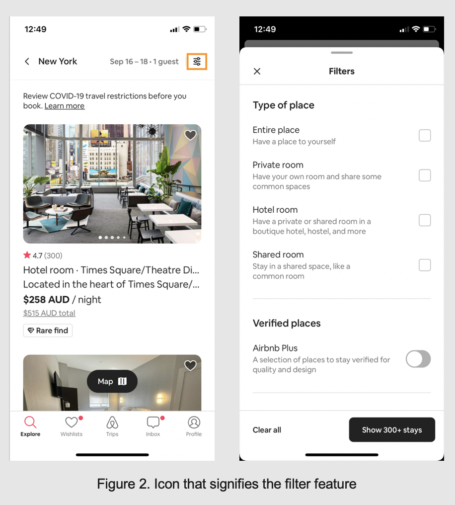
Searching for the Accommodation
The app follows the standard format in terms of hotel booking procedure. It asks users to select the date and destination as the basic requirements for the search. The icon on the top right corner signifies other filters to check, such as room type (Figure 2).
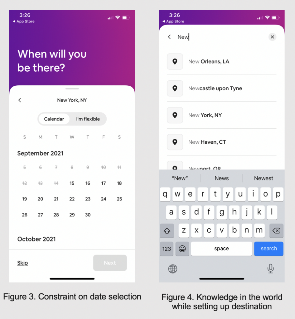
When selecting the date of the stay, the constraint has been applied by making the days before that date grey and unclickable (Figure 3). This will effectively prevent any slips of selecting wrong dates. In addition, while the users type the first letter at the stage of setting up the destination, a list of cities starting with that letter will appear so that users can take advantage of the knowledge in the world (Figure 4). All of the above designs help narrow down and provide more targeted search results that fulfill users’ needs, ultimately utilizing the user experience.
Specific Accommodation Page
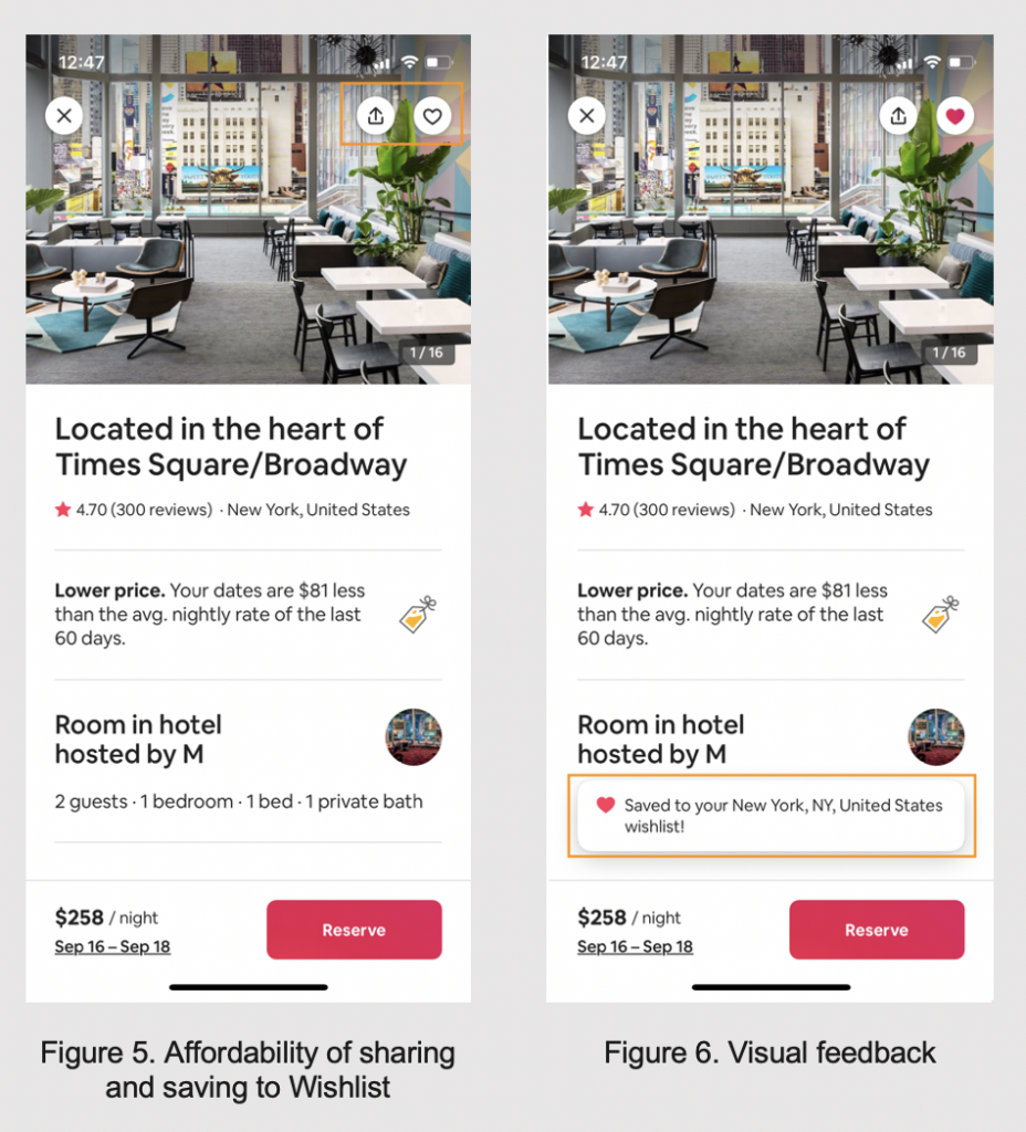
Once the search results come out, users can scroll through all the accommodation options. This interface involves the natural mapping. Users can scroll down to check available accommodations. By clicking the image or title of the accommodation, users will be taken to its own page with detailed information. The icons on the top right corner act as signifiers, informing where to tap as well as the affordability of sharing and saving to Wishlist (Figure 5). Tapping the heart icon gives an instant visual feedback by filling the icon with red color and a message box indicating the success of the action (Figure 6).
The host’s profile image appears as a circular, plain image below the accommodation title (Figure 7). It is designed to be clickable to show the host’s detailed information, although there is no button or text that signifies this function. This indicates the low discoverability.
The review is one of most important criteria for users to evaluate the accommodation. In this case, the review section is easily discoverable while scrolling down the page. Each review is fully shown, and users are afforded to scroll sideways to view all reviews. However, it lacks a signifier there on how to operate this command, forcing users to make use of knowledge in the head (Figure 8).
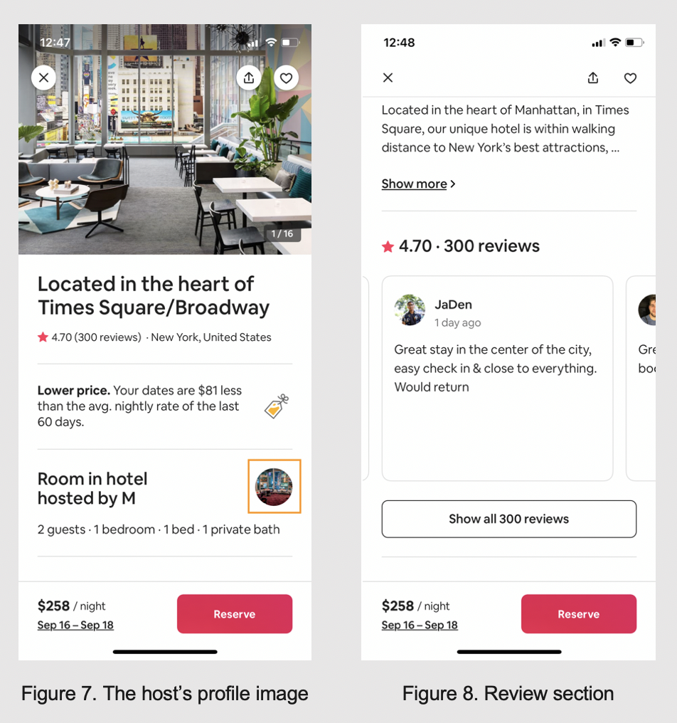
Solution: Add underlined text “About the host” underneath the host’s profile image, as a signifier. Add arrow icons (both left and right arrows) on the review section, so that users are clear about the possible action of scrolling sideways.