Airbnb is a digital marketplace for property rentals that disrupted the travel and tourism industries after it emerged on the scene in 2008. Known for its sleek branding and design, Airbnb allows property owners to host visitors while simultaneously opening up a whole world of new experiences (not exclusive to accommodations) for travelers.
1. Initial Experience on the Homepage
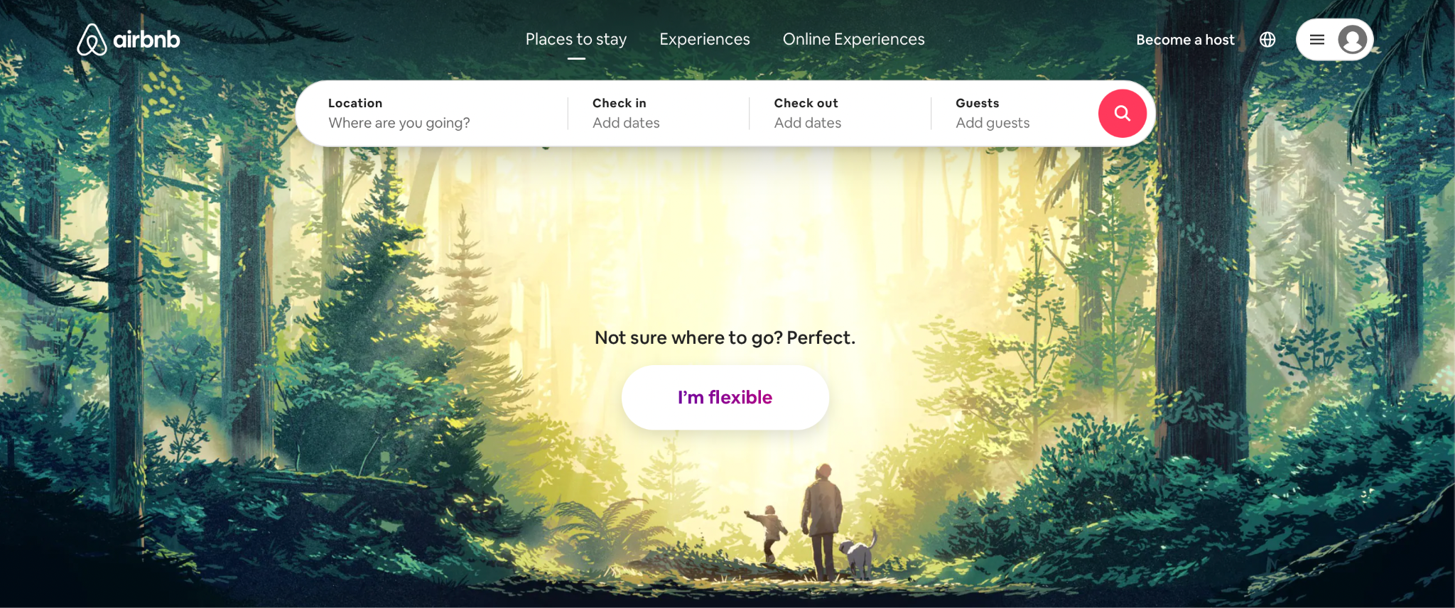
I wanted to plan a little getaway for myself somewhere within driving distance of New York City. This creation of a goal is the first step in the 7-action cycle Don Norman describes in his book, The Design of Everyday Things. I decided to go to airbnb.com to find a place to stay. This is step 2 of the 7-action cycle, the creation of a plan. Once I got to the Airbnb website, I was immediately drawn to the clean and relaxing graphics. One of Airbnb’s strengths is attracting users to their website with their aesthetically pleasing branding and UI by tapping into the visceral level of processing, which is responsible for making initial judgements based on fast and automatic responses.
2. The “Location” Tab
At the top of the page, there was a section with individual tabs for “Location”, “Check in”, “Check out” etc. as well as the corresponding questions/instructions “Where are you going?”, “Add dates”, “Add guests” etc. in each tab. The location of this section at the top of the page made it easily discoverable. The labels/questions/instructions, which in this case are the signifiers, helped me overcome the Gulf of Execution by informing me what to do. I like how the organization of this section specifies the action sequence for the user – first input information in the “Location tab”, then the “Check in/Check out” tabs, and then the “Guests” tab. This is the 3rd step in the 7-action cycle. When I hovered over the “Location” tab to input where I wanted to go, the tab turned grey and the mouse turned into a cursor, implying that I had to input some text. This again is an example of a signifier, an aspect of the interface which told me the appropriate action to take. The act of me inputting some information into the “Location” tab was step 4, perform the action.

3. The “Check in” Tab
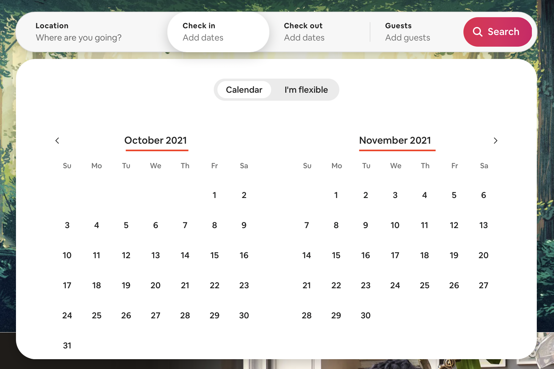
When I clicked on the “Check in” tab, a calendar view popped up. The system image of the calendar matched with my conceptual model of what a physical calendar looks like. This is an example of performing steps 5 and 6 – perceive and interpret. At the top of the calendar, there was a chevron arrow pointing to the left and another one pointing to the right. When I clicked on the arrow pointing right, the calendar month moved forward by a month from September + October to October + November. This is an example of natural mapping since moving forward in time is indicated by a right chevron arrow and conversely, moving back in time is represented by a left chevron arrow. However, one thing Airbnb should keep in mind is that due to cultural differences in conventions, some users may not view time as a linear concept and therefore, won’t be able to make the connection between the direction of the arrows and the corresponding movement in time. Hence, this could have the potential to be a cultural constraint.

I didn’t have any set dates in mind so I decided to go with Aibnb’s “I’m flexible” option. I think this is a creative solution on Airbnb’s part to eliminate any constraints on travelers caused by a lack of certainty of their travel plans. In the “I’m flexible” view, I had the option to pick a time frame from a set of pre-existing choices. Since I didn’t have the option to input in a number of days of my liking and could only select from the set of choices, this is an example of a logical constraint.
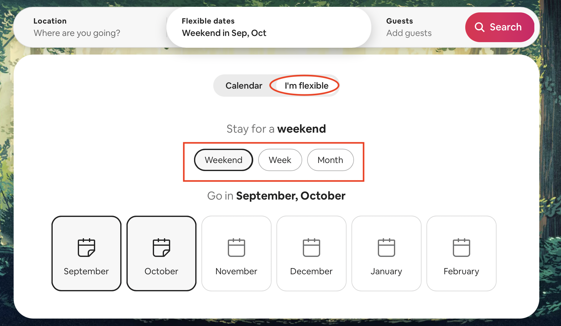
I selected a weekend in September and October. The text in the section changed as I made my selection which is an example of timely feedback, and aided in me overcoming the Gulf of Evaluation. I appreciated that Airbnb provides feedback throughout the process and not just at the very end. I think this is also a clever way of eliminating the need for a “Save” button since the changes in the text itself show that the action has been recorded and implemented by the interface. A potential area for confusion (especially for novice users) could stem from the fact that it is not very intuitive how to click out of a section due to a lack of signifiers. Since there is no “Exit” button or an “X” icon, there is no way for a novice user to know that to click out of one section, one must either click into another section or anywhere else on the screen outside of the current section. In this instance, the system image might not match the user’s conceptual model, and this could result in frustration.

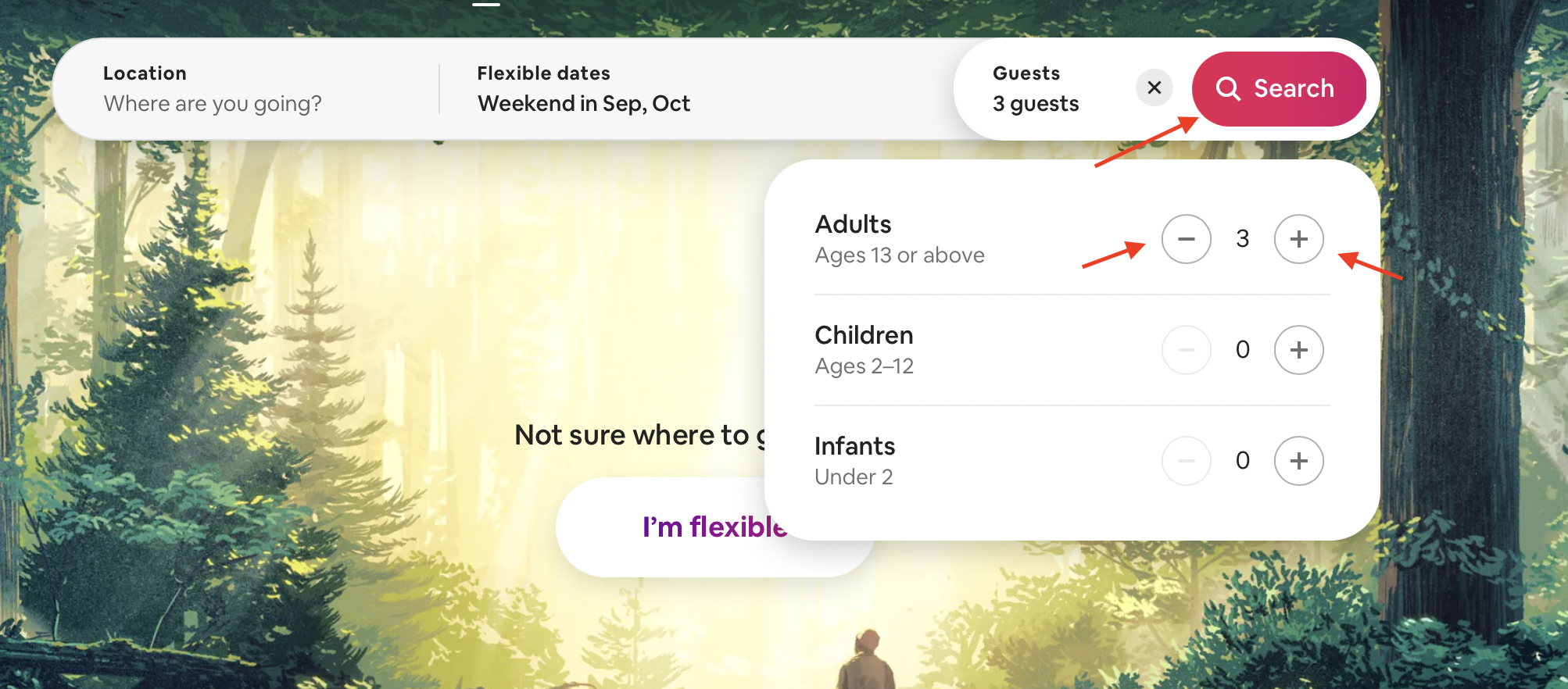
4. The “Guests” Tab
In the “Guests” tab, I knew to use the plus or minus signs to indicate the number of guests, thanks to the knowledge in my head about the rules of arithmetic. This is another example of natural mapping. I was unable to click the subtract sign when the number was at 0, which was made clearer by the restricted icon that popped up. This is another example of a logical constraint. In addition, the fact that instead of inputting a number in a textbox I had to use the add/subtract buttons to indicate the number of guests is a smart way of using an interlock to prevent slips that could occur from mistyping.
Happy with my specifications, I knew the next step would be to initiate a search for possible options. I knew that this is possible on the website (i.e. is an affordance of the website) because of the search button, denoted by a search icon. In addition, the bright pink colour of the button made it hard to miss and hence, was discoverable. When I clicked on the search button, I received instantaneous feedback when I was redirected to a new page with a list of options from which I eventually made a selection. This was the final step in the 7-action cycle, comparing the outcome with the goal.