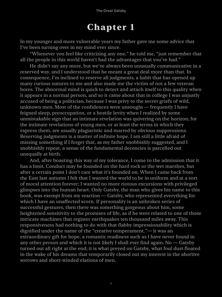
Apple Books is an app used to read eBooks. As native app in Apple’s ecosystem, many people default to using Apple Books as it’s readily avalible and touts a minimalist interface. While it is simple to use and requires little learning, Apple Books still could use improvement in many ways.
Apple Books has a skeuomorphic design. Even the name of the app is used to suggest how similar the app is to a physical reading experience. In many ways, Apple uses the skeuomorphic design philiosophy in its favor to create a seamless experience. However, it also has its limitations.
Turning the Page
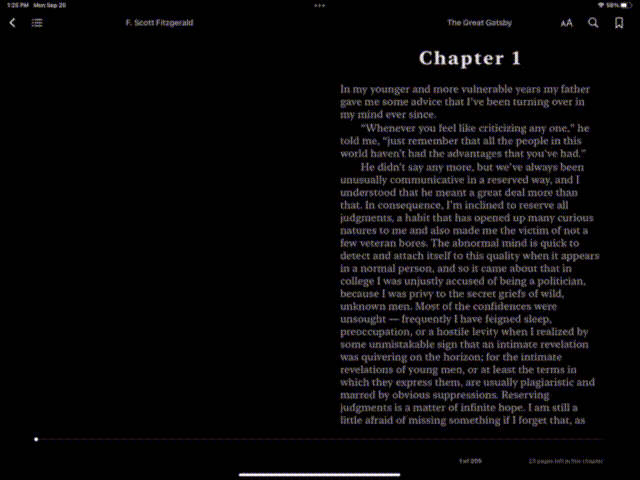
One of the strong points of Apple’s design philosophy for Apple Books is the satisfying page turns (Fig. 1). The iPad, since it has a touch screen, affords touch within the Apple Books app. In landscape mode, users can see two pages of the book. This is a pericived affordance as well as a signifier. The visual layout of the app signifies to the user that they can turn the page in the app much like turning the page in a physical book. As you swipe your finger across the page, the user can see the instant feedback.
Unlike a book though, you can hold an iPad in more than one orientation. In portrait mode, while the book metaphor is not as visually obvious, there are still cues on how to turn the page. The lack of two pages can make it ambigous of whether swiping up and down or left or right gives access to more pages. However, the page number at the bottom (Fig. 2) acts as a signifier to remind users of the book metaphor. Admitedly, the signifier in this case could be stronger as users could still have trouble crossing the gulf of execution. A possible solution to give a stronger visual cue, if we wanted to keep with skeumorphic design philosophy, is to add the look of a textblock (the stack of pages in a book) on the right side of the screen.
Highlighting and Note Taking
While Apple takes the reading of experience of book and tries to replicate it within its app, this is where the metaphor can hurt a user’s experience. Apple seemed to focus a large amount of its attention of just reading the book, but didn’t put the same attention to detail in some of the auxillary parts of reading.
For many people, the experience of reading a book often involves highlighting and writing notes in the margins. With the addition of the Apple Pencil in the iPad set up, this seems like an ideal set up for a person who likes to read on the go. However, Apple Books is severely lacking in this department.
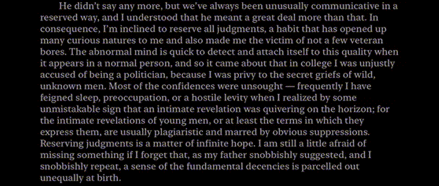
Figure 3 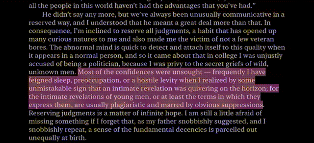
Figure 4 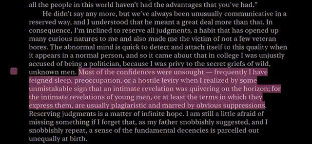
Figure 5
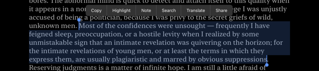
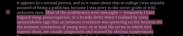
Highlighting with the Apple Pencil within Apple Books is easy. Just drag your Apple Pencil over the words you want and it highlights (Fig. 3). The instant visual feedback is delightful. Though this works more like you’re selecting an area than using a highlighter, it’s still relatively simple and easy to figure out.
However, this is where the user’s conceptual model of a book hinders their performance in the app. In a real book, you can write notes independent of highlighting and these notes are readily avalible to see. In Apple Books, users can only add notes to highlights (Fig. 4) and these notes once finished, must be clicked on to view (Fig. 5). In addition, they obscure the view of the text and users must tap on a different part of the screen to dismiss them. This method of highlighting and note taking differs significantly from real note taking in books.
In this case, the Apple Pencil affords instant highlighting, but it also might give users the perceived affordance of writing notes instantly by hand. To tap the highlighted selection, find the note button, and then write your note in the given area, is a cognitive interruption to a user’s note taking process. There are many solutions to this problem. Let users add notes to the margins of the book, independent of highlighting. I think handwritten notes would help keep with the feel of a physical book and provide a more seamless experience, but if there are technical limitations, just typed notes are okay. There can be an option to collapse notes if Apple is worried about visual clutter. Also, Apple needs to shorten the process to add notes. This can be done by adding a shortct, such as tapping the margins or the highlighted text with the Apple Pencil.
In addition, there are two ways to take notes. Through the previously mentioned way with the Apple Pencil, or to select the text with your finger and press note. In which it instantly highlights the selected text and opens the note screen. The problem with this interaction is that it lacks consistency. The note icon in Apple Pencil method is a little comment bubble the color of the highlight (Fig 4), while in finger selection method it says “Note” (Fig. 6). A solution to this will be addressed in the next section.
Beyond the Physical Book
While I have mostly focused on Apple’s use of skeuomorphic design, Apple has added some great functionality within Apple Books not avalible to real books. Apple Book’s selection menu (Fig. 6) offers a variety of activity-centered controls. With Apple’s little selection menu, it provides a quick way to do multiple tasks that would normally disrupt the flow of reading a book. Despite its overall utility, its presentation could use some work.
The menu in Figure 6 has many options in text. This can make an action slip more likely as all the options are close together and are not super differentiated from each other.
In addition, there are more menus. When you tap on a highlighted area of text, you get a highlight menu (Fig. 7), which has icons for all the options, many which overlap with the selection menu (Fig. 6). Then when you tap the right arrow at the end of the menu, it turns into the selection menu. My solution to this is to unify these menus to reduce redundancy and convert the text of the selection menu to icons. This makes the menu smaller, the options more easily differentiable, and doesn’t make users learn two different menu set ups.
Lastly, I want to talk in specific about the “search” option on the selection menu (Fig. 6). The search function in Apple Books finds all the instances of the selected text within the book. This, however, breaks conventions. Functionality like this is usually called “Find” such as when you press Ctrl + F and find a word on a page. “Search” is ambigous as it could mean searching the web. To solve this, I would replace it with a magnifying glass as suggested previously or replace the word “search” with “find.”