What is Apple Wallet?
Apple Wallet is a build-in app on iPhone that help user organizes their credit and debit cards, transportation passes and tickets, identity cards, keys, rewards cards all in one place, and use them conveniently in daily life. In this article, I am going to use the design concepts proposed by Norman to critique this app.
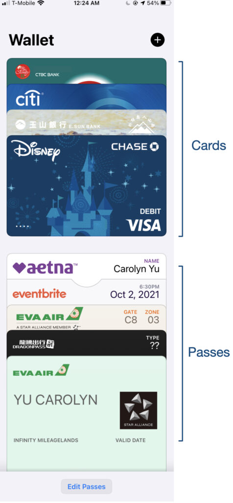
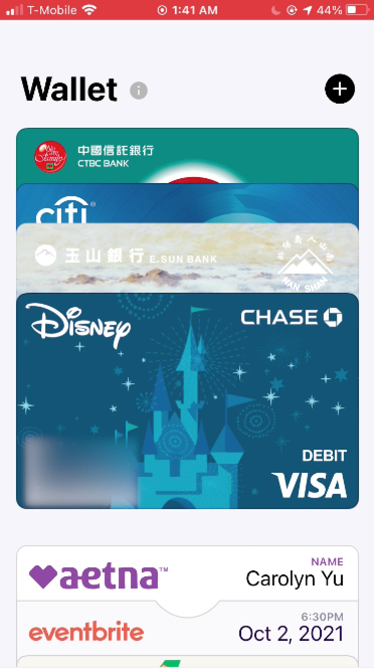
First, Cards display mapping a real wallet.
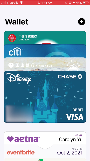
Through the explicit and simplistic homepage, the first thing I am noticed is the plenty of cards displayed in front of me, which provide good discoverability. Each card is overlapped with the next one. This image is similar to how my credit cards display in my physical wallet in the reality. Therefore, through mapping, I can easy to connect the wallet concept in my head. Besides, the arrangement of the cards is presented on a simple vertical axis, which imposes a constraint on gesture operations. Users can intuitively be using scrolling gestures on the page instead of using swipe or other gestures.
Second, gestures to the cards.
The cutting line at the bottom of the page also provides another important signifier, which allows users expect the page is not finished and scrollable. Besides, when I scroll to the end of the page, the bouncing animation provides me feedback of noticing that I have already arrived at the bottom of the page. There is no more item below.
Then I try to reorder my cards. After I decide to pick which specific card, I tap on the card without leaving my finger for about 1 second. The card I pick floating up in a few pixels that can be recognized by human eyes. This is a clear signifier telling me which card I actually pick, and also understandable feedback telling me I indeed have picked up a card.
After I make sure my target card, I can start to change the order of these cards. As an Apple user, my mental model has been trained by other apple products. Therefore, I am naturally following the guide same as other products to drag the item I am holding in to change the item’s order. Therefore, I can change the order of the cards successfully without labels. However, this will be a serious problem for users who are not familiar with Apple’s design system. Thus, I suggest that adding an information button for users who do not have the apple gestures system knowledge in the head, so that users can learn the rules, especially when the interface looks for a minimal design and loses the signifier.
Last, simple UI create logical constraint
When I try to see the detail and information of a card. I would tap on one card naturally and start to find any clue on the page. This is because I follow the basic guide in the mental model: any item with a frame or card-like shape on the screen may be clickable.
On the card detail page, I noticed the interface keep a simplistic design: only a big image of the card on the top, a table shows the transactions, and a button presents an icon with three dots on the right top corner. At first, I don’t know what the icon with three dots means. But with the logical constraint concept, I remove the other parts that obviously have their own functions. Then the icon with three dots part left over, which means it may be the button that allows me to access more information about the card.
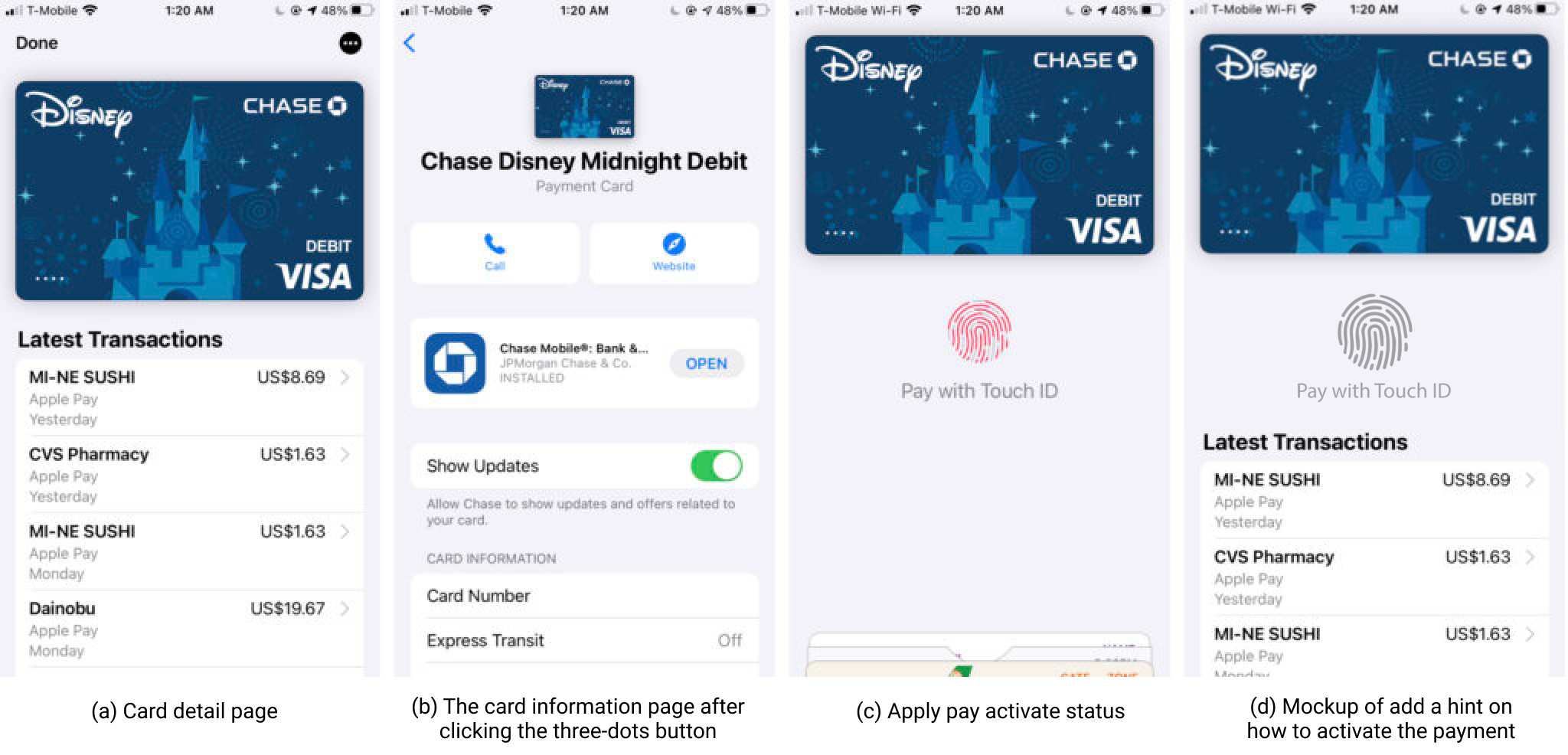
However, not every detail has been considered in this app. For example, the payment via the access of Touch ID is invisible. When I start to learn how to use Apply Pay to pay for my daily items. There doesn’t have any hint to tell me how to activate it. Although it could be activated the payment simply put my finger on the only physical button of my iPhone 6s whenever I need it, I never try it by myself before I learn it from googling how to use it. The fingerprint icon only shows on the page when I put my finger on the button, which presents the process of recognizing. Therefore, I recommend adding some signifiers, such as a fingerprint icon in the middle of the page to present the stage that allows the user to activate the payment. I believe adding the hint can help increase the discoverability of the payment feature, and also may help bridge the gulfs of execution and evaluation.
Conclusion
Apple Wallet App has already become one of the main trend payments for people nowadays. Although there is room for improvement in usability, I believe with the aid of signifiers, mappings, conceptual models, and constraints, the app could improve and become a more clear conceptual app that allows users easier to use.