WHAT IS COURSERA?
Coursera is an online education provider that offers online courses from top universities and companies around the world, also known as MOOCs(Massive Open Online Courses). Upon completing a course or a specialization track of multiple courses, learners earn certificates which can be published as aacknowledgmenton social media sites such as LinkedIn.
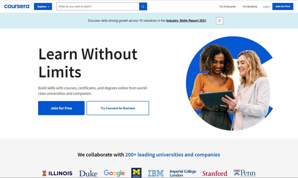
Preview of Courses View

Coursera provides a range of categories and courses before the logging-in step, which allows users to scroll through the page to see the courses they might interested in. The landing page has several key signifiers to provide affordances as a perception of how they could be controlled, such as “Explore Degrees” button, the scrolling arrow next to the course images, the “Explore” button and the search bar next to it which indicating the context that a search function and a range of courses are provided.
Logging in On Coursera
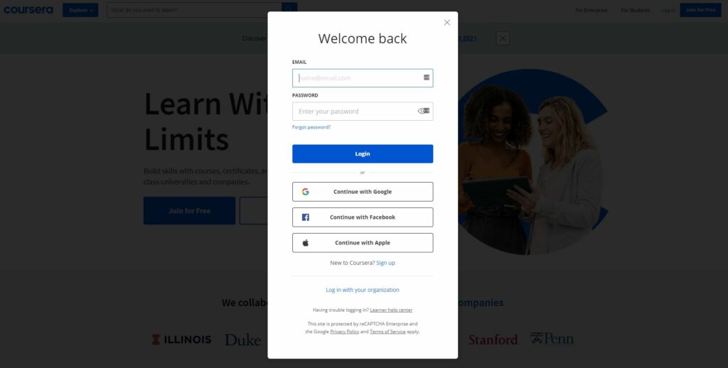
SUMMARY: The sign-up and log-in page have two ways to login, one is typing in email address and password manually, another is link the coursera account to the existing accounts such as google, facebook and apple. It’s manageable and easy to use for both first-time users and returning users.
Coursera follows a very standard format in terms of the login process. By utilizing existing account sign-ins instead of entering email and passwords, it makes use of the concept of knowledge in the world, which lets the users log into the account effortlessly, The “login” button acts as a signifier and informs that the website affords to log in.
Coursera Course View
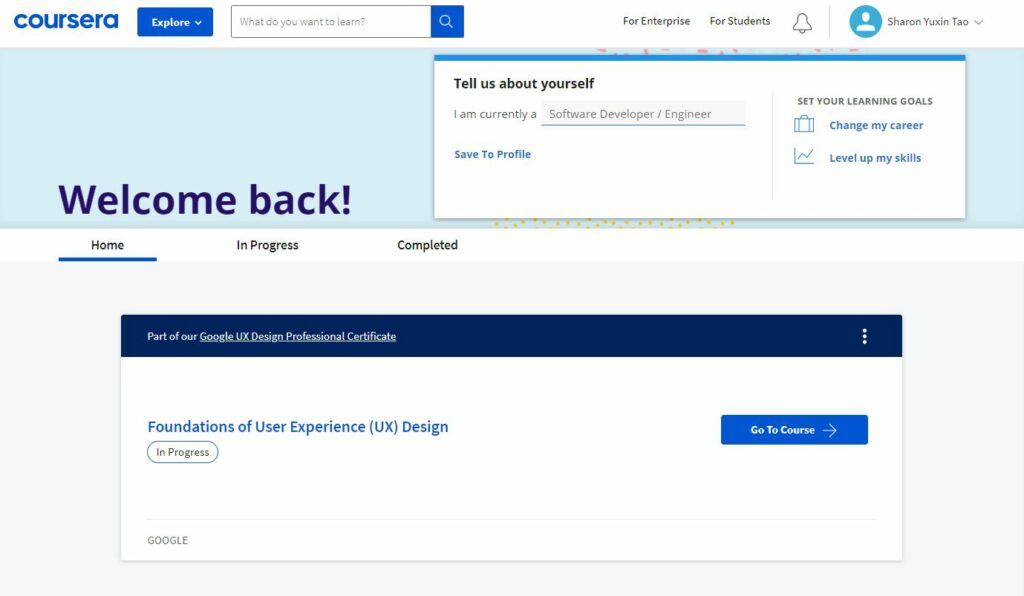
Learning Progress View
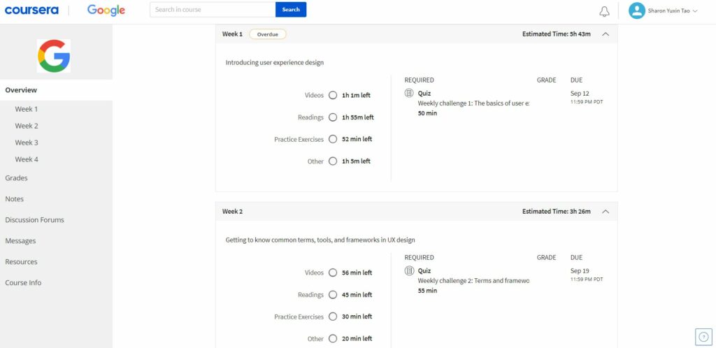
SUMMARY: “Go to Course” button on the “Home” page is discoverable as a signifier which indicates that the intended user action within this context is to dive into the course directly. Upon clicking on the button, users will be directed to the course overview page that shows the overall cource structure and learning progress. However, new vs. returning users might have different intents regarding what expect to see/do for the next step.
If a first-time user clicks on the “Go to Course” button, he’ll expect to look at the overview course information when he arrives on the page. In this case, he is directed to the page which matches his expectation and he would be informed by a timeline and graphs indicating how many courses in total he needs to learn.
If a returning user from yesterday logged in to the website, what he expect is to continue the video course he watched from last night. However, he has to go through multiple steps on the page to set on the course page. Thus, there’s a Gulf of Execution arises which conflicts with user’s expectation.
However, if a returning user from 2-3 months ago logged in to the website, it’s helpful to remind him with an overview that shows learning progress and continue learning the course afterward.
Learning courses View
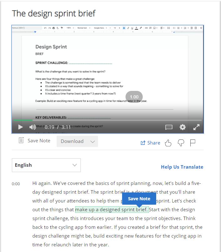
The notes session on the right side affords highlighting notes and taking screen shots. The “save note” button below the video screen acts as a signifier informing where to capture along to the timeline.
Conclusion
Coursera now owns popularity within the online education field and people use it for a variety of purposes. However, it has room for improvement on the usability and accessibility in some areas so that users would have more delight experience learning and completing tasks online.