Craft is a free note-taking application lauded for its minimalist interface. Through this application, users can create notes, organize documents, and search for specific documents or keywords. Furthermore, Craft’s block-based content structure enhances the note-taking experience by enabling users to create subpages, shift content around, and upload multimedia all within a note.
Navigation Bar
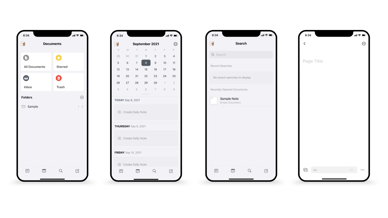
The navigation bar at the bottom of the screen includes four icons representing the documents, calendar, search, and new note pages. The icons are good signifiers of the page that each icon leads to, which enables good discoverability for the user. Furthermore, the navigation bar uses a good conceptual model, as the navigation bar is placed in a similar location to many other iOS apps. This allows users to call upon knowledge in the world to help them easily navigate through the app.
However, the navigation bar does not provide feedback when an icon is selected, as demonstrated in the image above. Each screen shows a different page that is selected, but there is no corresponding change in the navigation bar. Lack of feedback in the navigation bar can result in slips, leading to a gulf of evaluation if the user is unsure if they have selected the correct page. To bridge this gulf, adding a circle around the selected icon or highlighting the selected icon would provide natural mapping and make it easier for users to confirm which page they are on.
Note Interface
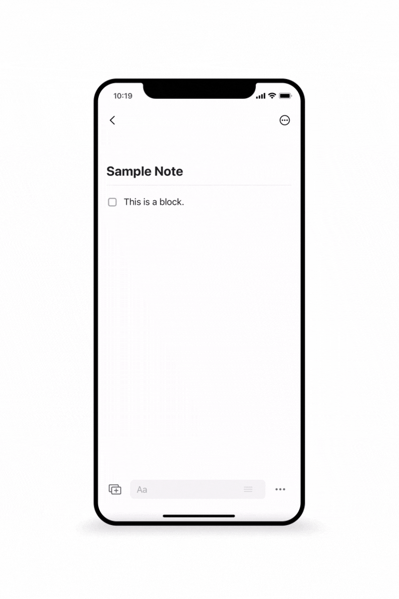
When creating a note, users can employ knowledge in the head of their previous experiences with smartphone applications and tap on the screen to bring up the keyboard. Furthermore, the boxed “+” icon in the lower left corner also enables good discoverability as it signifies that pressing this icon allows the user to add or upload content. Pressing this button brings up a menu of options such as images, files, and code that can be added to the note, as seen in the above gif. This menu also demonstrates constraints for what types of uploads are allowed.
However, the user faces the gulf of execution when faced with the right side of the screen, as there are two ellipses menus: one on the top right corner for page customization, sharing, and search; and one on the bottom right corner that undoes, pastes, and redoes actions. It is impossible to discern what each ellipses menu does, which can lead to mistakes.
To bridge this gulf, one or both of the ellipses menu icons could be changed to become better signifiers. For instance, the top right menu could be changed to an “i” icon or a gear icon to tell the user that the menu is meant for viewing or adjusting properties of the note.
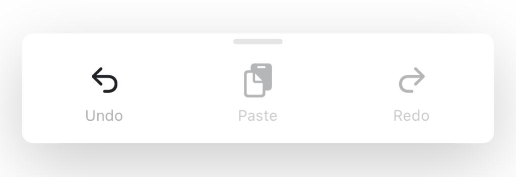
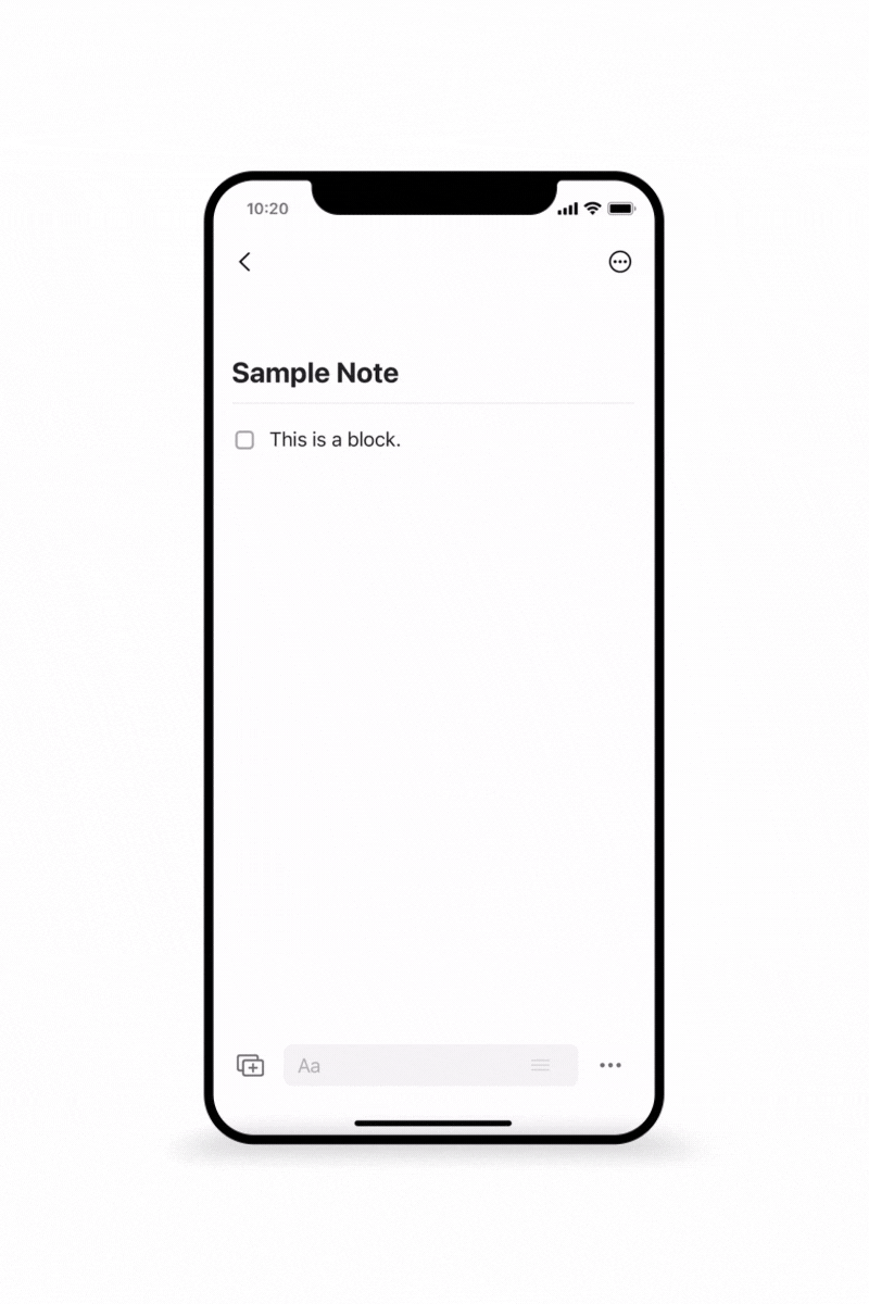
Though the bottom right ellipses menu icon is not a good signifier, the menu itself demonstrates a good example of both a logical constraint and a physical constraint. In the image above, the “paste” and “redo” buttons are grayed out, which provides a logical constraint where the user realizes that their only option is to undo. Furthermore, the grayed out buttons also provide a physical constraint as users are prevented from interacting with either button, even if they try to.
Note Interactions
In Craft, each line of text or media is organized in structures called blocks, and each block affords adding, moving, and deleting content.
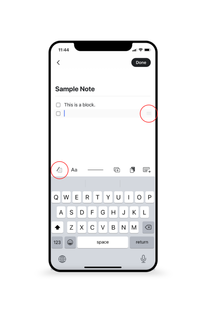
The keyboard toolbar employs good discoverability and contributes to a good conceptual model where pressing buttons within the toolbar will modify the content in the current block accordingly, similar to how keyboard toolbars work in application such as Messages. For instance, pressing the leftmost button on the toolbar (circled) brings up a menu that allows the user to choose how they wish to modify a particular block of text by making it a checklist or changing the color of the text.
Moving blocks requires the use of either dragging the three-lined icon on the right side of each block (also circled). This leads to the gulf of execution, as it is not apparent what would occur if a user interacted with the icon. Furthermore, the three-lined icon looks very similar to a typical hamburger menu on a website, and may lead to the user making a mistake if they believe that pressing the icon will open a menu. A possible solution would be to change the icon to an icon with four arrows pointing in four directions to signify that blocks can be moved by dragging.
Deleting blocks also requires the use of the three-lined icon. Instead of dragging the icon, users have to tap it to bring up a menu and delete the block. There are no signifiers that suggest tapping the icon is an option, meaning that this icon has bad discoverability. The lack of signifiers can result in slips as the user attempts to delete a block, along with frustration at the behavioral level of processing. To solve this issue, a trash can icon could be added to the keyboard tool to make it easier for users to remove blocks.
Conclusion
Overall, Craft has a clean and simple design, but the design may be too minimalist for users whom are not as familiar with technology. Though there are areas for improvement in usability, Craft is a good option for taking detailed notes that are supplemented with a variety of multimedia.