
Crunchyroll is an anime focused streaming service that allows users to watch anime TV shows, read manga, and discover mobile anime-themed games. It has a vast library of animes to pick and choose from so that one will never be bored. Crunchyroll has a free version (where you have in-video ads), or the user can subscribe to one of 3 membership tier levels for their premium version. There is a fan ($7.99/month), mega fan ($9.99/month), and ultimate fan ($14.99/month) premium subscription option that comes with a 14-day free trial. All memberships allow users to watch new episodes one hour after they are released in Japan, enjoy access to unlimited ad-free anime, and access digital manga. The app is free, available on mobile, tablet, desktop, gaming consoles, Apple TV, and Roku.
Homepage
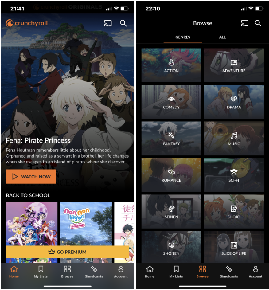
Figure 1.2 (right) – “Browse” page for people to discover animes by genre
When first downloading the app, the landing page immediately lets a user start watching anime hassle-free. However, there is a big “Go Premium” button that tries to get users to buy one of the three available premium memberships. There are five main pages on the app. “Home,” “My Lists, “Browse,” “Simulcasts,” and “Account.”
Discoverability
Crunchyroll additionally has fantastic discoverability because the app lets you scroll down to see animes from different types of scenarios. “Back to school animes”, Sports time: all the time”, “Animes your pet will love”, etc. Furthermore, if users go to the “Browse” page of the app, they can see Crunchyroll’s vast library of animes broken down into even more genres. These titles are helpful to discover more animes in a specific genre that a user knows that they enjoy. Or, it can help people discover and try out new animes to see what type of animes they like the most.
Feedback
What is great about some of the buttons on the app is that they provide great feedback. When you tap the button, it looks like it is physically pressed down and gets darker, letting users know that they are taking an action that will bring them to a new page.
Another signifier in this app is a physical signifier. When a user adds or removes an anime from their list, the phone will vibrate to signal the user know that the anime has been added or removed. Along with the message “Added to watchlist” or “Removed from watchlist”)
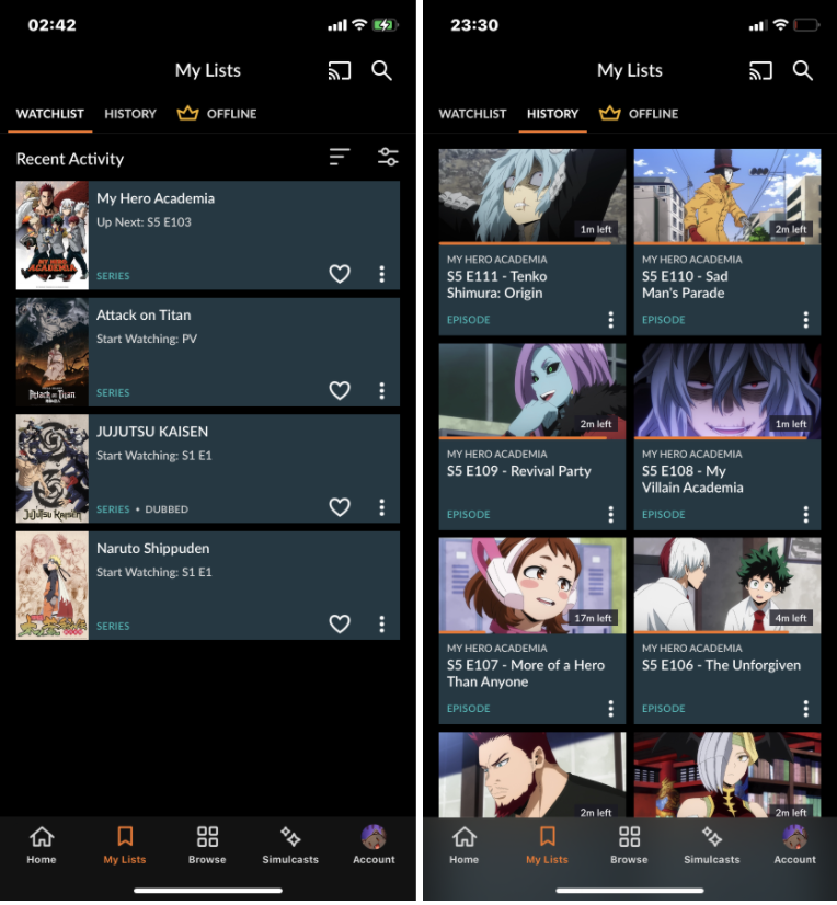
Fig 2.2 (right) – “The History page” in the “My Lists” page
Mapping
Users can quickly tell where they are on the “My List” section because the orange bar at the top slides to the right if they tap on “History” or slide their screen to the right. This easily lets users know where they are on the “My List” section. Also, with the icons on the bottom, depending on which page the user is on, the icon will turn orange to tell if they are on the “Homepage” or “Simulcasts” page, or vice versa. In addition to the colour-filled icons, Crunchyroll provides excellent mapping by indicating to users how much of an episode is left visually with a progress bar and time-wise by stating how much time is left to watch in an episode.
Human-Centred Design
Crunchyroll provides an example of good human-centred design because of their “My List” feature. Users can browse animes and add whichever ones seem interesting to their watchlist, and when you return to the “My List”, they will see all the animes they hope to watch conveniently in one place, personalised for them. It adds convenience because people won’t need to go to their Notes app or mentally remember the animes they want to watch in the future.
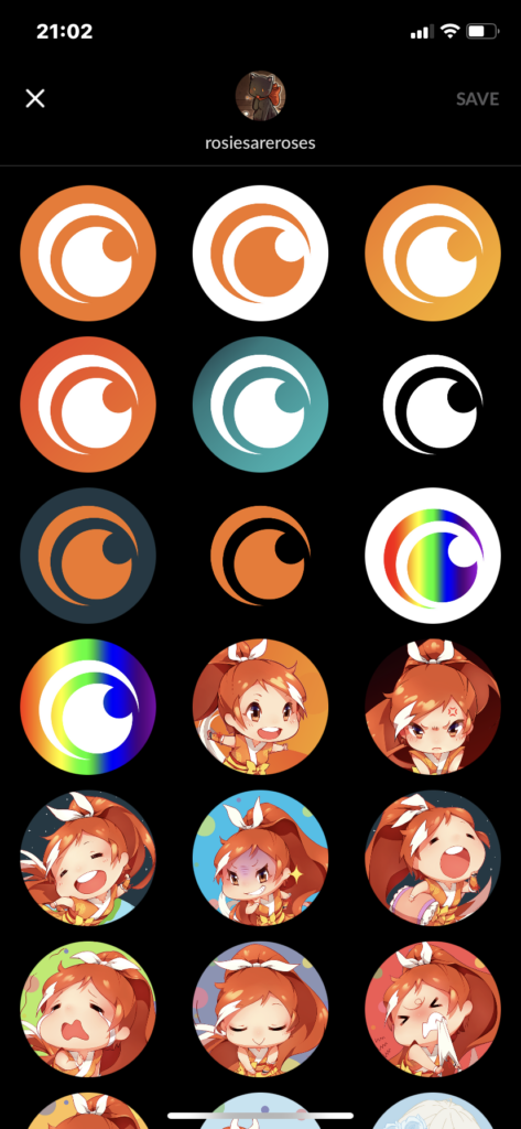
Adding on to the My List feature, part of the excellent human-centred design is the option to select profile pictures for the user account. There are many anime avatars users can choose from if they are a fan of a specific anime. There are pride versions of the Crunchyroll logo, which is incredibly inclusive to the LGBTQ+ community. The option for choosing an avatar makes a user feel like an account is theirs and that they are expressing a part of themselves.
Lastly, users can create a username that adds to the human-centred design of this app. Users aren’t just using their email address and a password to log in. They can personalise their username to express themselves if they choose to comment under anime episodes and interact with other users. Otherwise, it can just be something for a user to enjoy about their own account. For example, my username is rosiesareroses because it is very similar to the famous K-Pop singer, Rosé’s usernames on Instagram and Tiktok.
Goal-Driven Behaviour
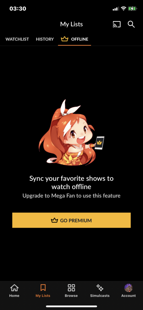
Crunchyroll keeps pushing premium subscriptions but, in a way, that it is not too bothersome. One of the pages that lightly suggest users go premium is on the Homepage, but the “Go Premium” button disappears once a user starts scrolling down. Additionally, going premium is recommended if users discover the “Offline” page (see figure 3). So, if they want to download episodes and watch offline, they are then given the information that they need to have the Mega Fan subscription enable to sign up for this page. Lastly, when watching an anime and if users want to watch the most recent episode of an anime, then Crunchyroll lets the users know that they will need a premium subscription to do that once again.
Knowledge of the World
Because there are so many streaming platforms that offer mobile versions, people have knowledge of the world about how many of these apps go and that almost every single streaming platform has a premium version and know that the platform will try to get users to subscribe. This means that there are often buttons on different pages that users know they can tap if they want to sign up. There is not a need for a signifier on the button (such as an “>” after the “Go Premium”) letting people know that the block of text is pressable because the general population know which block of texts are buttons and which are just static text. The gulf of execution is small because there are not many errors and obstacles that can be made on this app. After all, there are reasonable constraints on performable actions to keep the app simple and let users easily watch anime(s).
Conclusion
Overall, this is an excellent app for first-time anime watchers looking to explore what animes are available to watch and long-term anime watchers who want to use an app to keep track of the anime they are currently watching and keep a running watchlist. The gulf of evaluation is small because Crunchyroll provides evident and instant feedback to the users. Using this app to watch anime is a seamless experience with high discoverability to help users find what they want to watch.