
Facebook Marketplace is a section on the Facebook app whose mission is to provide users a platform to arrange to buy, sell and trade items with other people in their area. The transactions and interactions are purely user-to-user. Facebook isn’t responsible for facilitating or managing transactions.
This blog post will focus on two modes of exploring listings on Facebook Marketplace —
- Exploring item listings using the search bar
- Exploring item listings by scrolling through the listings page
First Impressions

Highlighted Marketplace icon provides appropriate feedback regarding the section selected. The primary buttons – “Sell” and “Categories” are placed upfront. The positioning is in alignment with the primary goals of the platform – Selling and Buying. The positioning and visual language of these CTAs further enhances the discoverability of the functions.
Providing a list of categories upfront informs the user of the different items they can browse through on this page, highlighting the affordance of the platform.
Even though labels clarify the intention behind the 2 buttons – Sell and Categories, the icons (signifier) don’t appropriately convey their objective.

Icon used for Sell Label represents “Edit”

Using an effective signifier
The “New for you” section successfully translates Knowledge in the Head to Knowledge in the World by consistently reminding users of the status of preferred items and their interactions with the sellers.
Exploring Item Listings- Search Bar
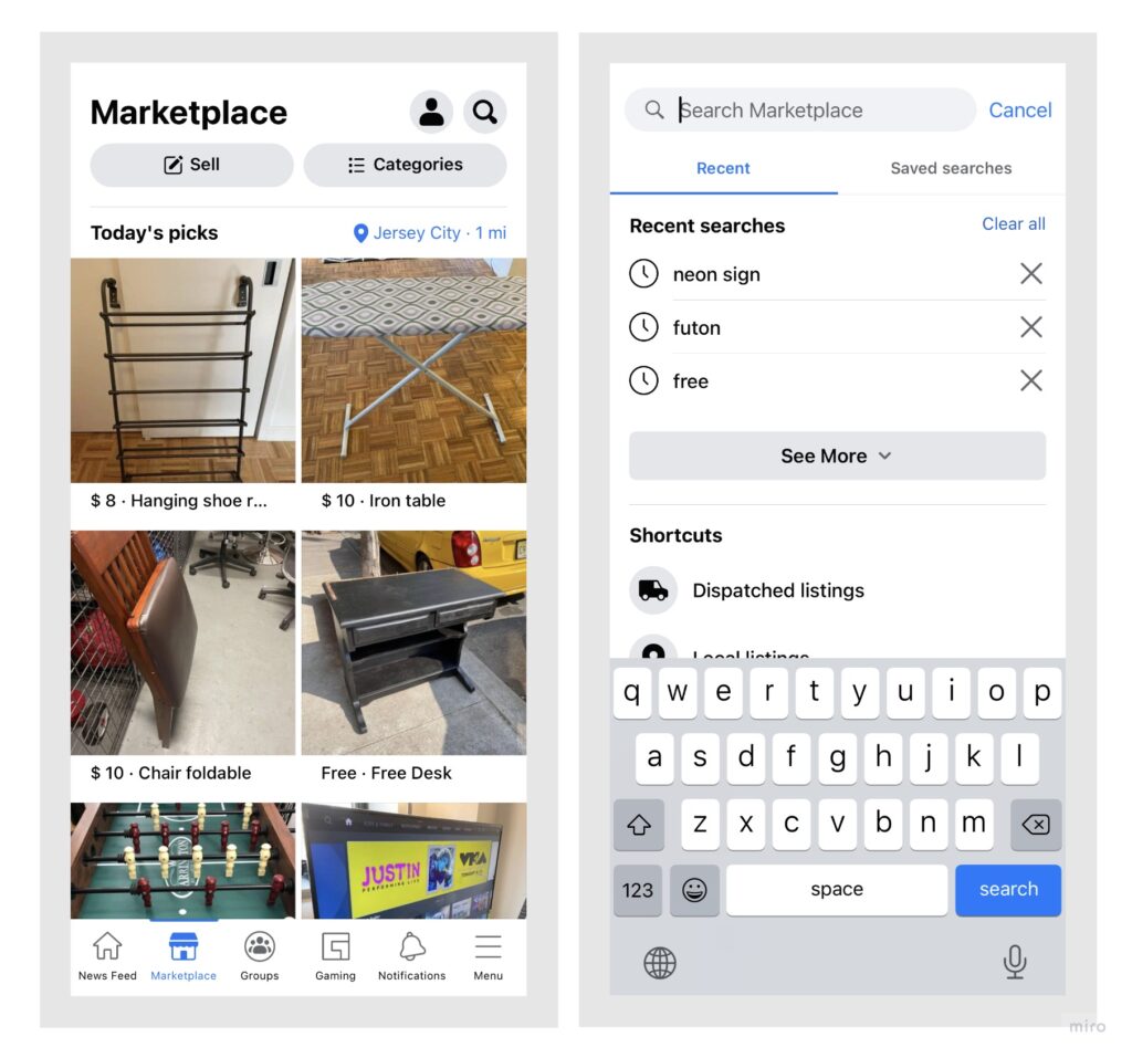
The first method of exploration is browsing the items using the search bar. The use of effective signifiers on the screen enhance the discoverability of this function . One the first screen, the positioning of the search icon (to the right, which is the most common placement of the search bar as in other apps) is in sync with conceptual model of most users.
Pressing the search icon provides an appropriate feedback to the user as it expands into a search bar with an effective signifier– place holder ” Search Marketplace”. This explains the search bar’s affordance.
Search Page Functions
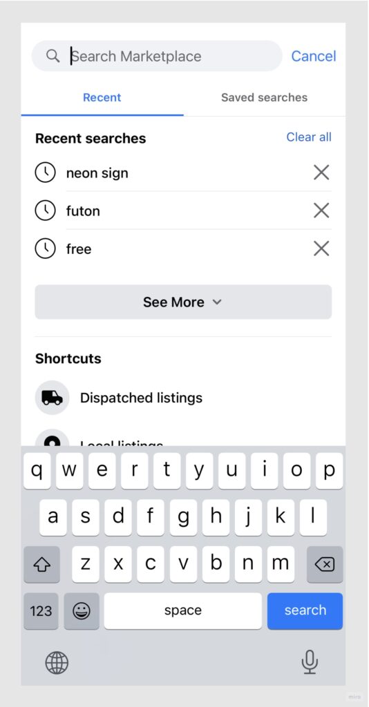
Through “Recent Searches” and “Saved Searches” feature the system reminds user of the previously searched or preferred/saved searches while preventing them from memorizing the past searches. Thus, translating Knowledge in the head to Knowledge in the world.

The category listings underneath the search bar highlight the affordance of the platform by suggesting what the user can search for on Marketplace. Affordances are further emphasized on through effective signifiers (icons representing each category).

The Saved Searches tab shows affordance – Searches can be saved. Although nothing in this section suggests how the searches could be saved. The user would assume that the call to action provided in this section (Figure 7) would allow them to save their searches but instead it provides the same function as the search bar. This is an example of ineffective mapping . Hence, a gulf of execution arises here.
As the user types in the preferred keyword in the search bar, a listings page displaying the items open. On this page, when the user clicks on the alerts button, that specific search gets saved. This clearly doesn’t match the Conceptual Model of the user. User could never have predicted that generating alerts for an item would also save that search for them.
After the alert is created a “alert generated” floating notification pops up on the screen providing a feedback to user’s action. But this feedback is only applicable to alert and doesn’t inform the user that their search has also been saved. Hence, a gulf of evaluation arises here.
Solution: This issue could be resolved by displaying brief description, explaining the user how creating alerts could save the search results for them. This description could serve as an effective signifier. Also, after the user has generated the alerts, a floating feedback for both – “Alert Generation” and “Search Saved” should pop up. Hence, bridging the gulf of execution and the gulf of evaluation.
Exploring Item Listings- Scrolling through the page
Page Structure
The browsing page’s segregation into different categories highlights the affordances available on Markeplace. However, at a glance the page doesn’t seem structured. The category segments are not prominent enough. Hence, the page appears to be an endless list of items available on sale. This reduces the discoverability of the items based on their category.

Left Image – Current , Right Image – Solution
Solution:
This problem could be resolved by :
- Introducing sufficient spacing between different sections
- Using signifiers (icons) with labels for each section, as in the category listings
This would enhance the discoverability of different categories of items existing on the platform.
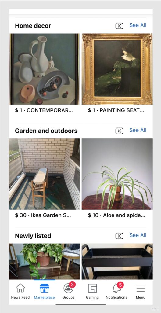
Images in each section match the header name of each category. This reflects effective mapping between category name and its images. This further enhances discoverability of items on the platform.
Misleading & Distracting Sponsored Ads
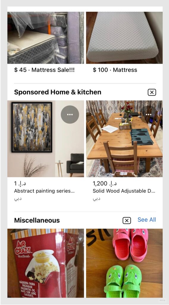
Current Interface
The problem of improper category segregation is further accentuated by Sponsored ads. Sponsored ads look the same as items listings hence users tend to click on them. In most cases they are directed to another web link without being informed about it on the listings page. Hence, a gulf of evaluation arises here.
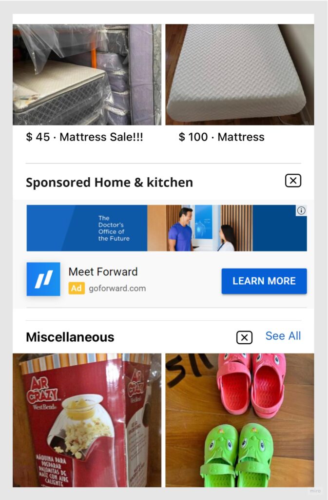
Solution’s Image.
Sponsored ads reference taken from Youtube iOS app
Solution: Adding details of the link user would be directed to, will help in bridging gulf of evaluation. Adopting a different visual language for depicting this section also highlights the different affordance of this section – Sponsored Ads .
The varied visual language could also serve as an appropriate signifier in this case , hinting that this section functions differently from the other item listing sections.
Location SetTIngs
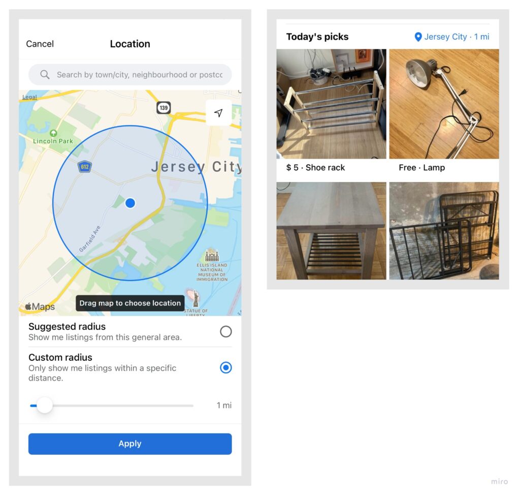
Providing the users an option to filter/view options based on their location gives them a positive feeling of having some control on the system. The map here clearly gives an estimate of users location. Hence, serves as an effective signifier. The “Suggested Radius” and “Custom Radius” option work as good constraints to display only the results relevant to the user. This limits the amount of information the user has to process.
Once the user has applied the filters based on their location’s preference, they expect to see items only within the selected radius. But here, location setting is only applicable to the “top picks” sections and not to all categories. This doesn’t match user’s conceptual model as it provides an improper feedback to their action. A gulf of evaluation arises here.
Solution: The location setting filter should be applicable to all categories. Only then its purpose would match the user’s conceptual model. Since the location settings filter would be applicable to all categories, it should be placed along with other global headers at the top of the page ( Closer to “Sell” , “Categories” buttons)

At a glance a user can only see the item’s cost and a short description. Since most users are required to pick up the listed items from a location, location is a key decision-making parameter for them. The item’s card as well as the item’s description page fails to give the location details of the listed items. The users need to send a message to the seller to inquire about the item’s precise location.
Adding a signifier for distance from user’s location
Solution: Introducing an additional step in the overall user-flow can get very frustrating. To resolve this issue, appropriate signifiers, conveying relevant information regarding the item’s location should be placed on the item’s card itself. This will ease user’s decision-making process.
Conclusion
Facebook Marketplace is now used immensely for a variety of purposes, but as explained above, it has room for improvement on the usability front in many areas. It is easy to navigate through some of these usability issues while the others restrict the user from achieving their goals with ease.