
FotMob is a platform that gives football fans real-time scores, live commentary, and detailed stats. The personalized news and notifications make it easy to keep up with their favorite teams and players. The application also gives quick match updates to make sure the fans don’t miss a goal, no matter where they are.
This design critique is from the perspective of FotMob’s football fan-facing platform and based on principles introduced in Don Norman’s book, The Design of Everyday Things.
Navigation bar
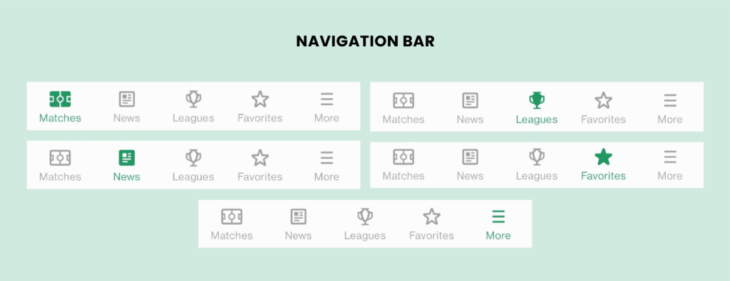
The navigation bar at the bottom of the screen contains multiple examples of good design principles. It displays five icons above the text lab, each signifies the five tabs in the application that the user can switch between by tapping on the icon. In the event that the users are tapping on an icon, on the navigation bar, the icon will be highlighted green, which tells the user which tab they are on currently. This immediate feedback is good for the users as it signifies that the action is done. The bottom navigation bar also uses natural mapping which gives the user a clear idea as to what the tabs would do when tapped upon.
Matches Tab
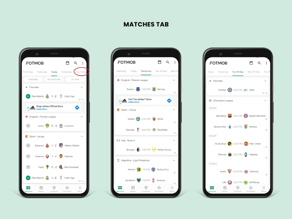
On entering the application, the users land on the ‘Matches’ tab where they can see the upcoming or past matches. The top navigation bar shows ‘Today’ highlighted with a green line under the text, while the other options are greyed out. This shows good discoverability for the users so that they know which day the matches are on. Also, the ‘Tue 14 Sept’ text is cut off which affords the top bar can be scroll left or right.
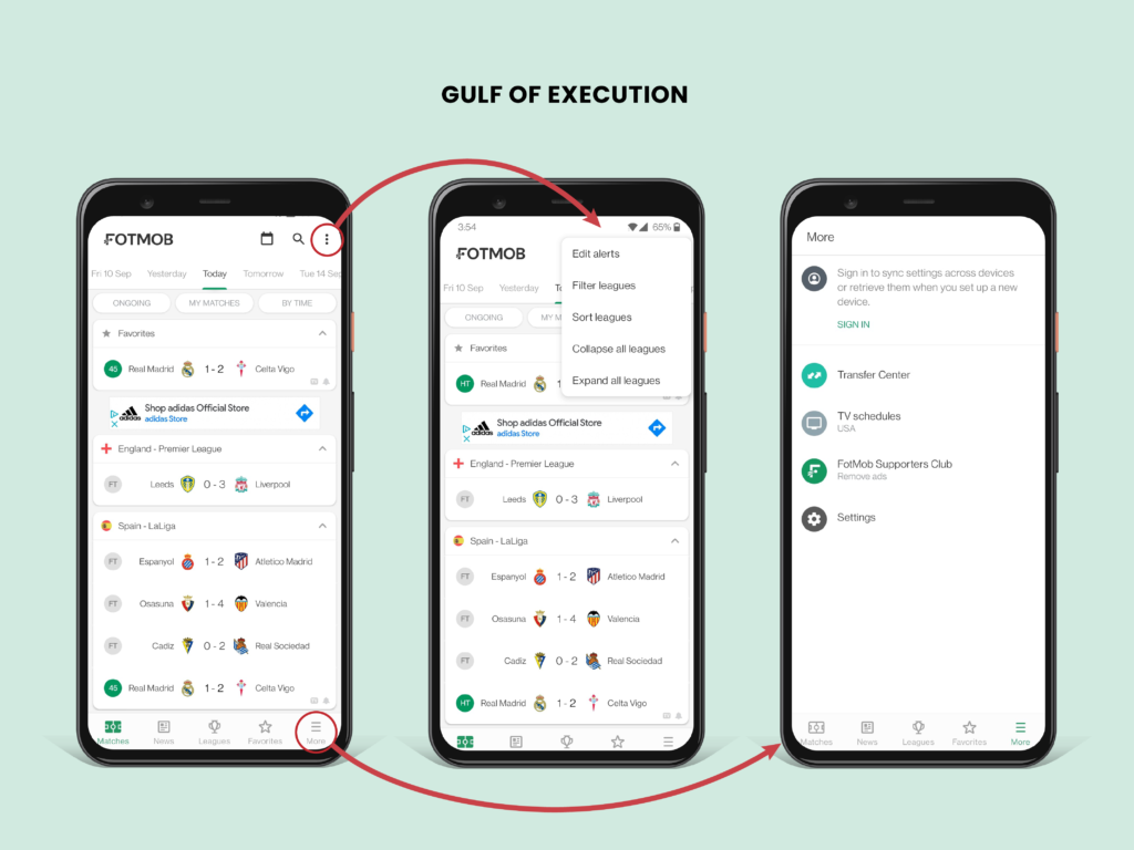
However, the user experiences the gulf of execution when faced with the right side of the screen as there are two types of essential menus. One is a menu on the top right corner for filters, alerts, and sorting. The second menu on the bottom right corner under the ‘More’ tab has TV schedules, transfer center, and settings. It is hard to know which menu has what options, which leads to mistakes.
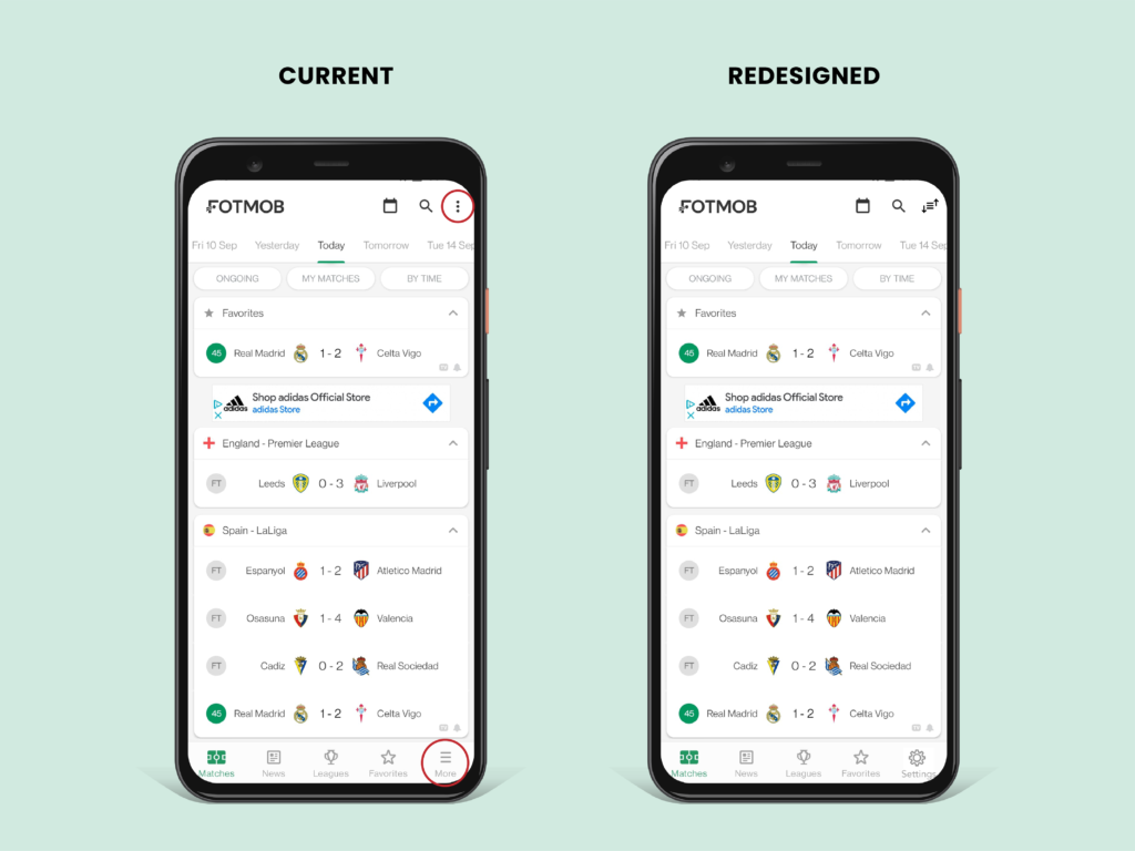
I suggest using better signifiers for both menus. For the top-right menu, it could have a filter and sort icon that signifies that the menu is for customizing elements on that page. And for the bottom right to have a gear icon above ‘Settings’ text to signify that the tab is for other customizable elements for the whole application. This way the settings option will be more discoverable than being inside of the ‘More’ tab.
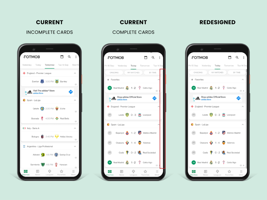
Depending on the card sizes, the users can either see complete cards or incomplete cards at the bottom of the screen. For some screens there are incomplete cards, which act as signifiers, indicating there are more to view underneath and it affords to scroll. But when there are completed cards on the bottom, the first-time users would not know that the screen is scrollable. I suggest having a scroll bar on the right-hand side, which affords scroll ability.
League’s Card
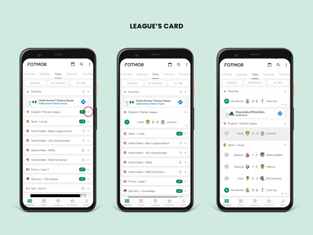
On the matches tab, there are different cards sorted by the league names. Each league has matches lined up for that day. ‘v’s and ‘^’s act as signifiers, affording that each card is expandable or collapsible. On expanding a card, the users can see which matches are under that specific league. With the knowledge in the head, the user taps the match they want to see the details page of. Immediately the section is highlighted for a quick second, showing good feedback, and then enters the page.
Conclusion
Overall, FotMob has a good conceptual model, as the users know how to proceed from one place to another. However, even if it is used by a vast number of football fans, there is still room for improvement on some of the interaction and usability areas. But it is easy to understand and navigate through once you start to play around with the functions and settings. I really recommend this application for all the football fans out there!