
Google Maps is a map-based service that helps users to navigate to a destination and discover places on the map. Since Google Maps is one of the most broadly used apps in the world and have many features, this article addresses the usability issues of three main features of Google Maps (Landing Page, Searching & Navigation, Finding Nearby Places) based on Don Norman’s Theory in Design of Everything”
Landing Page
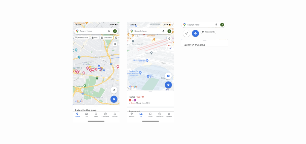
The landing page of the application is very clear with signifiers, affordance, and mapping. First of all, Google Maps literally maps the real world very efficiently. It provides minimized information for navigating so that it does not overwhelm users with overfull information. Google Maps provide roads, public transportation, and parks. This minimized information doesn’t overwhelm users and efficiently maps the real world at the same time. Plus, a dot on the map that signifies user location moves as the user move or changes direction. The motion of the dot maps where the user is and it makes it easier for the user to recognize where they are. On top of the efficiency mapping of Google Maps, Every button gives clear feedback, especially even when you click the finding my location button. It either zooms in or shows a 3D view if it is already zoomed in. In addition, Google Maps prevent slips by giving the proper amount of constraints. Since the landing page is consist of the most frequently used features such as “finding my location”, “finding direction”, search places”, “Discover places”, and other features are separated with navigation bar, it efficiently constraint actions that users can do in the landing page, and prevent users from making slips from the numerous options. Even if the user slips Google maps provide back buttons that users can recover from the slips.
Searching & Navigation
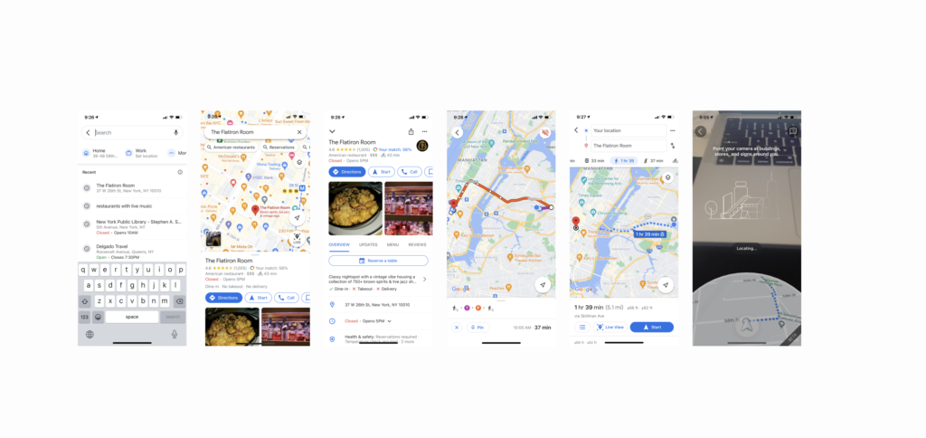
The users can search the place and navigate to the destination with Google Maps. Since Google Maps use the same design patterns throughout the application, such as lists, Buttons, Backdrops, icons, and Search bars, the users can quickly learn what signifies what is available and affords what type of actions. Navigation to the destination is also a good example of using Gulf of Execution and Evaluation. When users hit the direction button of certain places, then it shows direction with lines on the map from the current location to the destination. As a dot that signifies the user’s current location spontaneously show direction and location as the user move, it helps users see if his goal is achieved. Also, Google Maps provide navigation that resembles a conceptual model of how users find a way to the destination. In addition to providing where to take transportation and change direction with text, Google Maps recently added a feature that supports users to figure out where they are by comparing the surrounding buildings with AR. Google Maps navigation is getting closer to what we do in the real world to find a way to the destination.
Finding Nearby Places
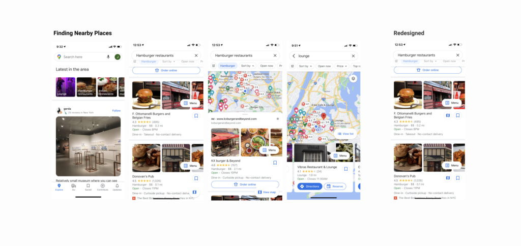
However, Google Maps also have some usability issues due to the trade-off of a conceptual model and discoverability. When the users drag the backdrop to the top to see nearby places, it shows recommendations based on the user’s current location. Once a user clicks the place, it shows detailed information of the place which meets users’ expectations. However, if users want to see the location of the place on the map, users need to find the “view map button” which discoverability is low due to its location at the bottom of the page. This use case may have been lowered in prioritization because of the conceptual model that users have. To provide more discoverability to the use case seeing the location and place, I would recommend adding the view map buttons to each list to make it more discoverable and signify that it is possible to see the place information and maps simultaneously.
Conclusion
Even though Google Maps provides many services with its complex data, it is very usable with efficient usage of signifiers, mapping, feedback, constraints, and conceptual models that resemble real-world action. However, some of the features were not used because of their discoverability. This indicates that there are still room for improvement, even the most renowned apps in the world if we examine it.