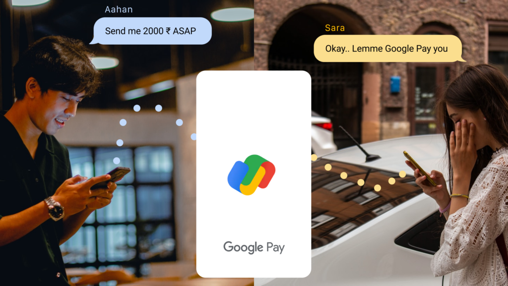
Google Pay (India) is a digital wallet payment service that connects the user with thier bank account and lets the user pay bills, send money to friends and family, or buy groceries. It’s the second most popular app in India, with a market share of 34.63%, combining Android and iOS users.
Home Screen
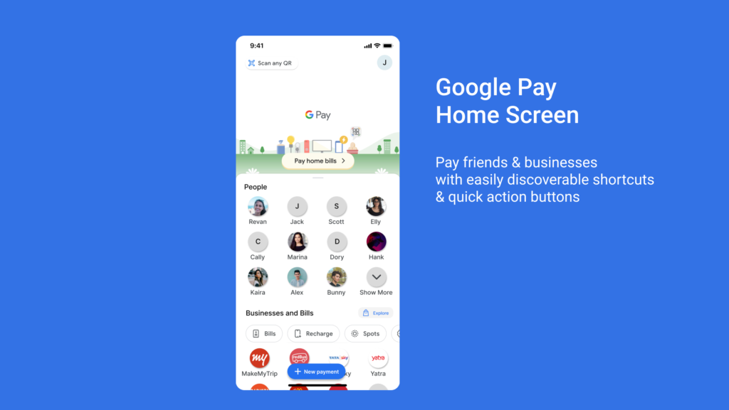
The primary function of this app is to let users make payments. And the home screen has a perfect signifier for this action with a clearly labeled floating icon button that matches the user’s mental model. The home screen has great discoverability of features like “Pay home bills” and “scan any QR code button,” which comes in handy while making payments at grocery stores and delis.
Another example of good design in this screen is its different sections for people and business. This clarity in design helps the user to know with whom they are interacting to pay the amount. Also, the talented designers at google successfully avoid the information overload on the user by limiting the number of people and businesses they see at a time.
The shortcut buttons like bills, recharge, sports, and gold have a good mapping to the result. Like on selecting the recharge button, the apps navigate to the screen that allows users to enter the mobile number.
New Payment options page
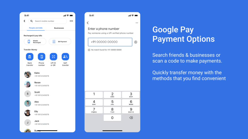
This page starts with an easy-to-locate search bar, which provides affordance to the user and allows them to type characters and numbers. The placeholder text signifies what kind of search results the user can get upon entering the information. Also, the location of the search bar is ideal for the user’s conceptual model.
The tabs below the search bar avoid information overload for the users by applying constraints and splitting the overall payment modules into two sections, viz People & Bills, and Business. Also, the selected tab state provides discoverability and tell users their location in the system.
The next section is where users can choose a method to initiate the payment. Here the easy-to-understand icons, along with their description text, affords the user to take action according to the payment method of their choice or situation.
Once the user taps on any of the icons of their choice, the app navigates to the screen, which allows entering information based on the selection made earlier. This kind of mapping gives the user feedback that they are on the right path as it matches the user’s mental model.
As the user proceeds further, Clear heading text for title and body text for descriptive message signifies what information they can enter to move further. And if the user enters wrong information or does not match with the database, the app provides feedback in simple and easy-to-understand messages.
The Payment Page
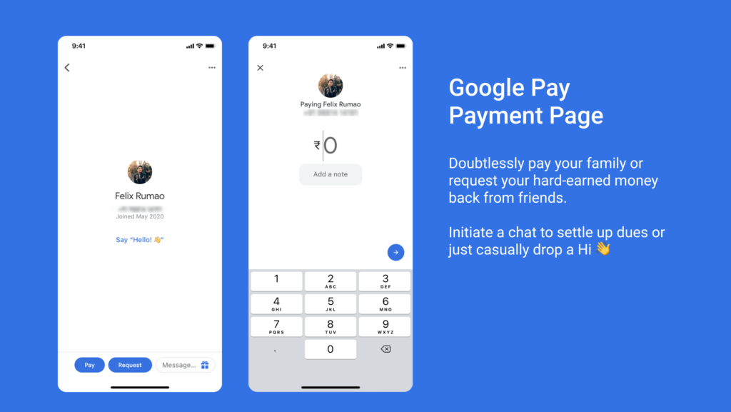
This screen has a minimal interface that prioritizes crucial information like the user name, profile, and mobile number of the person that you are sending/receiving the money. This type of UI emphasizes data and validates the user’s mental model by giving feedback like the profile photo and mobile number that helps identify that specific person.
Small nudges like ” Say Hello” messages redirect the user’s attention to the bottom of the screen, which leads to the discovery of important CTAs like Pay and Request. The easy-to-understand labels signify the result of the action, which would be similar to the user’s knowledge in mind. Besides the CTA’s, a text box also helps users have a small chat with the other person. The design of this text box is such that it affords to type in characters and numbers.
Upon choosing the Pay option, the screen carries forwards the vital information that helps identify the person. The designers at Google have paid attention to detail in UX copy by using words like Paying and Requesting before the person’s information. This helps the users map their actions to the result. The greyed-out “0” affords users to enter an amount and uses a numeric keyboard, which signifies that the text field only accepts numbers and allows the completion of the user’s transaction. As the transaction goes through the app and then the banking system, the app provides detailed transaction information with the transaction’s status, which acts as a feedback to the user. The status and the history of these transactions are available in the user’s and the person’s chat history.
One place where google pay would improve the user’s experience is by adding a search bar on the home screen. While using google services, people tend to use the search bar more than scan for the information. Adding a search bar on the home screen would save a click and give results like finding a person or business right at the user’s fingertips.
Conclusion
With the rise of mobile payments and banking systems in India, Google Pay captured a good market share. It secured itself 2nd place because of its easy-to-understand User Interface and good User Experience, which is used by young folks and older people who are not very familiar with touch screen devices.