Google sheets is a spreadsheet editor belonging to the Google Workspace collection of applications. Users may create, share, and edit spreadsheets simultaneously with other users for remote productivity and collaboration. While a mobile app now exists, here we’ll be focusing on the widely used web-based application through the lens of Don Norman’s The Design of Everyday Things.
Adding Sheets
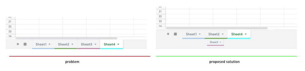
Borrowing visual elements from Microsoft Excel, Google Sheets is skeuomorphically designed, as “tabs” hold different sheets of data that can be color-coded as an office or schoolwork binder would be. A small downward-pointing arrow on each tab clearly signifies access to a menu where additional actions can be taken, including deleting, duplicating, or renaming a tab. While the bottom ribbon allows discoverability between switching tabs and adding new tabs (a widely used (+) icon), this linear arrangement of tabs does not lend itself to optimal information architecture. Tabs can historically only be horizontally arranged in spreadsheet editors. Why does the bottom worksheet ribbon consistently face this incremental innovation between spreadsheet applications? Evolution might look like allowing users to stack or group tabs vertically to allow a hierarchy to be built within spreadsheets themselves. This would allow users to go beyond the sequential notebook conceptual model, providing a more dynamic way to organize and rearrange information.
Applying borders
Google Sheets’ most vital function is allowing users to create tables to store, organize and present data and information. However, when formatting tables, the border tool poses a serious mapping issue. Since all of the border possibilities cannot possibly be mapped directly next to each selected cell, accessing them in the toolbar is necessary. However, the mapping of the border choices is not intuitive – they seem to be placed randomly within the menu.
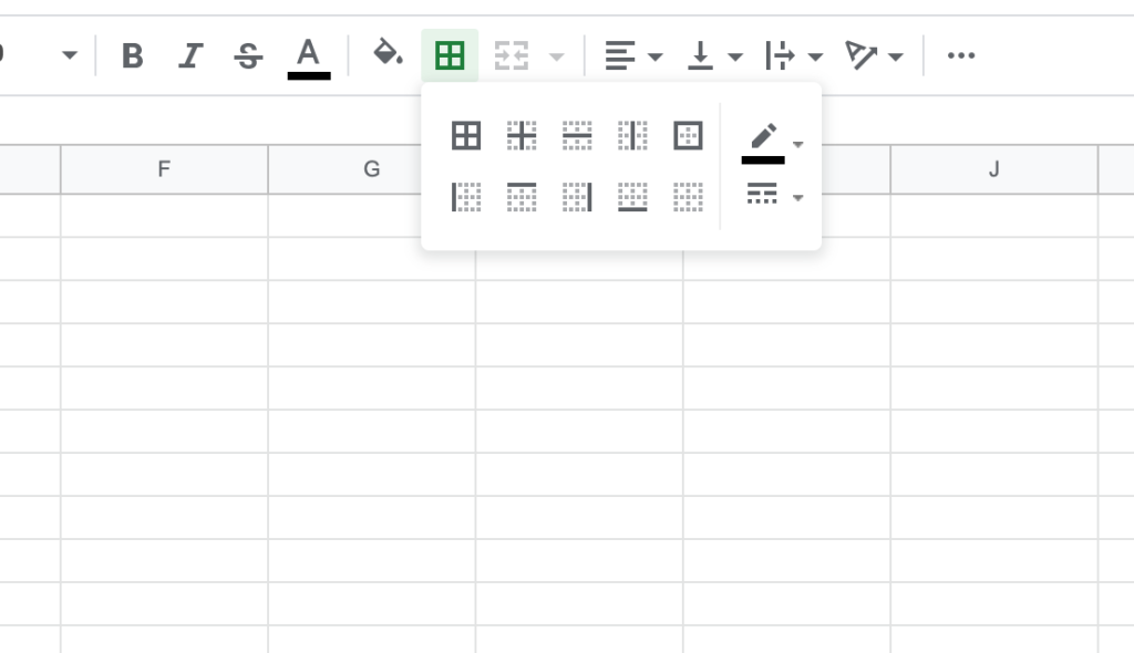
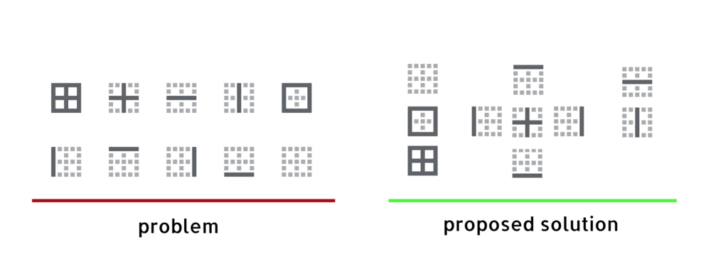
Instead, borders should be split into 3 separate groupings. The middle group of side-specific buttons should be naturally mapped into a grid, with the top icon representing a top border, the bottom icon representing a bottom border, etc. This would reduce the cognitive load on memory and visual search to complete such a simple task.
While the border tool does provide instant feedback, as the icon becomes green on grey once clicked, removing the borders is not an easily discoverable feature – it’s not clear what to do. Clicking the greyed icon does not remove the borders. This is an unintended constraint, as the user must select the specific “clear border” icon to remove a border they just applied, which has little proper visual contrast nor emphasis for how important of a role it plays within a spreadsheet application.
Editing Formulas
Formulas used in Google Sheets have been standardized across spreadsheet applications. The same formula for Excel can be used in Numbers or Google sheets, vice versa. In Google Sheets, feedback from mistakes when entering formulas is provided in the form of an error message and red underline, speficing to its users instant root cause analysis.
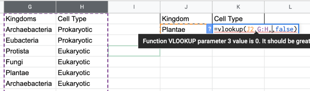
However, with close to 10 different possible error messages, Google Sheets should instead make use of forcing functions when an incomplete formula is entered. Rather than a #VALUE error message, no output should be made. An even more effective method could be to apply an interlock when an invalid parameter is entered, therefore stopping the user from completing the other parameters.
When a formula is invalid for any reason, Google Sheets currently expresses an error code (#N/A, #ERROR, #NAME, etc.), which is helpful only for an advanced user. However, slips are not as easily identified for anyone. If the formula’s logic is entered correctly, but the user enters the wrong cell reference (ex: A:C instead of B:E), it will give the user an unintended output. Double-clicking into a cell that contains a formula reveals a unique use of color to map the formula input to the referenced cells, which is helpful for a user to identify any action-based slips they might have made. However, the color mapping can only be accessed by double-clicking, making this not very discoverable for novices. Users might not know that double-clicking provides additional functionality since many users single click to enter text/formulas.
Rather than double-clicking to view formula mapping, a visual mode should be implemented, that allows users to switch it on to access all colored mapping with a single click. This would help speed up the process of debugging troublesome sheets more efficiently. The boolean text in all formulas should also be black or grey to prevent users from searching for a non-existent cell reference among all of the different colors.
While a few bad experiences with spreadsheet applications can result in learned helplessness, swapping out old features for improved experiences may give users more confidence to make use of Google Sheets for the powerful tool it should be.